Year Ye Year Ye
January – Patient Hub
Adaptive Apps approached us for help with their logo, branding and website for their new product, Patient Hub. Patient Hub is an app designed to allow healthcare professionals to work in a way that’s familiar to them, whilst also bringing patient tracking systems used in primary care into the 21st century. See full news article here.

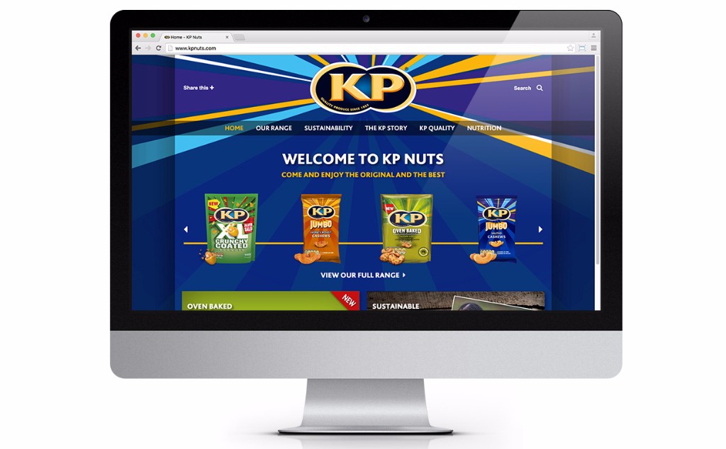
February – Warning, contains nuts
Following on from the success of our KP Snacks interiors project, we were asked to create websites for their three key brands – KP Nuts, McCoy’s and Hula Hoops. We were more than happy to oblige! KP Nuts and McCoy’s sites are live and we’re working on Hula Hoops for launch in 2017. See full news article here.
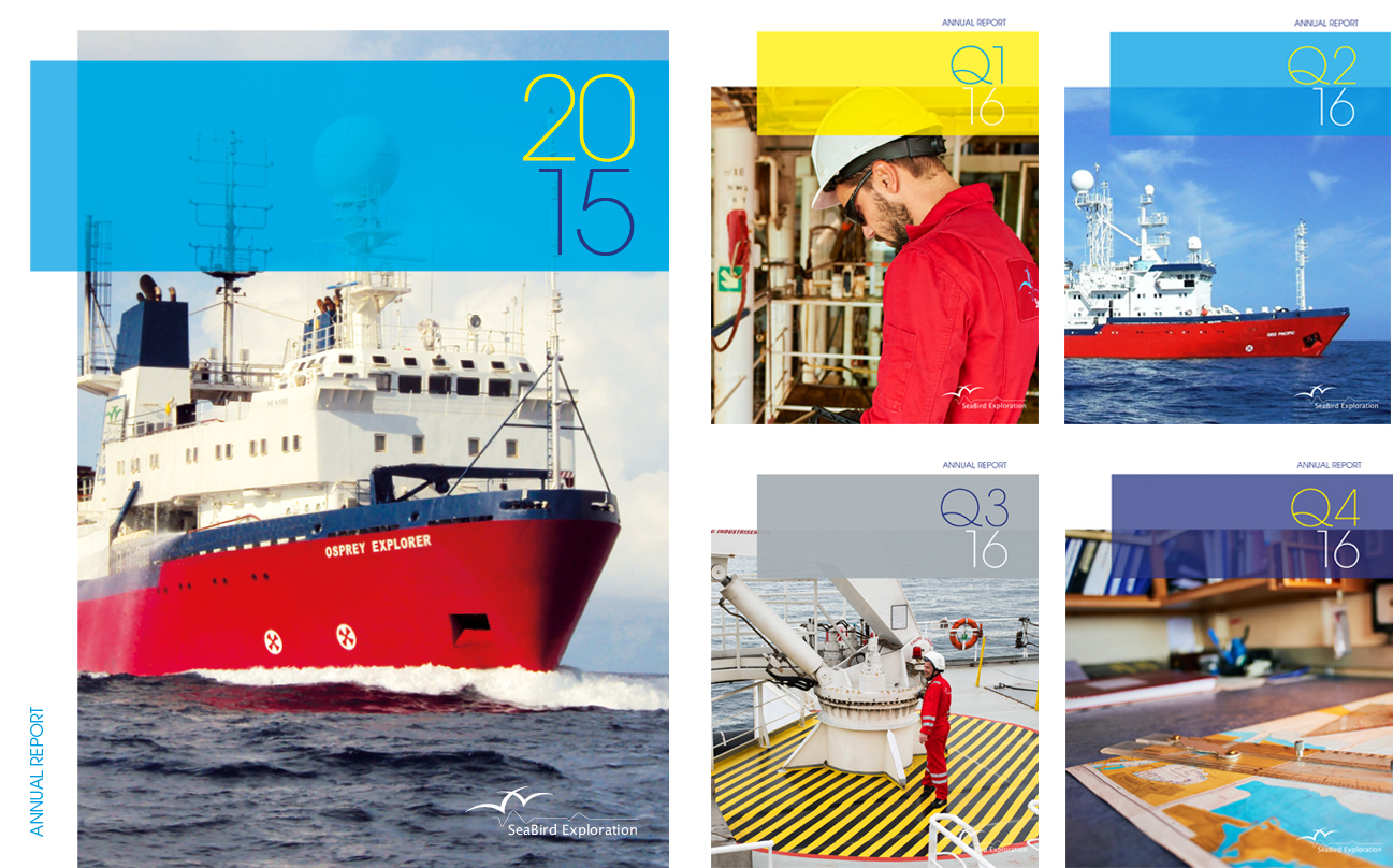
March – Seismic exploration
March saw us working with our long-term client Seabird Exploration on their latest Annual Report, whilst also setting the style for their 2016 quarterlies. The Q4 report will be our first project for them in 2017. See full news article here.
April – Volcanic Appellation
We were joined in the studio in 2016 by Eva Cartwright, owner of the Somlo wine shop in Hungary where visitors can sample over 160 wines from Somlo-hill. We sampled many of her imported selection which inspired us to design her identity and materials for promotion of these unique wines in the UK. See full news article here.

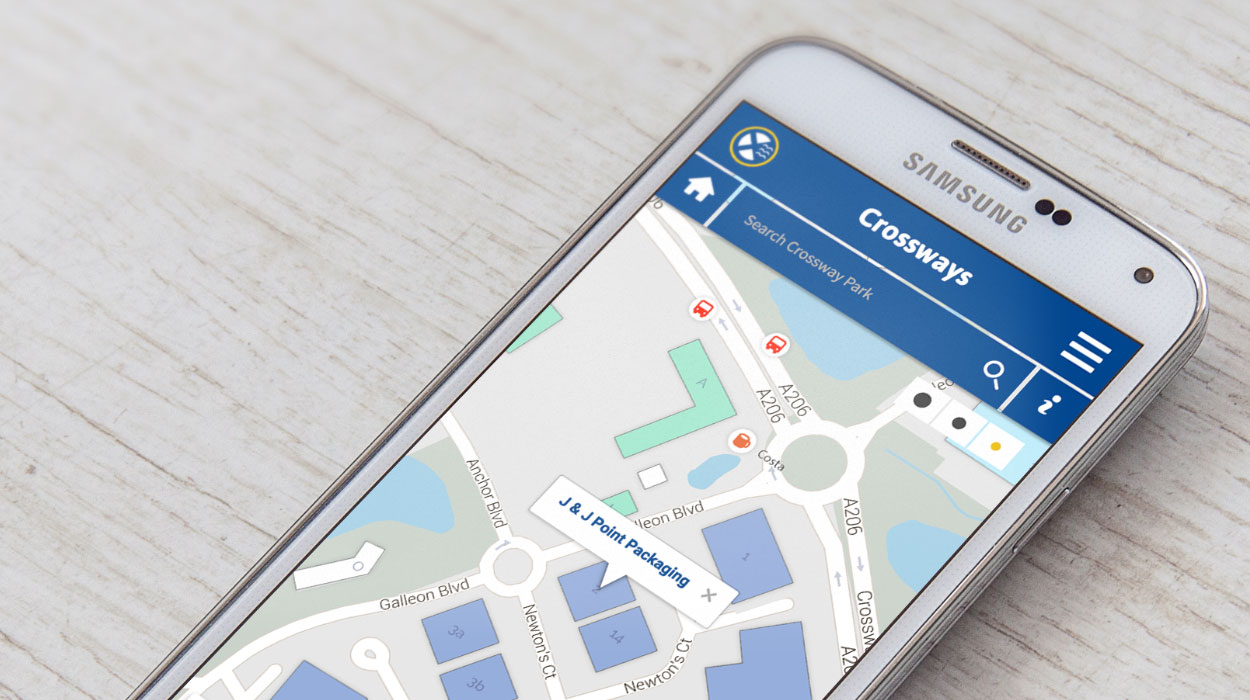
May – Revisiting Crossways Business Park
We originally designed the website for Land Securities who used to own Crossways. Caxtons now manage the business park and we were asked to re-vamp the website to bring it up to date. The new website required an online directory of tenants and services, including an interactive map that worked as well on mobiles as it would on desktop computers. See full news article here.
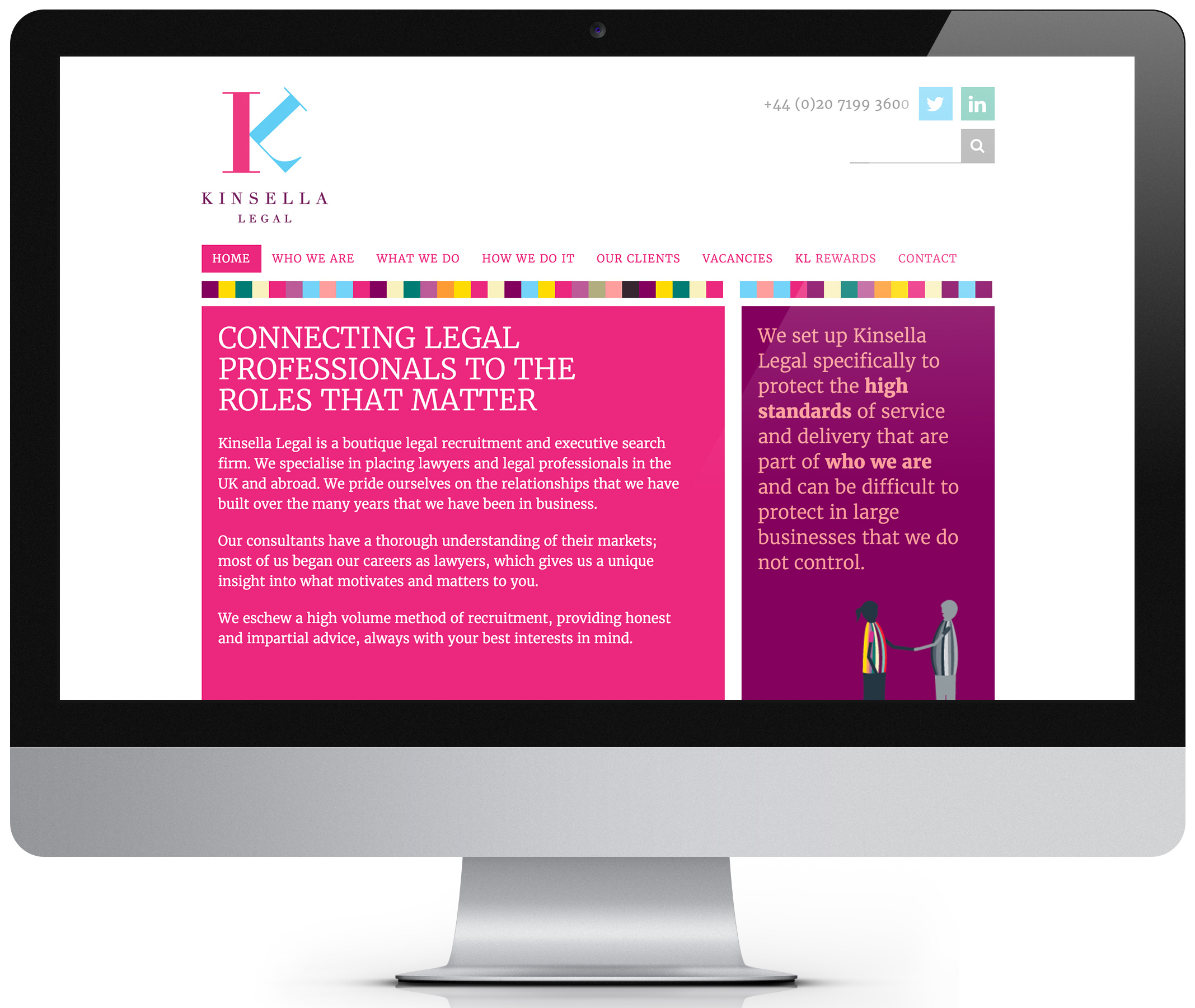
June – Kinsella identity and website
We began working with the lovely legal recruiters at Kinsella in June this year when they came to us to refresh their identity. We elevated the marque with a sophisticated play on the initials creating a contemporary, elegant logo. November saw the launch of our design and build for the Kinsella website, bringing it in line with their updated identity. For the website we retained the playful and quirky nature of the business through their rich colour palette and in-house illustrations. See full website article here and the identity article here.
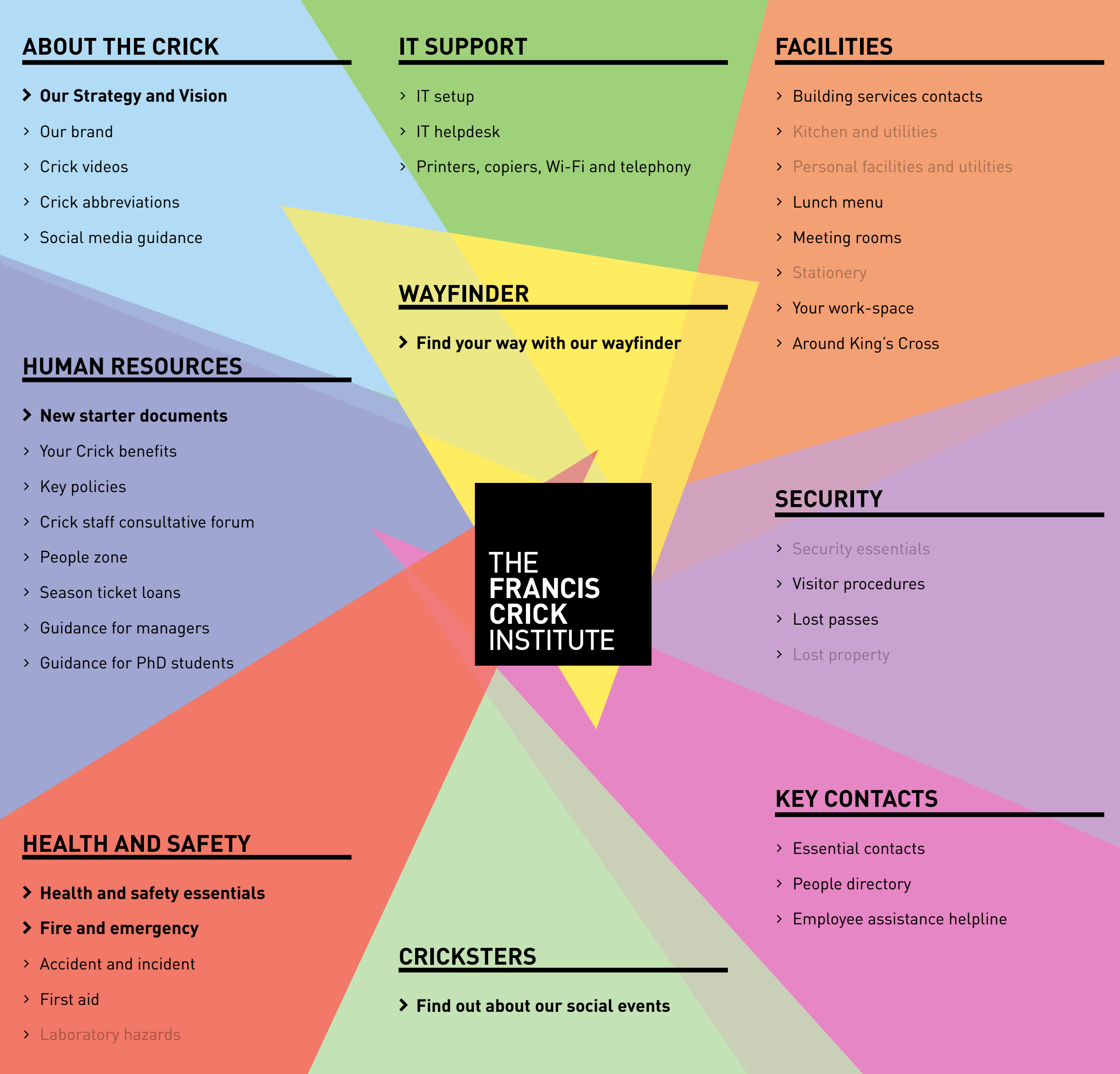
July – Francis Crick intranet
You may remember our earlier work for The Francis Crick Institute for their exciting new biomedical research centre in Kings Cross. During July, we helped the Crick employees old and new find their way around and settle in by creating the ‘Crick Lab Guide’ which is available on their intranet. With a large amount of information to communicate, the guide needed to be engaging, fast and easy to navigate. It’s good old ‘clear, concise communication’. See full news article here.
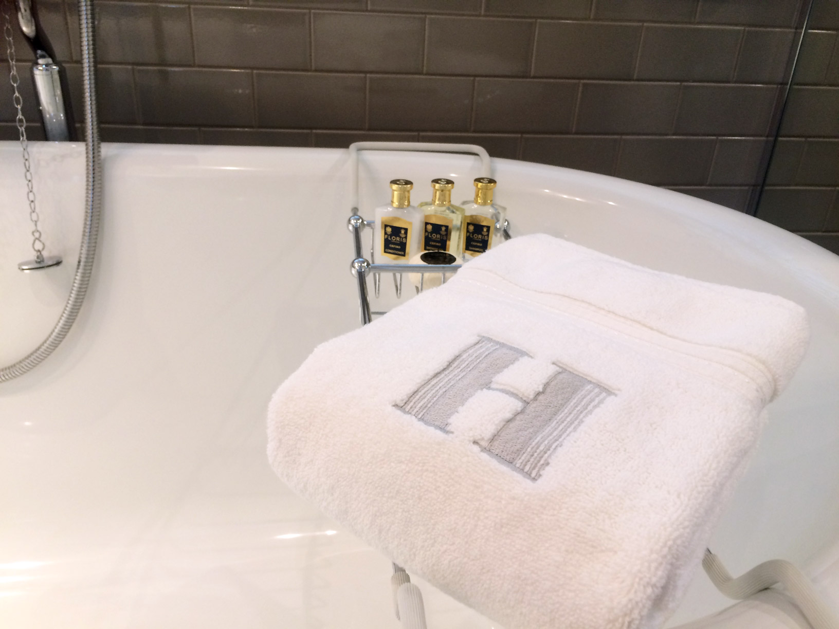
August – Hurley House Hotel branding
Hurley House Hotel has only been open for 4 months and it is already raising the bar for luxury boutique retreats, with its sights on a Michelin Star. Collaborating with the Hurley House Hotel team we created the brand and visual language for the hotel that reflects the team’s vision and the quality and nature of this venue. As well as the identity, we created core branded elements for the launch and worked with Hurley’s digital team to ensure the brand came to life across all its digital formats. See full news article here.
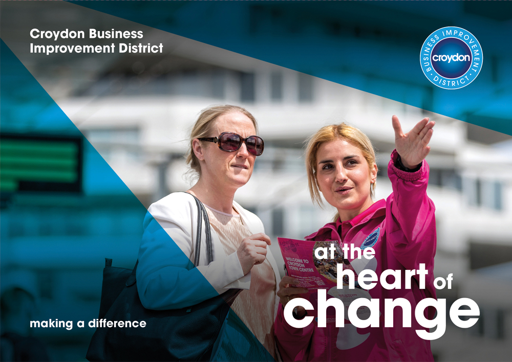
September – Croydon BID, at the heart of change
Croydon BID’s renewal campaign was conceived and launched back in September to encourage the levy payers of Croydon to vote yes for another 5 year term. Through a workshop with the team, we agreed the messaging for the campaign as ‘at the heart of change’. We art directed and commissioned new photography that captured the benefits of having the BID on board for Croydon. All the materials we designed came together and did their job. Congratulations to the Croydon BID team on securing another 5 year term! See full news article here.
October – Transferring knowledge
We were tasked with the design and production of a brochure surrounding the UK vision for industrial biotechnology as part of the future UK strategy for this key enabling technology. This document from The Knowledge Transfer Network is intended to be educational and informative, through the examination of the future of the industry and impact for the UK. See full news article here.
![]()
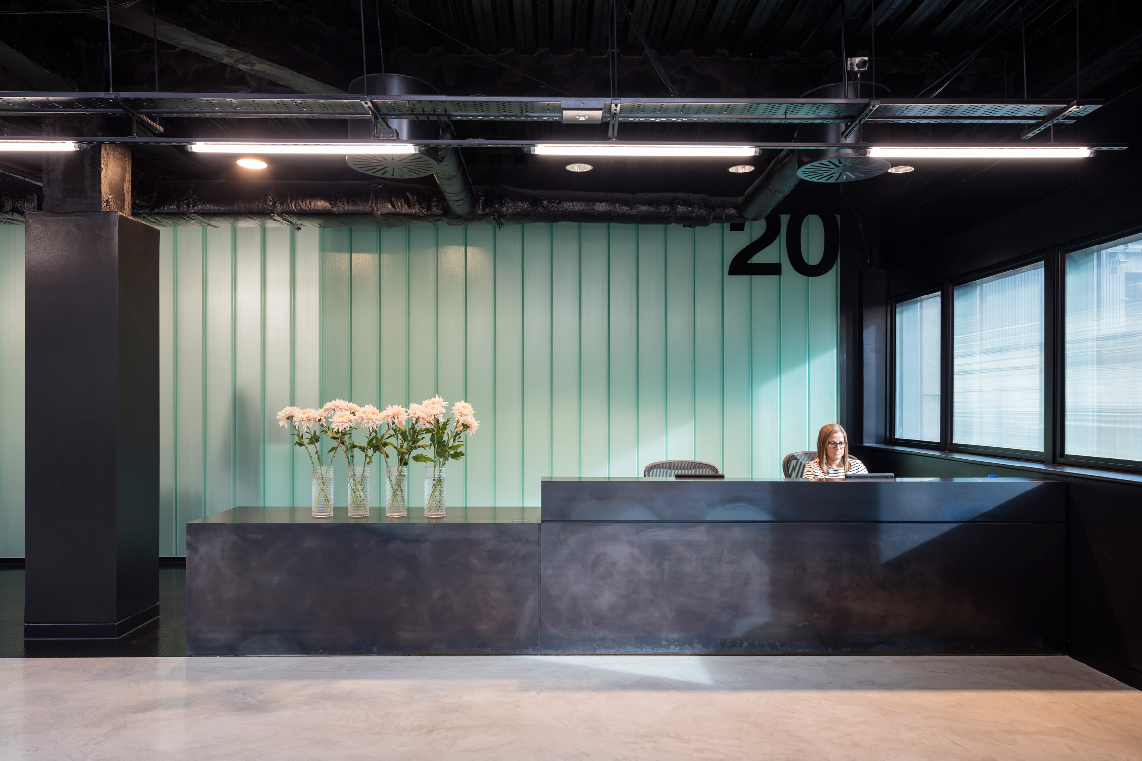
November – Derwent 20 Farringdon Road branding
Throughout the year we’ve been working with Derwent on the marketing and design materials for their striking 20 Farringdon Road offices. We started with the branding, technical pack and then the website. We took inspiration from the building’s stepped facade to create a fresh and bold identity with typography as king. During December we’ve been completing the signage and wayfinding for the building plus a host of new marketing materials to promote the remaining space available on the third floor. See full news articles here.
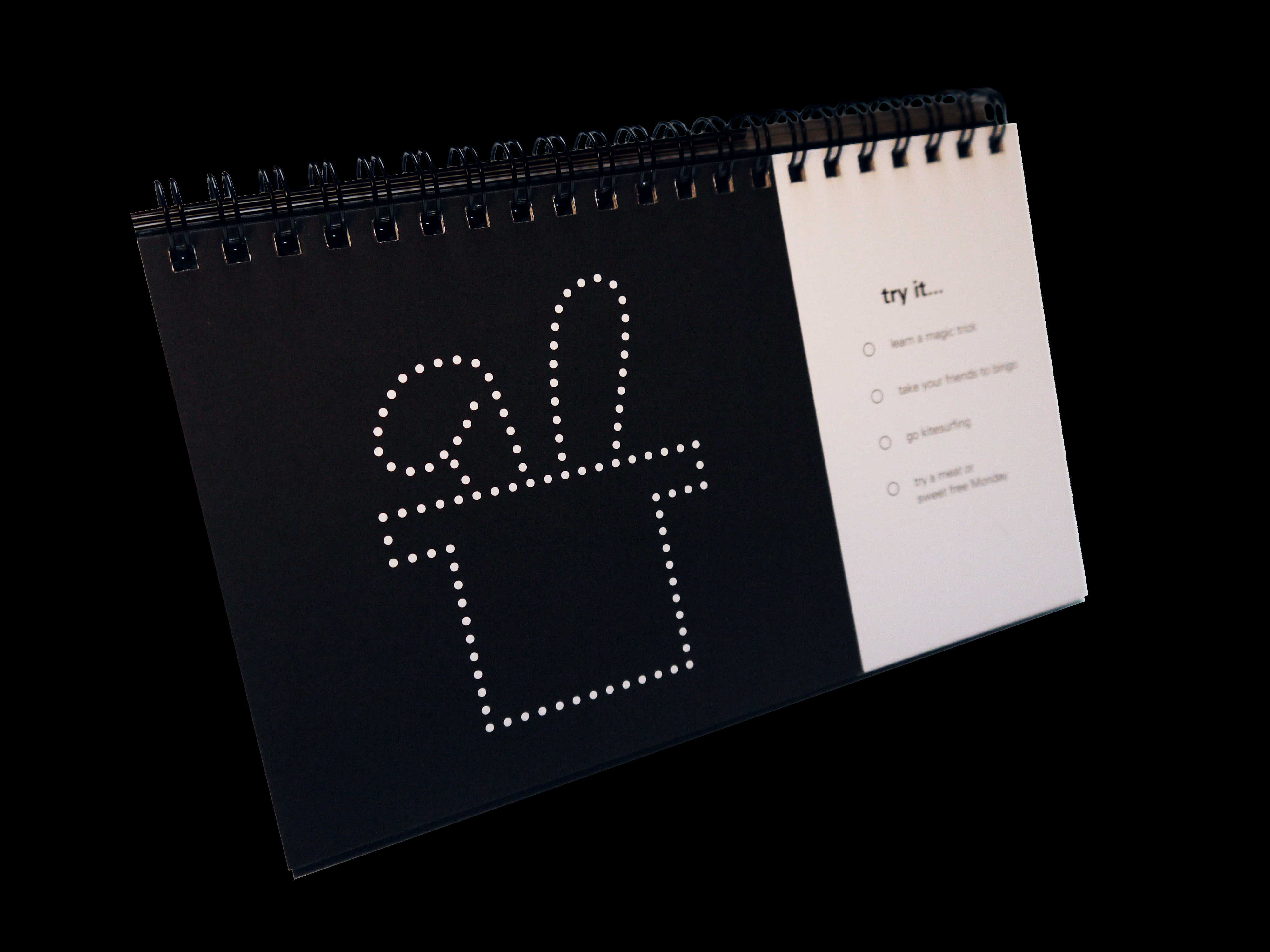
December – TTP calendar
Our final piece of 2016 was the infamous tothepoint calendar, setting new challenges for 2017. We hope you’ve received yours but if you haven’t, and want one, do let us know at hi@tothepoint.co.uk and we’ll pop one in the post. email link.
We thank all our clients and suppliers for their work and support in 2016 and look forward to working with you all in 2017.