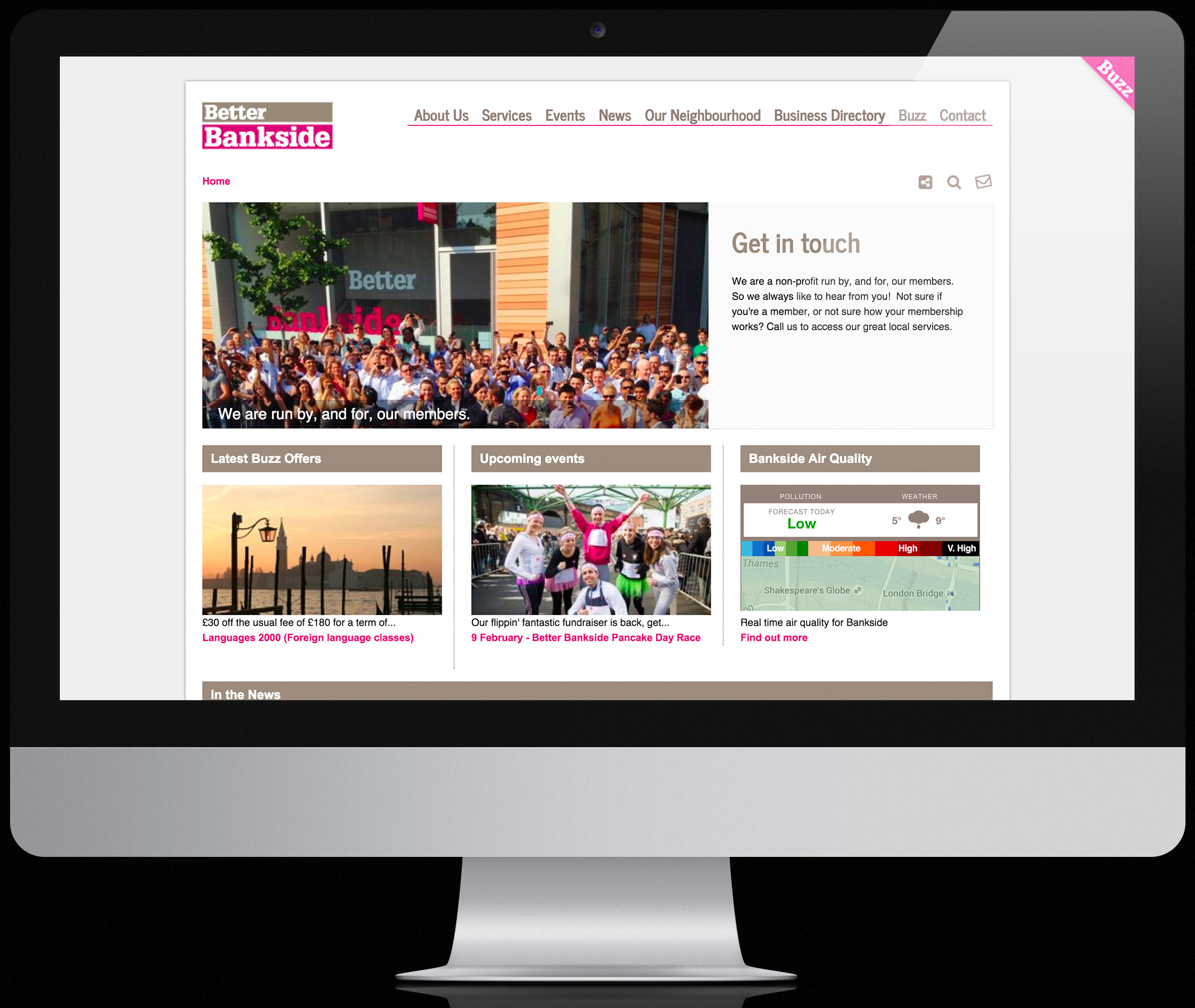
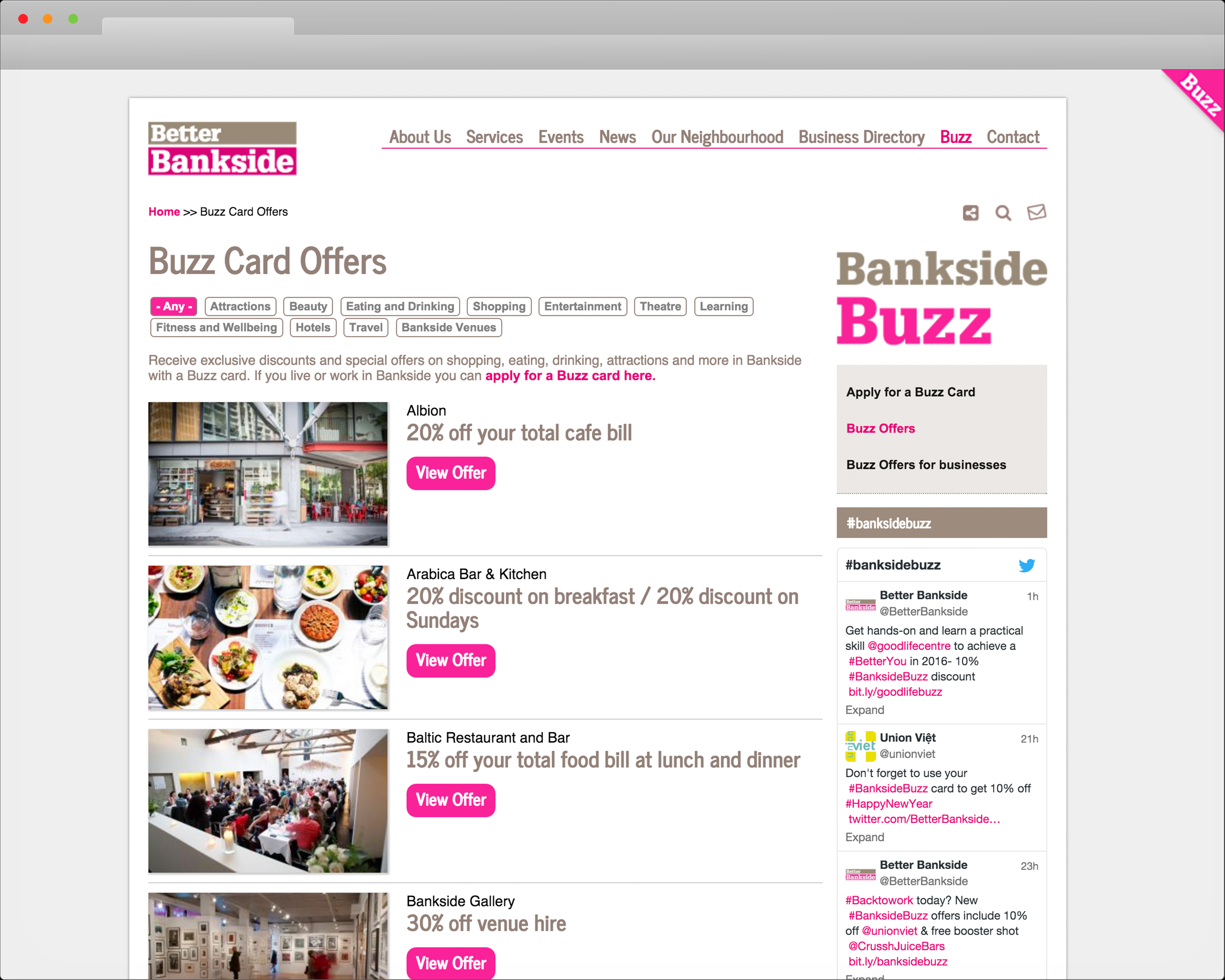
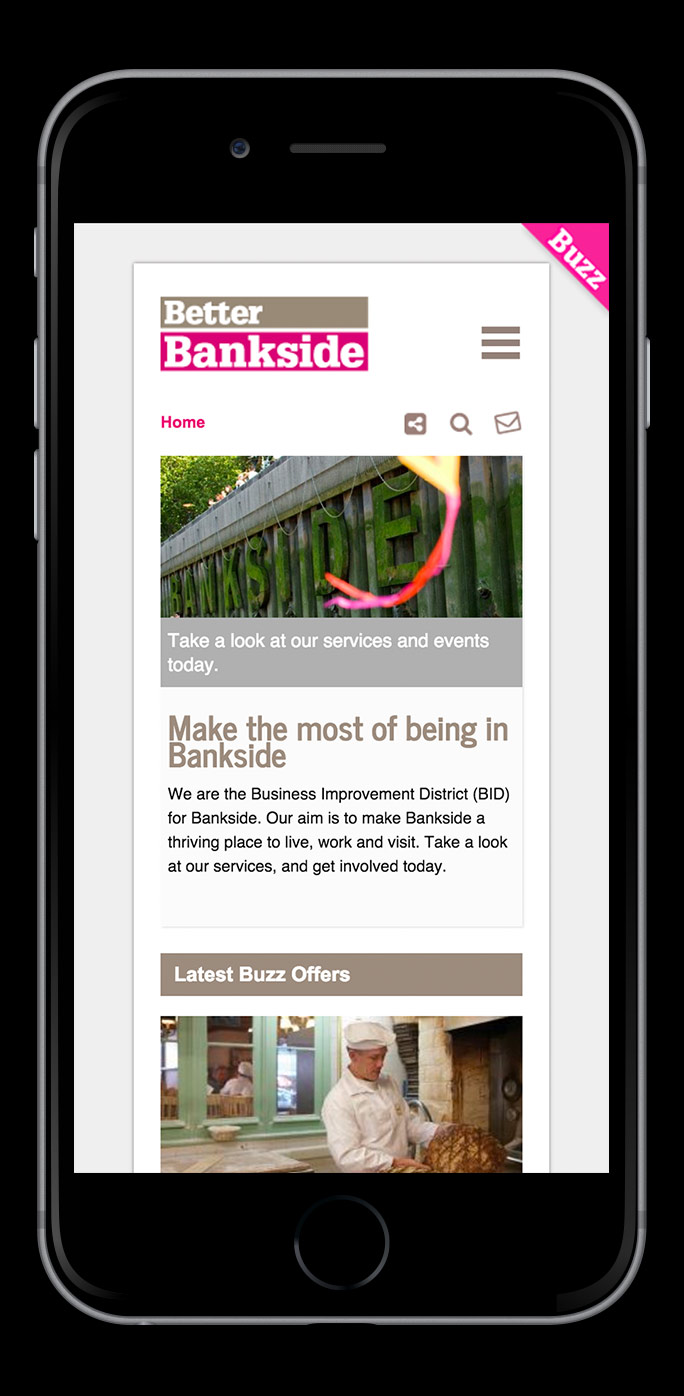
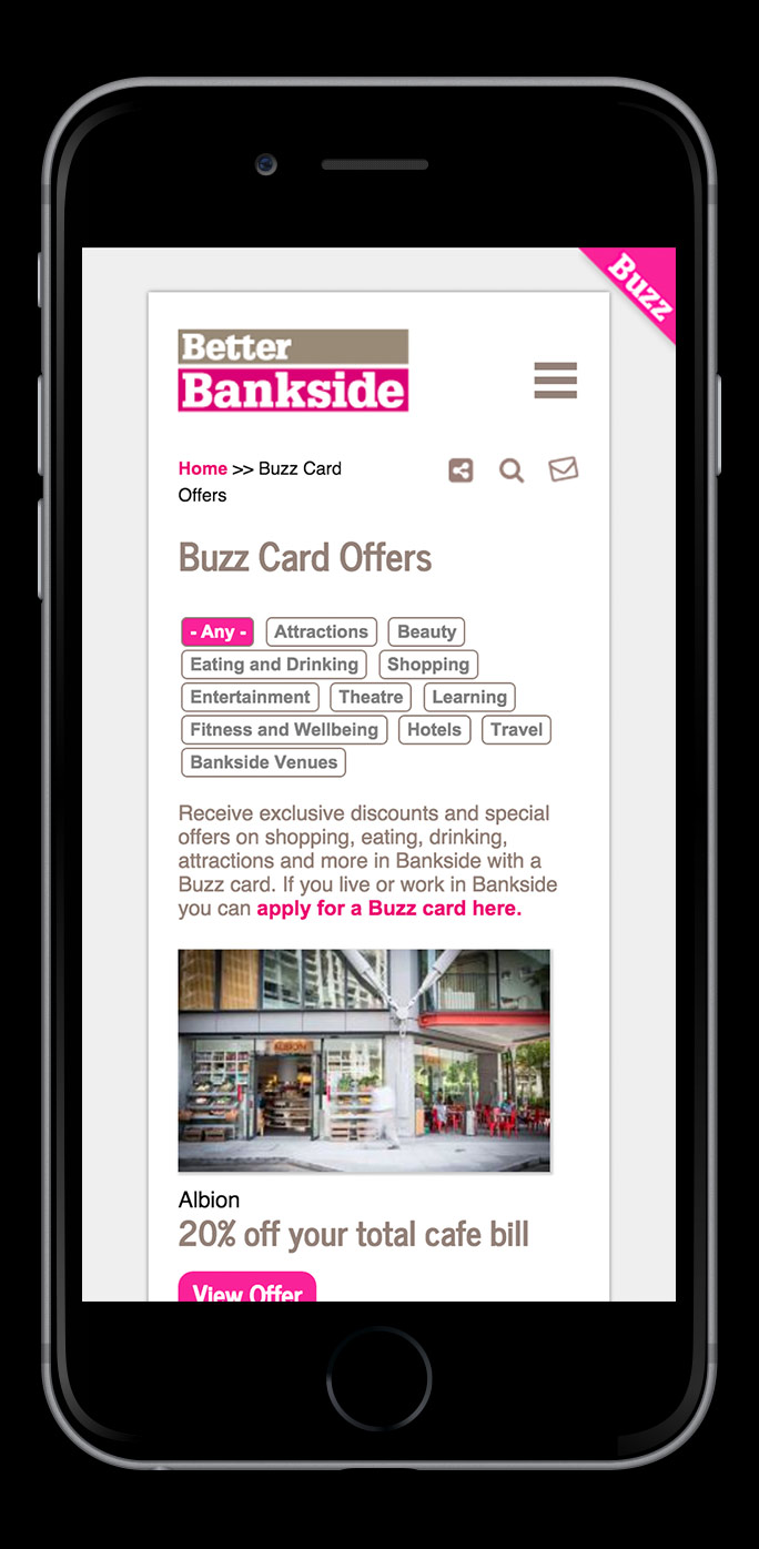
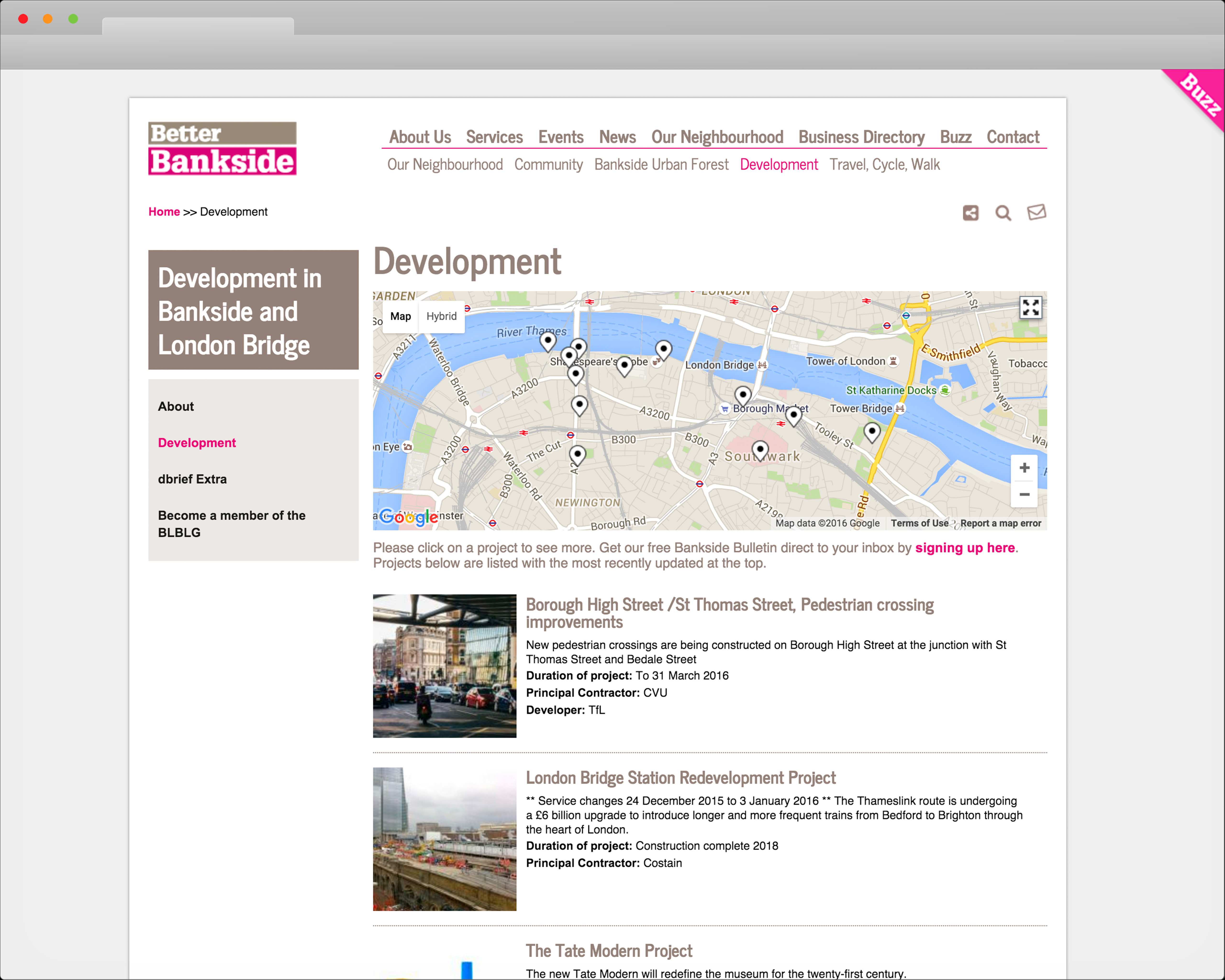
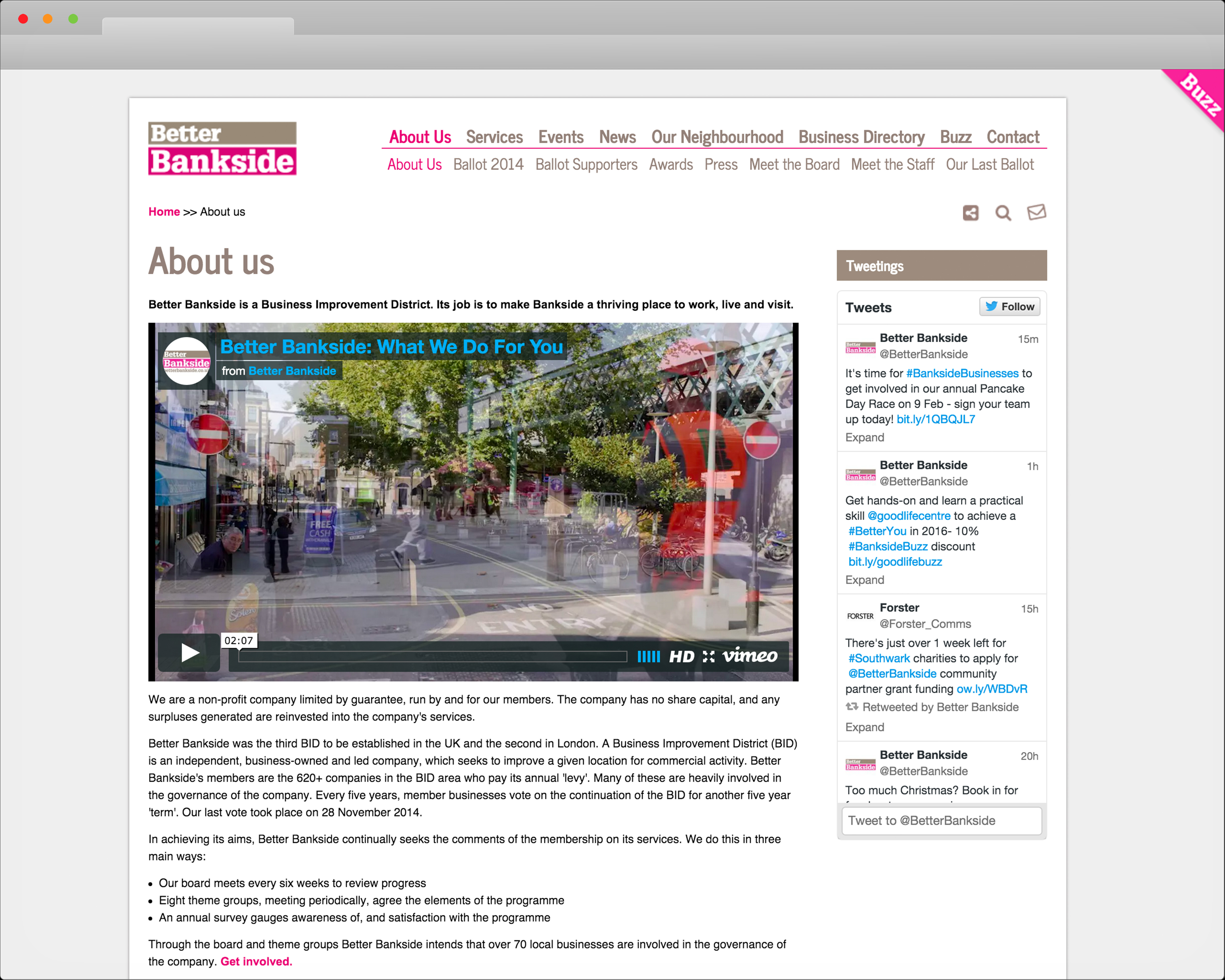
Working with both their in-house team and developers how did we overhaul the Better Bankside site to deliver a modern site design and series of templates that would enable them to make better use of their varied content?
We chose to sparingly use their magenta brand colour as a key highlight for important links and areas that require the users attention. Giving much more clarity to the text and images whilst allowing a little more space around items so the screen seems less cluttered.