Hurley House Hotel is the brainchild of Bassam Shlewet (Founder and former Chairman of TTT Moneycorp Group). The goal was to create a destination venue that raises the bar of expectations – every element perfectly combined to create a contemporary, stylish venue where excellent food and drink can be enjoyed in comfortable surroundings.
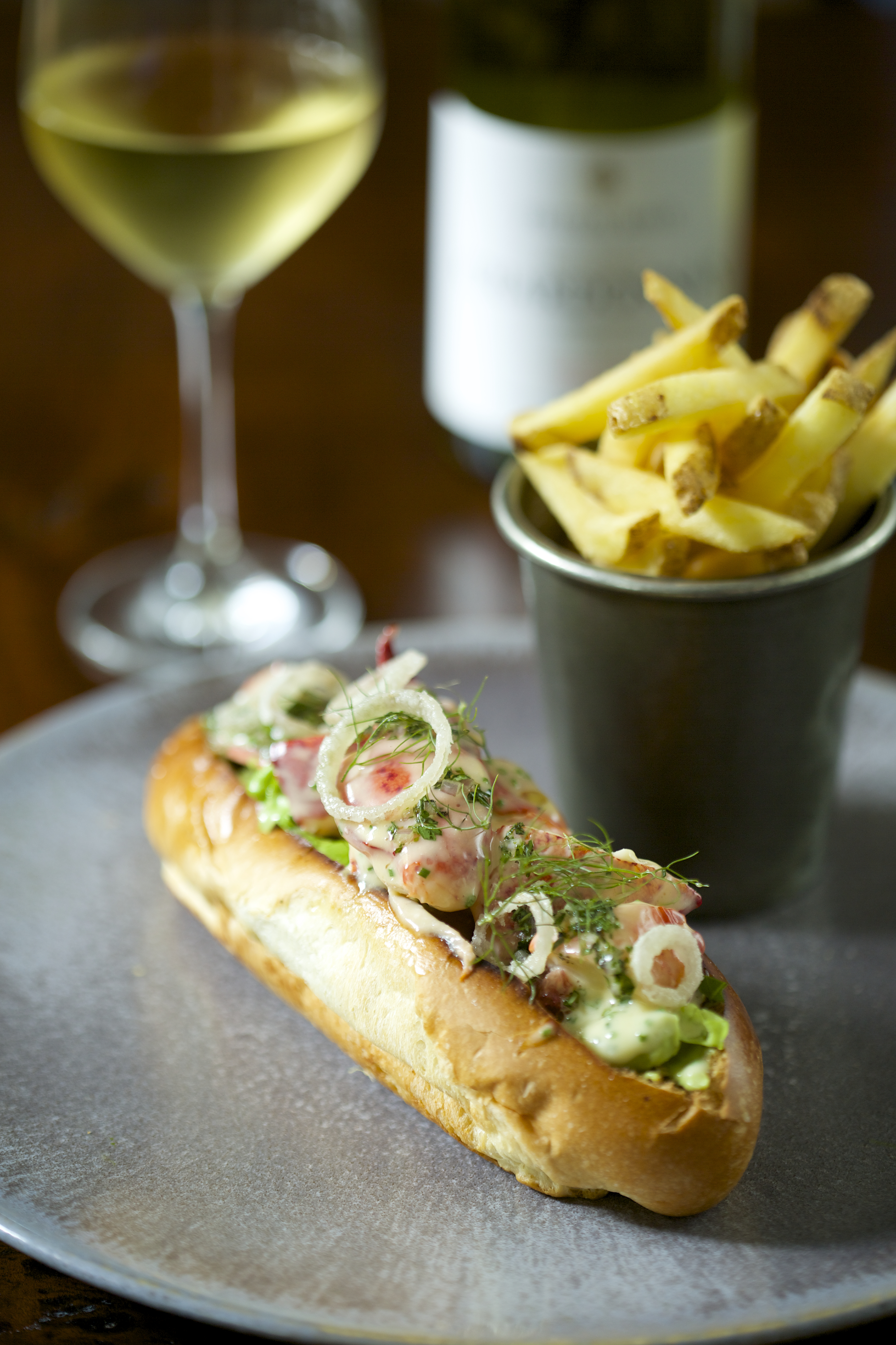
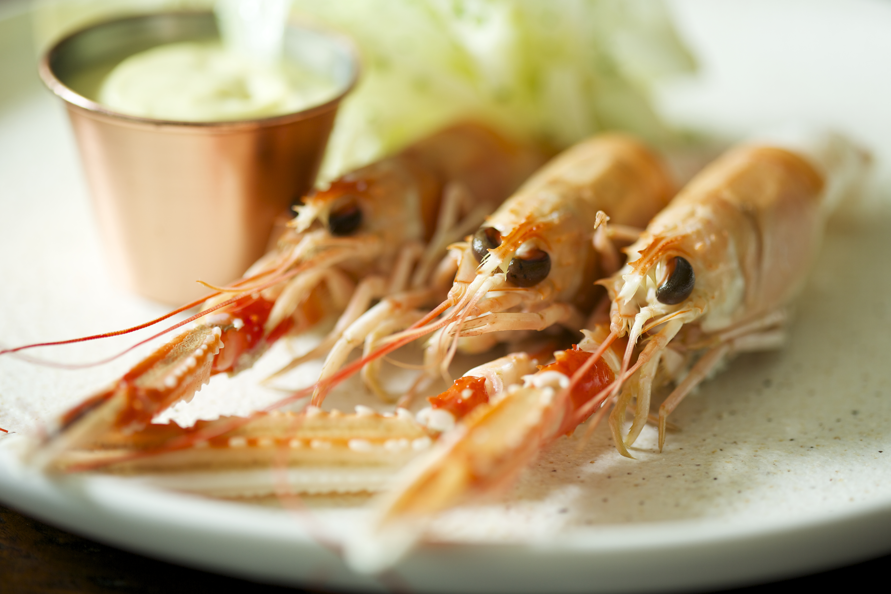
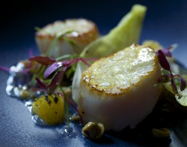
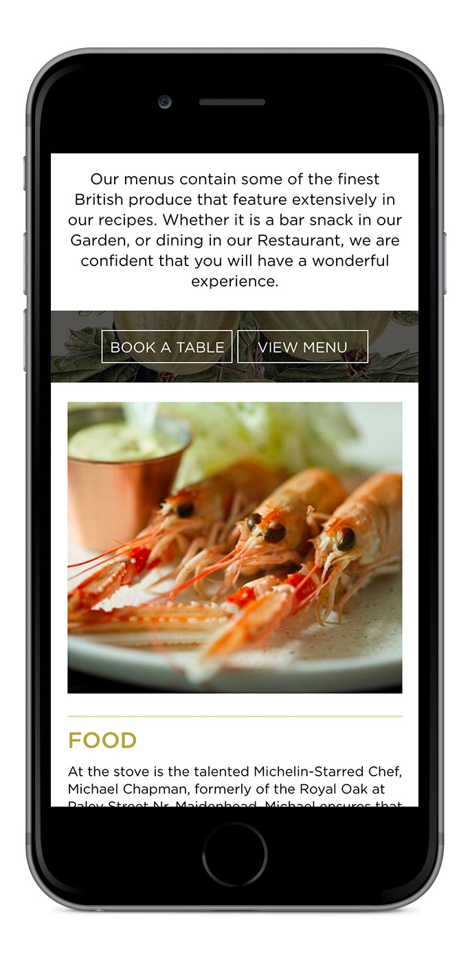
Our MD Simon can testify to the quality and pure delight he experienced at one of the food tastings when a variety of the exceptional dishes that will be on offer were tested at an informal get together a few months ago. Below are some of the dishes you can now enjoy at Hurley House Hotel.
Following close collaboration with the Hurley House Hotel team, and extensive research into this relatively new sector for us, creative proposals for logos and icons were presented. With projects of this nature where there is so much personal investment from the entrepreneurs (not just financial) it is essential to be flexible and ensure the brand reflects their vision.
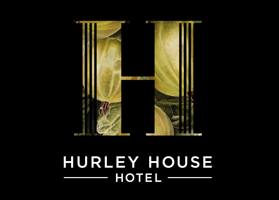
Taking on board their creative input we investigated the introduction of original illustration to reflect the quality and nature of this re-envisioned venue. Supplied with a botanical illustration from Victorian times of Gooseberries we researched and discovered the stunningly detailed works of botanical artist Jess Shepherd ( inkyleaves.com ). We commissioned her to produce a series of illustrations but the Gooseberries hit the mark first time and already has pride of place, framed on one of the main walls at the new establishment.
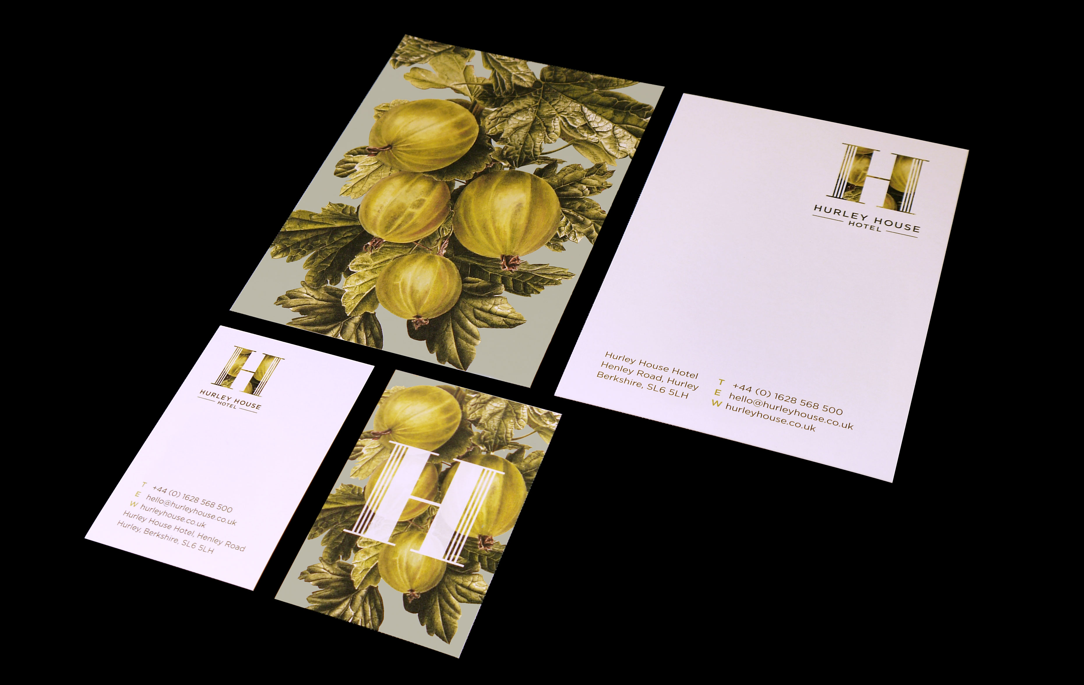
The illustration has been used as a core visual element of the Hurley House Hotel identity in conjunction with a crafted typographic ‘H’ device that incorporates three vertical bars to represent the three H’s of Hurley House Hotel. After some extensive digital and print testing the final logos were selected for use across materials.
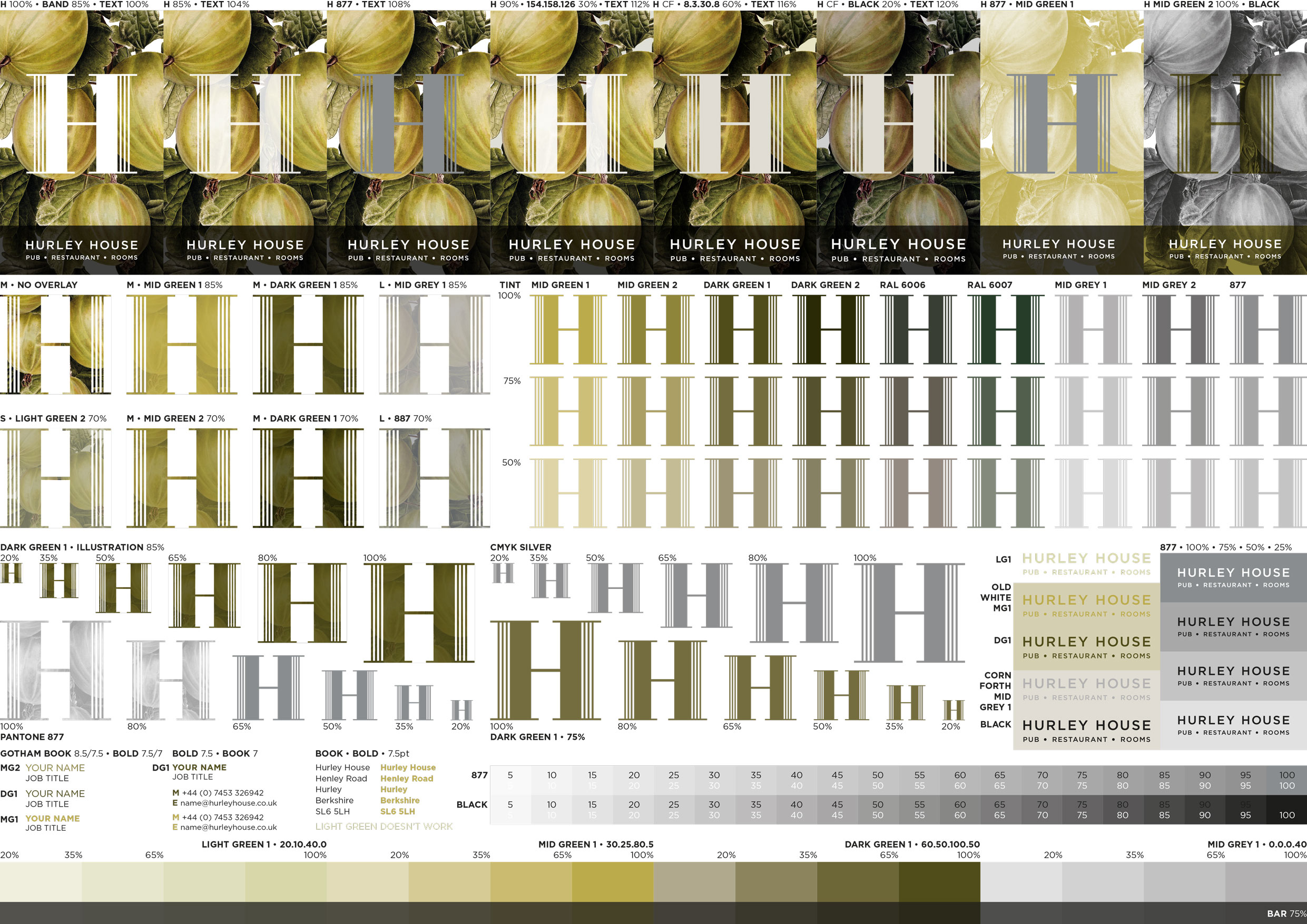
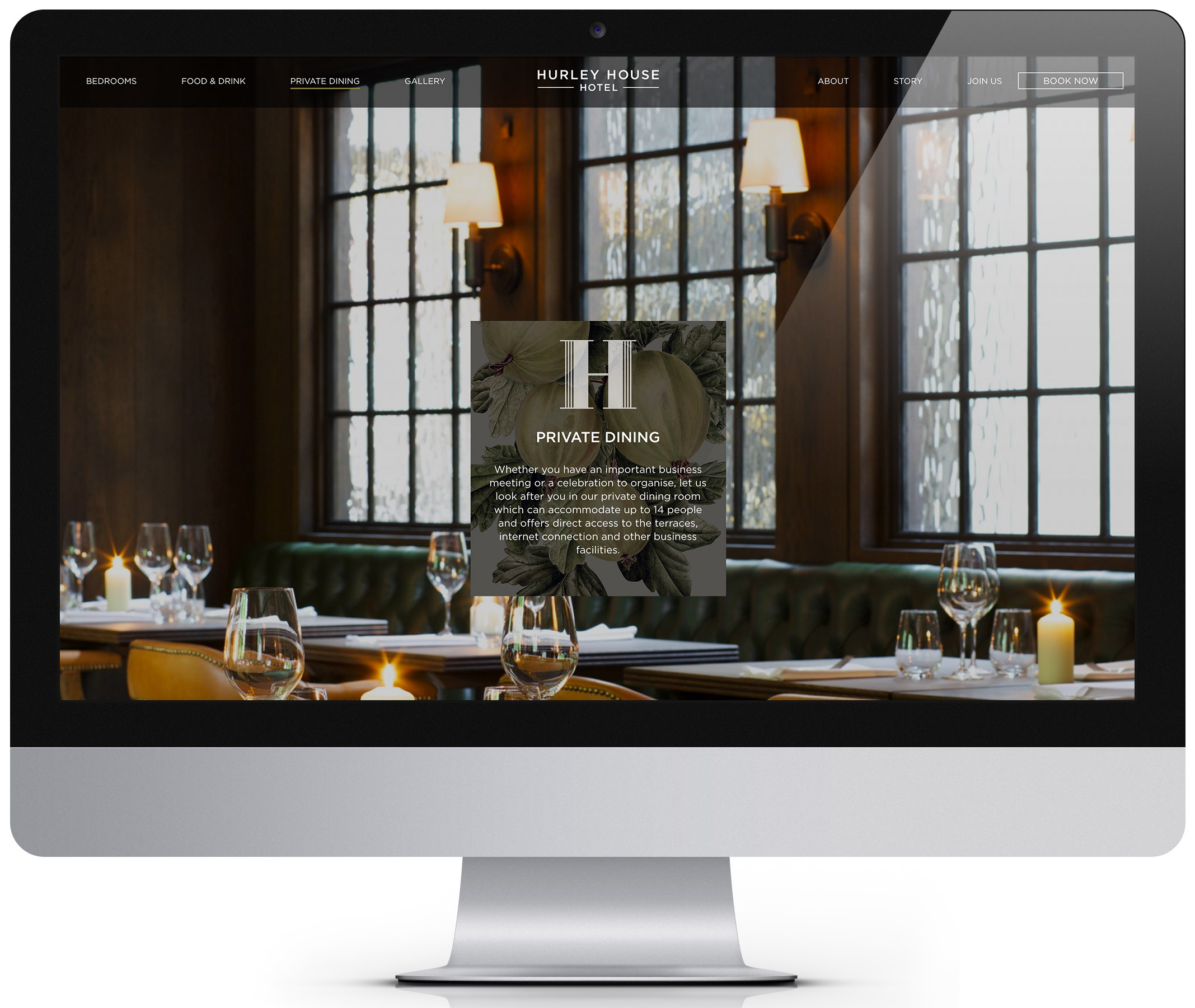
These design elements either work together as seen on the traditional exterior pub sign or individually as seen on the building signage or the various items of stationery. This provides the brand with great flexibility for creative application, ensuring that it can be applied as a simple understated mark to allow photography of the venue and food to speak for itself, to the more elaborate stand-alone illustrative logo.
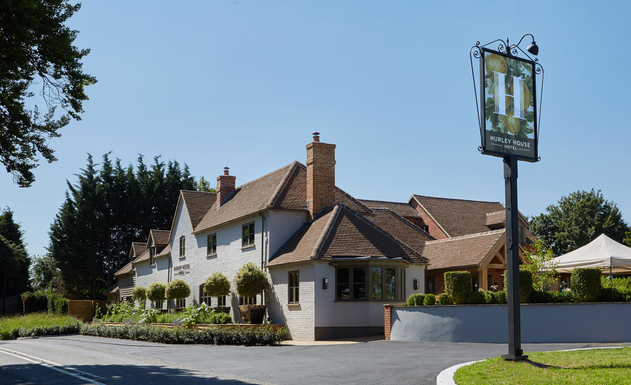
As well as the identity, we have designed and delivered core branded elements for the launch including interior and exterior signage, business cards, stationery and promotional postcards. Add to this the must-have brand guidelines that establish the rules for implementation and you have the tools to ensure essential brand consistency for future design work.
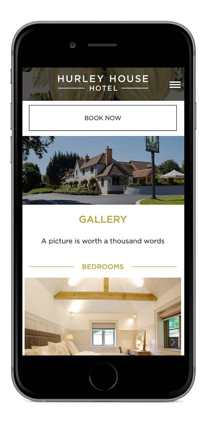
Our final design input for the launch phase was to work with the digital experts in this sector, UMI ( umidigital.co.uk ). Our role was to ensure the brand came to life in all its digital formats as well as it does in print and the workplace environment. This highly visual site goes a long way to achieving this, showcasing high quality photography and video of the Hotel and the fine dining, ensuring the aesthetic, and look and feel, are appropriate for the luxury market and true to the brand ethos.
But don’t take our word for it, why don’t you pop over and see for yourselves? Find out more about Hurley House Hotel at hurleyhouse.co.uk.