tothepoint

news
2017

Take a look at our monthly news stories to keep in touch with our recent work, what we've seen and what we'd like to see. You could also sign up to our newsletter for regular updates to your inbox.
01
17

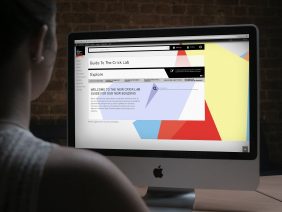
The Francis Crick Institute Launch

We created an email invitation going out to around 2,500 people, with an engaging animated header and yes/no button response, making it easy for the team to gather responses and manage the guest list. This regal opening also called for a high-end ceremony schedule, so after researching the best and finest paper stocks, we opted to print duplex…

...read more

11
16

20 Farringdon road, signage & marketing

The signage is simple but bold, following on from the identity, using the large numbering and stepped line echoing the building exterior. With seven floors, four stairways and numerous tenants we had our work cut out! To promote the last space available we created a bespoke marketing system which mirrors the zig zag of the brand. With an industrial…

...read more

November Round Up

New Capital Christmas Cards The festive time is upon us once again and the lovely folk over at New Capital once again called upon our services to produce their Christmas card. We gave them a number of options to choose from and they’ve ended up using them all! Business Review This month our account manager…

...read more

09
16

Big moves for data

ST2 aims to alleviate the main public concerns about data storage which have been identified as; future costs security knowledge of where the data is held/stored Theirs is a truly ground breaking approach to the datacentre world. Offering very low cost fixed term pricing, in a Tier 4 environment, using unique security software harnessing best…

...read more

07
16

20 Farringdon Road

Taking inspiration from the building’s stepped facade, the fresh and bold identity uses typography as king, with a restricted monochrome colour palette and an orange accent colour. Through this visual language, we played with the positive and negative space to reflect the contemporary nature of the building. Once the identity was sorted we got down…

...read more

Click Around The Crick

With a large amount of information to communicate, the guide needed to be as easy as possible for users to navigate. It’s good old clear, concise communication, something we know a little about over here. We needed to give the Crick an engaging interface for the existing pages to help smooth the migration from their old…

...read more