
At first, we were tasked with the job of updating some of the signage outside their care homes, including their advertising boards, to bring them in line with the new John Whitgift Foundation identity we had created. However, after initial briefing discussions, we agreed there was an opportunity and need to turn this into a wider brand evolution project at a time when care homes were increasingly coming under the spotlight during the pandemic and confidence needed to be re-established.
With a limited budget we had to look at the key drivers for the brand evolution that would have the most impact. These were: to have a clearer message of purpose; a more legible logo, especially for digital; and to look at bringing some consistency to the materials.
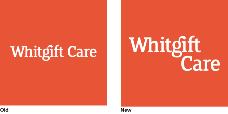
In its former state, ‘Whitgift Care’ sat within a red square on a single line, so at small sizes the type becomes illegible. To give the logo more character and impact, without reinventing the wheel, we increased the size of the type by splitting ‘Whitgift’ and ‘Care’ over two lines with a typographically crafted overhang. The balance created a much more powerful logo without losing existing recognition through keeping the familiar colour and the friendly font. We also included options where this more characterful typographic logotype did not have to be restricted by a box, as can be seen on the advertising hoarding below.
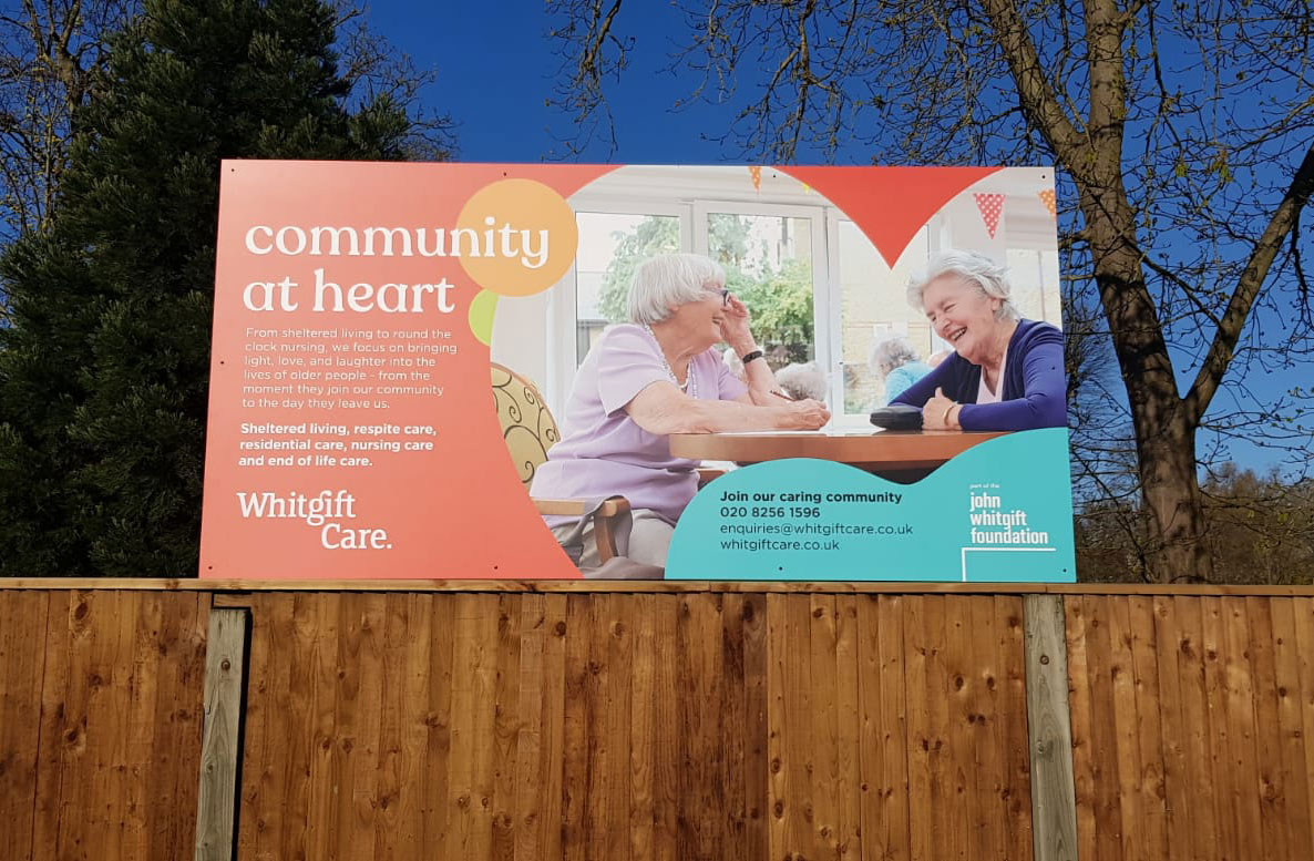
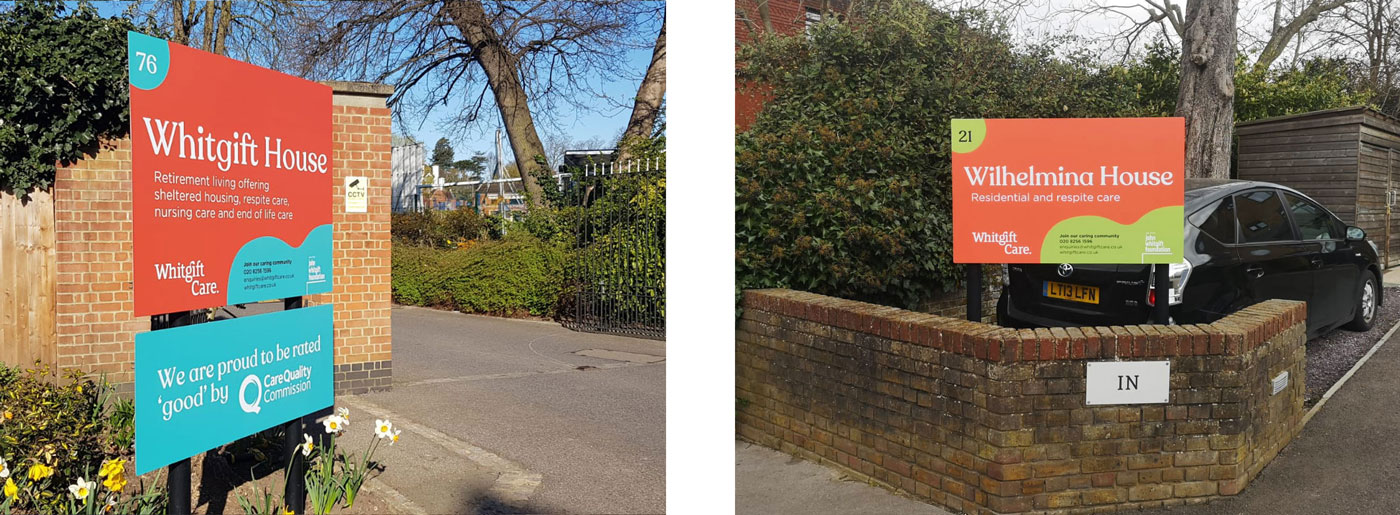
Having established the new logo, it was time to shift our focus to designing the signage with new messaging. It was clear from our research that care homes generally use the same safe, comfortable, and frankly drab language and imagery. All care settings should be safe, clean, and comfortable. These should be a given, not the focus of copy as care homes can be so much more. Whitgift Care needed to stand out from the crowd, visually and with clearer more engaging messaging.
We wanted to convey that Whitgift Care offer care homes that bring life, light, and laughter into the lives of older people. We reflected this in the new copy and visually through the use of vibrant colours, subtle shapes and engaging imagery on the signage and advertising. After proposing several new strap lines, which were more aligned with the charity’s community focus and values, we all agreed on ‘community at heart’. This steered a development of the creative approach with the introduction of subtle heart graphics to reinforce that community is at the heart of Whitgift Care, and the John Whitgift Foundation.

