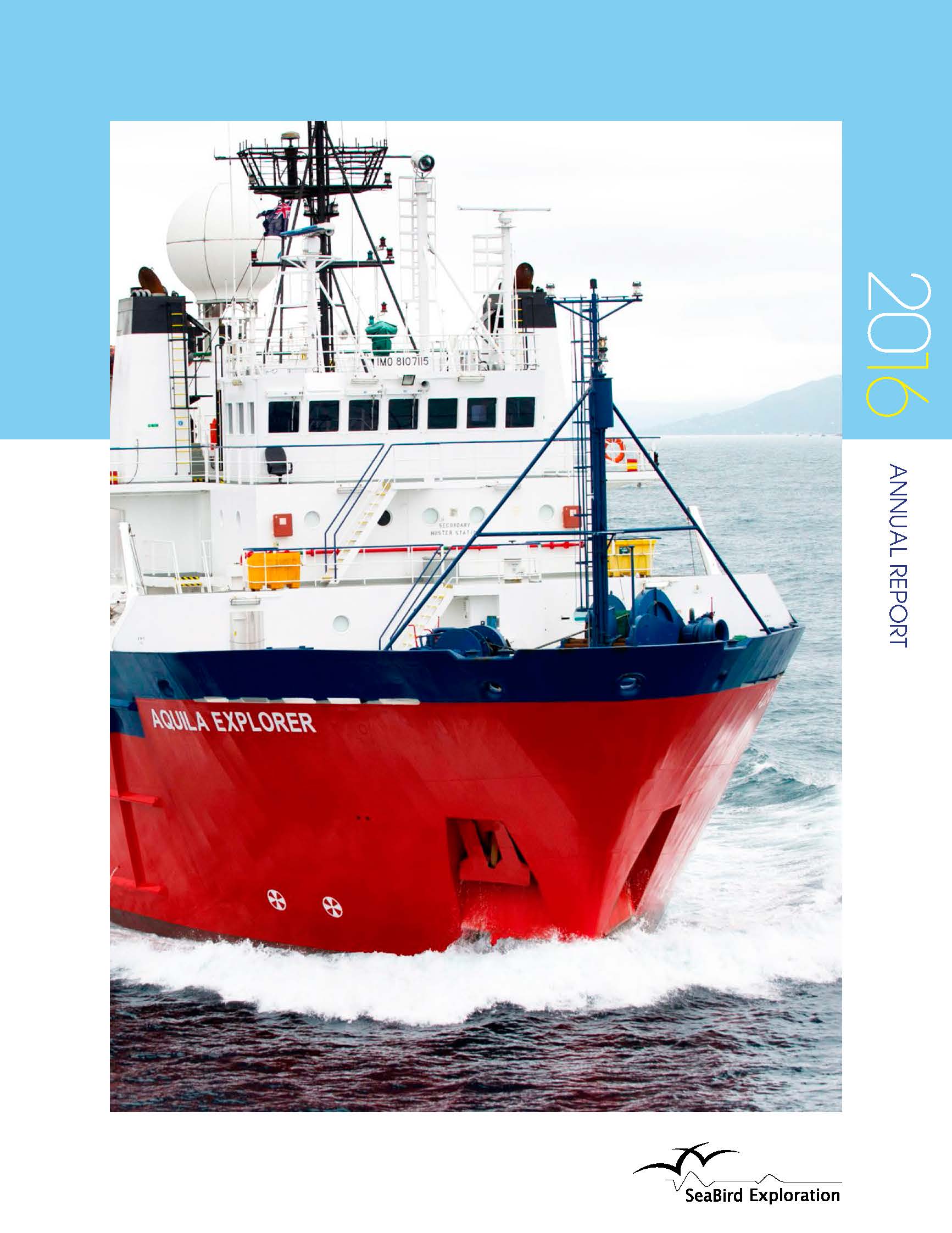
SeaBird like the key focus of the look and feel of their reports to be on their ships combined with the activities of their people on land and at sea. Good imagery is therefore essential and recent ship photography has improved substantially including the use of drones. The birds-eye views that are possible with this technology provide additional drama and different perspectives for the image led sections.

This year, reinforcing the physical nature of the shipping landscape, we introduced the backdrop of a strong horizon line which we built into the graphic styling of the pages with information breaking in and out of the horizon line to provide an interesting hierarchy to the information. As a Scandinavian organisation, they tend to like clean lines and have a real appreciation of design and white space. From our perspective this is very refreshing as many clients want to fill as much space as possible, making information both unappealing and inaccessible.
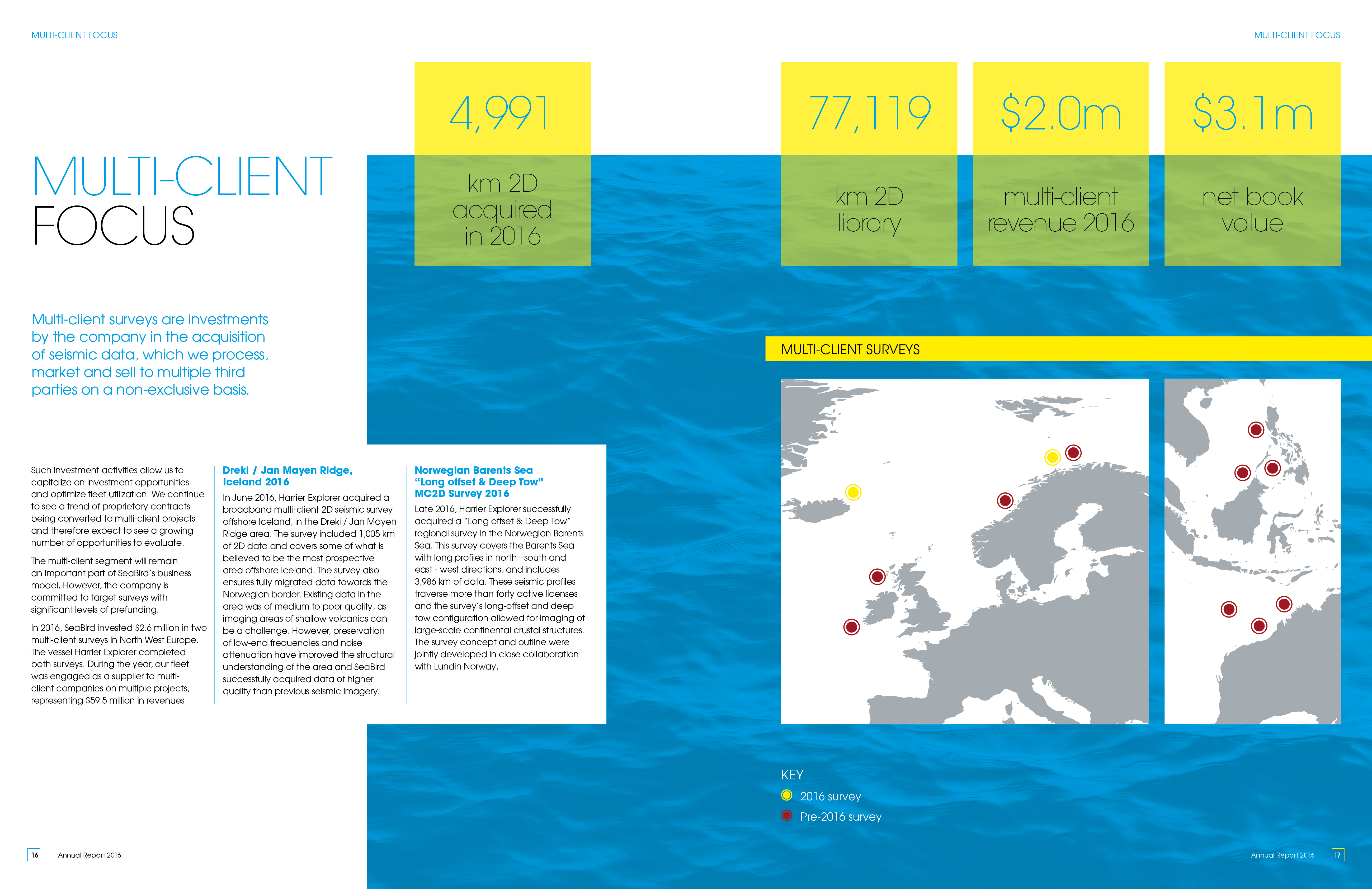
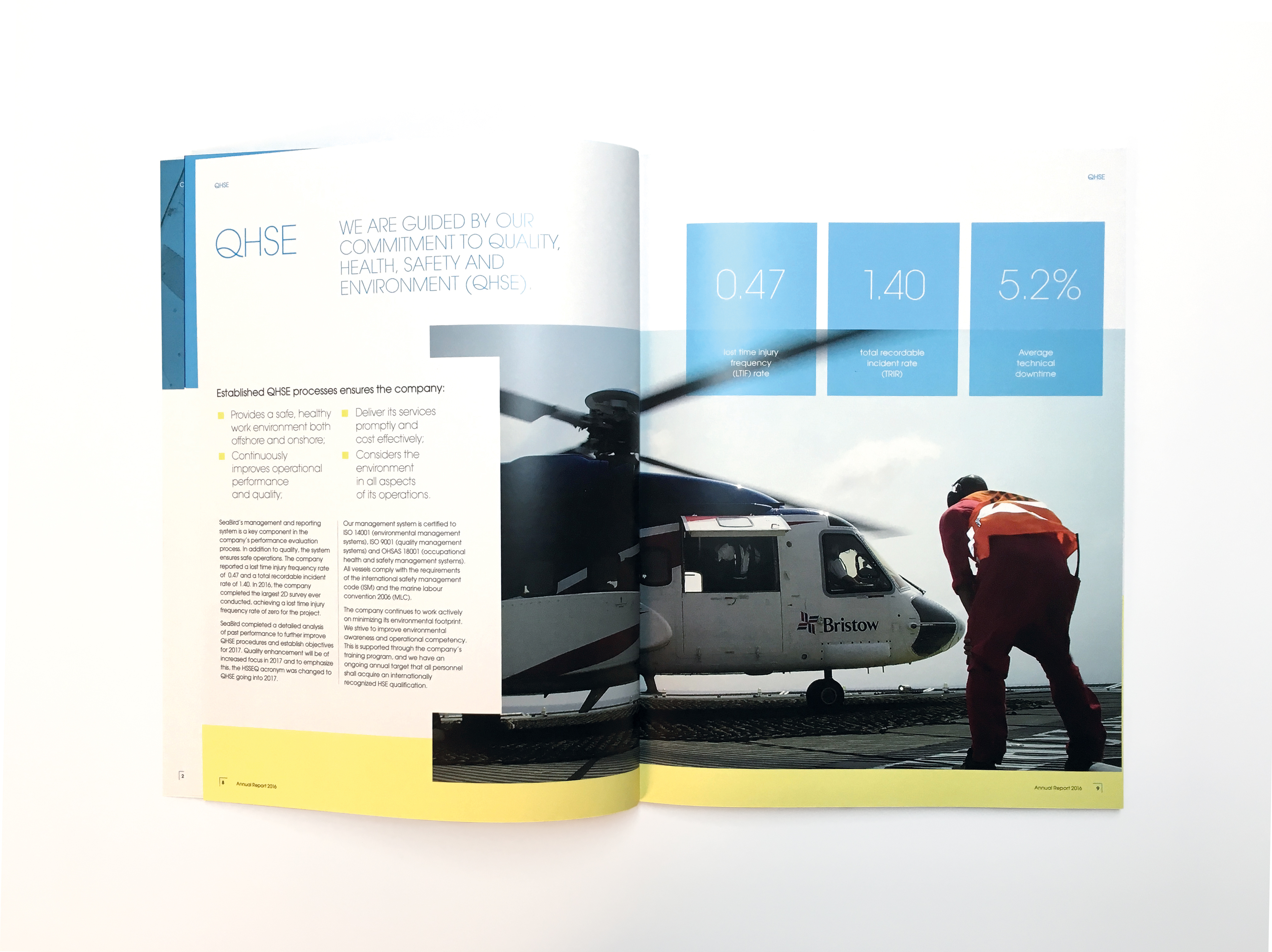
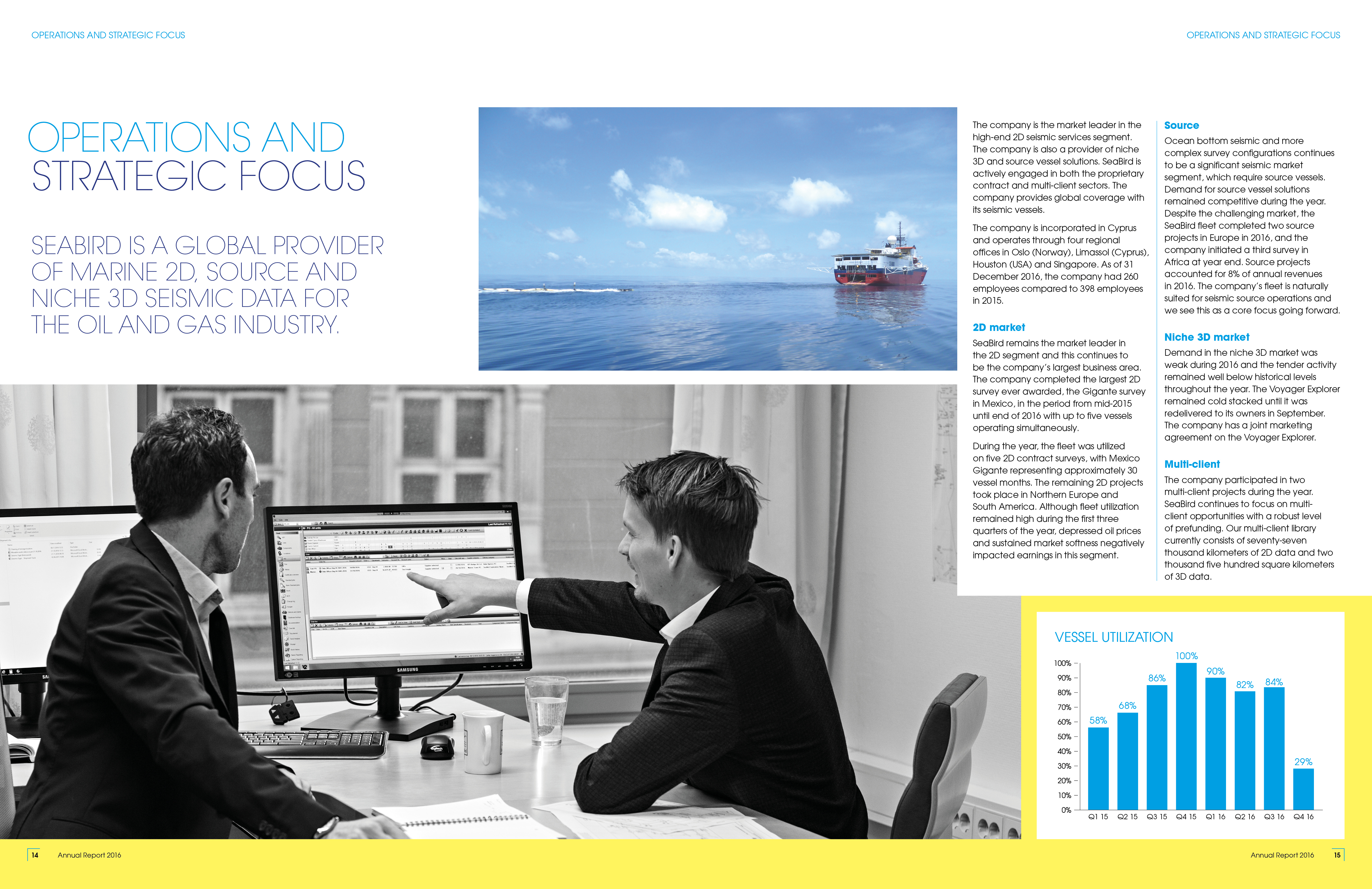
The mix of colour, black and white photography combined with mapping imagery, location maps and pull out stats provides a real sense of a dynamic, results driven, global organisation and stimulates the viewer as you flick through the document.
The Annual Report is followed by four quarterly reports throughout the year that sit together as a family, so stay tuned in the upcoming months to check out those designs too!