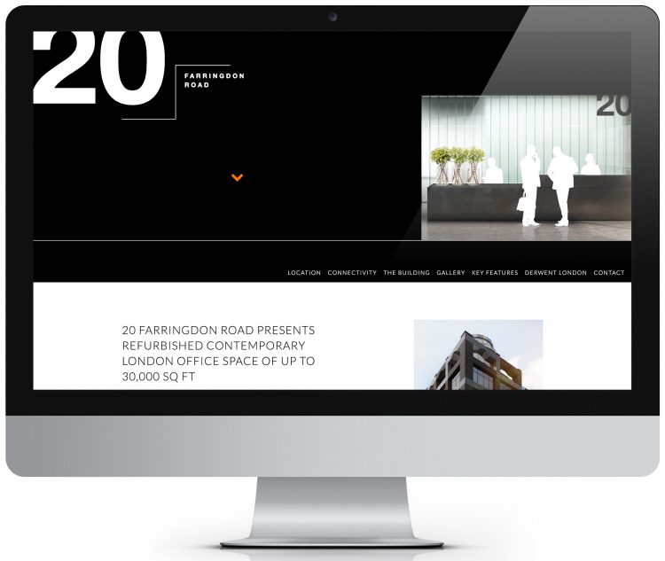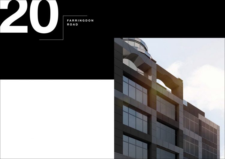
Taking inspiration from the building’s stepped facade, the fresh and bold identity uses typography as king, with a restricted monochrome colour palette and an orange accent colour. Through this visual language, we played with the positive and negative space to reflect the contemporary nature of the building.
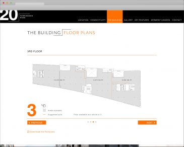
Once the identity was sorted we got down to the details and created the technical pack. Whether cutting into images or anchoring text the stepped theme runs throughout the marketing materials.
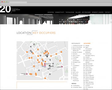
Following the design of the technical pack, we set to work on the website. A staggered responsive grid system, punctuated with parallax photography and galleries, the single page website completes our hat-trick of innovative online brochures for Derwent. The themes and digital trickery we used may seem familiar to you, if you have seen our other Derwent websites; Holden House and Charlotte St Studios.