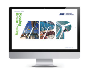
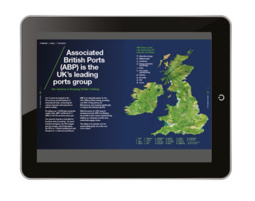
ABP is the UK’s leading ports group with a key mission of ‘Keeping Britain Trading’. Their 21 ports are integral to the UK economy and the bedrock of our international trade, connecting the nation’s importers and exporters to global markets. They provide over 119,000 jobs across the supply chain and contribute £7.5 billion to the UK economy every year.
Working in both a digital and print format
ABP is driving innovation within the industry, introducing many firsts with statements such as, ‘First in digital, maritime, safety and industry innovation’. It was therefore important to ABP, and Natasha Gray their Corporate Communications Manager, that the Annual Review reflected this innovative approach.
Another key requirement was that the design had the capability to work in two different formats. A traditional printed format which they could mail out to all 21 of the ports they manage around the country and, equally important, a digital, interactive version for viewing on iPads and monitors.
The key challenge we faced was to design the document in such a way that negated having to create two separate documents, one for print and one for screen. Our solution was to design one document that had text copy a little larger than we would normally allow for print, that was also readable on a standard format screen, without the need for zooming in for most readers. For print, the document design could be split down the middle allowing for it to be printed as spreads and bound as a 36-page PUR bound document, achieving the desired gravitas and authority.
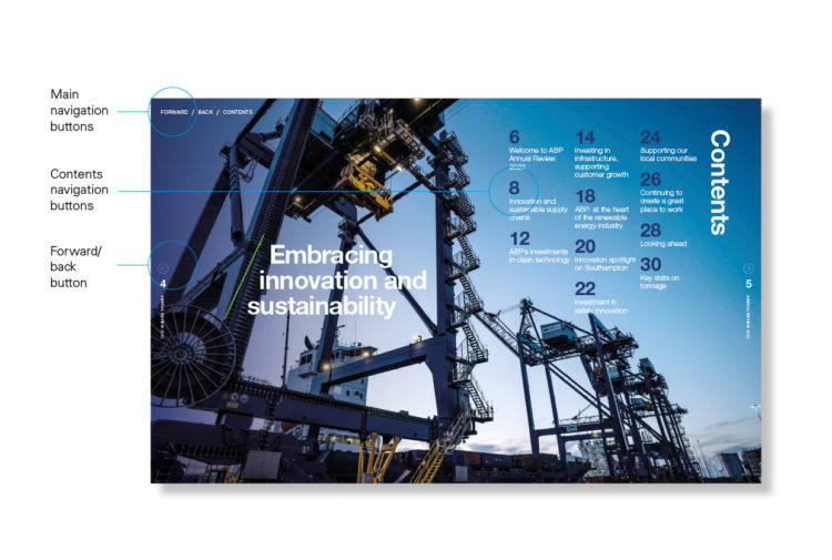
For digital, so the document could be viewed on screen, we incorporated navigation throughout with an interactive contents page linking to specific section headers and dividers that enabled easy navigation at the touch of a button across the document.
Providing simple interactive navigation
The core concept
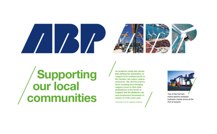
Our key design concept was to take inspiration from the ABP logo itself, which contains a forward slash device incorporated within the ABP bespoke characters. We took this and used it as a design feature to create an on-brand visual language, and used this to accompany headings, highlight key copy and interact with imagery.
Social media and website assets
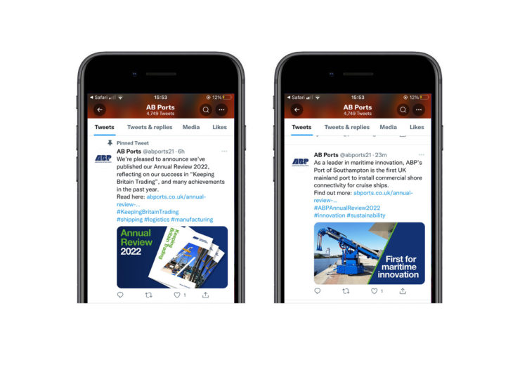
This device was also used in social media posts for Twitter, LinkedIn and Instagram as well as web banners and assets for the website. As part of our initial tender document, we also created ideas that demonstrated how simple animated gifs could be created for social media assets to show how imagery and messaging could be more engaging and by incorporating the ‘forward slash’ device as a reveal mechanism.
All of these deliverables were generated for the Annual Review launch date which was on July 6th. 1,500 printed brochures were delivered to their 21 key ports strategically positioned around the UK.
A large part of the Annual Review is all about ABP’s investment in clean technology and how we are at the heart of the renewable energy industry. To reinforce this, it was important that the Annual Review reflected our commitment to the environment and sustainability. tothepoint reflected this by printing on uncoated paper for improved recyclability, using vegetable-based inks with a print company which had ISO 140001 accreditation.Natasha Gray, ABP Corporate Communications Manager
