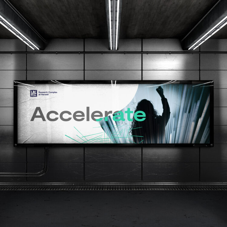
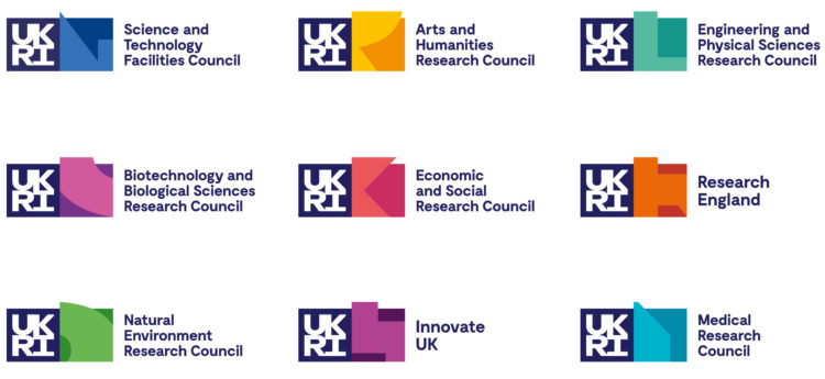
Research Complex at Harwell is an integral part of UKRI’s nine research councils and as such needed to sit as part of UKRI’s brand identity family. Each council is attributed its own colour palette and distinctive individual shape, each of which is taken directly from a section of the UKRI logo. As an impactful and simple link with the UKRI, we took its brand ‘colour wheel’, which accommodates all nine councils within its palette, and converted it to multicolour graduation as a visual demonstration of how RCaH collaborates with all of them on some level.
The nine UKRI Research council logos
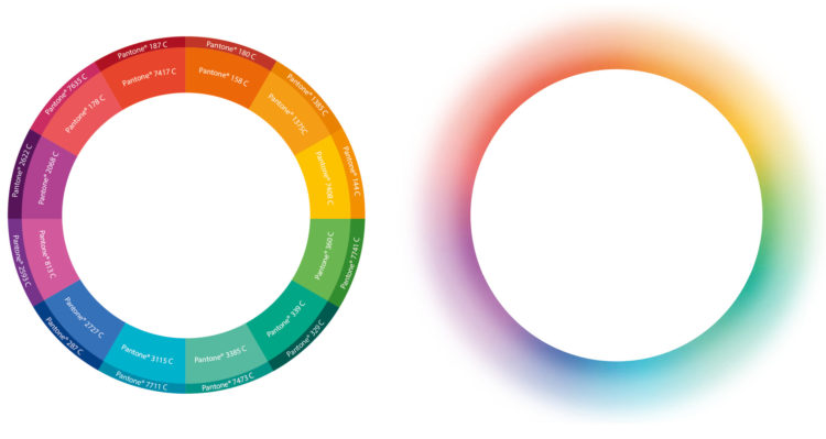
Core branding concept device – the solar flare graphic formed from the UKRI colour wheel
Creating a set of unique bespoke images generated by combining two images together
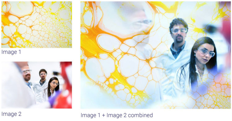
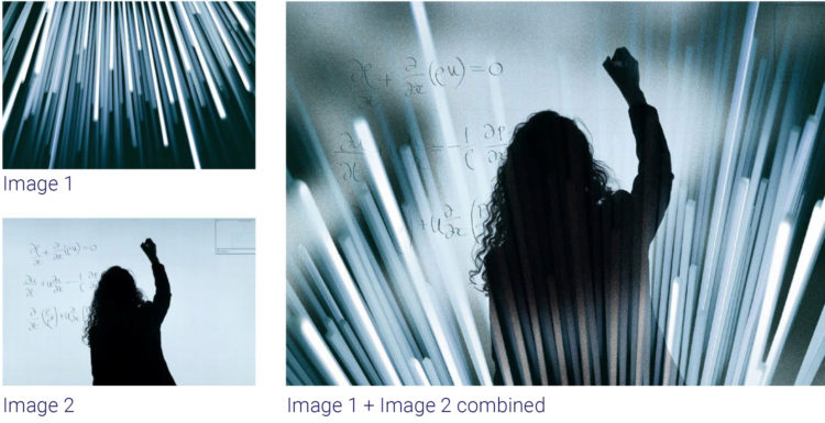
The solar flare device was used in conjunction with photography which involved combining two images together for graphic effect. One of the images would involve a person or persons in a science-based environment, the other would be based on a detail taken from a piece of scientific research and discovery. We created a suite of dynamic images that Research Complex could now use and build on using this concept.
Using the ‘solar flare’ effect in conjunction with UKRI research council shapes as masks
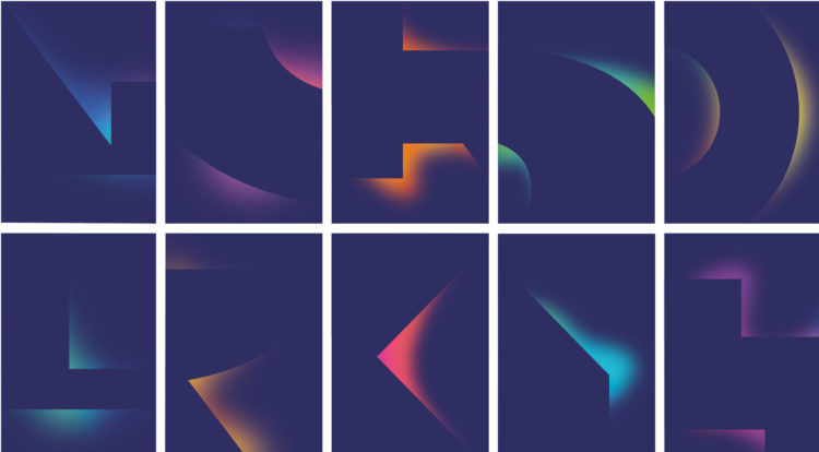
We also utilised the council ‘shapes’ taken from the UKRI guidelines and used them as masks against a set of colour gradients taken from the solar flare. This treatment created some interesting abstract graphics. When these are used in conjunction with the bespoke brand photography, the combination of all three assets creates powerful and unique imagery.
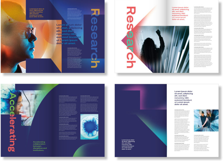
Solar flare, combined imagery and masked gradients, are used together to create powerful graphics
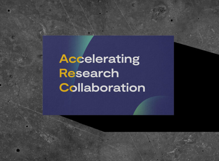
Establishing core messaging and strapline
As part of this exciting project, we worked with the core team on messaging. We organised a series of four workshops, meeting with staff, stakeholders, funding councils and collaboration partners to distil the core purpose and vision for Research Complex. This was encapsulated in the strapline “Accelerating Research Collaboration’ and a series of core values were established.
Guidelines that provide clear instructions for logo usage and brand assets
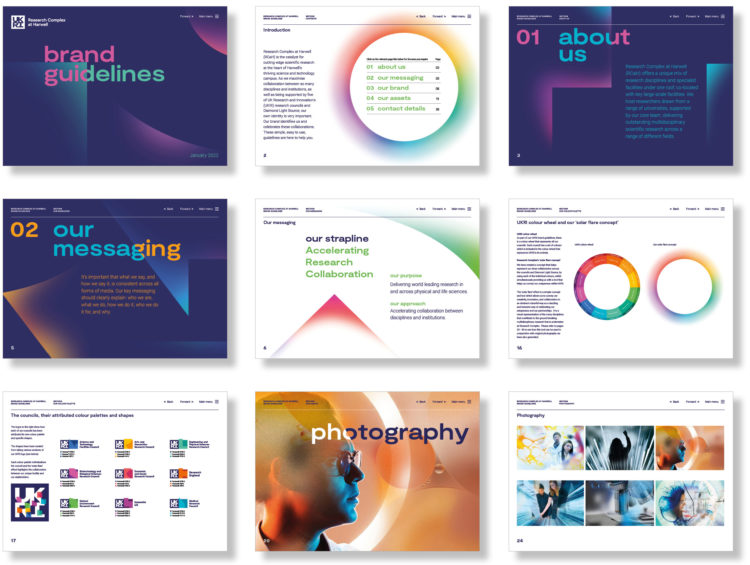
The interactive guidelines we produced enabled the recipient to get to key pages through ‘one click’ interactive links, enabling them to get to the information they required as quickly and efficiently as possible.
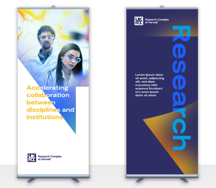
Creating templates that work for different media from PowerPoint and social media to exhibition and workspaces
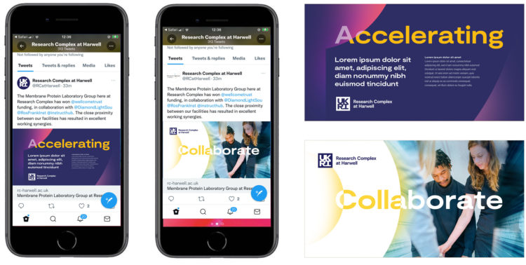
As Research Complex is a government-funded organisation it’s important to justify any expenditure, therefore it was necessary for us to generate templates for various outputs and media that enabled Research Complex to create its own materials quickly and on brand. This also included some signage templates for their offices and merchandise to launch the new brand.
These images show the old logo for the Research Complex and our changes to bring it in line with UKRI branding. The more creative aspect of this project was to create the visual language around this new identity, to align with UKRI but to differentiate and visually show the unique services that Research Complex can provide.
Professor Payne had this to say about the project, “Working with tothepoint to create a fresh and vibrant brand for Research Complex is crucial to our future plans and vision for our science. Tothepoint quickly understood what we wanted to achieve and worked with us and UKRI to create an identity that compliments our six funding stakeholders and celebrates our unique position within the UK research funding landscape.”
