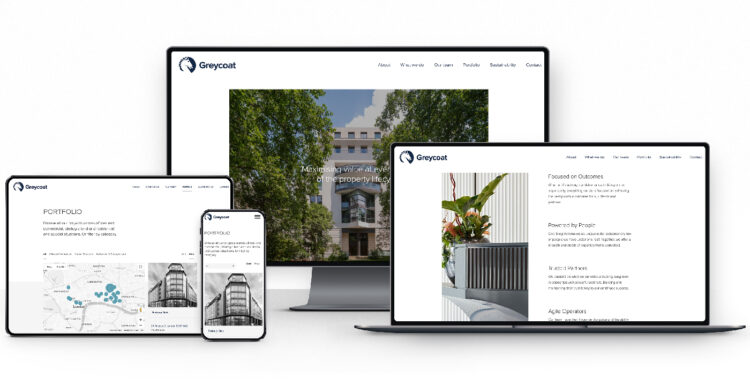
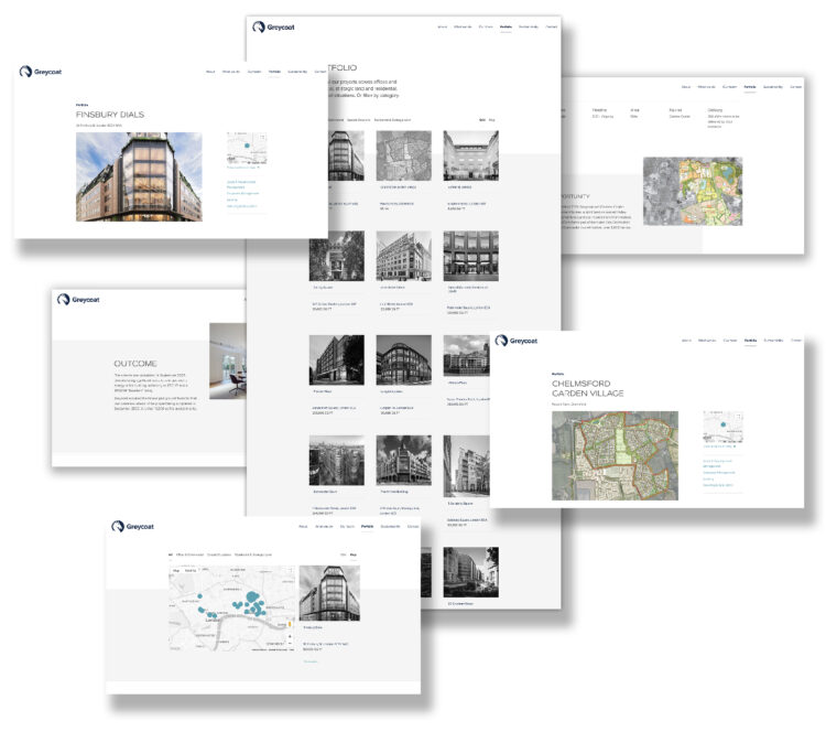
This month we’re proud to reveal our collaboration with property asset managers Greycoat on their new brand direction and website, bringing a fresh new contemporary look to the business whilst retaining the recognition of their existing brand presence.
Updated logo for Greycoat
Previous legacy logo
A contemporary logo for a heritage brand
Greycoat’s brand mark was well established over many decades and well known within the property sector. As a mark of quality and heritage, our task was to bring the current brand up-to-date with a contemporary design refresh, that was more considered for digital applications, without taking things too far away from Greycoat’s widely recognised brand and values.
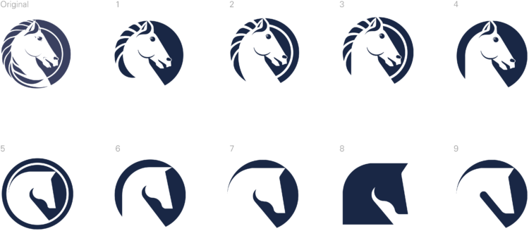
Our initial focus was on the horse insignia. Working gradually to remove and re-work the detail of the graphic, we produced a sequence of alternative versions ranging from subtle reduction in detail through to a much simpler silhouette mark. Working through these options helped us to ascertain how far to take the re-design, and which aspects of the existing mark were to be retained.
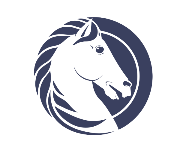 Old roundel
 New roundel
The end result was a delicate simplification of the horse insignia that retained the classical look of the original. Cleaner lines and less detail brings a boldness to the mark lending it more gravitas and clarity, especially for digital use but also when used as a standalone stamp or at smaller sizes.
Combined with the Proxima Nova typeface Greycoat now have a more impactful logo that holds it’s own as a modern evolution of the Greycoat brand across all mediums.
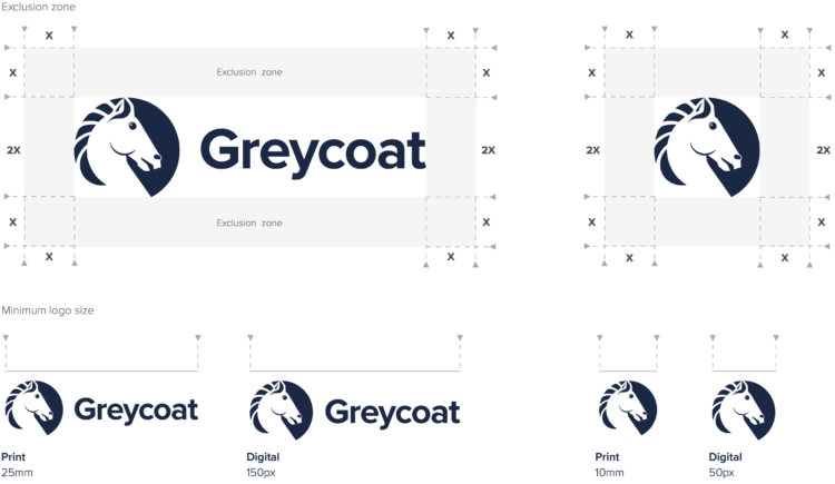
As with all our branding projects, the new logo was supplied to the client in all the required digital and print formats alongside a set of brand guidelines outlining best practices for brand application.
A fresh look website
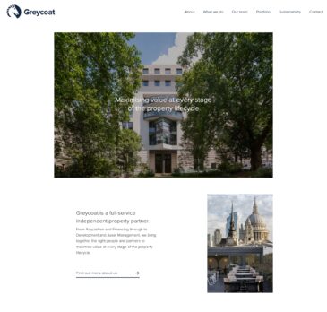
Following our re-brand for Greycoat, we swiftly moved on to a fresh design and build of their website.Built on WordPress, the new website features a revamp of Greycoat’s property portfolio, aiming to better showcase their comprehensive expertise as a full-service property partner.
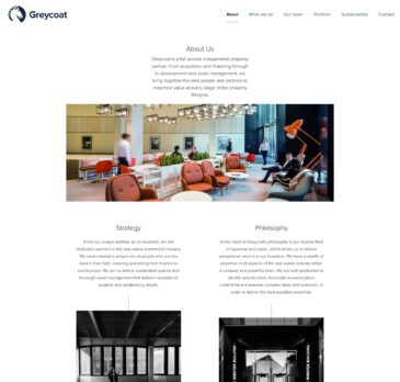
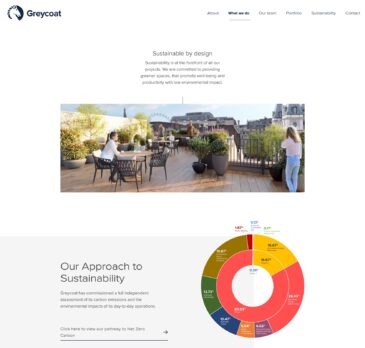
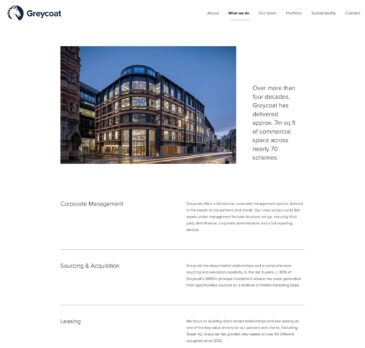
The website highlights our client’s role in both commercial and residential property development as well as their long standing heritage within the sector and their commitment to sustainability.
The aesthetic of the new website is defined by the generous use of white space and clean, modern typography, providing a contemporary and sophisticated look. This minimalist design approach not only improves readability but also enhances the rich photography across the Greycoat portfolio.
In addition to showcasing the portfolio, the website also emphasises Greycoat’s long-standing heritage and forward-thinking approach to sustainability.
Built using our custom WordPress theme, the website leverages the Gutenberg block builder. This choice ensures that the site remains flexible, allowing for dynamic updates and additions, while maintaining a consistent and controlled design language. This balance between flexibility and control enables a reasonable amount of freedom when creating future page layouts whilst preserving the overall design.
Dan Higginson, Director ‑ Development & Leasing at Greycoat had this to say on his LinkedIn account
Having created our new office at 15 Suffolk Street, we thought it was about time we turned our attention to our virtual home; a place to showcase the incredible people behind the name and our commitment to delivering best-in-class projects and sustainable spaces across central London and beyond. Thanks to tothepoint and Ruth Murphy for their hard work on delivering this. Dan Higginson, Director ‑ Development & Leasing at Greycoat