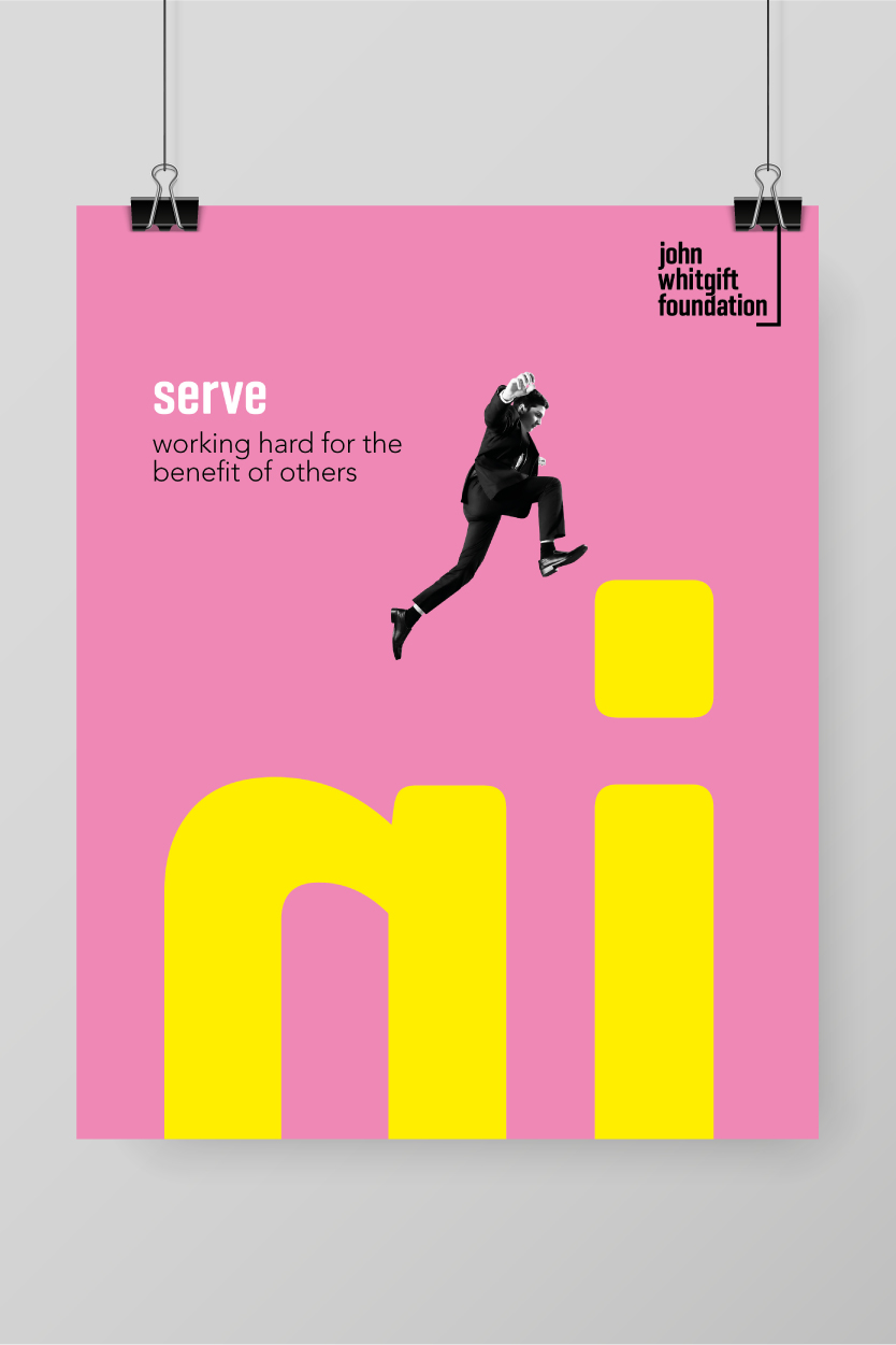
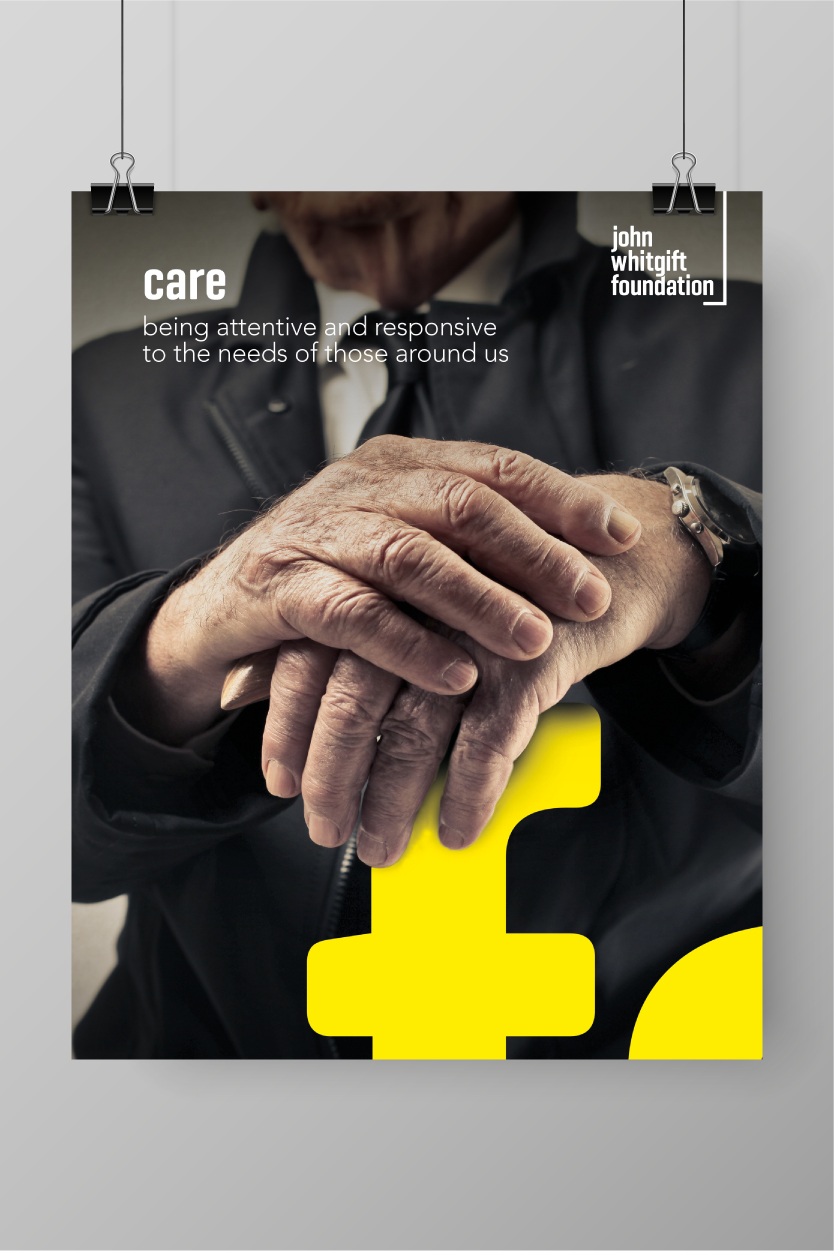
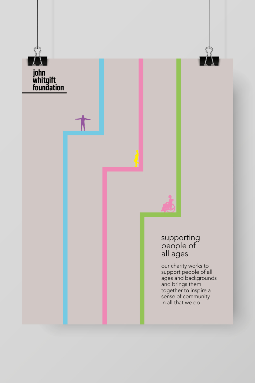
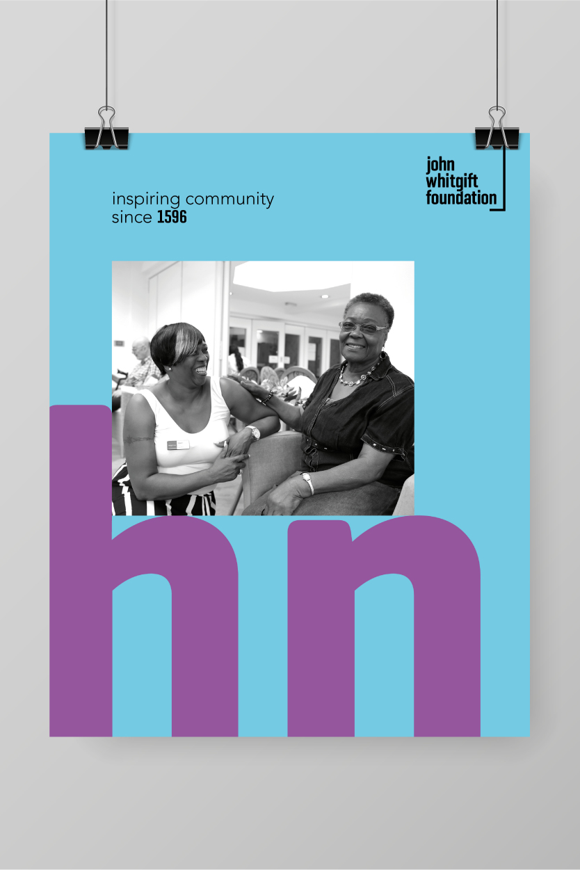
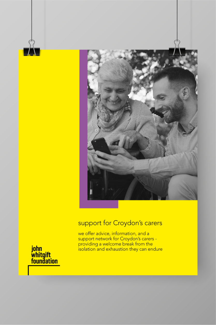
The posters reinforce the John Whitgift Foundation’s founding vision, mission, and their three core values: to ‘serve’, ‘care’ and ‘excel’. The bright, colourful, energetic brand that we created, utilises various graphic tools and a visual language that acts in a supporting role. From the keyline graphic that underpins the logotype, to the use of large typographic elements which are details taken directly from the logo, they all help reflect the overarching message of ‘supporting the community’.
The keywords and messaging also reinforce the foundation’s three core activities:
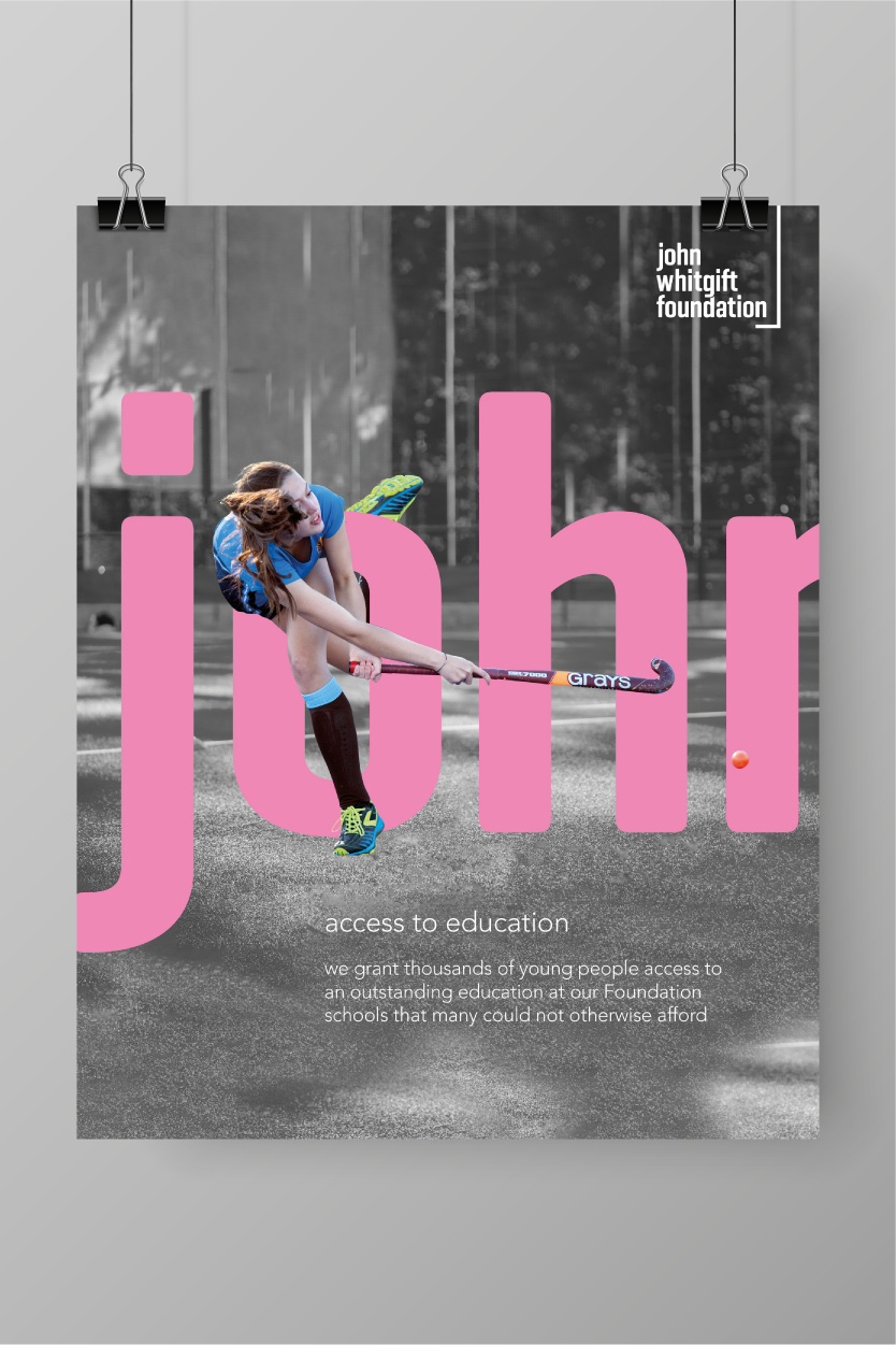
Access to education: They grant thousands of young people access to an outstanding education at their Foundation schools that many could not otherwise afford.
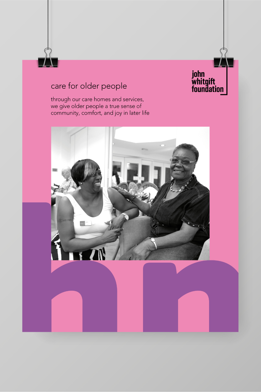
Care for older people: Through their care homes and services, they give older people a true sense of community, comfort, and joy in later life.
Support for Croydon’s carers: They offer advice, information, and a support network for Croydon’s carers – providing a welcome break from the isolation and exhaustion they can endure.
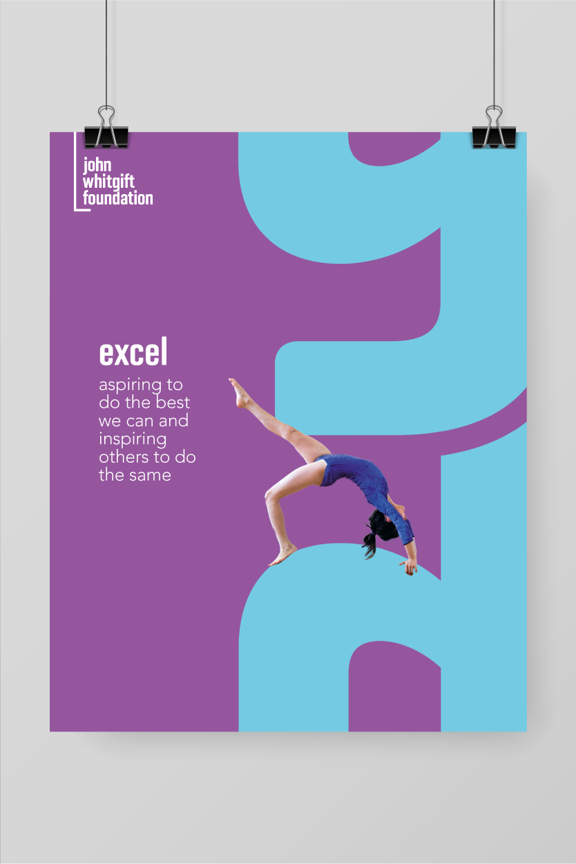
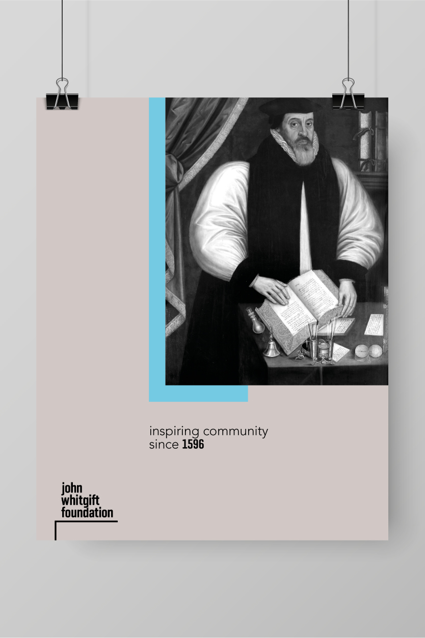
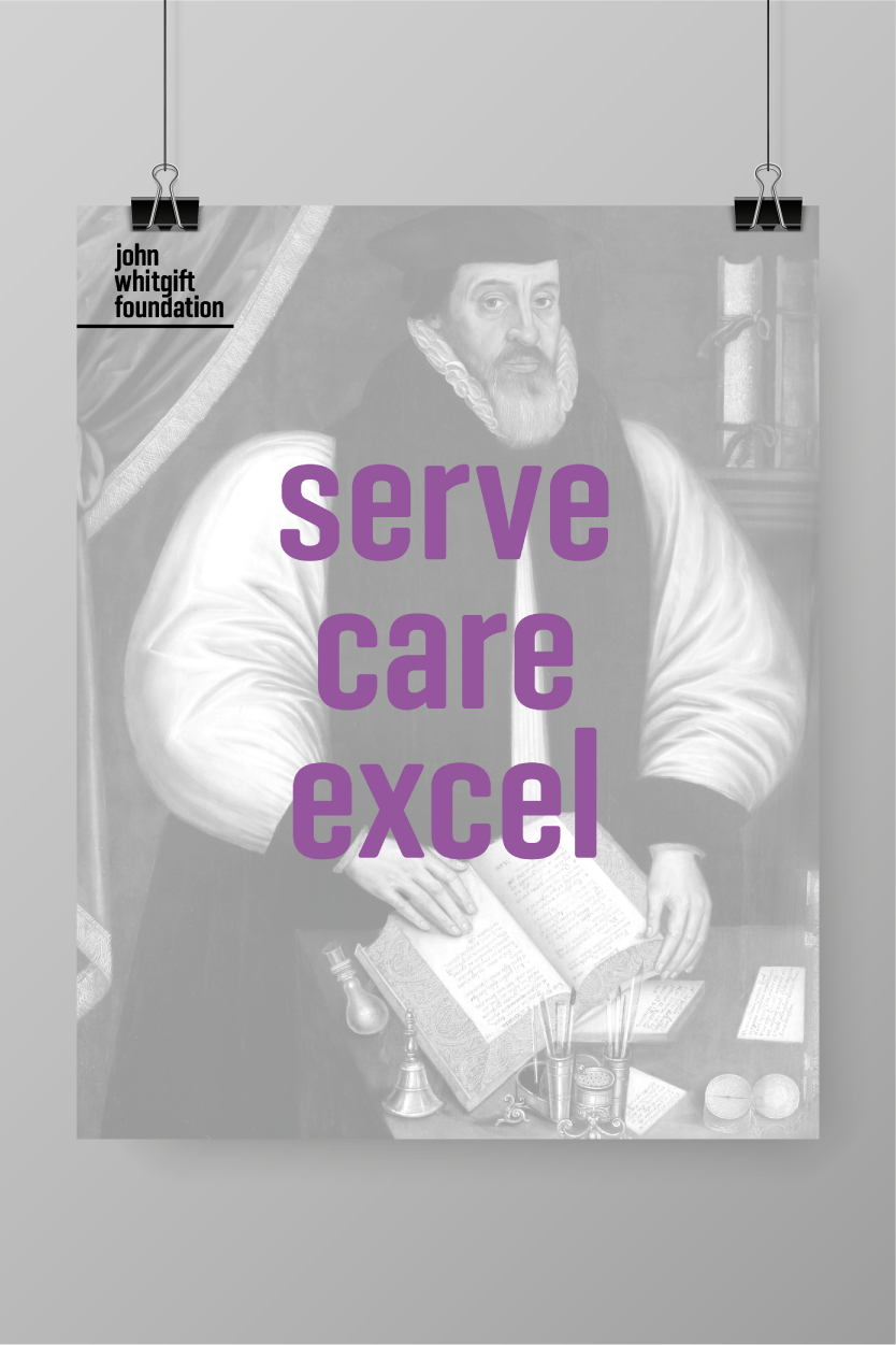

The values that the Foundation stands for are as true today as they were in 1596, when they were established by John Whitgift. Who wouldn’t want to stand by the sentiment displayed by one of the posters: ‘aspiring to do the best we can and inspiring others to do the same’?