Having worked on accessible projects for various clients over recent years, Screen Language reached out to us to create an accessible brand for their new project, providing an ‘audio-described’ movie streaming service. Audio-described movies are created to benefit the visually impaired, containing an additional voice-over soundtrack to describe what’s happening on screen. Given the target audience, accessibility was vital to the project’s success.
![]()
Beginning with various concepts, we arrived at a red and black logo featuring a round symbol containing recognisable ‘play’ and ‘sound’ icons. The red gradient of the symbol and keyword ‘sound’ reflected the opulent velvet of classic cinema curtains.
Museo was the chosen font, a chunky sans-serif typeface with friendly rounded characters. During the development process, we tested various colour combinations for accessibility at different sizes to ensure the desired colour contrast was fit for purpose.
Once we established the logo, we went on to produce an animated ‘sting’ version to be added to the beginning of featured movies, or as a sign-off. The audio description service is depicted in a short sequence of play icon and equaliser graphic morphing to an illustrated person wearing headphones. Naturally, the animation itself has an audio description, added by our client.
The main goal of the project, to provide an audio-described movie streaming service, was created using a 3rd party video event aggregation service called Eventive. We worked with the Eventive development team to customise their interface, implementing our new brand elements alongside our suggested changes to make the experience more accessible. For example, we suggested the main body font be changed to ‘Hyperlegible’ – an accessible typeface developed by the Braille Institute.
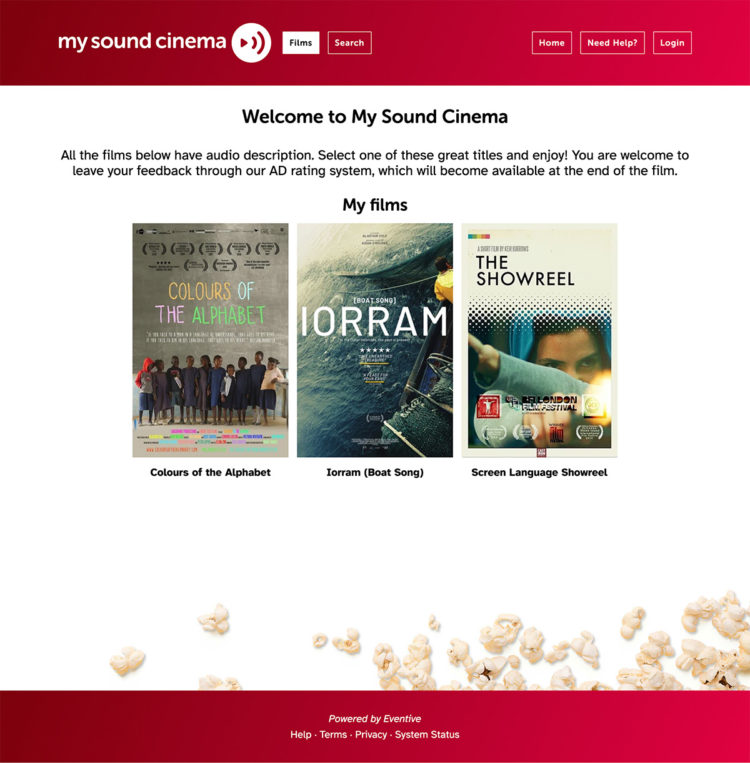
The end result is a simple clean website, currently live but still being tested by real-world individuals with varying degrees of disability.
“Tothepoint have been fantastic to work with – they provided us with simple yet sleek designs and animations and supported us throughout the process of selecting, testing and customising the VOD platform that worked best for our target users, blind and vision impaired audiences. They liaised for us with their partner web accessibility company, helped us implement essential accessibility adaptations and write our accessibility statement, always communicating in a friendly, clear and responsive manner. It has been a real pleasure to work with the team at Tothepoint. “ Elena Zini, Founder, Screen Language.