Fairfield Halls, Croydon
Fairfield Halls is operated by BH Live in partnership with Croydon Council and is one of the biggest arts centres in the UK, the largest in South London and the largest multi-disciplinary arts and entertainment space in South London and the South East. It hosts a year-round diverse programme of events including concerts, cultural events, classical performances, music, dance, comedy, theatre productions, community events, conferences and exhibitions, meetings and banquets.
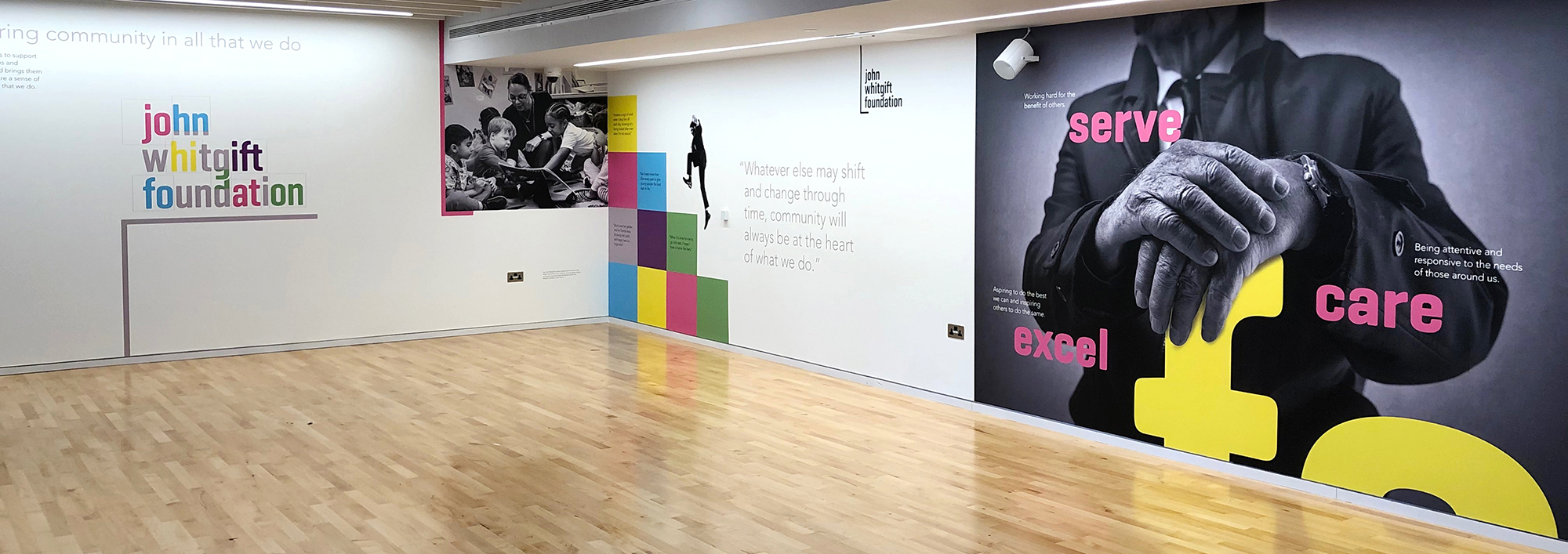
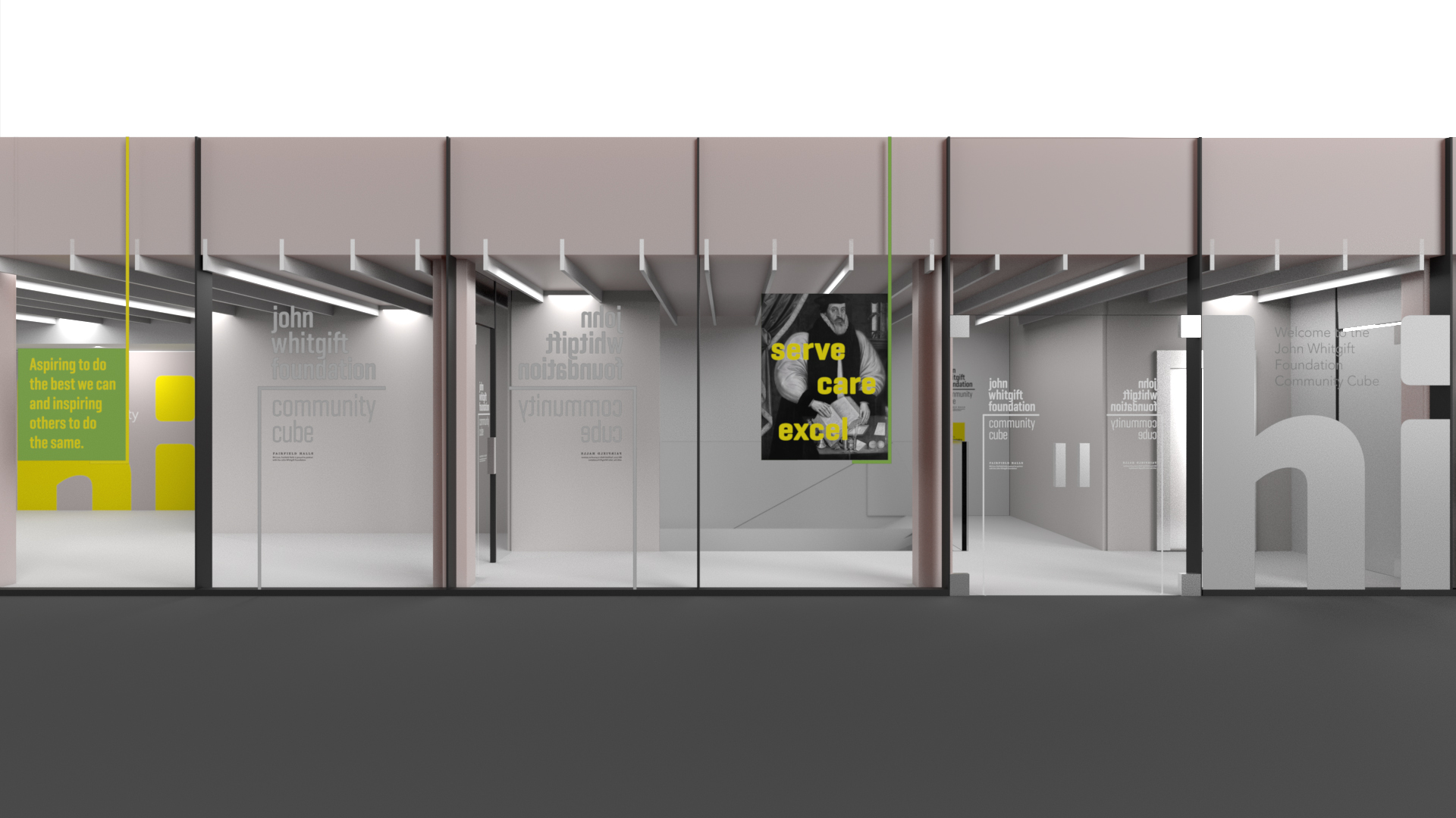
John Whitgift Foundation Community Cube
This glass-fronted space of the newly revamped arts centre will play host to all manner of community events and activities throughout the year, as well as being available to hire by individuals and groups. The Foundation also plans to put on a programme of free activities for the public including a dementia choir, exhibitions, workshops for local school children and musical performances.
The partnership with Fairfield Halls coincides with a major brand launch for the John Whitgift Foundation, also designed by us where the charity has changed its name and brand identity to reflect a more modern, forward-thinking and dynamic organisation.
The Cube exterior glass panels and interior walls have been adorned with the Foundation’s new brand including its new vision, to support people of all ages and backgrounds and bring them together to inspire a sense of community in all that it does. John Whitgift Foundation’s name is in recognition of its Founder, Archbishop John Whitgift, who established the charity more than 420 years ago in 1596 under Queen Elizabeth I’s reign.
Creative solution – large format wall graphics and glass vinyl applications

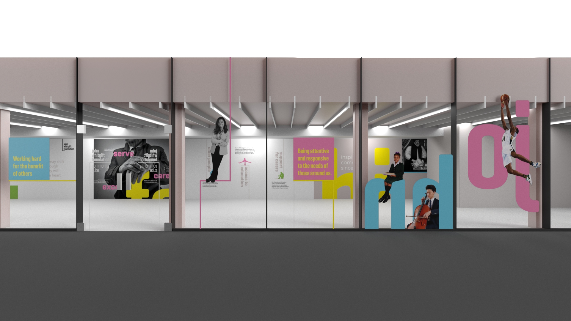
In order to bring the space to life, whilst also being aware of budget constraints and durability, tothepoint decided to utilise vinyl wallpaper on interior walls and cut vinyl on exterior windows as a means of adding drama and visual impact to the space whilst also communicating the Foundation’s core values.
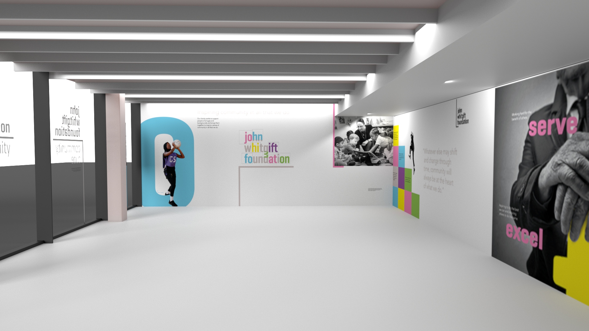
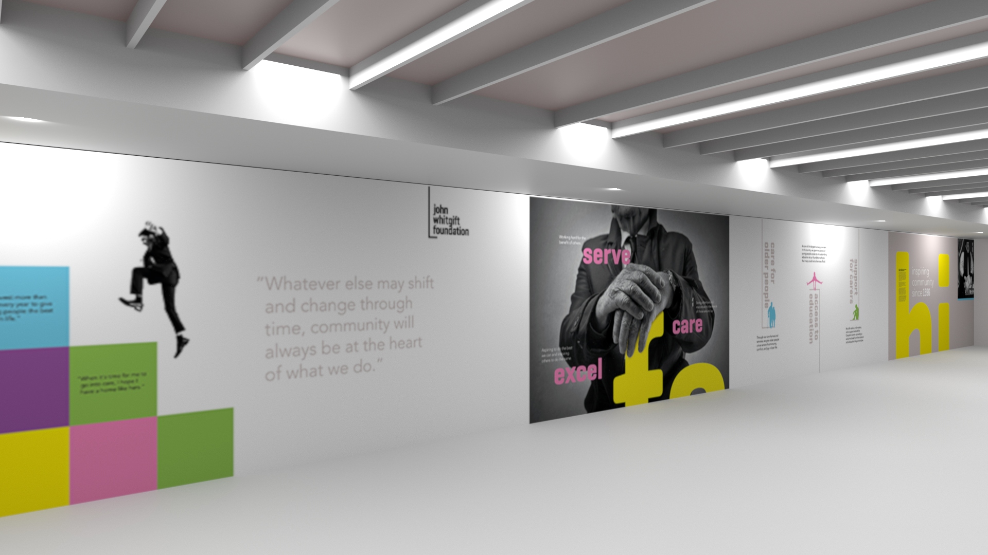
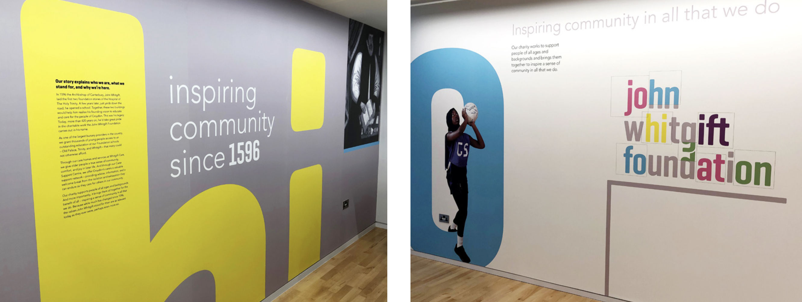
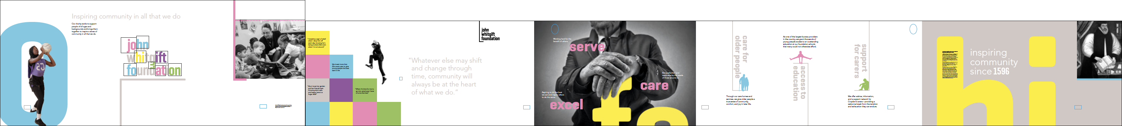
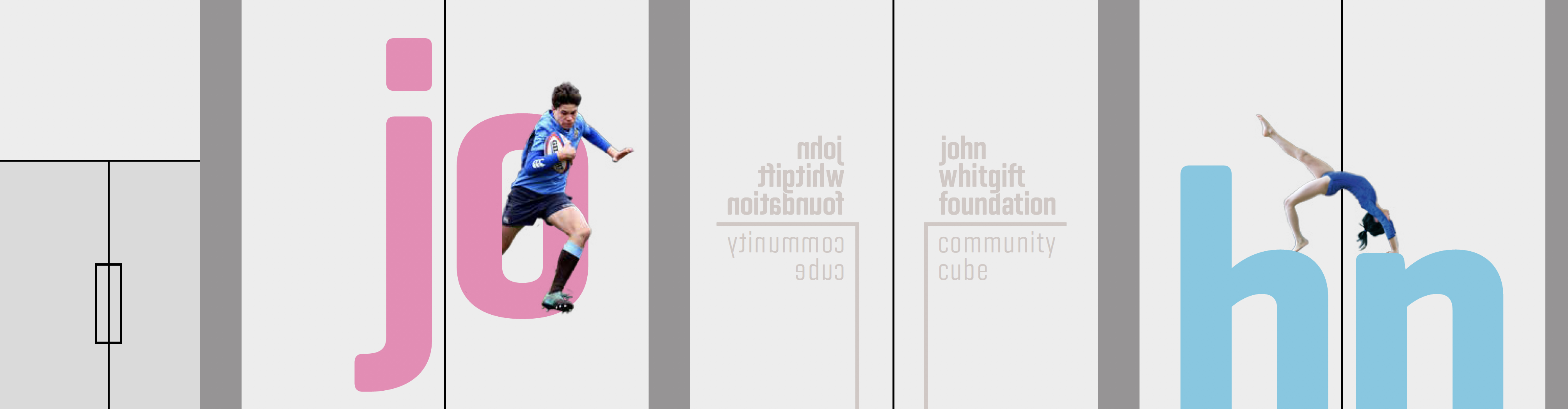
We designed the graphics considering how they needed to be viewed from both the inside out and outside in. The strong typographic brand look and feel we created, when combined with photography cut-outs of local people, draws the eye from a distance and makes a strong statement from a community perspective.

Representing the local community
It was important to us and our client to feature real people as part of our creative, so we art-directed the first photo shoot and captured students from two of the Foundation schools, Old Palace and Trinity.
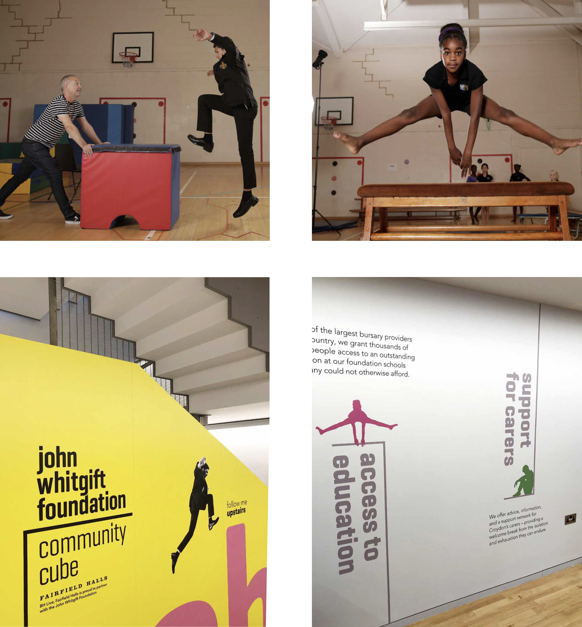
When the photographs are integrated with our letterforms, or converted to graphic silhouettes, they really bring the large format graphics to life, with a strong sense of identity and personality that truly represents the local community as well as the brand. There are plans for more shoots to help capture the wide range of people who are either part of the John Whitgift Foundation or benefit from the community services it provides.
Our branding work for John Whitgift Foundation was also covered by an interesting organisation called ‘Creative Conscience’, their founder, Chrissy Levett, said about our work:
We love the design of this project, powerful and modern, we wish more NGO’s understand the power and value of creativity to communicate and engage, well done to all involved. Impressive. Chrissy Levett MA (RCA) Founder / CEO Creative Conscience This was an amazing project to be involved in. We’ve been able to bring the brand to life in this great space, helping to promote all the different ways in which the John Whitgift Foundation serves its community. tothepoint’s MD Simon Hutton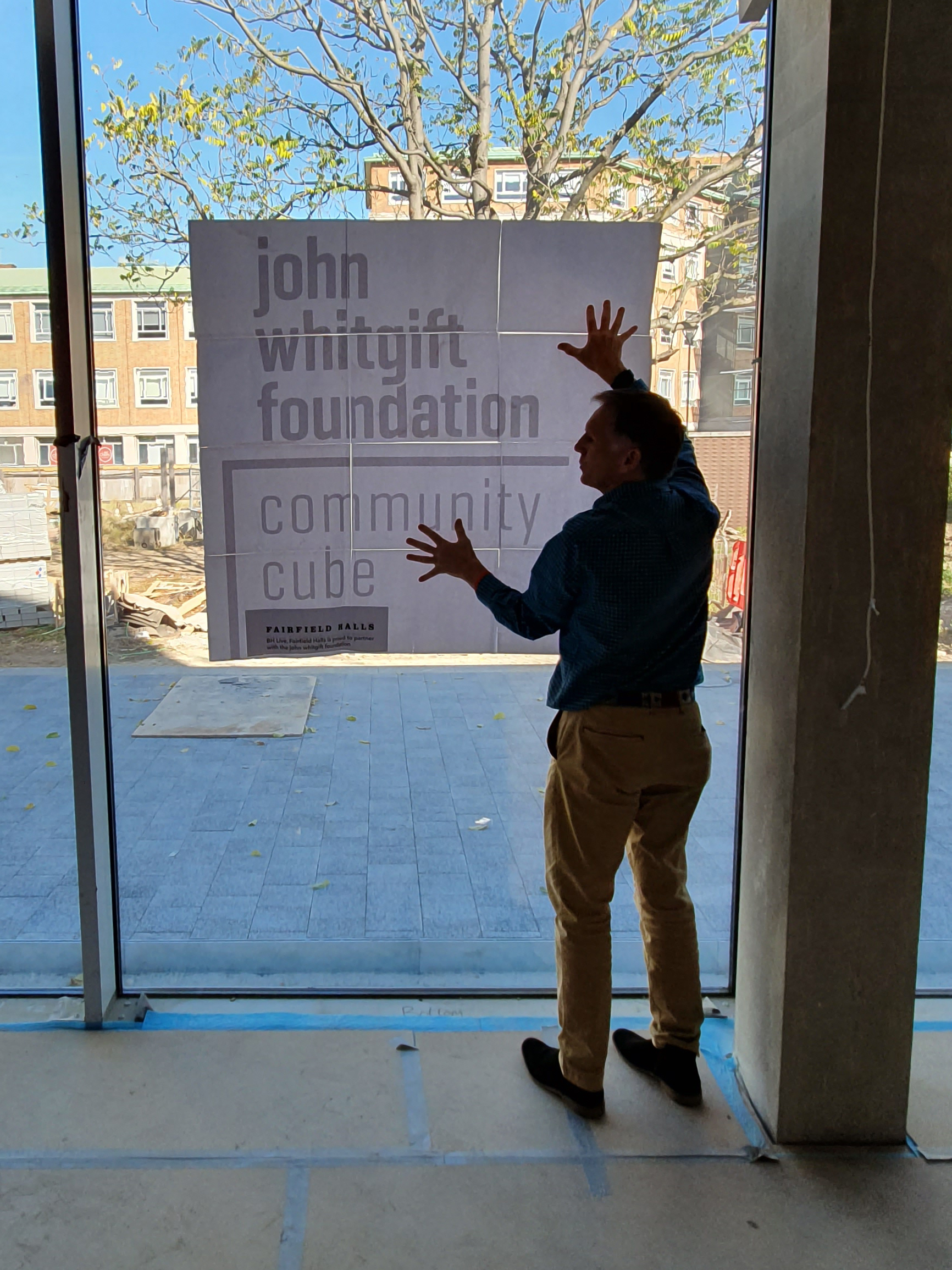
![]()