Our creative challenge was to come up with something that completely stood out from the competition, in print and digital, with visual elements that not only promoted their key messages and values but also helped build brand recognition.
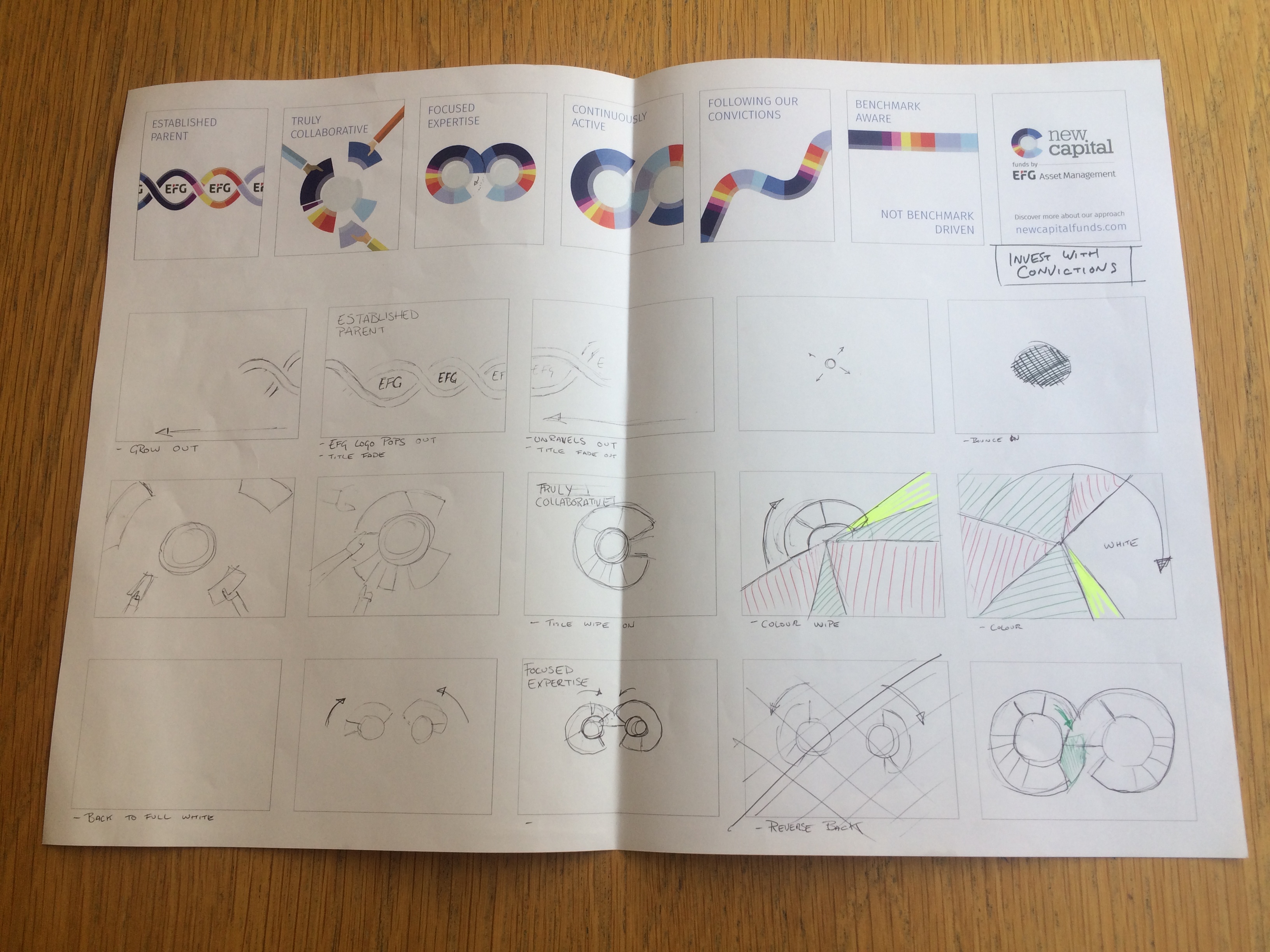
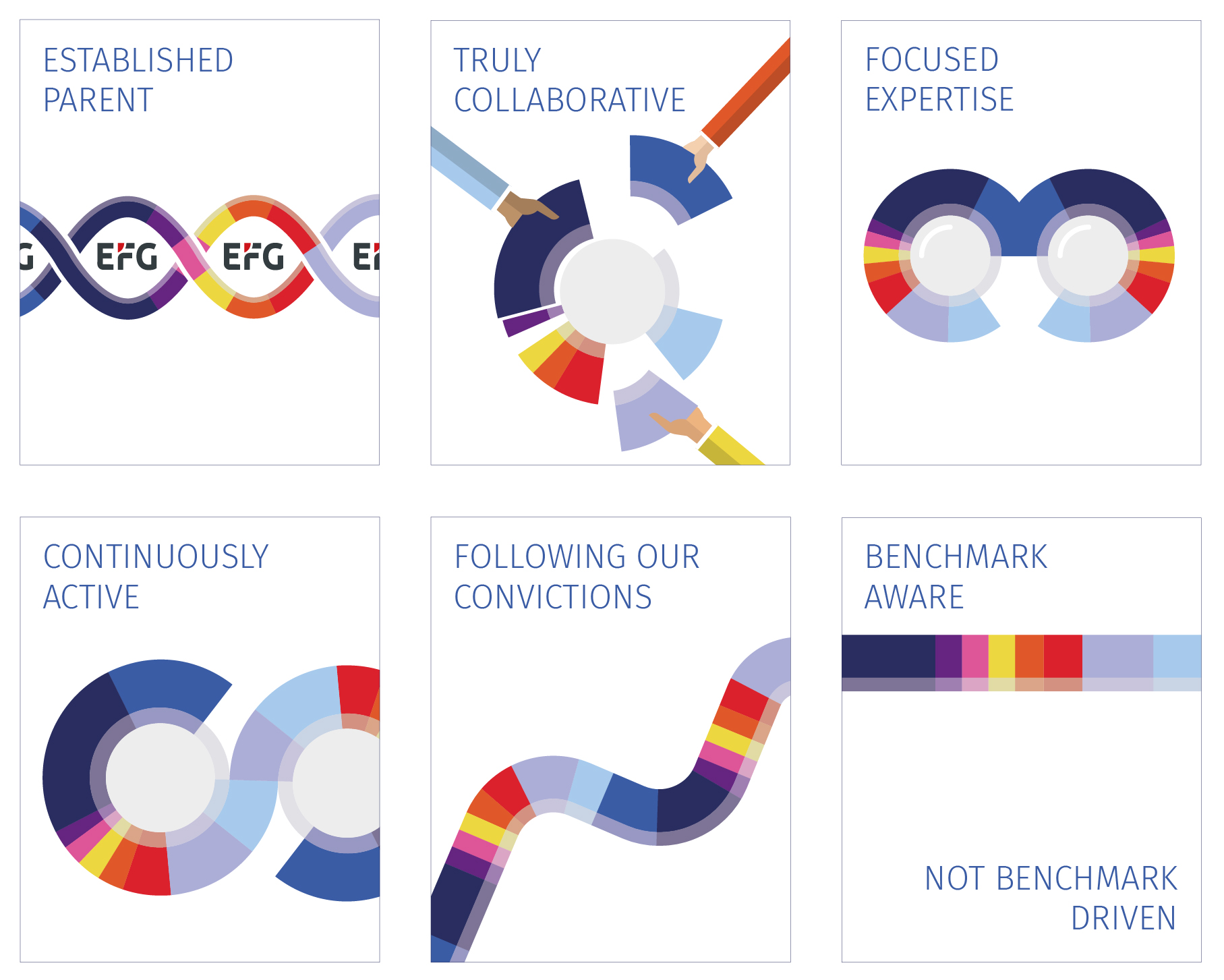
This is something we already advocate… a piece of marketing should reflect your brand even when the logo is removed. We started the project by developing the core messaging, identifying the key benefits of their offer and then translating this into typographic storyboards. We then focused on how to interpret this through elements of the logo, in particular how the ‘C’ icon could morph into different shapes that could represent the individual key service and product messages. With these aspects approved the magic could begin with the creation of dynamic animated icons.
Our designer Joe was elated as he finally had the opportunity to show off his animation skills. So from concept to storyboard, all the way to the finished animations, we had difficulty holding him back from all the potential animations that could be created. And it didn’t stop at after effects…
With the limitations of gif banner ads we were briefed to produce, he wanted to push the concept even further, so he designed, tested and built an HTML5 banner to demonstrate the difference. Comparing the standard gif banner to our HTML5 option with its dynamic animation and transitions was a no brainer for our client. We now have a series and size variations that turn standard banner ads into engaging pieces of digital display that can be placed on all the relevant financial websites for international reach.
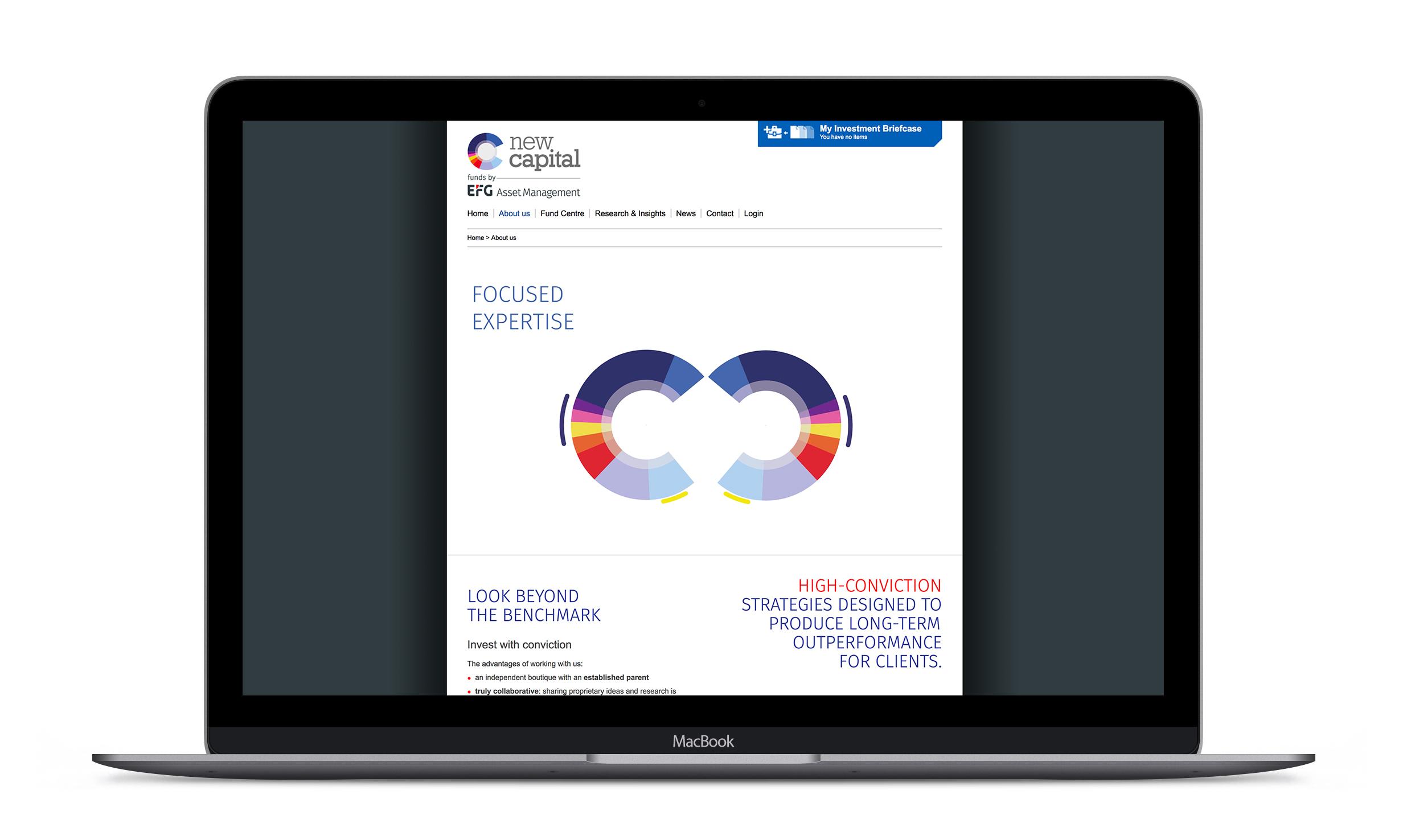
As part of this brand evolution, we have also looked at updating the New Capital homepage and About us page. This involved redesigning and reflowing the structure in line with the campaign and incorporating the final video that stitches together all the individual animations of the icon. You can view it here.
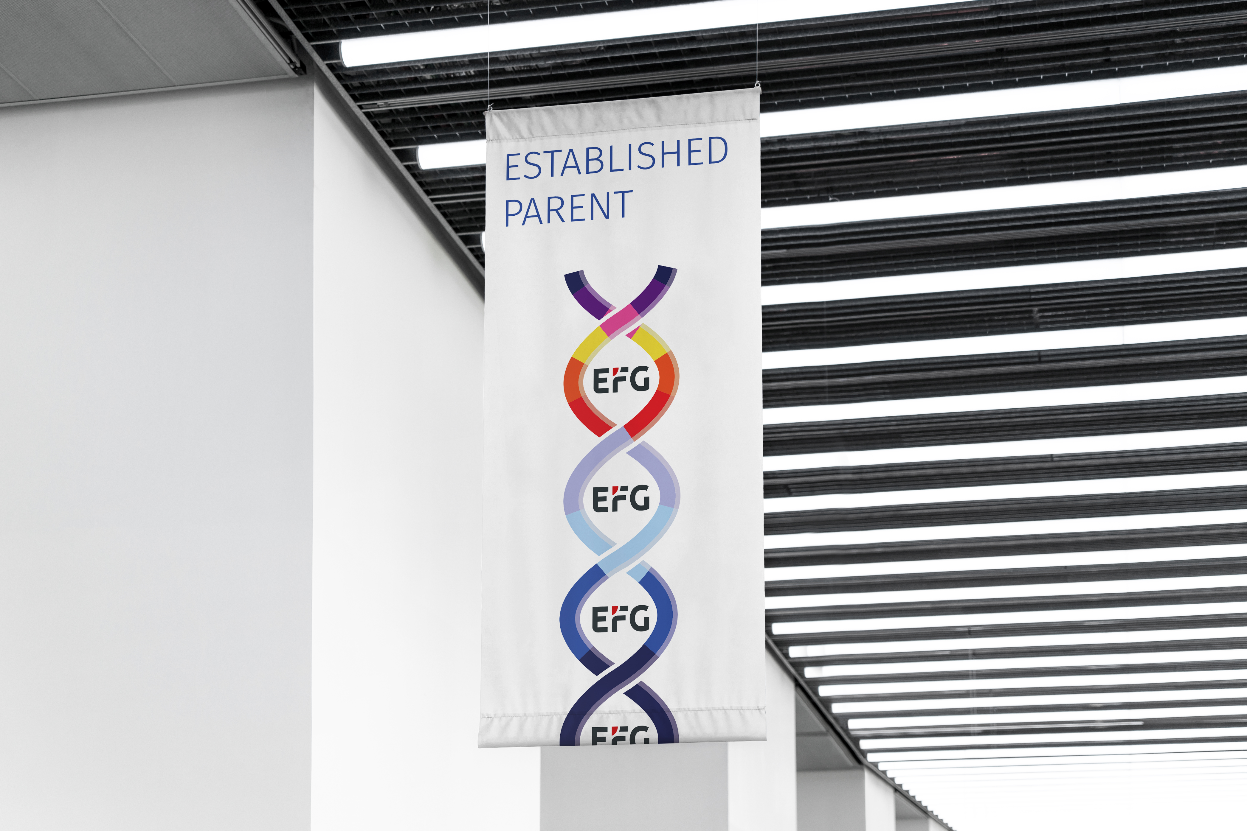
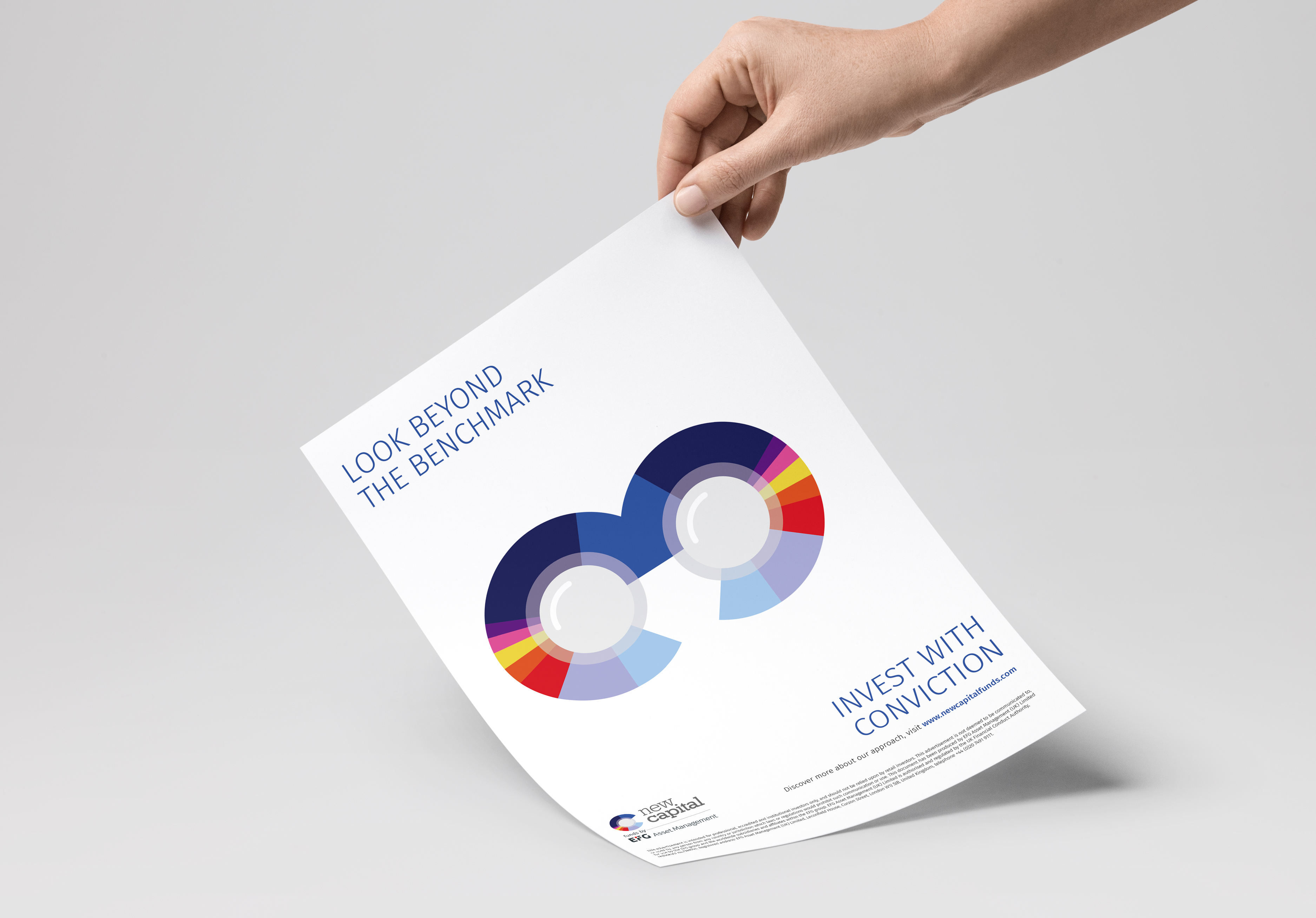
We are currently designing other marketing materials, from print to display, with our most recent being a table top banner designed and produced for an event in San Diego. We can see huge potential in further animations and applications of the icon and there are rumours, given the close resemblance, that we might even look at creating a PAC-MAN style game … it could even challenge the success of our very own game ‘I shot the serif’.