We are pleased to announce that we can finally unveil our new branding work for the charity Circles Network, due for official launch later in March. We were first introduced to the Circles team by Amiya Kagalwala while working with him on the KP interiors project. He’s been a longstanding supporter of the charity and was eager to get us involved We’ve been doing charity work for the RNLI for the past 4 years and decided this was a great chance to help a smaller charity with their branding and communications plus they do great work so it was something we were excited to be a part of.
Circles Network is a voluntary organisation that runs projects all over the UK, helping people of any age who are in danger of being isolated or marginalised. They were founded in 1994 by CEO Mandy Neville and still continue to benefit local communities year on year. You can find out more about their services on their current website.
![]()
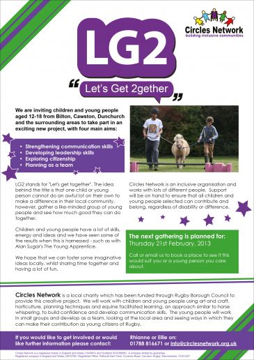
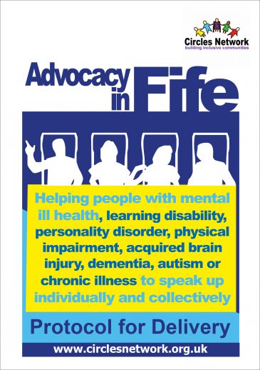
The original Circles Network logo (above) was dated, and the structure of the company had grown to encompass many different areas, making the main brand and sub-brands feel rather disparate and childlike. With clear, concise communication in mind we first set an agenda to re-structure the way that Circles Network define their key offers and promote their sub-brands for their projects. We brought all these projects under the Circles umbrella and focused their message to make it easier for people outside of the group to understand what they offer and achieve.
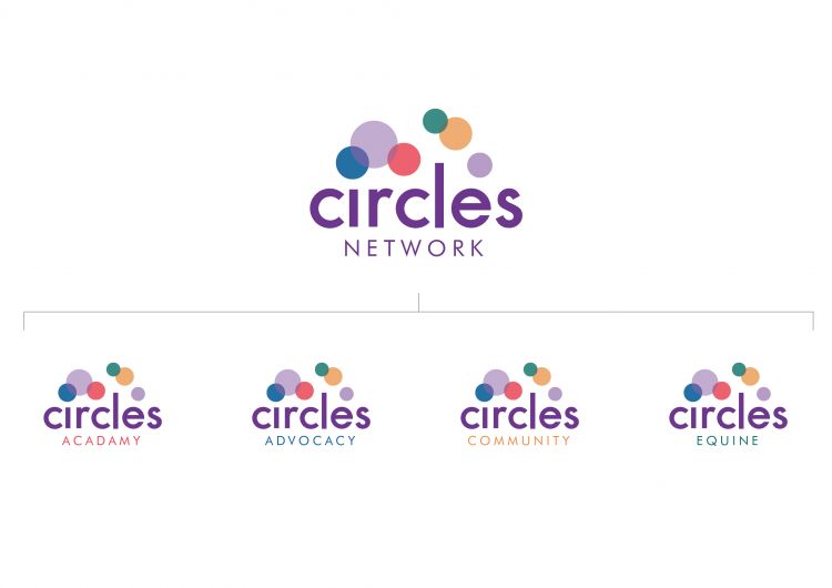
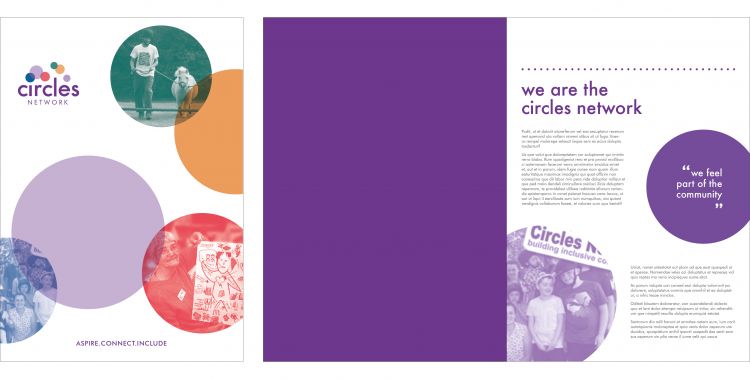
We wanted to visualise what circles represent, which is people coming together and helping each other. The logo also had to have a personality to reflect the people within the organisation and the people benefitting from it. After workshops and conversations with the Circles team and feedback from the people that benefit from Circles, we had a clear steer and in partnership developed the identity below. The bright colours give a sense of fun and play, whilst the overlapping creates a sense of community, togetherness and interaction. The colours represent the different sub-brands, showcasing the make up of the Circles Network.
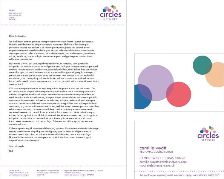
For our designer Lizzie, the next step was to create a visual tool kit and show how this could be applied to the new brand across various materials, from business cards and the letterhead to literature. Beforehand the printed materials from each of the separate projects was not aligned, and therefore it was impossible to tell that they were all part of the same organisation. The visual guide illustrated below creates a consistent look for a suite of materials for the in-house designer at Circles to adapt and develop so that all sub brands have the appearance of a family and are easily recognisable as part of the Circles Network.
By giving the Circles materials a fresh look, it has reinvigorated the brand and the people behind it. We have enjoyed being a part of this project, and we are looking forward to seeing what will happen in the future. Good luck to all those at Circles and thanks for letting us see and be a part of such amazing projects.