Informa has an interior design team that is responsible for consistency and quality control for all its offices, including colour usage, palettes, fixtures and fittings, and entry-level application of the Informa logo with its distinctive Orbit icon. However, Graham was keen to explore building on this and establishing some Informa brand application ground rules for signage, image usage and brand application guidelines. Ideally, he was looking for us to create a core concept that all their offices could adopt and apply consistently, potentially also capturing the ethos that embodies the organisation and its values.
Moodboards and the initial presentation pack
After our approach proposal and budget was approved, we began to look at themes that could be applied to the Informa brand from a visual perspective. These initially centred around Informa’s distinctive roundel-based icon the Orbit and how this could be dissected and interpreted with other roundel themes that might lend themselves to an interior concept application. This led us to many different avenues including 3D structures, lighting installations, image techniques, signage usage, as well as interior materials, furnishings, and fittings.
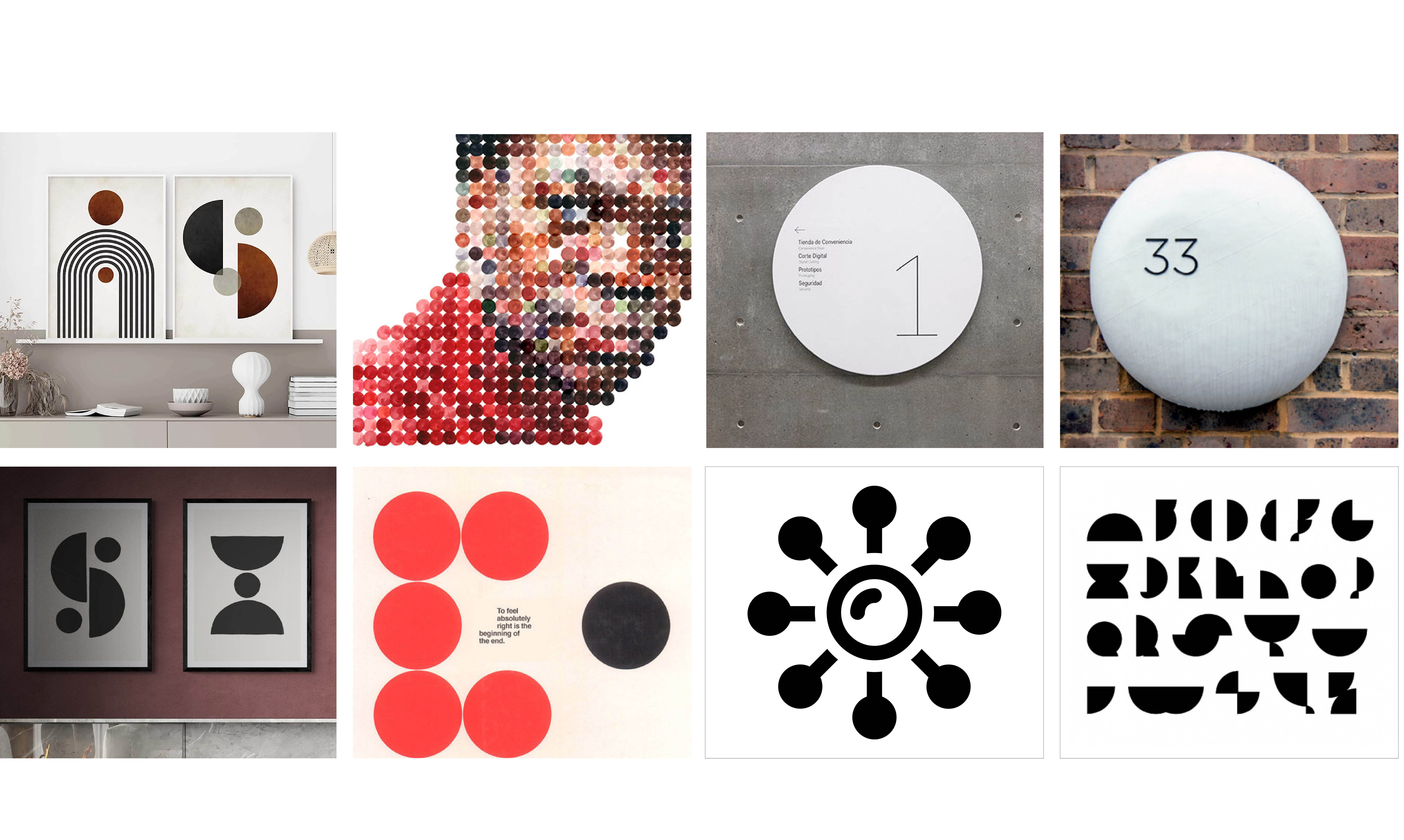
The ‘dot’ used as an international communications tool.
As part of our thought process, we looked at how themes related to the Informa ‘dot’ could have an international as well as local appeal. This led us to look at how dots were used as part of international communication methods such as Braille and Morse code due to their simplicity, clarity, and flexibility. We also looked into how the dot could be added to typography to create unique letterforms that reflected the brand.
The creative concept stage.
Once we understood the parameters which our client was willing to consider from our initial moodboard presentation pack, we were then able to delve down and immerse ourselves in the key graphic approaches. This evolved into how the dot concept could be applied to:
- Imagery
- Iconography that reflects elements of the Informa logo
- Key messages around the workspace
- Unique typography for signage and wayfinding
Highlighting key Informa messages.
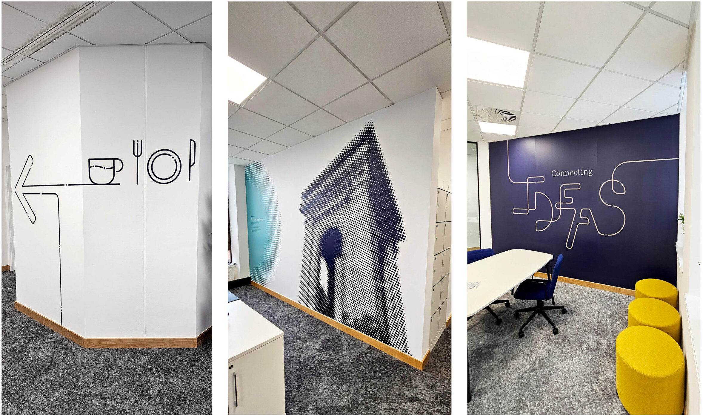
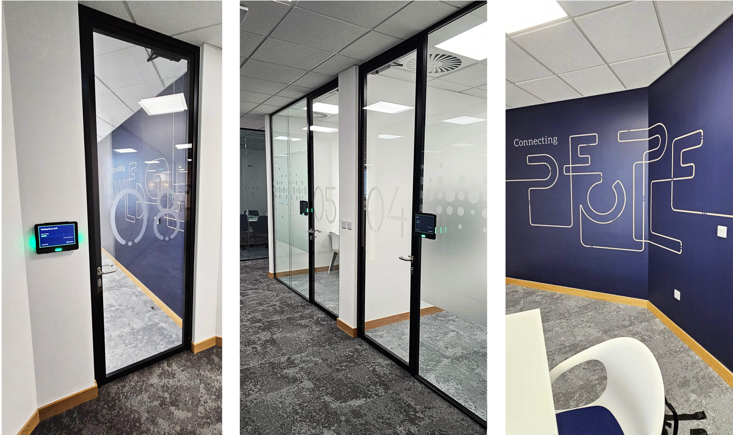
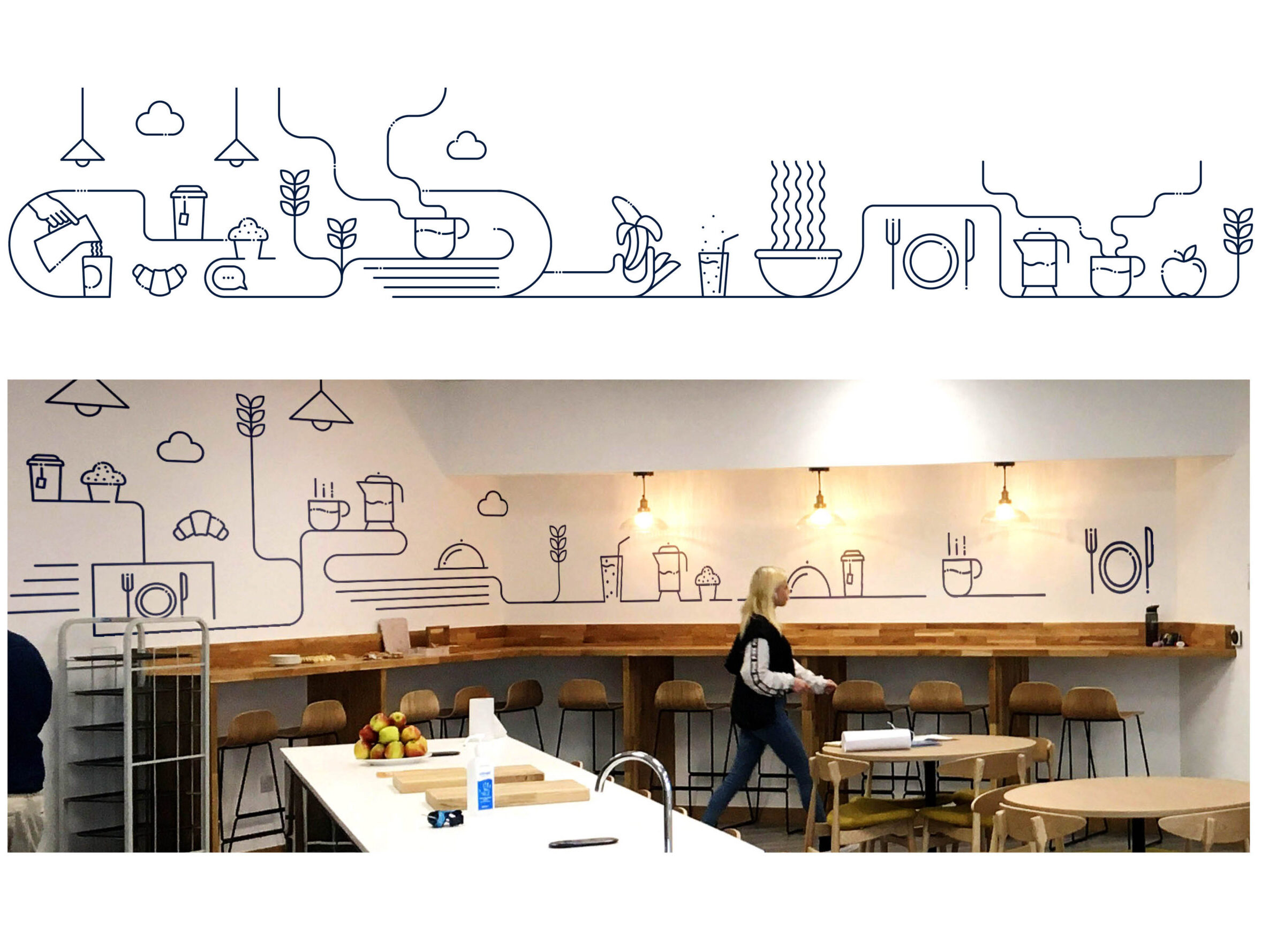
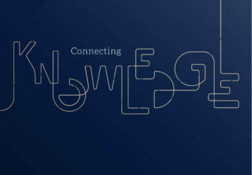
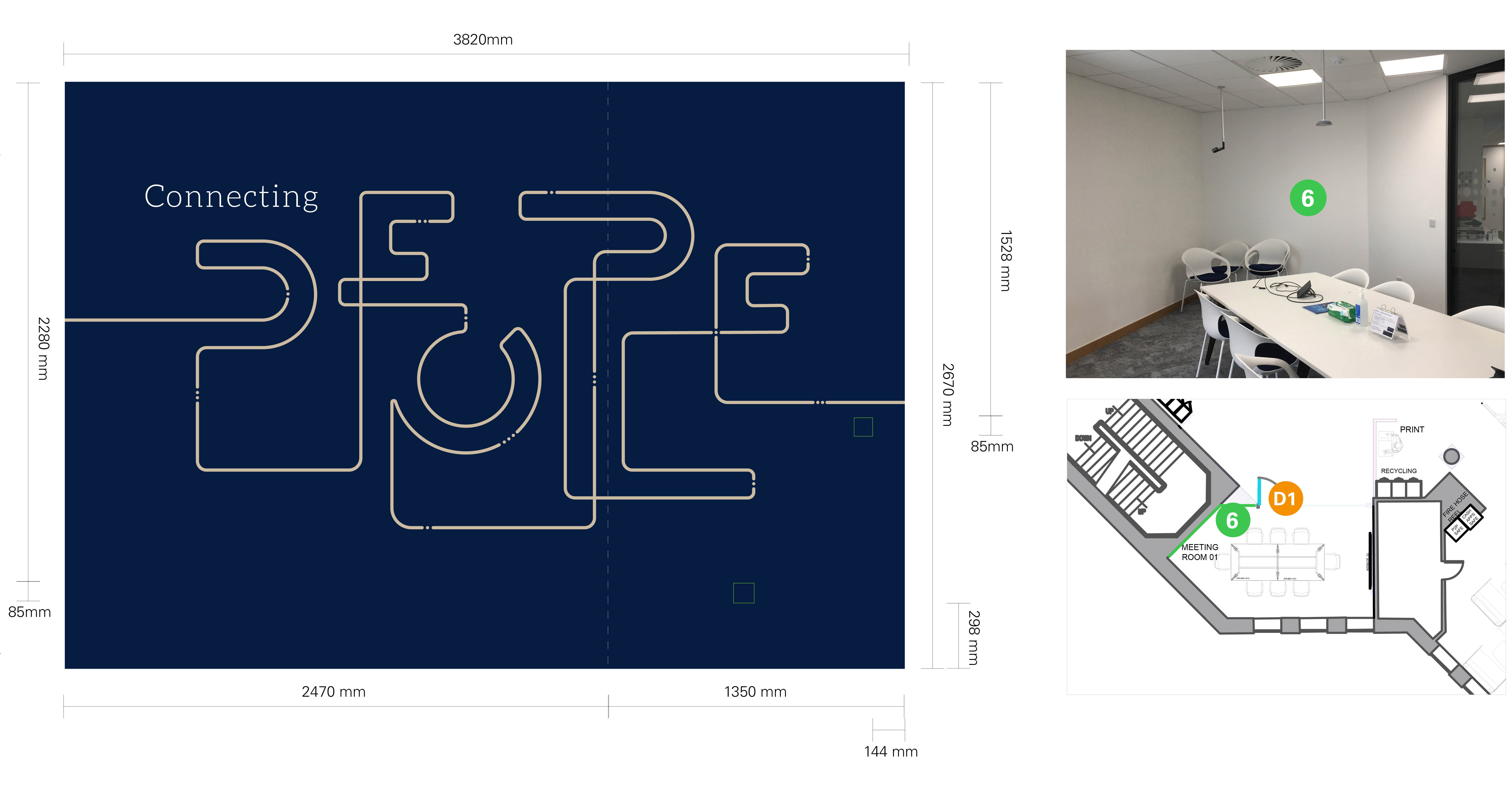
Graham was keen that some of the ‘hero’ graphics represented some of Informa’s key values and messaging. A common theme that seemed to reoccur across a lot of their brand materials was the word ‘connected’. They often talk about how they are ‘connecting knowledge’, ‘connecting ideas’, ‘connecting people’, and ‘connecting places’. We thought about ways we could show these messages in a way that was on brand and visually arresting. Our final solution was the creation of continuous line graphics interspersed with dot ‘pauses’ which we referred to as our ‘deconstructed Informa logo’ concept.


Ideas that represented Colchester.
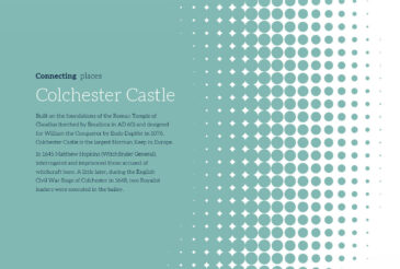
As part of the creative concept stage, we also looked at how we could represent and celebrate Colchester from a cultural, historical, and artistic perspective. From our site visits and research, we identified what made Colchester unique and the legacy that its people and history had left on society. From historical landmarks like Colchester Castle to famous modern-day cultural icons like Blur, this contrast provided lots of opportunities to create contrasting and emotive imagery which when combined with our dot halftone application provided intriguing impactful graphics.
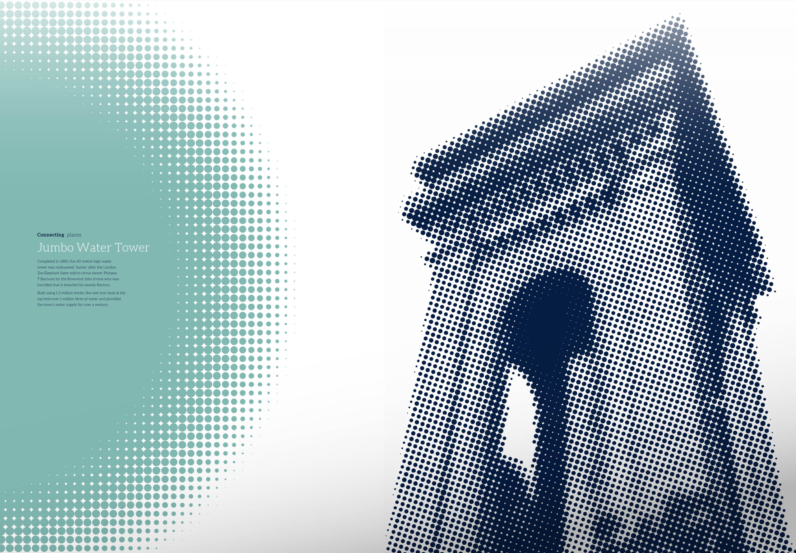

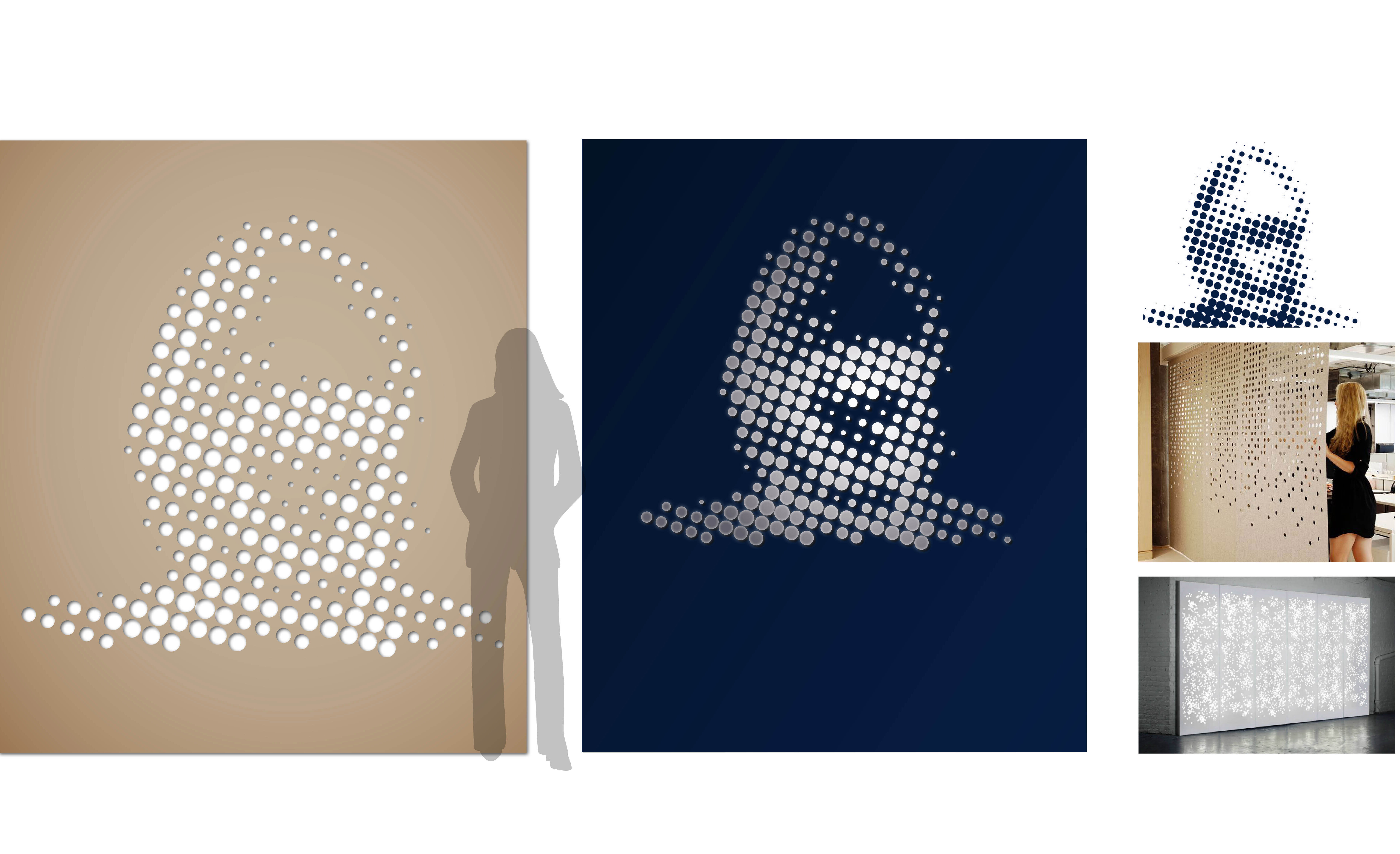
The dot halftone effect for Informa imagery.
Although this technique has been used before we felt its application would be perfect for Informa as it worked on two levels. When viewed up close the large format dot imagery appeared abstract with a pop art aesthetic. At the same time, the images were created from hundreds of different-sized dots, reflecting the different sized dots that appear as part of the Informa logo.

Space planning and the final presentation pack.
An important part of any project of this scale and nature is the planning and plotting of the graphics in terms of where they appear, accompanied by site visits to measure up to determine their size, production and application methods, and likely cost including installation.
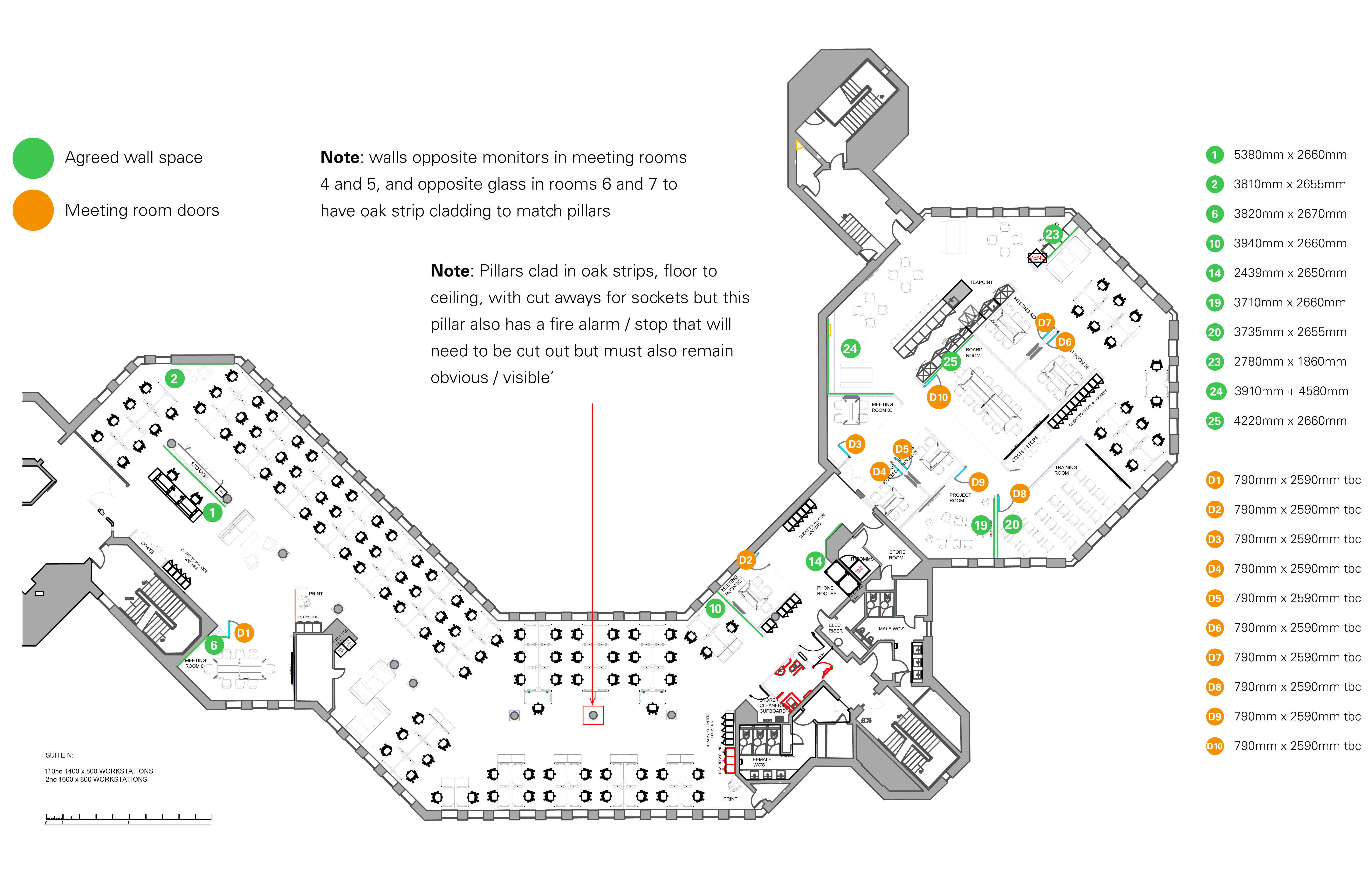
A final production pack is handed to our installers so that they are clear about what graphics appear where, the production method involved and the physical size of each application. In this instance, the materials used were essentially cut vinyl and vinyl wallpaper for all wall graphics, and frost manifestations for all glass signage.
Interior guidelines and possible global application.
Now that the project is coming to completion, we are working with Informa and its interior design team to establish which, if any, of these ideas and applications have the potential to be rolled out at its other offices.
Graham Jerome-Ball, Informa’s Director of Global Branding and Corporate Communications had this to say about the project:
“It’s vital that our interiors provide a sense of belonging and somewhere people feel comfortable, engaged and supported. We spend a huge amount of effort on getting the tech, furniture and fittings correct and I wanted to make sure we also had a complementary graphics pack that built on this. ToThePoint understood and developed the brief to give us a pack that has stayed close to the Informa identity but has also injected some fun and interest into our office space.”