A long-term partnership built on evolution
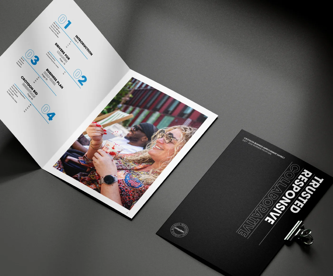
For over 14 years, we have worked closely with Croydon BID and CEO Matt Sims, developing renewal campaigns, marketing communications and continually evolving the organisation’s brand. Throughout that time, our role has been to help communicate the value Croydon BID delivers to both its levy payers and the wider Croydon community.Having successfully delivered the 2022–2027 renewal campaign, we were ideally placed to develop the next chapter: the 2027–2032 Business Proposal. As always, the process was highly collaborative, combining strategic thinking with strong creative execution to produce materials that clearly articulated Croydon BID’s purpose, achievements and future ambitions.
Defining what makes Croydon BID different


Working with a number of Business Improvement Districts, including Better Bankside and Harley Street BID, gives us a strong understanding of the sector and how organisations communicate with their levy payers.
Our approach is always to identify what genuinely differentiates a client before building a compelling narrative around those strengths. During a strategic workshop with Matt and his team, three defining qualities emerged that consistently shaped the way Croydon BID operates and the value it provides.
Croydon BID is:
- Trusted – approachable, visible and respected by levy payers, with a strong presence on Croydon’s streets every day.
- Responsive – quick to address the needs, concerns and ambitions of local businesses.
- Collaborative – a people-focused organisation that works alongside business owners, local leaders and the council to achieve positive outcomes.
These three qualities became the foundation of the entire campaign, appearing boldly on the cover of the Business Proposal and running throughout the publication. Testimonials from levy payers, business leaders and council representatives reinforced these messages, providing authentic proof of the BID’s impact.
Creating a bold, contemporary design language
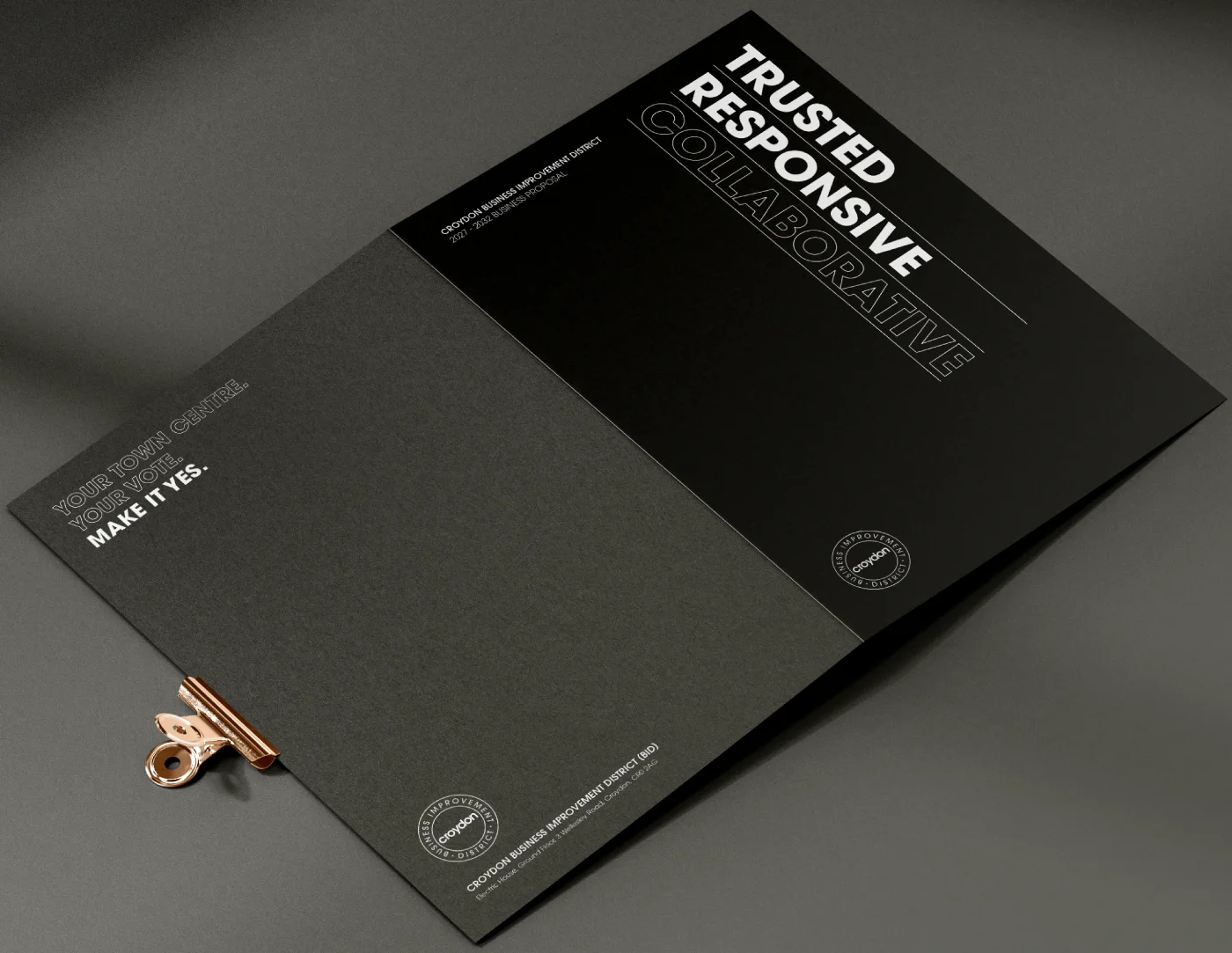
Once the narrative had been established, our focus shifted to bringing it to life visually.
Many BID publications are information-heavy and text-led. Our ambition was to create something more engaging: a publication that was easy to navigate, visually distinctive and driven by storytelling rather than dense copy.
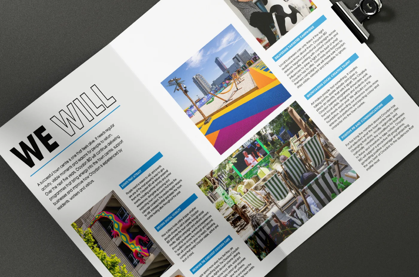
A carefully considered editorial approach balanced concise messaging with supporting facts, case studies and testimonials, creating a document that informed while remaining accessible and enjoyable to read.
Photography that captures people in action
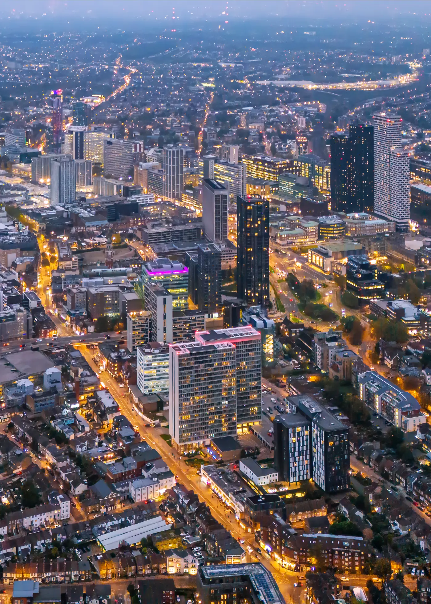

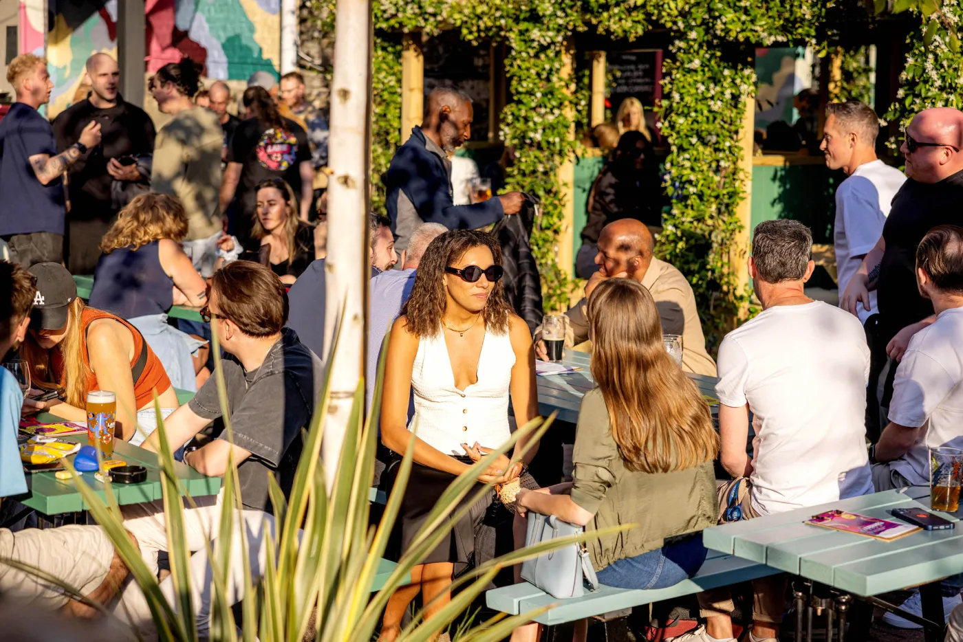
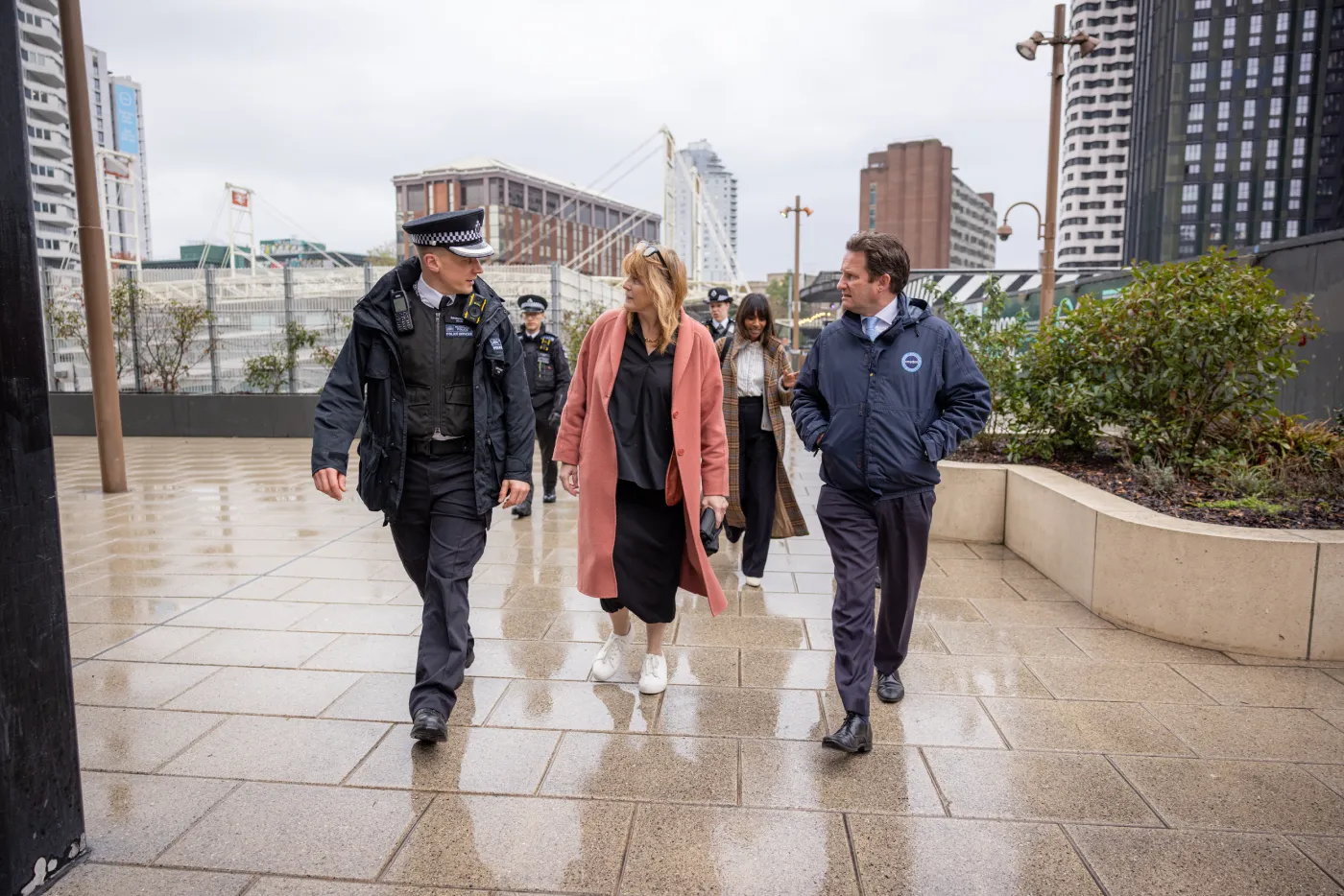
Photography played an important role in reinforcing the narrative.
Using a combination of existing imagery and new photography by Glenn Foster glenn-foster.squarespace.com, every image focused on real activity rather than staged portraiture. The photography showed Croydon BID working alongside its levy payers, supporting businesses and strengthening the local community, making the organisation’s collaborative nature tangible throughout the publication.
Evolving the brand for the next five years
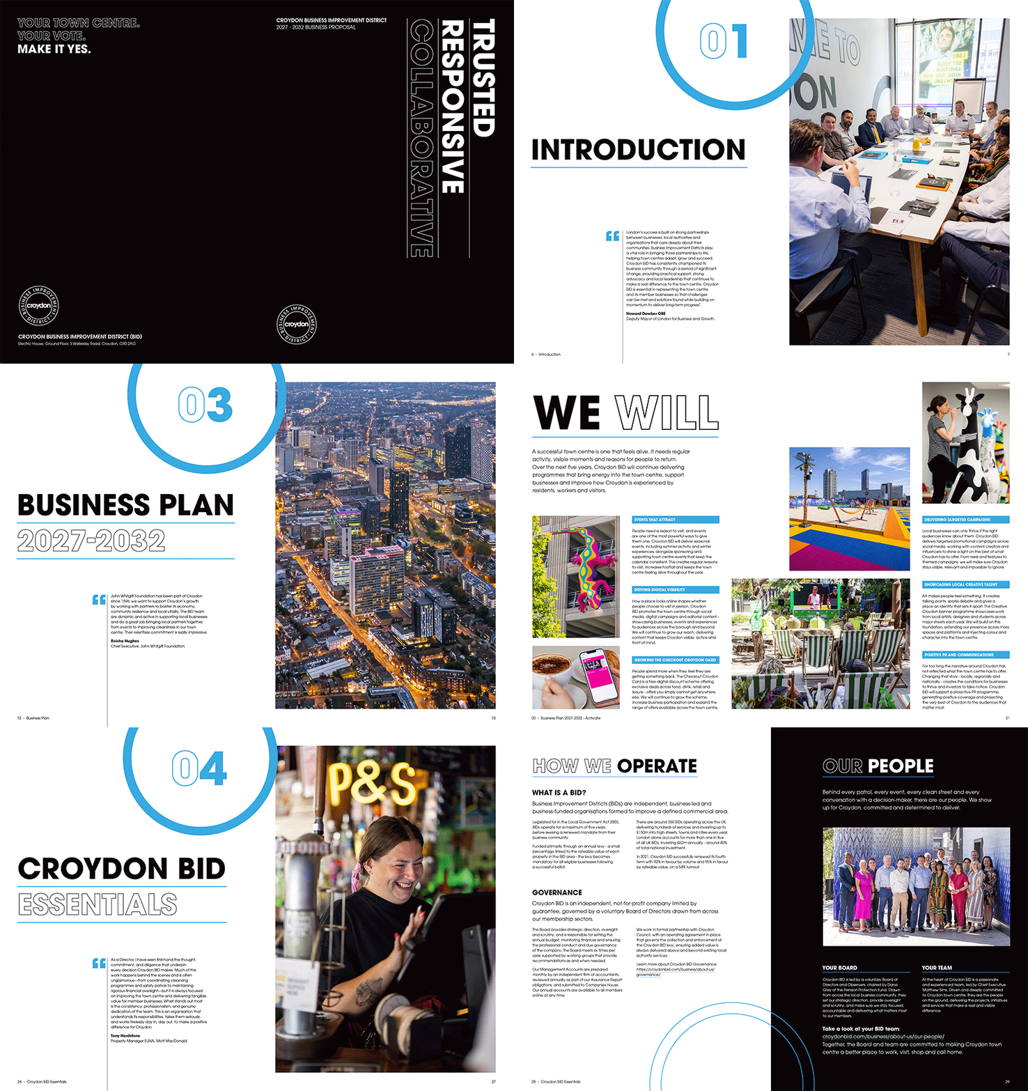
As Croydon BID continues to evolve, the visual identity needed to reflect its forward-thinking approach.
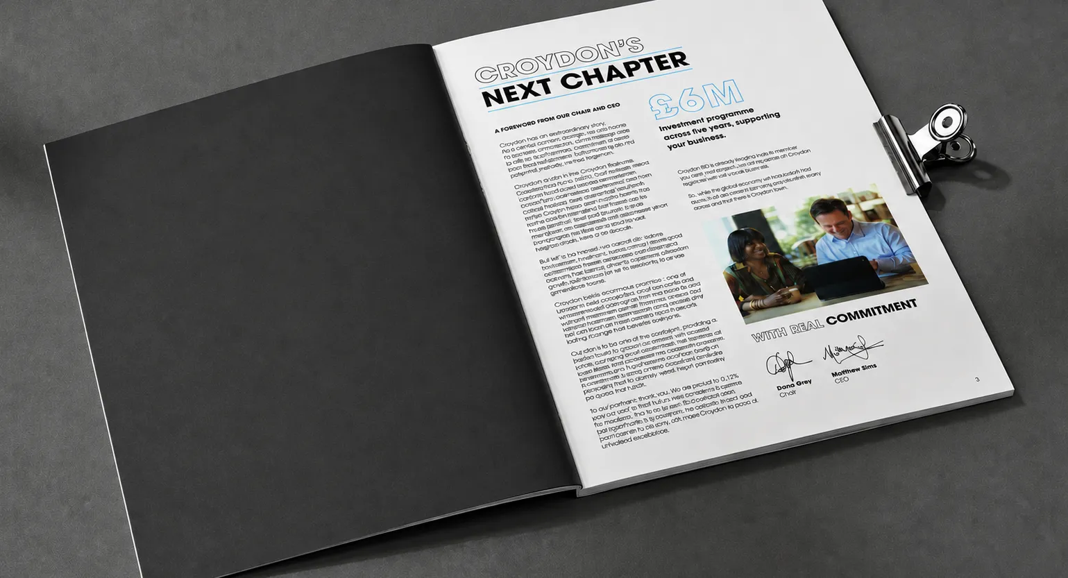
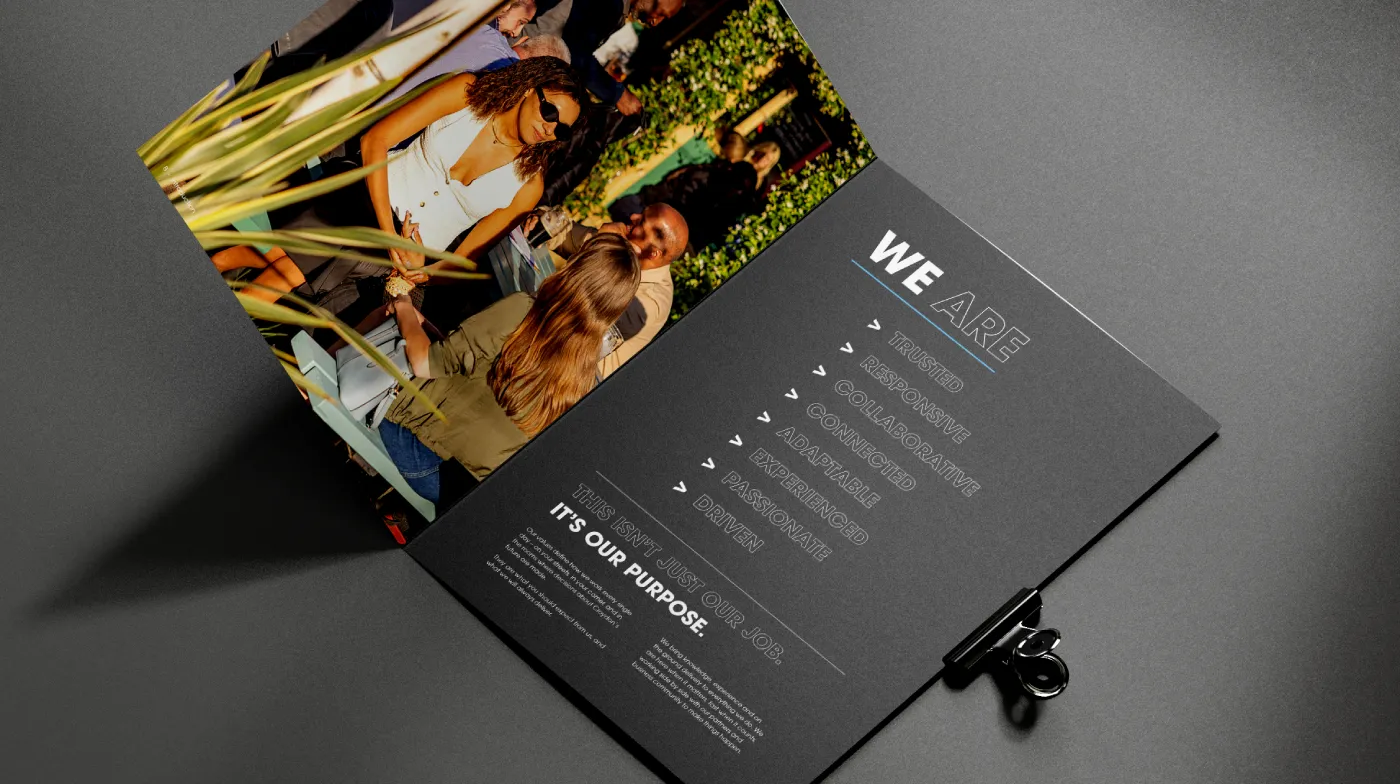
We adopted a design-led, minimalist aesthetic, using generous white space to create a lighter, more confident reading experience. Typography became a key design device, with Croydon BID’s Avant Garde typeface scaled dramatically to create hierarchy, pace and visual impact.
The restrained colour palette, predominantly black and white, punctuated with Croydon BID’s signature blue, reinforced a contemporary, sophisticated feel while allowing the content to take centre stage.
Design, storytelling and typography working together
Typography became more than simply a means of communication; it formed an integral part of the storytelling.
The repeated emphasis on Trusted. Responsive. Collaborative. created a strong visual rhythm and continually reinforced the campaign’s central message.
The same approach structured the publication into clear, accessible sections:
- Introduction – Everything you need to know about Croydon BID
- Consultation – Survey highlights. What you told us and how we listened
- The Business Plan – Covering four strategic priorities:
- Secure – Policing and safety
- Enhance – Creating a cleaner, greener environment
- Activate – Events and activities
- Represent – Championing local businesses
- Croydon BID Essentials – Key information and ballot dates
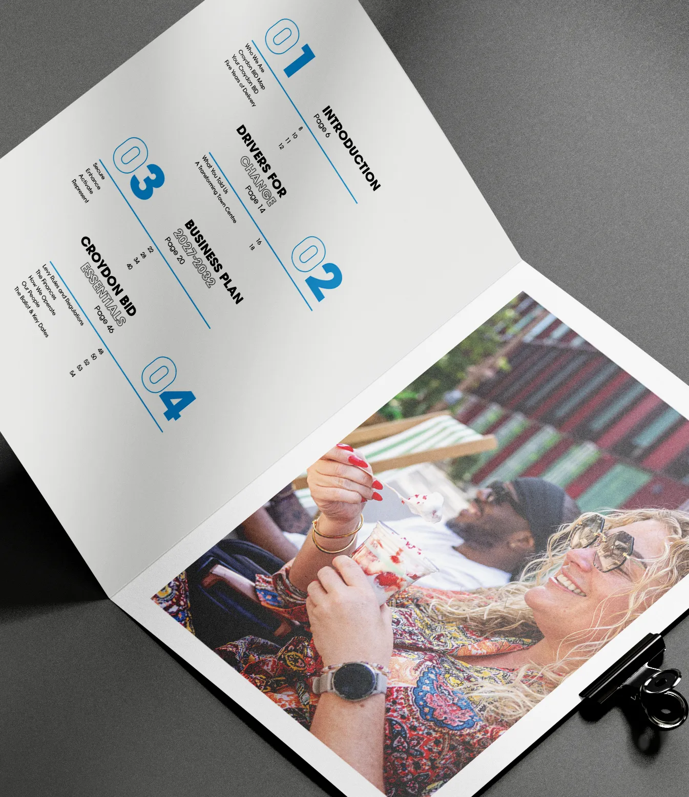
The result was a publication that combined strategic messaging with strong editorial design, delivering a clear and engaging narrative across both print and digital formats.
Premium print with environmental responsibility
The printed Business Proposal was designed to balance quality, sustainability and craftsmanship.
Working closely with Trio Offset triooffset.co.uk, we produced a premium publication using FSC-certified, recyclable materials throughout. The black uncoated cover features white printed typography, creating a striking first impression while remaining fully recyclable. Inside, four-colour process printing on uncoated stock delivers a tactile, high-quality finish that complements the clean, editorial design.
Extending the campaign online
The campaign was designed from the outset to work seamlessly across digital platforms.
The typographic language and visual identity were carried through to the dedicated Ballot 2026 section of the Croydon BID website. Additional video content strengthened the campaign further, bringing the themes of Trusted, Responsive and Collaborative to life through authentic, people-focused footage that showcased Croydon BID’s work within the community.
Client testimonial
“Creating, presenting and communicating who we are and what we stand for is the single most important thing as Croydon BID prepares for its ballot. Our new Business Proposal for 2027–2032 needed to reflect the continual evolution of both what we do and how we deliver it.The team at tothepoint are constantly challenged to create something a little special – a Business Proposal and ballot campaign that stands out, engages our members and encourages them to vote yes.
What tothepoint produced exceeded everything we hoped for. They have evolved our brand and created a sophisticated, beautifully structured Business Proposal and campaign that presents Croydon BID in a modern, bold and impactful way. The creative has extended seamlessly across every element of the campaign, including our website.
After 14 years, our relationship goes far beyond design. To us, tothepoint are exactly what they helped define us as: Trusted. Responsive. Collaborative.”
Matthew SimsChief Executive, Croydon BID