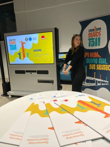
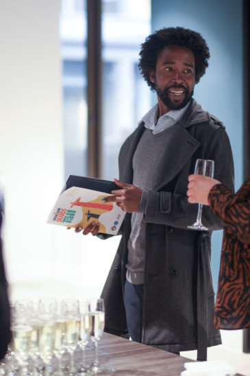
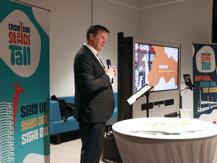
The brand and campaign were launched at a packed event on 11th October at the LSBU, the new educational campus in Croydon where a student can learn the skills and gain the confidence to become a nurse, business leader or entrepreneur. The welcome speech was enthusiastically delivered by Matthew Sims, Chief Executive of Croydon BID, followed by an overview of previous campaigns by Charlie Langhorne, Managing Director and Co-founder, of Wild In Art. His stories of the impact of some of the campaigns he’s run truly touched the audience and made it far more personal than just a call for sponsorship with the trappings of a corporate event.
Simon Hutton, our MD and founder, was at the event and said “It’s been great to be part of this force for good campaign. This is all about real people engaged in activities that can bring communities together, as well as show the value of creativity in society. On top of this, the auction of the final pieces will hopefully raise the target sum of £100,000, for the chosen charity – Crisis“.
The impact art has on people was further highlighted by the artist, Rich Simmons, who had been commissioned to create the art on the first of thirty Giraffes that will form a trail across the borough. His work was dramatically unveiled at the event after he talked about his own autism and suffering from depression, explaining how art had helped him through difficult times. He now shares his experiences and skills, introducing art and its benefits to children from all walks of life.
Croydon Stands Tall will also play a central role in developing a learning programme for school children from Croydon to join and contribute. School children will be offered the chance, as part of the curriculum, to individually paint 30 four-foot-tall giraffes which will form a secondary trail across the borough.
The brand represents the colourful nature and cultural mix that is so much a part of the area. Giraffes actually have a lot in common with Croydon. No two giraffes are the same, reflecting the uniqueness and diversity of the area, They are very sociable and roam in groups called ‘towers’, supporting each other as a tight-knit community. And they have hearts which are two feet long and weigh about 11kg… that’s a big heart, just like the big hearty welcome these wonderful animals will get from the community and visitors when they take their places around the borough. You can find out more about the campaign by visiting the website that has been built by Wild in Art.
Sponsorship document
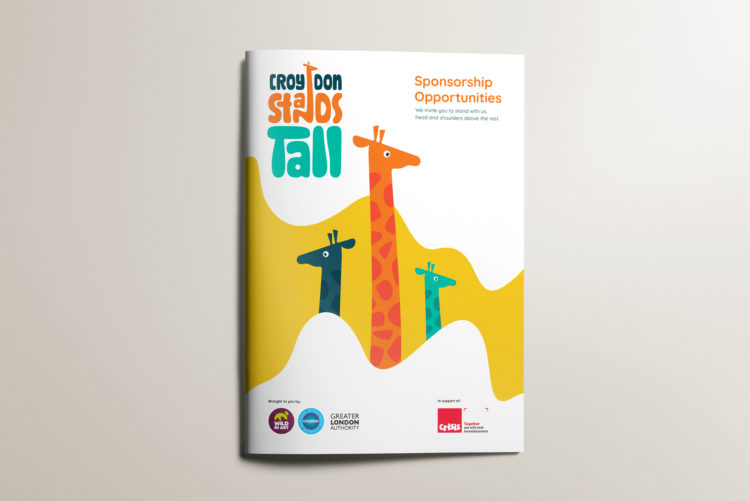
To encourage local engagement and reach of the campaign, we were briefed to create a sponsorship opportunities document for print and digital that would inspire businesses to be a part of the campaign. Designed to be the foundation for the brand guidelines, this was an ideal creative opportunity for us to showcase the vibrancy of the brand and visual language, whilst also communicating a set of simple and clear messages to encourage buy-in and sponsorship leads for Croydon Stands Tall.
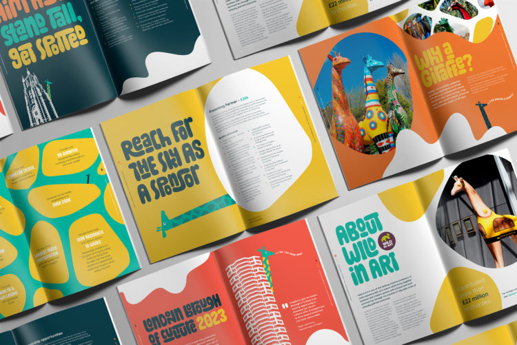
With years of print and digital experience, we took the draft content brief and had the mission to bring it to life in an easy-to-read and share brochure that stood out from the crowd. We focussed on creating unique page spreads for each message that could work in isolation or as part of the complete campaign story and call to action. These designs also act as a template for how to use the giraffe, the mascot for the campaign, and introduce the visual patterns and colours of our illustrative and photographic content. The final brochure was then printed by our go-to local Croydon printer, Scanplus, and distributed via the client as handouts at events to enhance awareness and bring gravitas to the campaign.
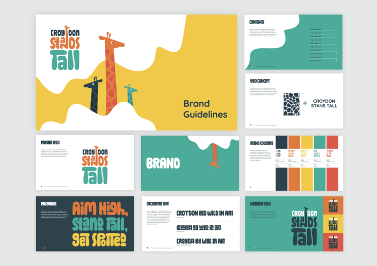
The Wild in Art platform has launched campaigns across the country, and even globally, so after looking at the many identities and visuals from previous campaigns, we wanted to learn from them and create something really unique. The Croydon Stands Tall brand is designed to immediately capture the element of fun that this initiative will bring to the people of Croydon. As well as the bright colours and bold illustrations, a key component of the Croydon Stands Tall brand is the chosen primary font, Jackerton. This fun typeface is intended to represent the spotty pattern found on a giraffe. The font is quite complex with many variations of how capital and lowercase letters can sit together. For our designers and Croydon BID, to ensure legibility, a balance between quirky and clear needs to be achieved every time a new heading or message is written.
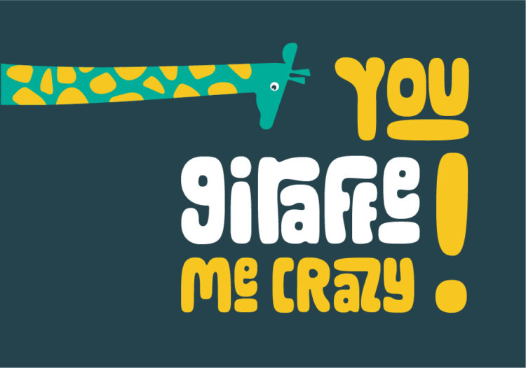
With this great font, it demanded clever and witty writing to go with it. To bring joy and embody the positive spirit of what the campaign aims to achieve, we developed copy lines with Croydon BID to bring light-hearted puns and jokes to the brochure to set the scene for future campaign materials.
Illustrations
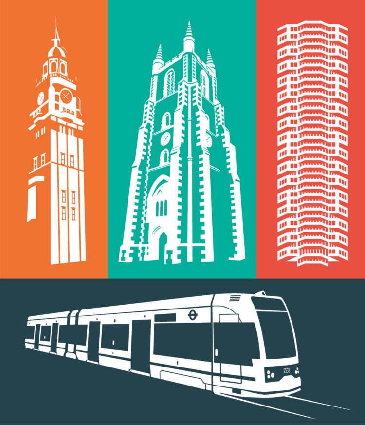
A more ‘classic’ side to the brochure was represented in a set of illustrations that were almost linocut versions of some of the more famous local sites and buildings of Croydon. We worked closely with the client to identify these ‘icons’ of Croydon to illustrate for the first set of materials. No 1 Croydon (or the 50p building), Croydon Minster, Croydon Clock Tower, and of course the famous Croydon trams were included to bring a sense of familiarity and local representation to the brochure and other materials and templates.
Guidelines and templates
The guidelines were kept simple, and we suggested that completed materials could be added later as examples of best practice. For the launch, they included an introduction to the logo and how it would sit with the partner logos and Crisis. This was then followed by colours, typography, a guide to messaging and type hierarchy, and a walk-through of the visual assets available. Examples of how this could all fit together editorially were demonstrated by using the sponsorship brochure as the first example of best practice. This kept the guidelines short, simple and easy to use for the in-house development of support materials and marketing – with us still on hand if needed. The brochure was also supplied as the master Indesign file to act as a template for other materials.
The other important template was PowerPoint, something we have actually come to quite like over the last year. With its animation tools and more creative flexibility than Word, this is our go-to tool for clients to use and be able to produce great-looking presentations, and make last-minute changes without having to call us.
The templates and brand guidelines were created in close collaboration with Croydon BID to enable them to create a wide range of campaign materials in-house. This helps to keep costs down and ensure fast response times to press and stakeholder enquires as the campaign gains momentum. As usual, tothepoint will stay on hand as consultants and support for the more creative and technical requirements.
“Croydon Stands Tall will take everyone on a journey from the moment it is launched, making art accessible for all, promoting health and happiness as we celebrate our people and culture as Croydon takes centre stage at the London Borough of Culture 2023. Croydon Stands Tall, right from the outset, needed to bring to life its identity clearly for all to see. Working with To The Point, we have developed a comprehensive set of creative assets complete with brand guidelines that provides a striking brand identity with versatility complete with fun and engaging fonts, illustrations and imagery. To The Point have out done themselves on creating an innovative brand that enables us to set the scene and the story so that we can narrate the incredible opportunities Croydon Stands Tall will deliver.” Matthew Sims, Chief Executive, Croydon BID.
