The brief: Bringing PSA’s Safer Care for All to life
When the team at the Professional Standards Authority for Health and Social Care (PSA) came to us, they had a classic communications challenge. They wanted to share a progress update with stakeholders a few years on from the publication of their landmark Safer Care for All report via digital channels but in a way that felt fresh, engaging, and accessible.
They asked us for guidance on the whole package, from messaging and audio through to art direction. Our mission was to help them distil a complex policy piece into a warm, punchy two-minute reel that informs, engages, and moves the conversation forward.
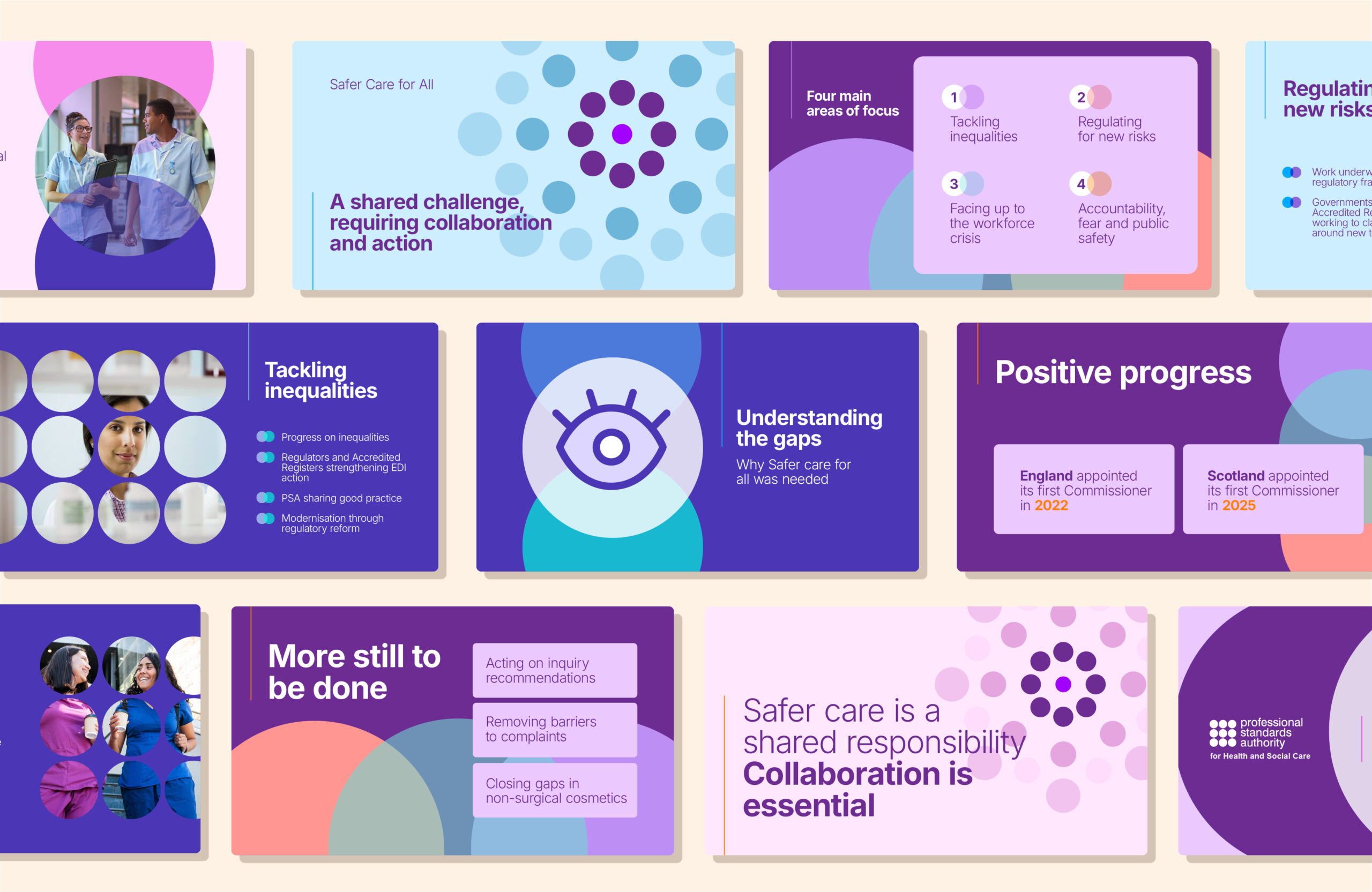
Key creative & design choices
- Building on brand foundations: We developed the art direction around PSA’s refreshed brand identity, using overlapping geometric frame “lenses” to bring real human photography into sharp focus.
- Brand flexibility: While built around PSA’s specific visual guidelines, the underlying lesson applies anywhere: any brand system, whether corporate, minimal, or bold, can be adapted to create visual metaphors that turn abstract messaging into human stories.
- Multi-channel pacing: Pairing an empathetic voiceover with clear, kinetic text overlays ensures key points resonate whether viewed in a board meeting or on a muted social feed
What the client said
“The tothepoint team took time to understand the brief and translated a complex piece of work into something clear, engaging and accessible. The final reel provides a strong summary of the PSA’s Safer Care for All report recommendations and progress to date, and gives us a valuable asset to use across our channels. The team were responsive, creative and easy to work with throughout, taking on feedback constructively and helping us present our work in a way that feels professional, human and aligned with our public protection role.” Karen Fraser, Communications ManagerKey creative & design choices
If you’re looking to transform a big report or policy document into snappy video content, here’s our studio cheat sheet:
- Focus on the big picture: Highlight progress, outcomes, and human impact rather than trying to squeeze in every technical sub-bullet.
- Let visual metaphors do the work: Framing devices, subtle motion, and visual cues break complex ideas into bite-sized chapters without cluttering the screen.
- Design for sound-off viewing: Great motion content pairs voiceover and on-screen text seamlessly, ensuring your core message lands whether sound is on or off.