![]()
There was a feeling from the client that their identity was creating the wrong impression at client presentations. Whilst their services and products were innovative and in most instances at the forefront of the industry, their identity was simply not reflecting this.
After an initial presentation of three approaches the client instantly chose the route which was based around the ‘forward slash’ concept, a symbol which is instantly recognisable in the tech industry. Our graphical application that accompanied this was a simple, clean, contemporary approach where less is more, and utilised a distinctive, minimal colour palette to great effect.
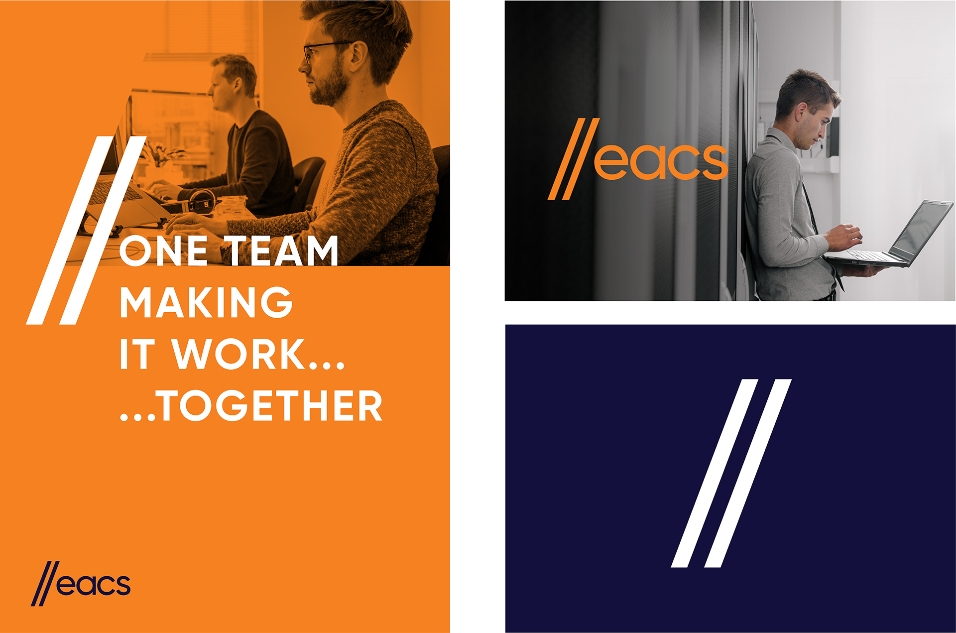
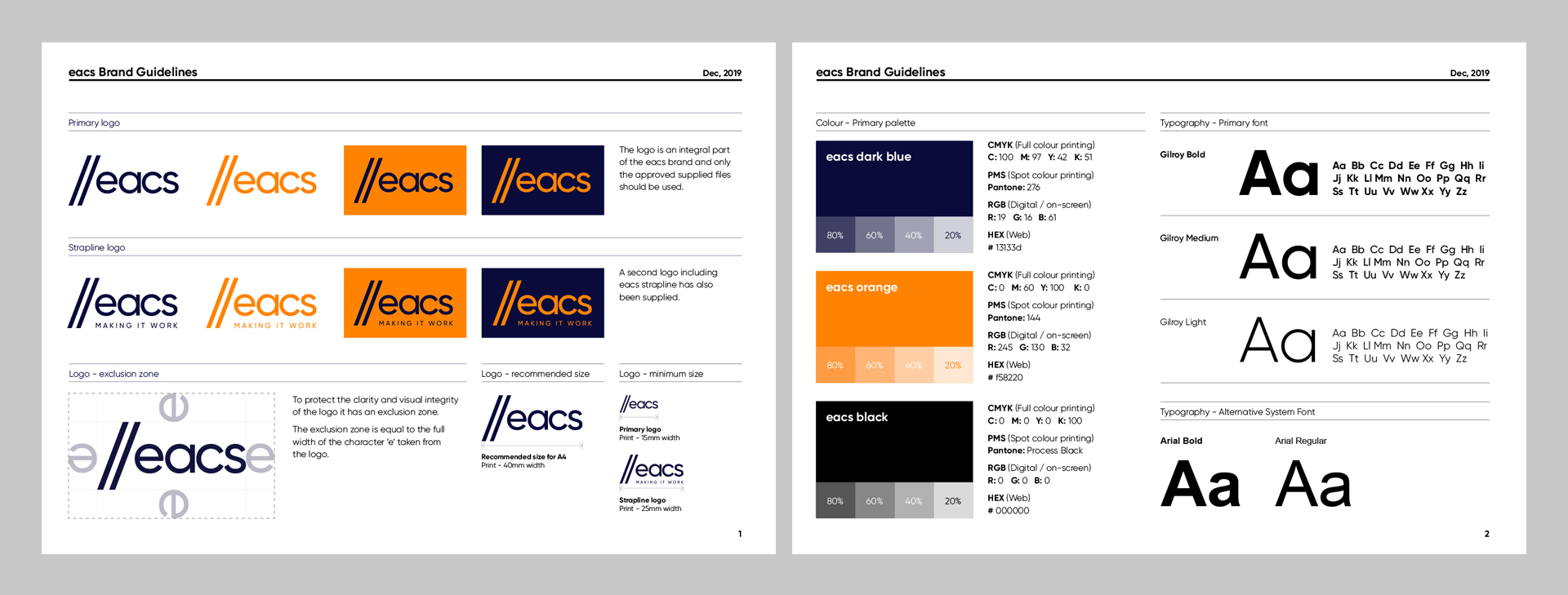
The first goal of the new logo was to create an easily recognisable identity with highly legible type. This was achieved by selecting Gilroy, a modern sans serif with a geometric touch as their primary typeface. The second goal was for it to convey a sense on their industry. This was accomplished by the use of the double forward slash, two characters often used within computer programming. This device can now be used within extended materials to help highlight key statements and bring visual interest to the page.
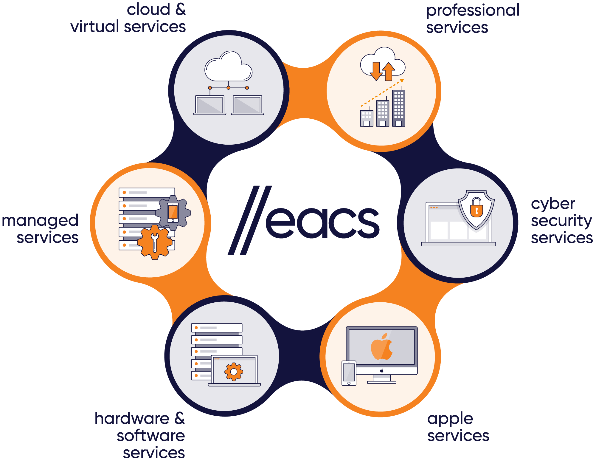
Once the logo was approved, as a second stage to the project, we then designed a new suite of icons for each of their 6 core services; Cloud & Virtual Services, Professional Services, Cyber Security Services, Apple Services, Hardware & Software Services and Managed Services. They had an existing diagram which worked well for them and had already been applied to many materials both internally and externally.
Therefore rather than completely reinventing their current graphic, we elevated the iconography within the existing diagram to be more in line with the clean, simple style of the new logo. We also suggested a change to the typography in the diagram, from full caps to lowercase in order to mirror the typography within the logo.
To help eacs implement the new brand we provided them with a set of basic guidelines for them to follow. These cover all the essential touchpoints; logo usage, colour values and fonts.