Due to the success of our work for The Francis Crick Institute we were approached by EDIS to create an identity for the initiative which clearly communicates equality, diversity and inclusion in science & health (EDIS).
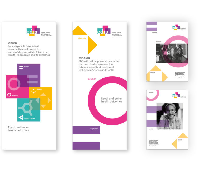
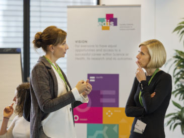
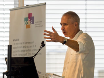
Initially we produced simple pop up panels, featuring their mission and vision statements, for use at the launch of the identity at a fundraising event which was at the Wellcome Trust on 18th September. Over 40 organisations from the science and healthcare sector were invited to discuss the importance of equality, diversity and inclusion in science and health, in the hope of gaining more funding for EDIS. We are proud to be a part of an incredibly relevant and important initiative, helping EDIS to communicate their message and gain traction in this sector.
The Brand
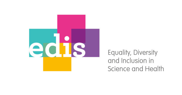
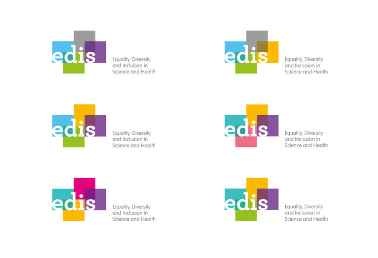
The identity consists of four individual coloured planes (diversity) of equal size (equality) coming together (inclusion) to create EDIS. As with most of our design work for brands, we are always thinking at the concept stage of application and flexibility for both digital and print applications. The planes coming together lend themselves to motion graphics as a simple interpretation of the initiative.
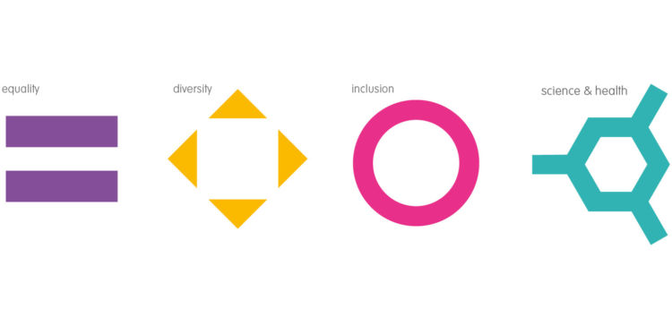
Icons
We also created four eye-catching icons that were colourful and representative of the individual words that make up the acronym, EDIS. This not only provides a toolkit which communicates the subjects of equality, diversity, inclusion and science & health but also provides navigation and signposting opportunities for both print and digital.
Colour experimentation
As the identity is focussed on helping minorities and removing obstacles, we also did an exercise in colour balancing and combinations for the identity that ensured the mark was optimised for colour blind individuals.
What our client has to say
tothepoint have been brilliant in helping create our brand and identity, challenging us to define how we want to be seen and delivering an identity that truly represents EDIS. The team at tothepoint have also been excellent in helping develop a visually accessible logo, something of the utmost importance to us. We would recommend the team highly and look forward to working with them in the future to develop EDIS further.