
The Association of the British Pharmaceutical Industry (ABPI) exists to make the UK the best place in the world to research, develop and use new medicines. Its members supply cutting edge treatments that improve and save the lives of millions of people in the UK. They work in partnership with Government and the NHS so patients can get new treatments faster and the NHS can plan how much it spends on medicines.
Back in November of last year, they approached us to evolve their brand in order to portray it is a relevant, modern, forward thinking and inclusive organisation. The existing brand contained a ‘tree of life’ motif and their ‘bringing medicines to life’ strapline. There was a strong feeling that this brand – designed 11 years ago – had become dated and was increasingly not suitable for them as a thought leadership, policy organisation. The logo was also becoming increasingly impractical to use on social and digital platforms. Given the importance of brand recognition amongst the ABPI’s audiences, there was a strong opinion that this should be a brand evolution rather than the creation of a new brand identity. By taking this approach, ABPI were acknowledging that they weren’t forgetting their past, understood the respect that the existing mark had within the industry and was simply moving forward and evolving like all modern organisations should.
Step 1. Evolving the existing brand
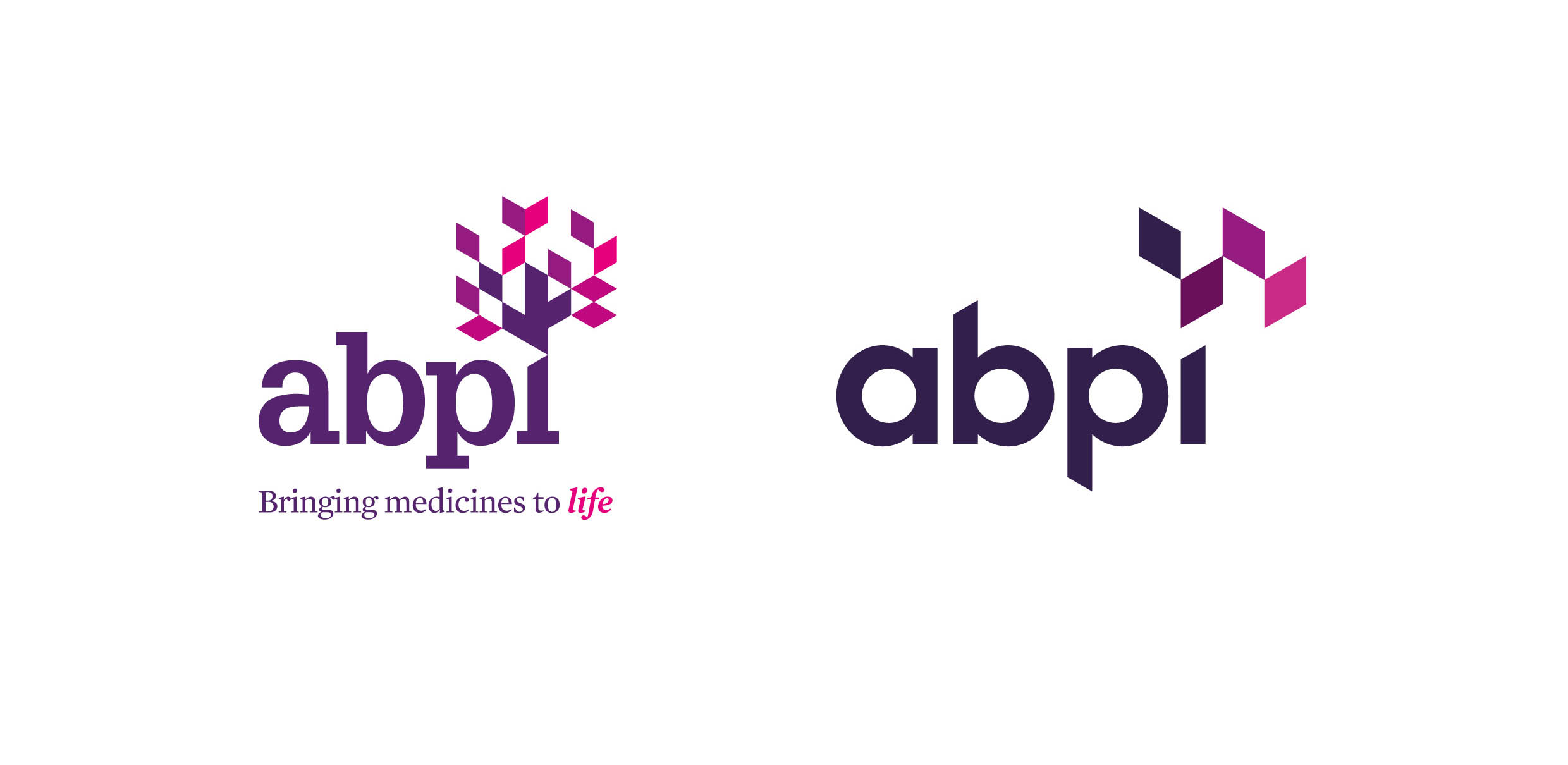
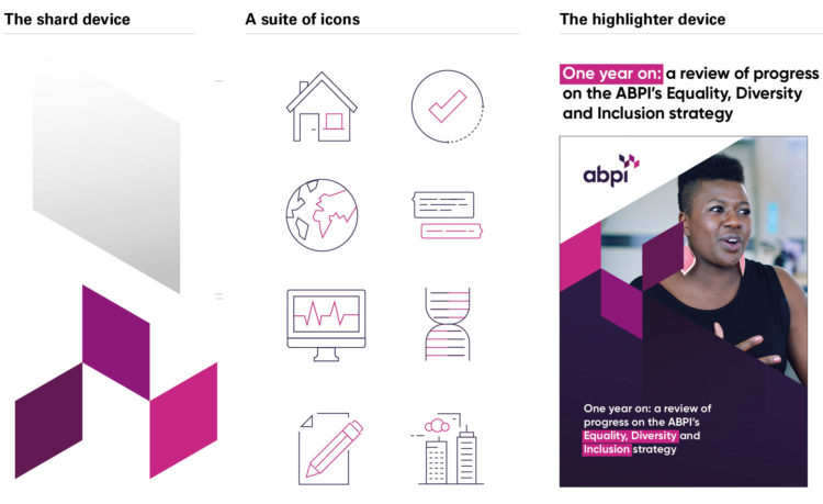
The new logo took the essence of the original mark and made it more relevant to the modern world with a much simpler, cleaner, confident, and dynamic brand mark. We took this same ethos and principle and followed this through all the assets we generated, as part of the brand refresh, for digital, print, video, and interiors. We chose Gilroy as the main letter-form font due to its clean lines, openness and modernity and retained some of the original shards from the ‘tree of life’ and evolved them into four simple shards that represented a more fluid, creative, open, and confident organisation.
Step 2. Creating a new palette with more gravitas and authority
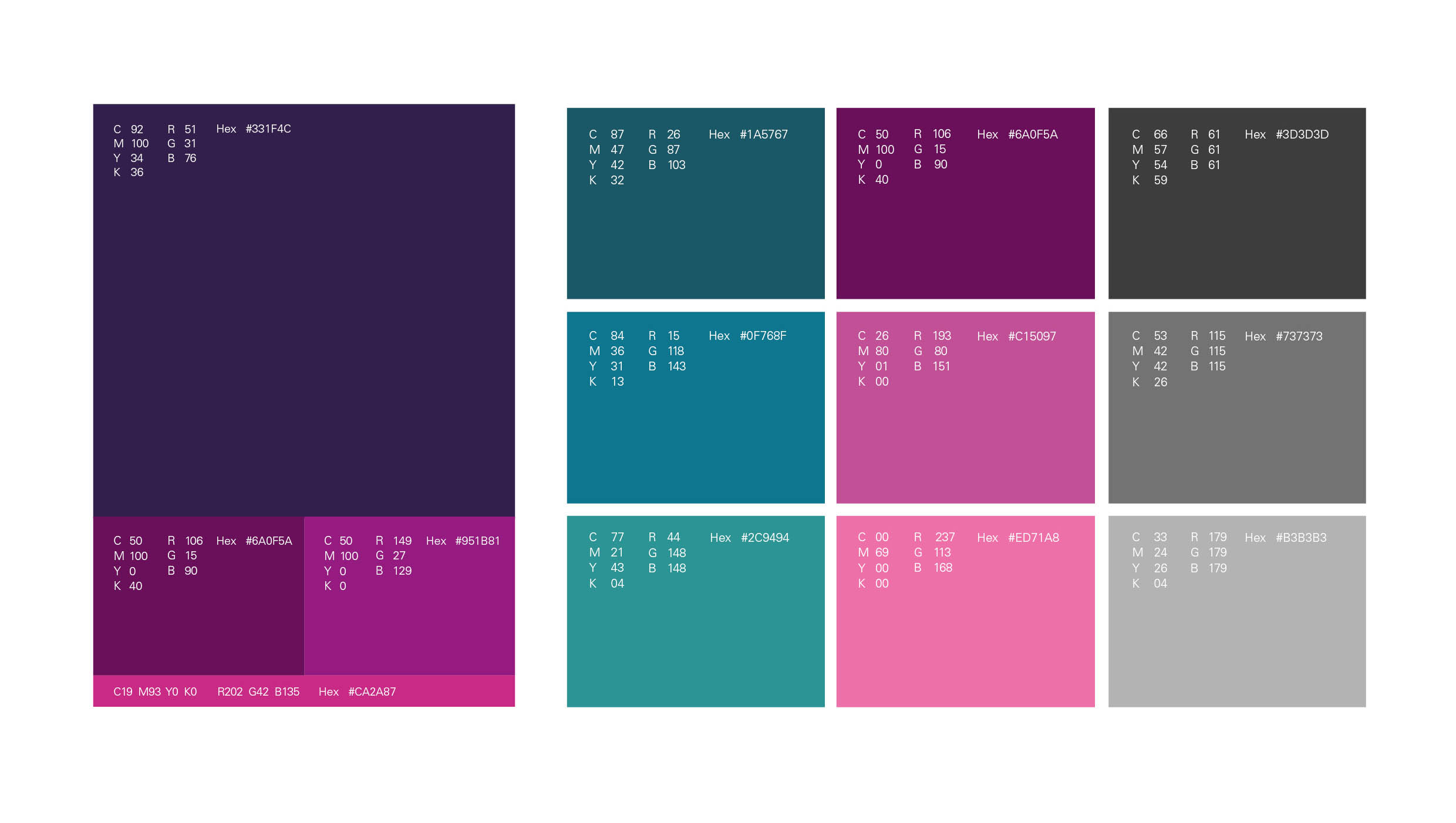
An important part of the evolution was the colour palette, as with the evolution of the mark itself, we didn’t throw everything out but refined and enriched it to a deeper palette which provided greater gravitas and authority. Where the primary palette was the dominating factor for most brand communications, the secondary palette was an essential tool for usage in information graphics.
Step 3. Creating a new set of new brand assets
Within ABPI there was a desire to communicate what it does more effectively to industry and government, whilst at the same time providing ABPI with a new brand look and feel. This involved creating a fresh set of brand assets, tools, templates, and guidelines to help them engage better with their audiences via events, social media, print, video, animation, and interiors. It also involved creating assets and templates for internal usage including PowerPoint and Word templates for general day-to-day activities and communication.
Step 4. Establishing clear and concise guidelines for ease of use
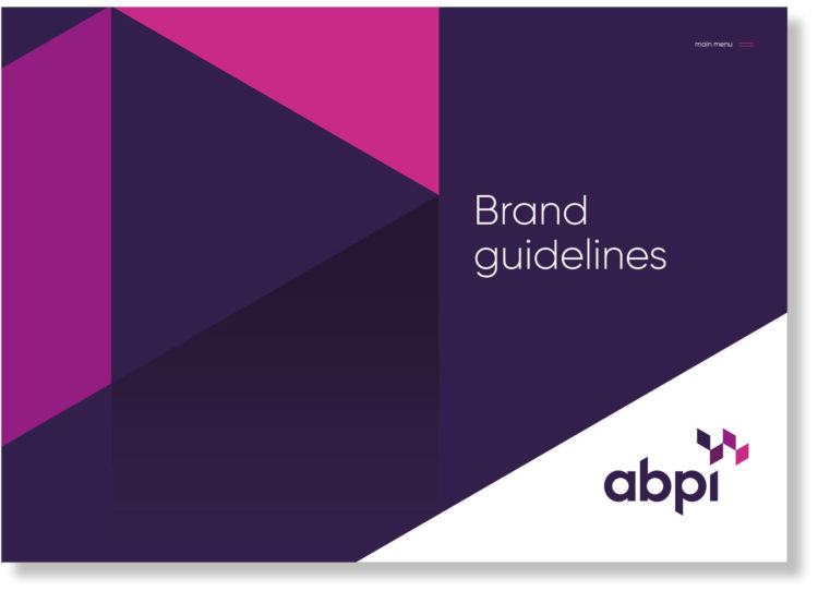
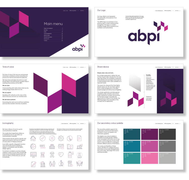
We created interactive guidelines that through one-click navigation links, provided simple, concise instructions as to how these tools and assets should be used for brand consistency. The simple menu enabled the user to get directly to the key information related to their specific needs, whether messaging, print, digital, or template related.
Step 5. Providing templates for external and internal documents
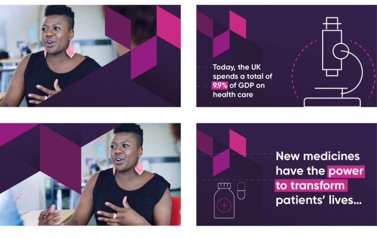
Various templates were created to facilitate multiple forms of communication. Social media templates for LinkedIn and Twitter were either image-led, or icon and messaging-led. Print templates were generated to help implement prestigious A4 reports and required us to create a typographic hierarchy that included: highlighted copy, large format stats, standard body copy, and Introductory copy.
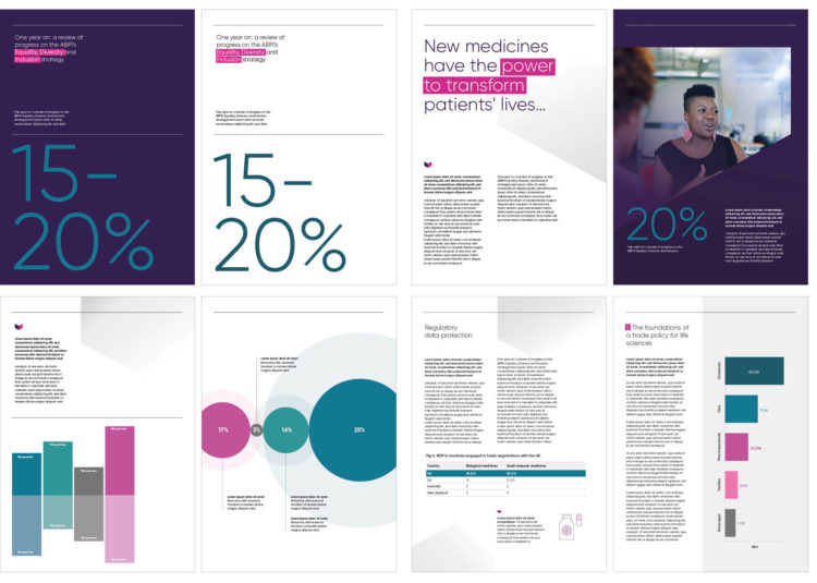
Grids were established to utilise the use of white space, stopping documents from looking too cramped, and providing breathing space on the page. We also established a style for information graphics so that data could be presented in a more dynamic, interesting way on the page.
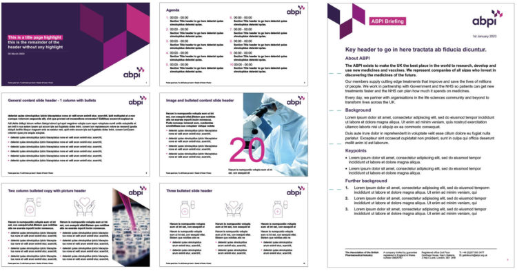
For internal and external use, we created PowerPoint templates for day-to-day communications within ABPI, as well as updated external PowerPoint presentations to reflect the new brand. We also created a series of Word documents ranging from briefing notes and letterheads to application forms.
Step 6. Reflecting the new brand in ABPI’s workplace environments

The brand refresh corresponded with ABPI moving location from Victoria to London Bridge. Therefore, it made perfect sense to reinforce the new brand and its ethos in its new workspace. It was our previous experience working on interiors with clients such as Twitter and The Francis Crick Institute that encouraged ABPI to do something more adventurous with the internal brand application to celebrate the brand evolution and their occupancy of this new, modern, and contemporary work space.
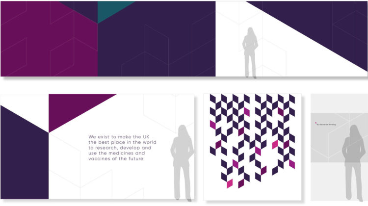
Working with what was essentially a completely blank canvas, we decided to separate graphics out into large feature walls, where the brand palette and shard devices would dominate, and accent walls, where smaller details taken from the brand could be utilised to provide focal points and draw the eye from a distance. The shards were also utilised to create a pattern repeat for frost-effect glass manifestations that worked on two levels. They provided privacy in rooms where information could be highly confidential, whilst fulfilling the compliance requirement related to health and safety.
Sharing the space with OHE and PMCPA
ABPI would be sharing its Hay’s Galleria, London Bridge space with two other organisations with which it has close ties and affiliations, OHE and PMCPA.
OHE (Office of Health Economics) provides resources, research and analyses in health economics, health policy and health statistics through their independent research and consultancy. As with ABPI, its work informs decision-making about health care and pharmaceutical issues at the UK, regional and international levels.
PMCPA (The Prescription Medicines Code of Practice Authority) is the self-regulatory body which administers the Association of the British Pharmaceutical Industry (ABPI) Code of Practice for the Pharmaceutical Industry, independent of the ABPI.
Bringing these three organisations together, within touching distance of each other, was a perfect opportunity to look at aligning the brands to create synergy in the space.
Communicating these close ties between the organisations with their brands and interior graphics
Mark Smyth of ABPI was project managing the interior fit-out for the space, which was being done by Woodhouse. Our challenge was to connect the new brand refresh we had created for ABPI and make it sit next to both the OHE and PMCPA brands so that the space felt cohesive as you walked around.
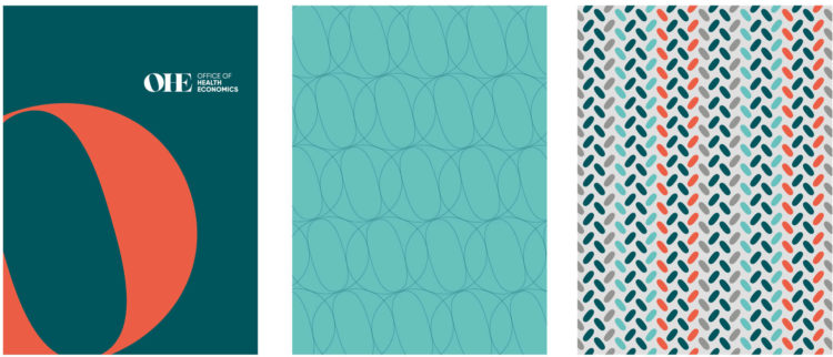
We decided that a good starting point would be the use of the ABPI secondary palette as a linking device between all three organisations, in particular the use of the teal colours, especially as OHE’s prime brand colour was in the same arena. Moving into the new space also provided PMCPA with the perfect opportunity to refresh its own brand which we duly created. Working in partnership with Alex Fell, a Director of PMCPA, we decided to use the same Gilroy font from the ABPI brand refresh in conjunction with the teal colours from ABPI secondary palette as a linking device.
An important part of the ABPI interior graphics implementation was the use of flat colour, simple brand icons and keylines that were used at various levels and intensities around the space. For consistency across both OHE and PMCPA areas, we took this same design approach for the graphics in these additional spaces.
OHE branded spaces
For OHE we utilised the OHE letterforms and in particular, the negative space within the ‘O’ letterform which Graham Cookson, Chief Executive OHE, informed us was indicative of a ‘pill’. By playing around with this letterform we created graphics that were either elegant and refined or bold and impactful to change the mood of specific areas.
PMCPA branded spaces
The same approach of flat colour, brand icons and keyline treatments was also adopted for PMCPA interior graphics. The chosen icon we created for the PMCPA brand was indicative of cells and cell division as viewed under the microscope.
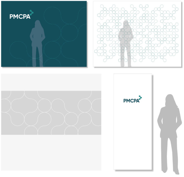
As with ABPI, the keyline treatment used in its space was adapted and followed through onto glass manifestations in both OHE and PMCPA spaces. By taking this same approach the interior graphics ensured all three sat together as a family, whilst still giving them each their own sense of identity within the workplace.
Elliot Dunster, Executive Director, Corporate Affairs and Devolved Nations at ABPI had this to say about the brand refresh and interior graphics application.
“Having worked with the To The Point Team over a number of years, they knew our brand as well as we did. Over this time, they worked with us to stretch our existing brand as far as possible. This meant that when there was an opportunity to make a real step forward and evolve the fundamental components of our brand, TTP was able to deliver initial concepts exactly to specification. The way in which they took the time to understand our audiences and how we practically use our brand meant that their initial concepts appealed to us from the start – and then we set out on the process of refining. As a result, we feel as though the ABPI now has a brand that reflects us as a serious organisation focused on thought leadership, which is practical to use, and which will help us stand out.” Elliot Dunster, Executive Director, Corporate Affairs and Devolved Nations at ABPI