Having some initial concepts for a logo and their website, we were asked to expand on this work and evolve it further, applying a clean and sophisticated design aesthetic to the new website.
While discussing their approach and purpose, it was clear they needed more than the written word to convey their vision. From initial discussions around infographics, we recommended an explainer animation would be the best approach.
Branding and logo
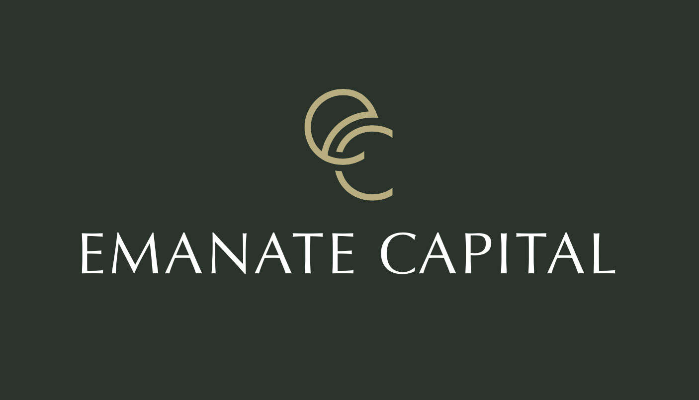
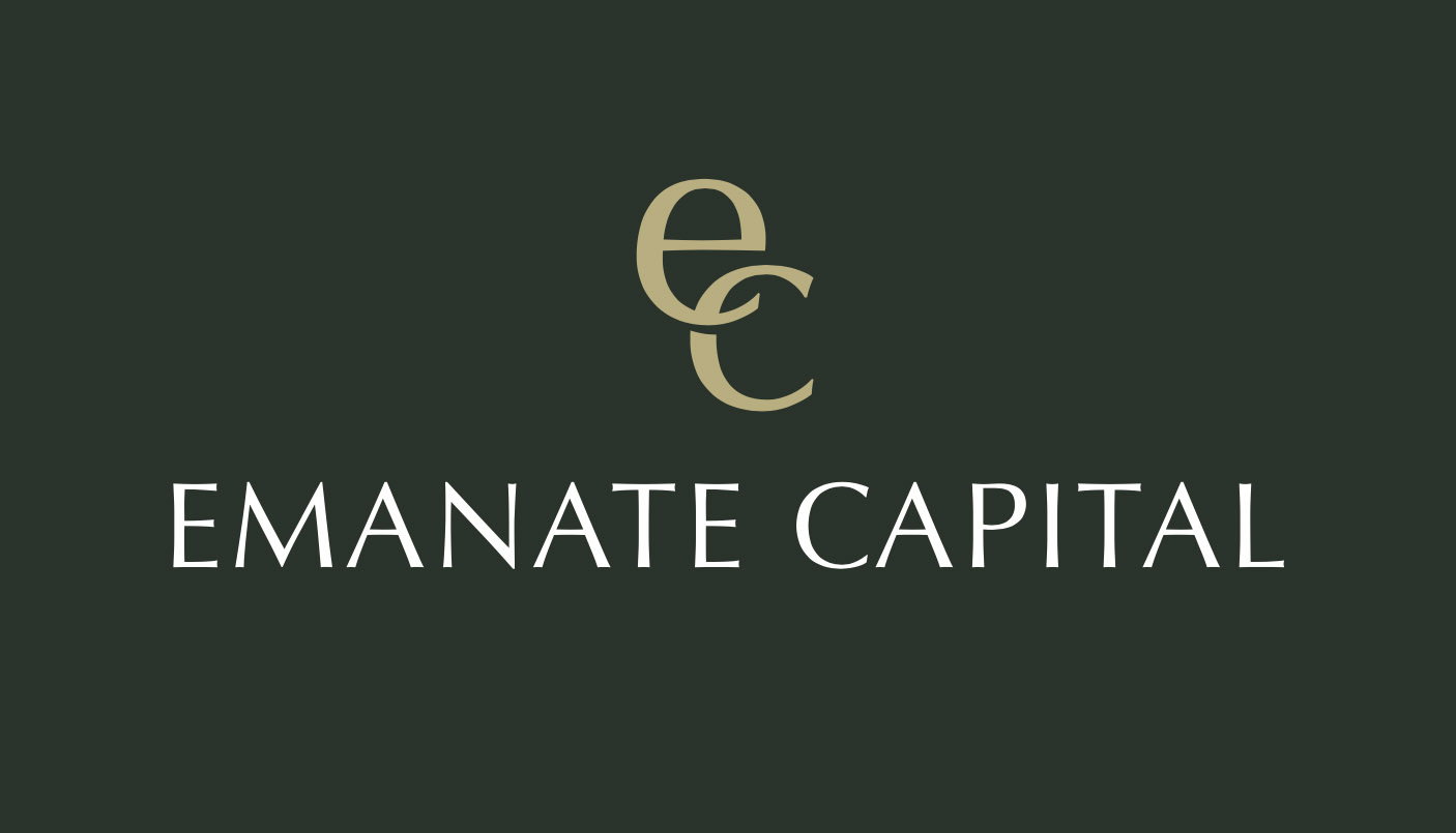
Starting with their initial concept, tothepoint has developed a clean and classic looking logo that features a gold ‘monogram’.
![]()
Our initial logo concepts below show typographic exploration, experimenting with font selection and the development of the monogram. Aiming for a classic high-end feel, we arrived at a solution that also reflects their purpose – of bringing investors together with people and projects – the e and the c join together in a ‘partnership’.
The client’s strap-line ‘realised with ingenuity’ was also an important factor and was included in the assets that have been trademarked – it underpins the theme running through everything that Emantate Capital stands for.


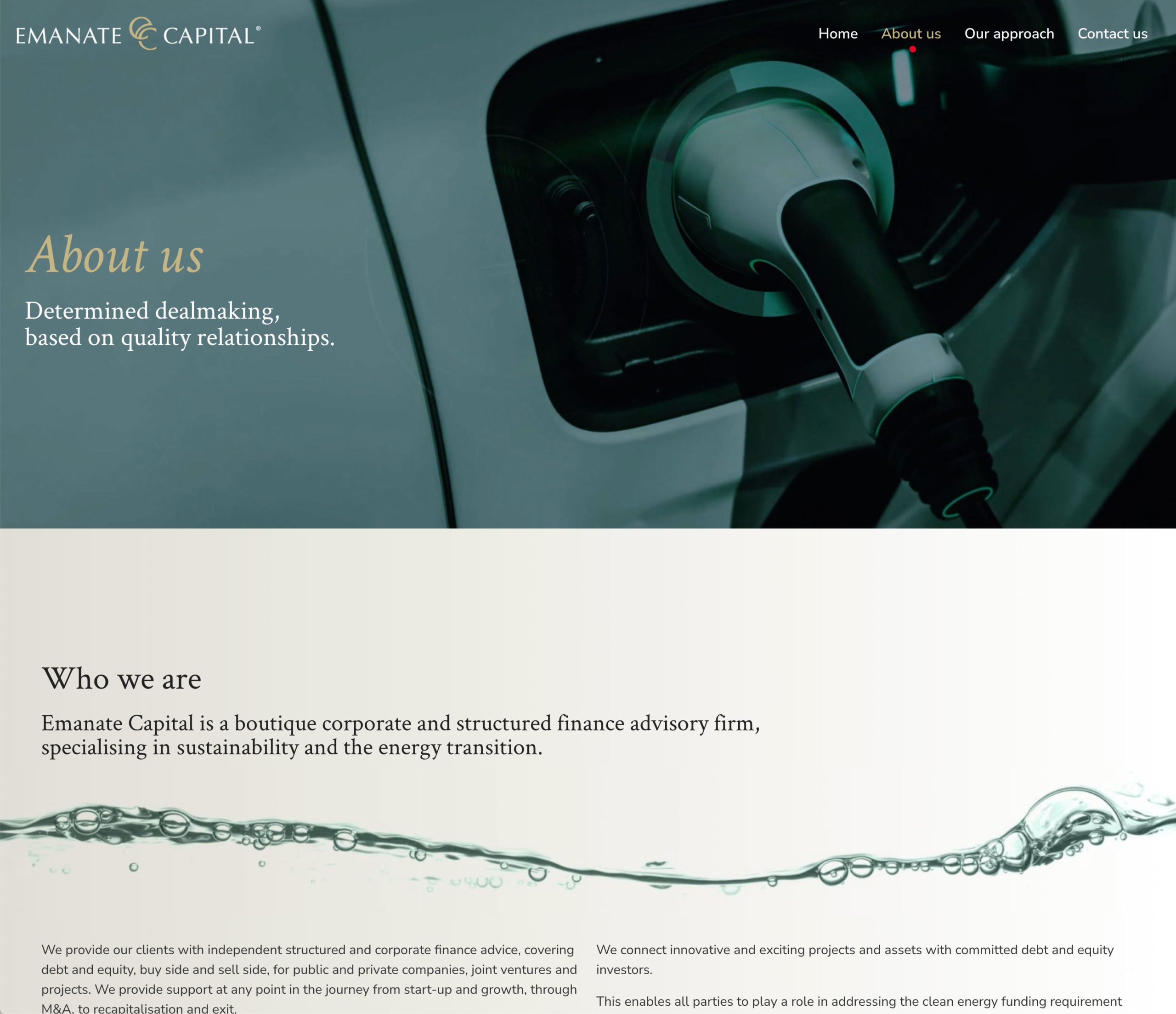
A clean sophisticated website
Having met with our client to discuss their business and their target audience at length, we worked with David Butcher to identify the key topics and messaging needed across the website. David has years of experience with clients in the finance sectors and helped us set the tone throughout, as well as explain the key, often complex, aspects of the business and what Emanate Capital offers.
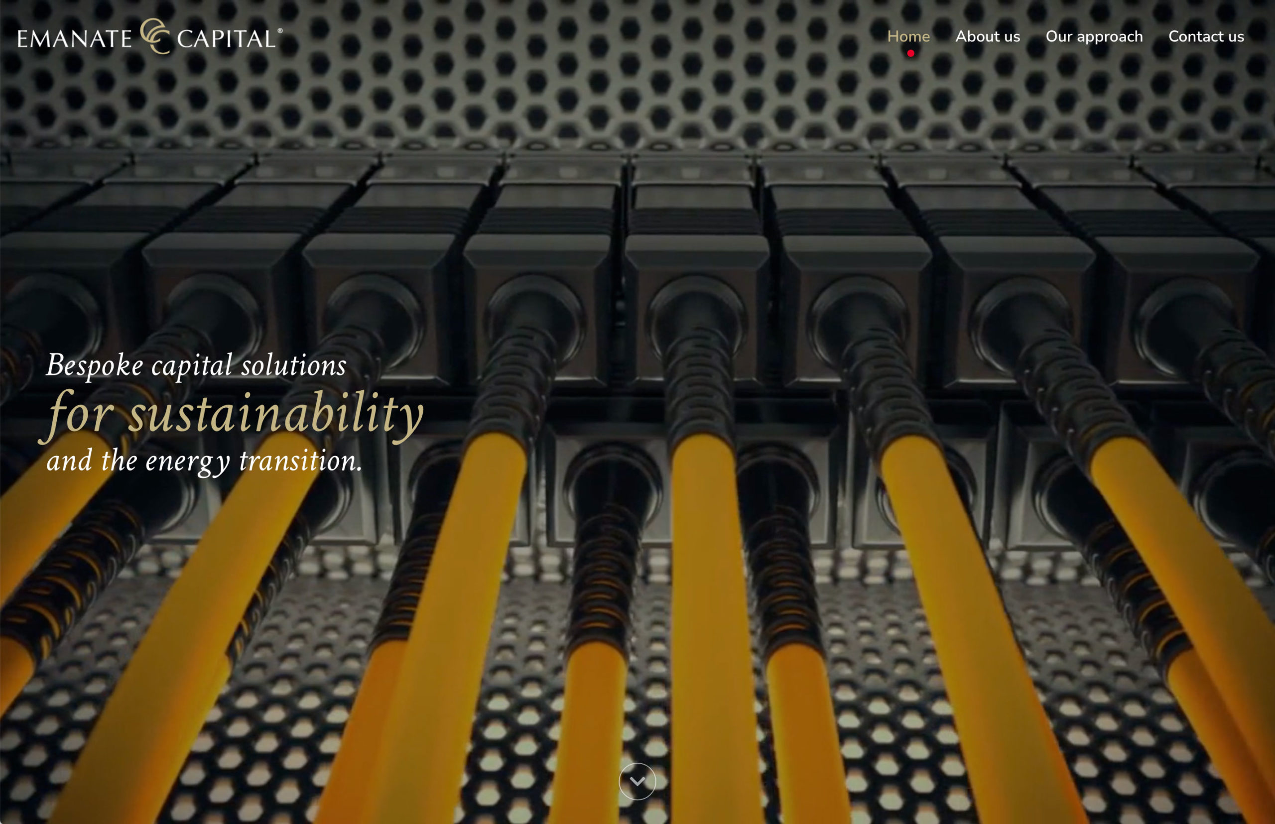
Running with a sophisticated, classic brand look and feel, underpinned with the use of a racing green and gold colour palette, the website was designed to look luxurious, and authoritative. The serif typography supports this approach, with key headings and captions animating as the pages load.
Rich video and photography help to communicate this aesthetic whilst also helping to support the technical industries that Emanate works with, looking fresh and modern and not overly industrial. This subject matter is first seen on the landing page as a full-screen video to add instant impact to the website.
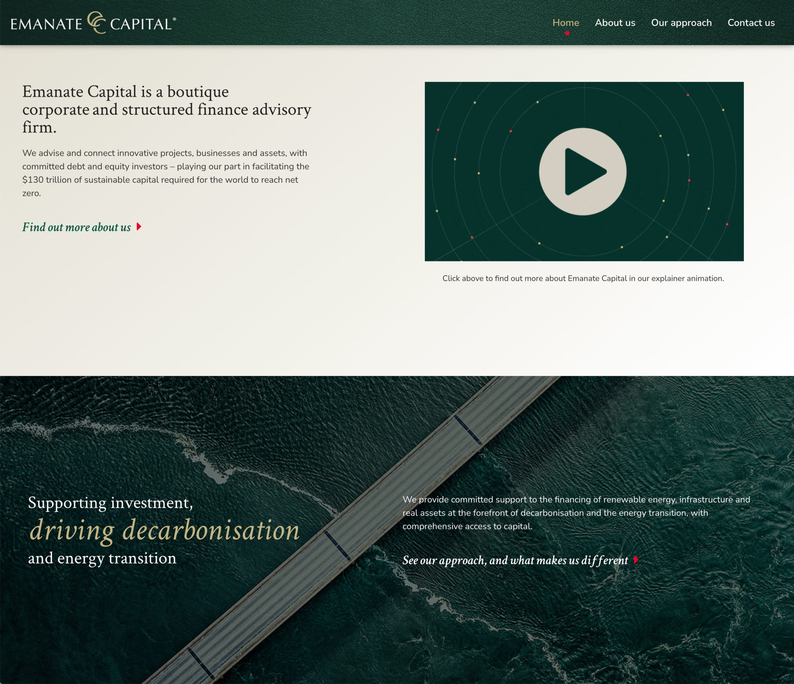
A very specific niche market focus for Emanate Capital meant very clear messaging was required. This was achieved with keyword laden statements across every page, explaining Emanate Capital’s skill-set and involvement in a sector that often requires complicated technical language.
![]()
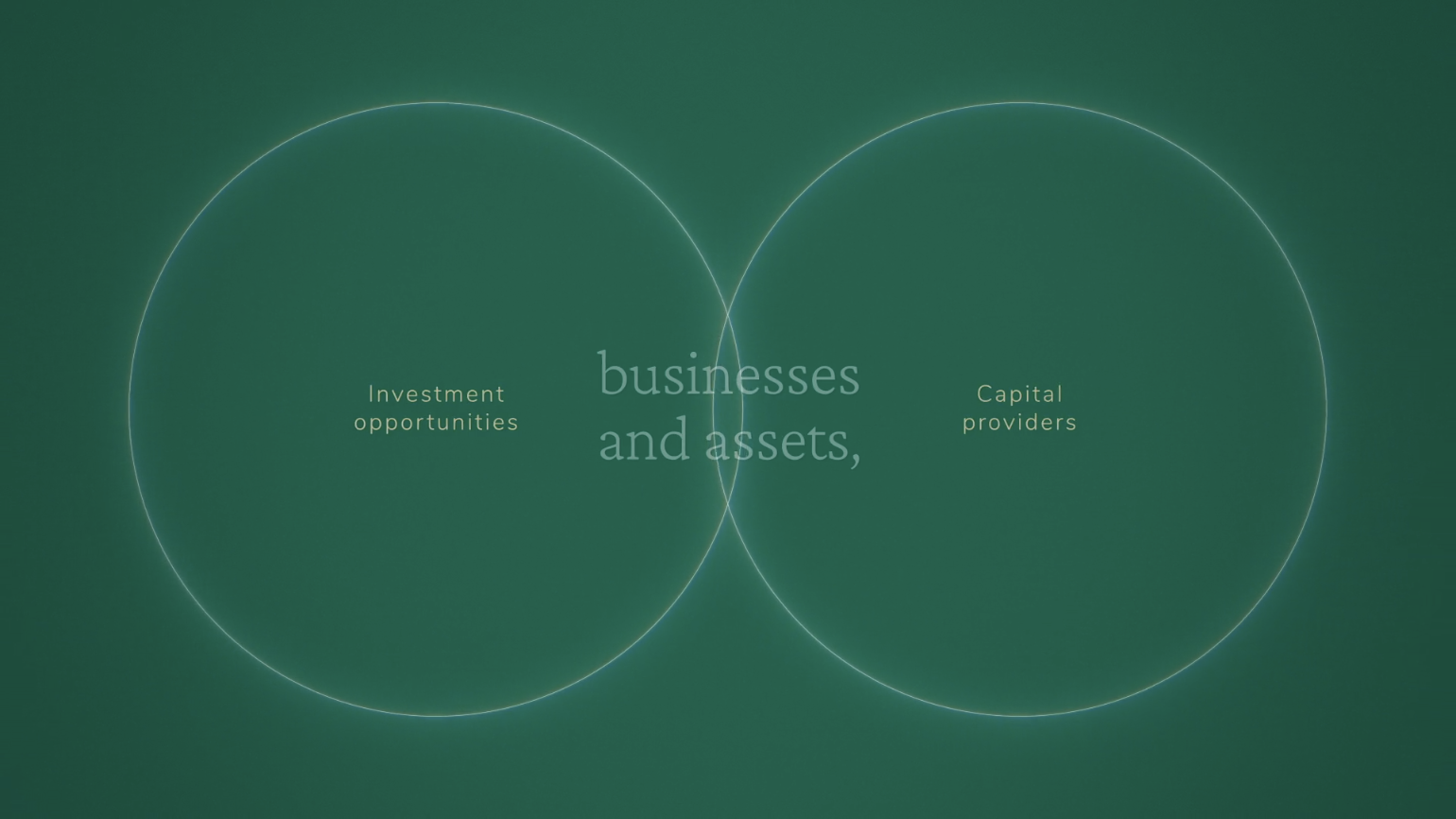
The bespoke nature of Emanate Capital’s business centres around experience and contacts, pairing corporations, developers and asset owners with the appropriate providers of capital. From the monogram and logo concept, this theme of combining specific skills and relationships runs through the website and the rest of the Emanate Capital branding.
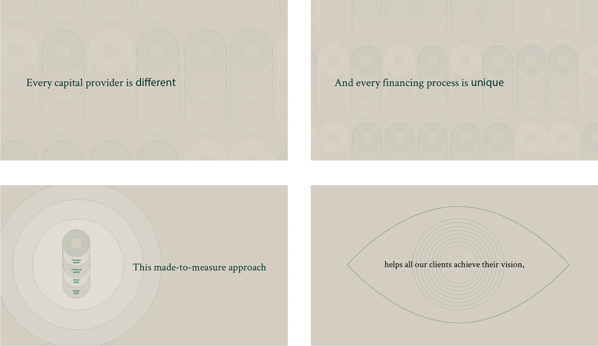
Explaining complex messaging through animation
In order to really explain Emanate Capital’s purpose and key selling points, we designed and produced an animated explainer video. Alongside planning the website content, we worked with our client and David Butcher to distil the main touch points and detail into a script that explained the processes that they go through from start to finish.
Much like planning a website, we began with a sketched storyboard. Various iterations of this were drawn up and edited to enable us to fine tune the script and visualise concepts before moving on to the next stage.
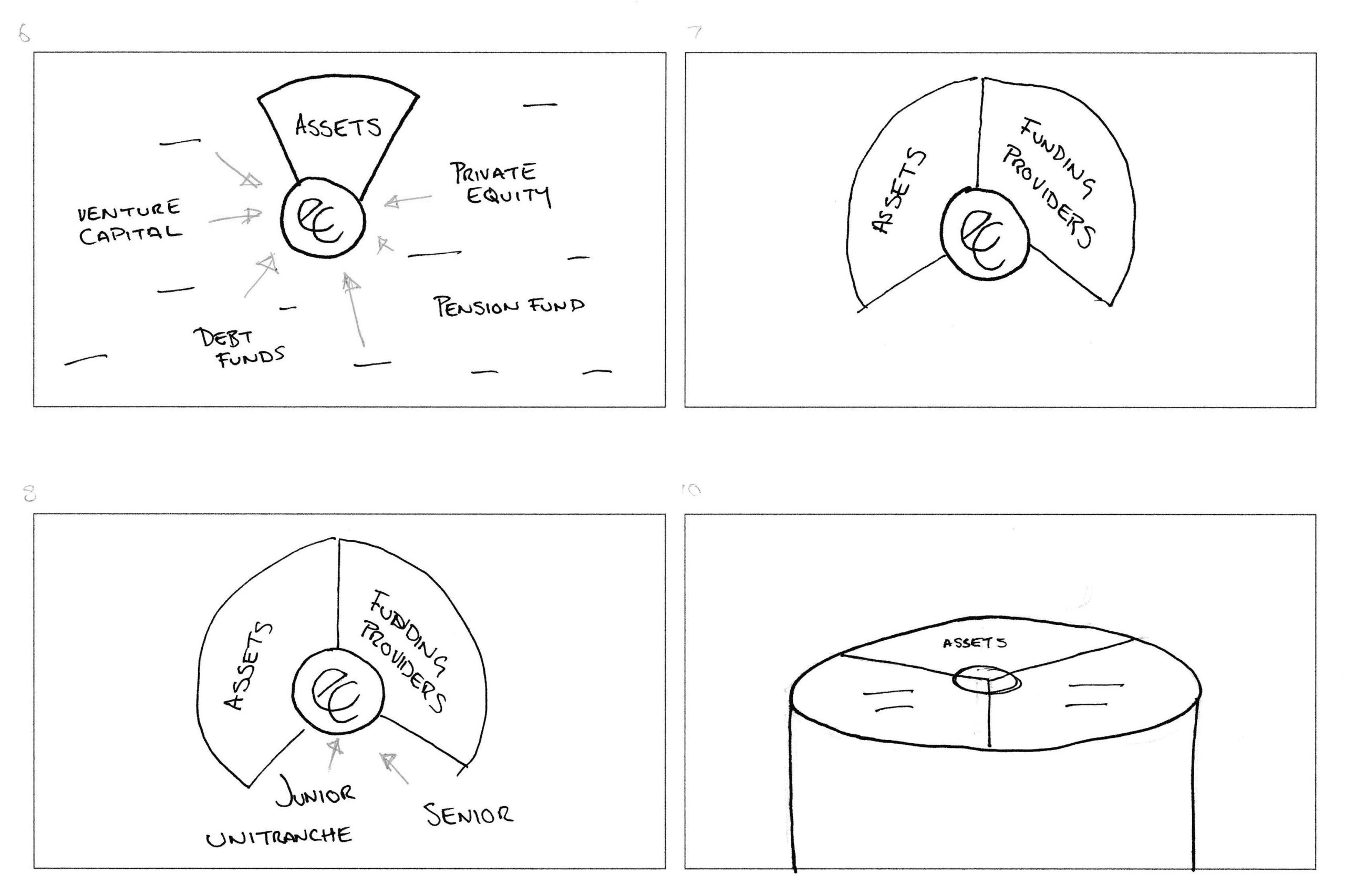
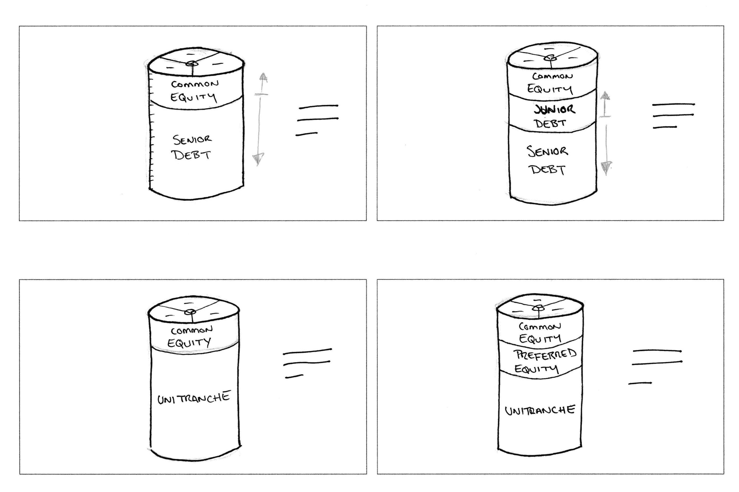
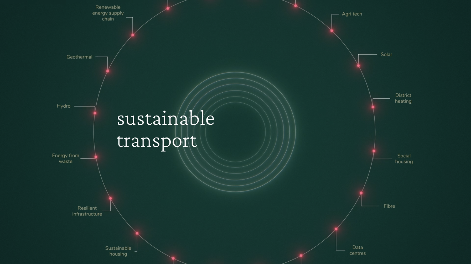
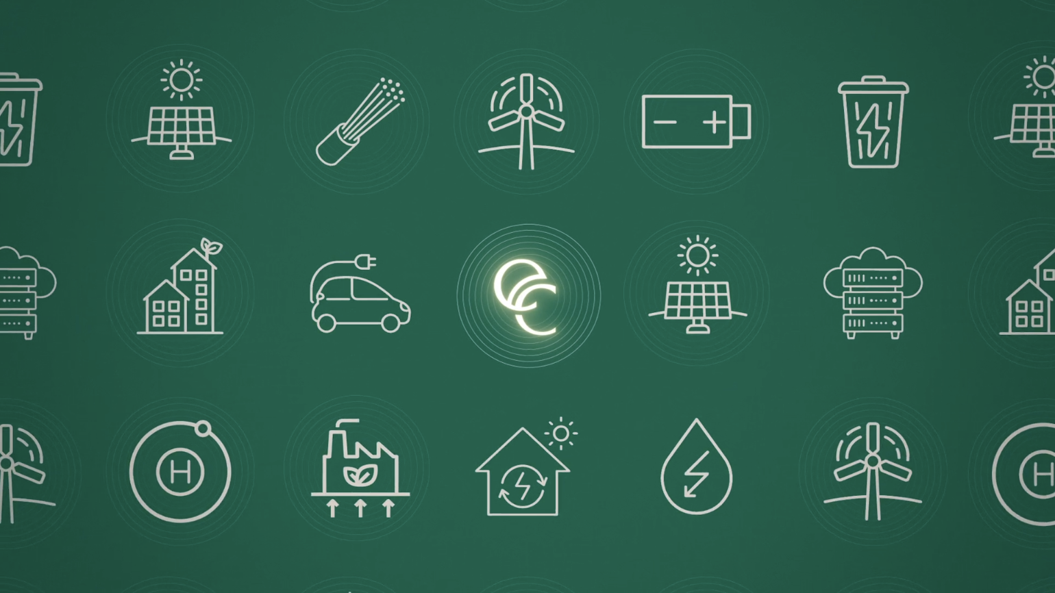
After our sketched scamps were signed off, we moved on to designing key style-frames to set the visual style and tone. To compliment our clean and sophisticated approach to the brand aesthetic, we decided on simple elegant key-line iconography and diagrams.
To find out more about how we plan, design and create animations in more detail, read our animation process presentation.
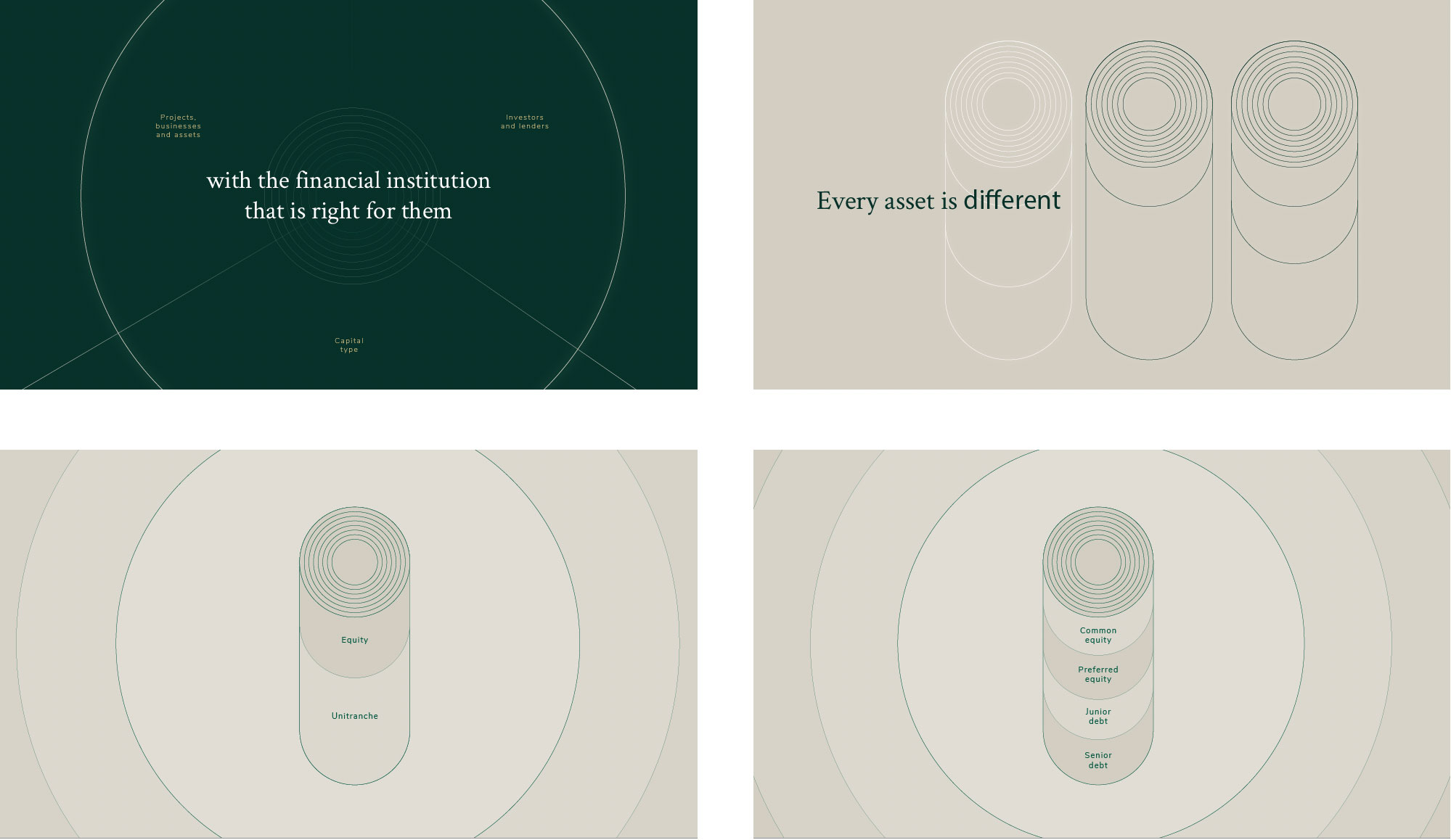
Bringing the racing green and gold palette together with the addition of a glow effect, and a red accent colour popping out of the designs at key points, the final piece compliments the modern luxurious aesthetic of the rest of the website.
If you’re interested in other animated movies and explainer videos that we’ve created you can see these listed on our tothepoint vimeo channel. Or even better, to find out more simply get in touch with us.