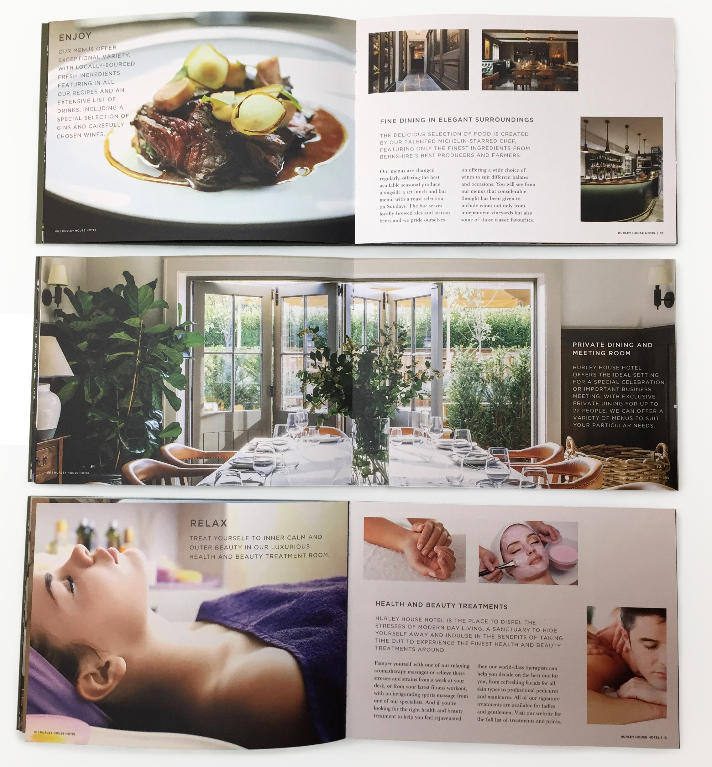
As with most luxury products the print solution is invariably a lesson in restraint, keeping it simple and letting the product sell itself. High quality imagery, with careful selection, is equally important in order to sell the lifestyle experience, which is the key objective.
Often overlooked, or left in the hands of the printer, is paper selection and in this instance we recommended Fedrigoni as their paper stocks, colour and texture options better matched the brand colours and aesthetic of Hurley House Hotel.
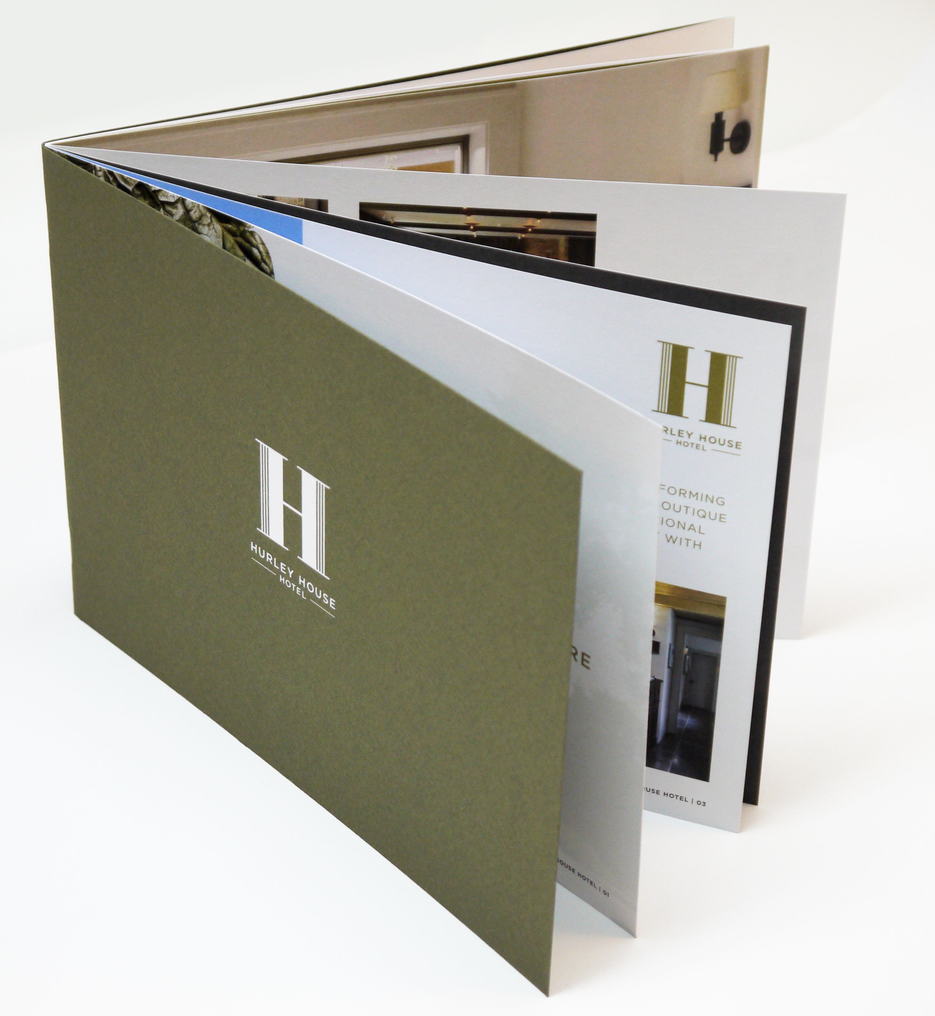
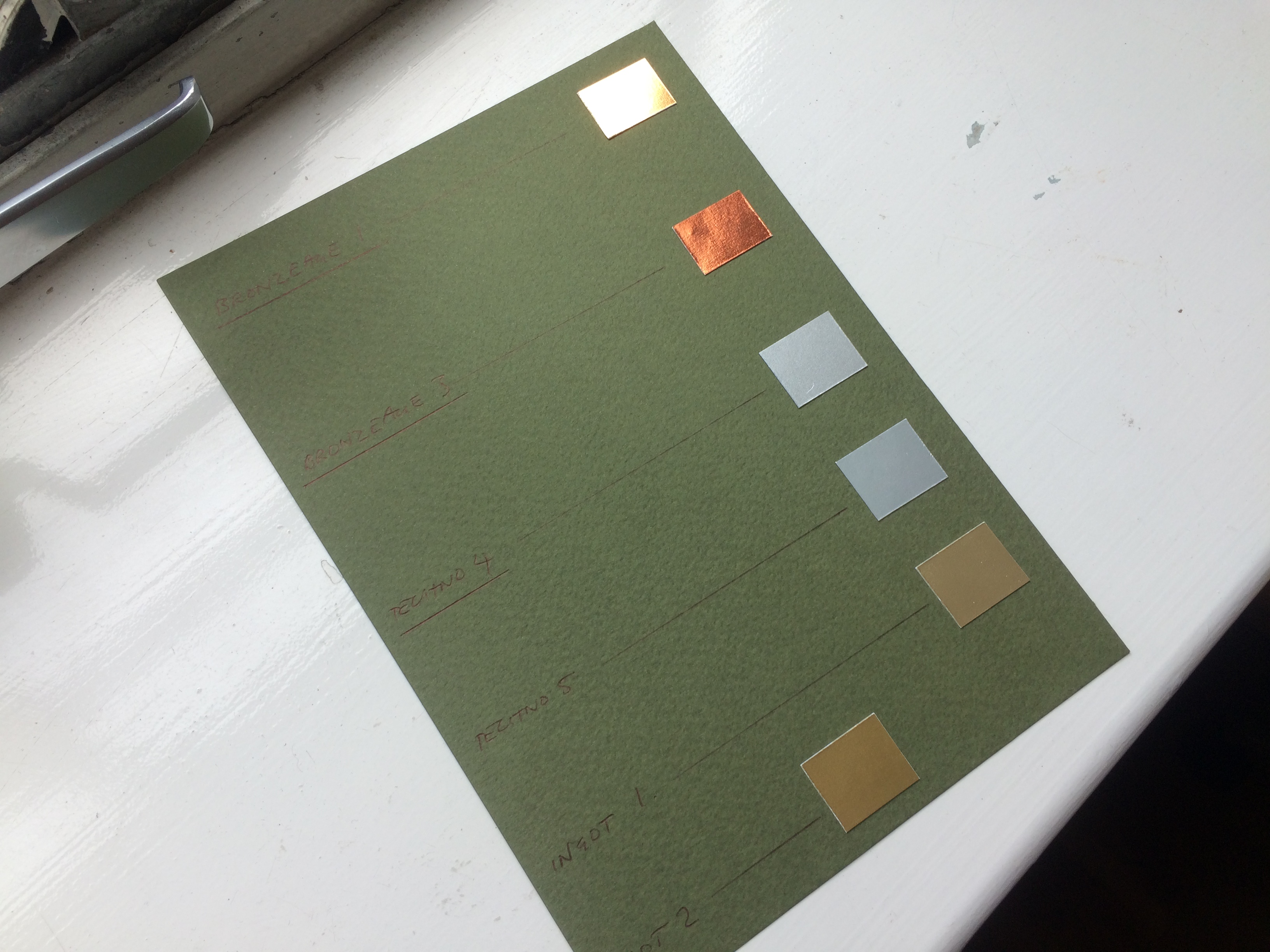
We also explored a number of print techniques with our client for the cover in order to elevate the product including, debossing, clear foiling, blind embossing but in the end our client’s preference was a metallic foiling of the logo. From the many metallic foil swatches our client liked both the silver and copper options in equal measure so we printed half the final quantity using the silver foil and the other half with the copper. We also ran up the colours on press to provide more ink coverage and density to give greater depth to the imagery and maximise their impact.
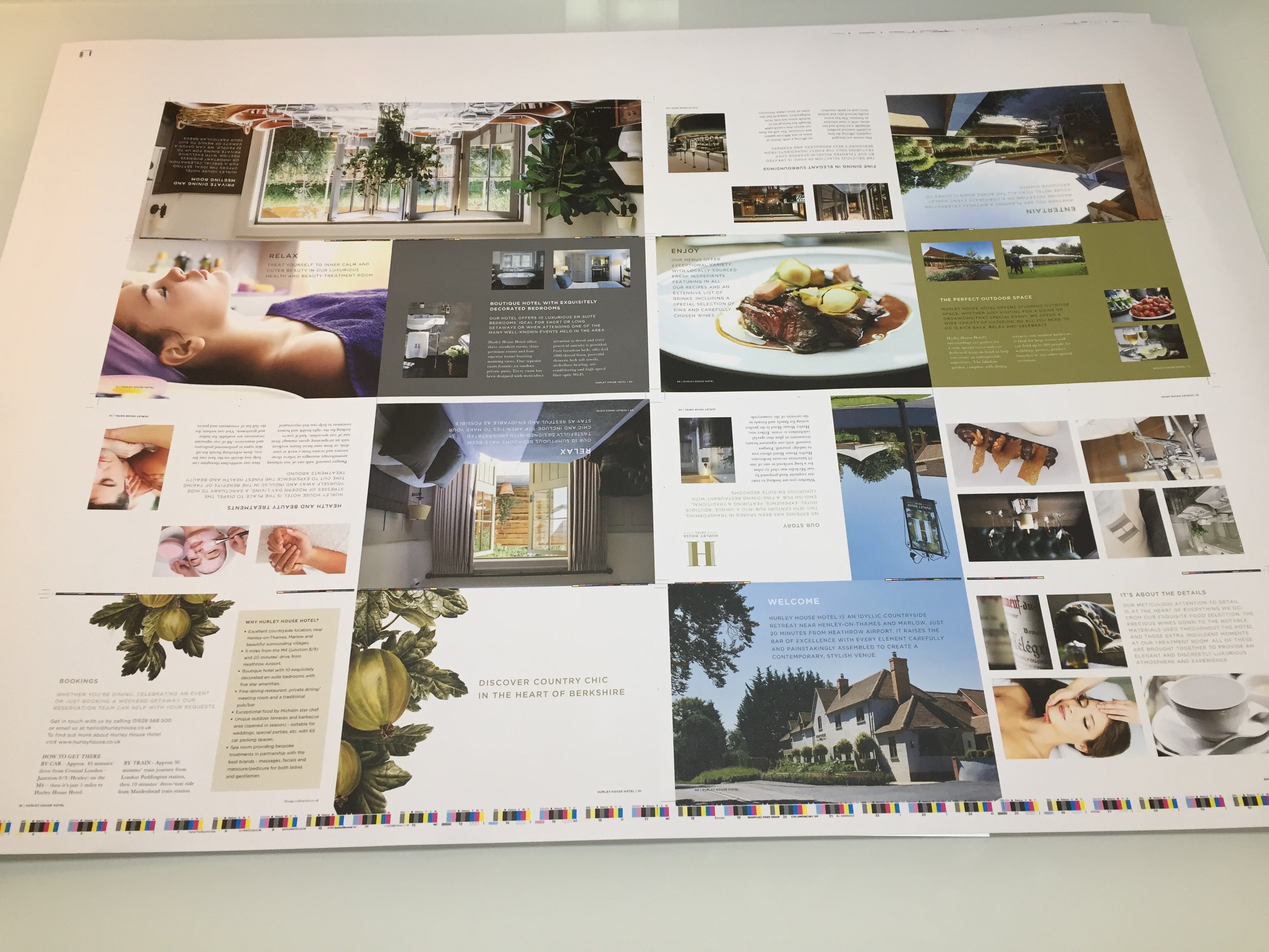
The final essential ingredient with high quality print is quality control, working with our printers to see running sheets and the final foiling before make up, to ensure standards are maintained through the whole process and not let down at the finishing stage. This attention to detail always pays off, whether for a luxury brochure or a standard piece of print.
The brochure is part of the far larger branding project for this luxury hotel near Henley which covers brand creation, stationery, signage, wayfinding, menus and website styling.