We recently undertook some jiggery pokery on a client’s ‘fixed size’ website to make it ‘responsive’. Nowadays, as you’re probably already aware, websites need to be ‘mobile friendly’. There are so many variants of screen size out there, not just mobiles, but tablets and all manner of laptops. The idea that a website can solely exist for traditional desktop screens is a thing of the past.


Our client’s website wasn’t just fixed width, but fixed height as well. This raises another ‘issue’ that some people still seem to cling on to, regarding the perceived ‘fold line’. As screens get bigger / taller / narrower / whatever, the idea that content can’t go below a certain measurement, or that users don’t like scrolling down pages, is a pretty old fashioned view.
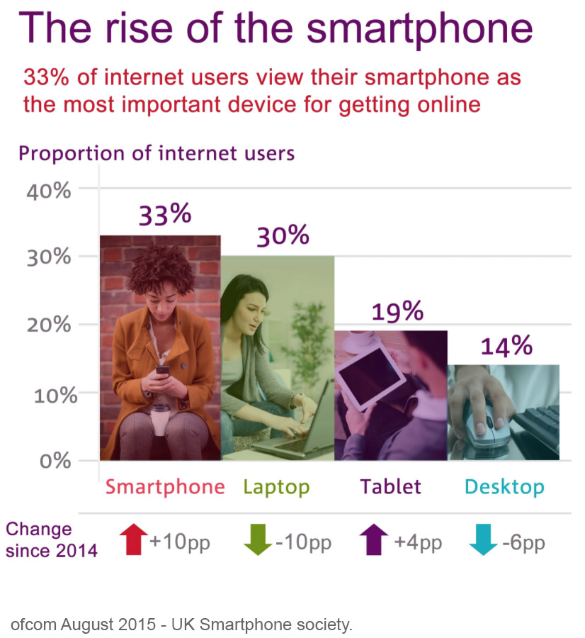
But today’s browsing habits go way beyond how deep your browser is. With the number people browsing the internet on mobiles set to overtake people using desktops this year, Google actually marks your website down if your site doesn’t respond.
We have to ask ourselves; how does this affect browsing habits? With users often ‘on the go’ when browsing online, their attention span is even shorter than ever. They want to find what they’re after, and fast.
So, is your website flexible and fast?
Obviously, we can help with a ‘quick fix’ that helps your website behave on a mobile phone. But is that enough? Is the key messaging visible? Is the navigation system lucid? Can people see the BIG BUTTON and is it inviting?
For bigger websites, you can’t simply stick ‘bandage’ on and crowbar it into a mobile view. You need to think of mobiles and desktop layouts together. The content can be the same, but the hierarchy should change to suit the device and create the best user journey. This takes a little more time of course, but with some intelligent design, it’s well worth the effort. And Google will love you for it!