We are no strangers to the property world (see here some of our previous works), and our work with Croydon Bid over the last few years (see more here) with local knowledge and experience, coupled with our place making marketing for Croydon, meant we were well placed to contribute valuable elements to the marketing of Purley to potential purchasers and UK and overseas investors.
So after an initial meeting we were delighted when they asked us to help them with their creative challenge: to create a memorable brand identity, brochure and sleek website for their 40 studio and one bed flats, ahead of their UK, Dubai and Hong Kong launches.
What’s in a name!
The first challenge was the naming. It turns out ‘Lofts’ is not an approved name on the lists that Croydon Council hold for street and building naming. Our MD took on this challenge and after several calls and emails to the Council, and the Fire Brigade (who wrote the original recommendations), it was clear that Lofts did not pose a safety risk and was a more accurate and contemporary description of the units than other proposed names. If at first you don’t succeed…don’t give up!
When inspiration hits!
Our initial source for inspiration was the building itself, split across 2 floors and a mezzanine, which played a key visual role in conceptualising and designing the logo. We were also inspired by the bold feature aperture windows which add character to the building, using their striking shape to add more visual drama to the layouts.
![]()
![]()
From concept to brochure, how we brought it all to life
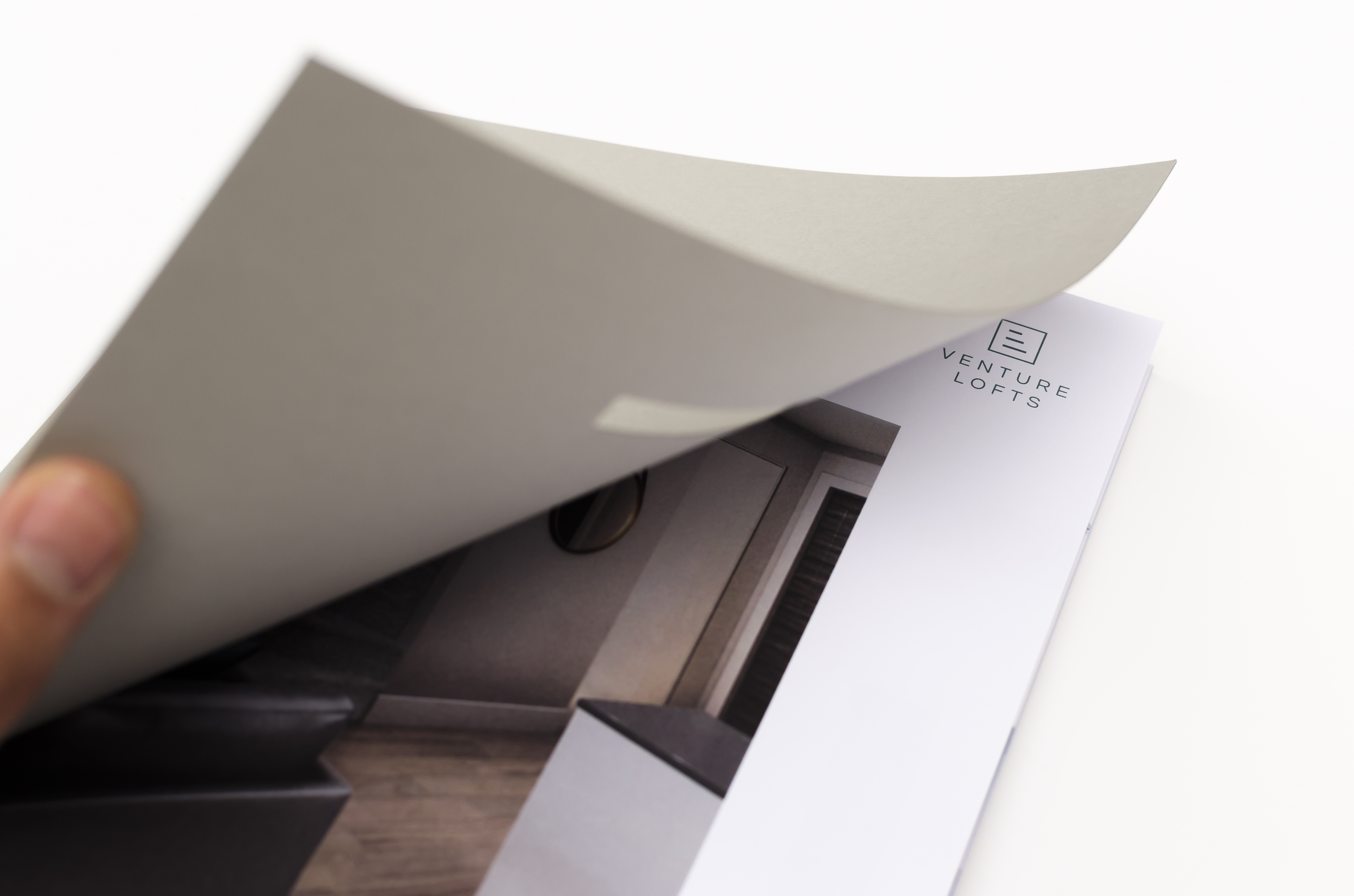
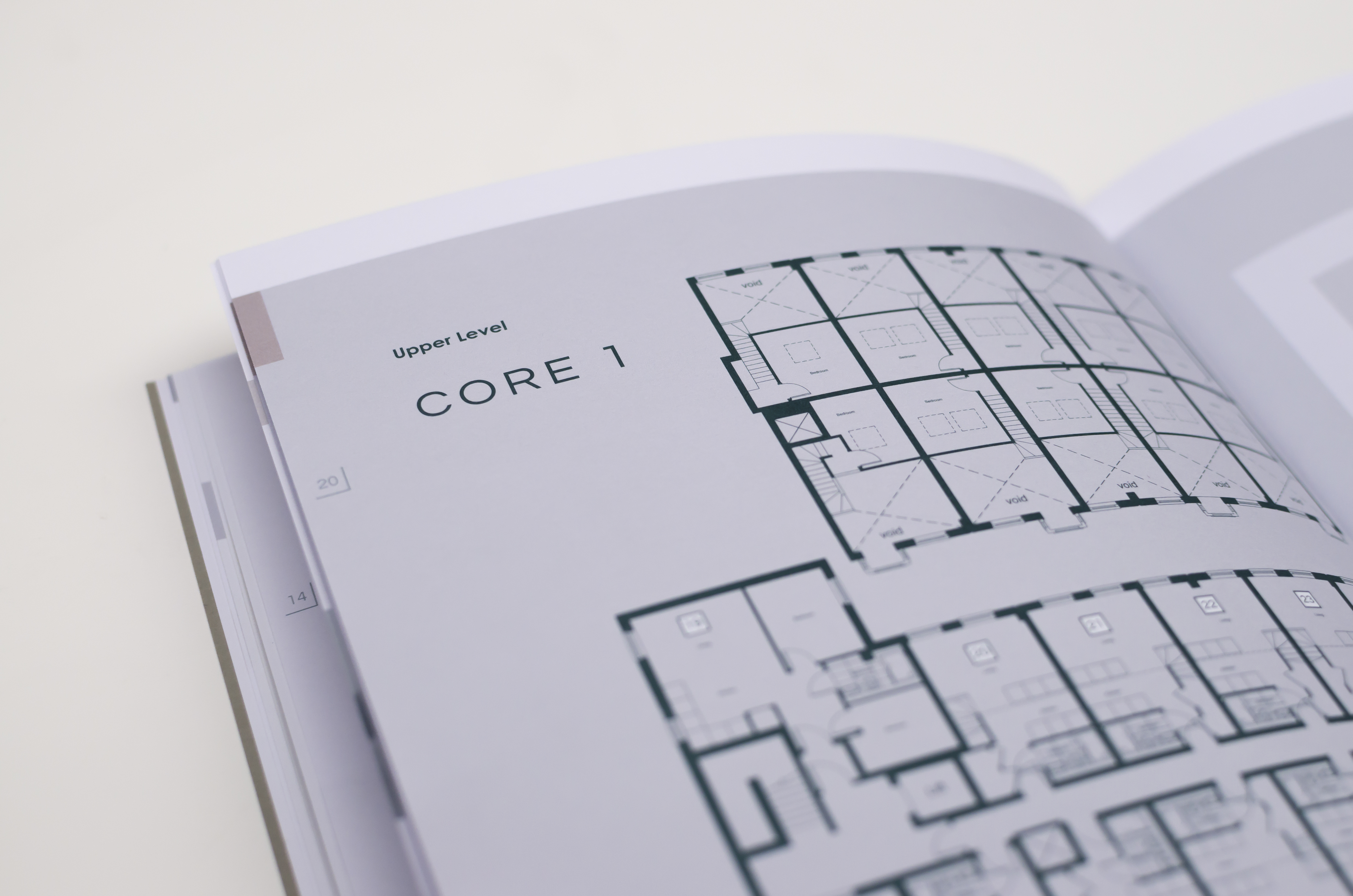
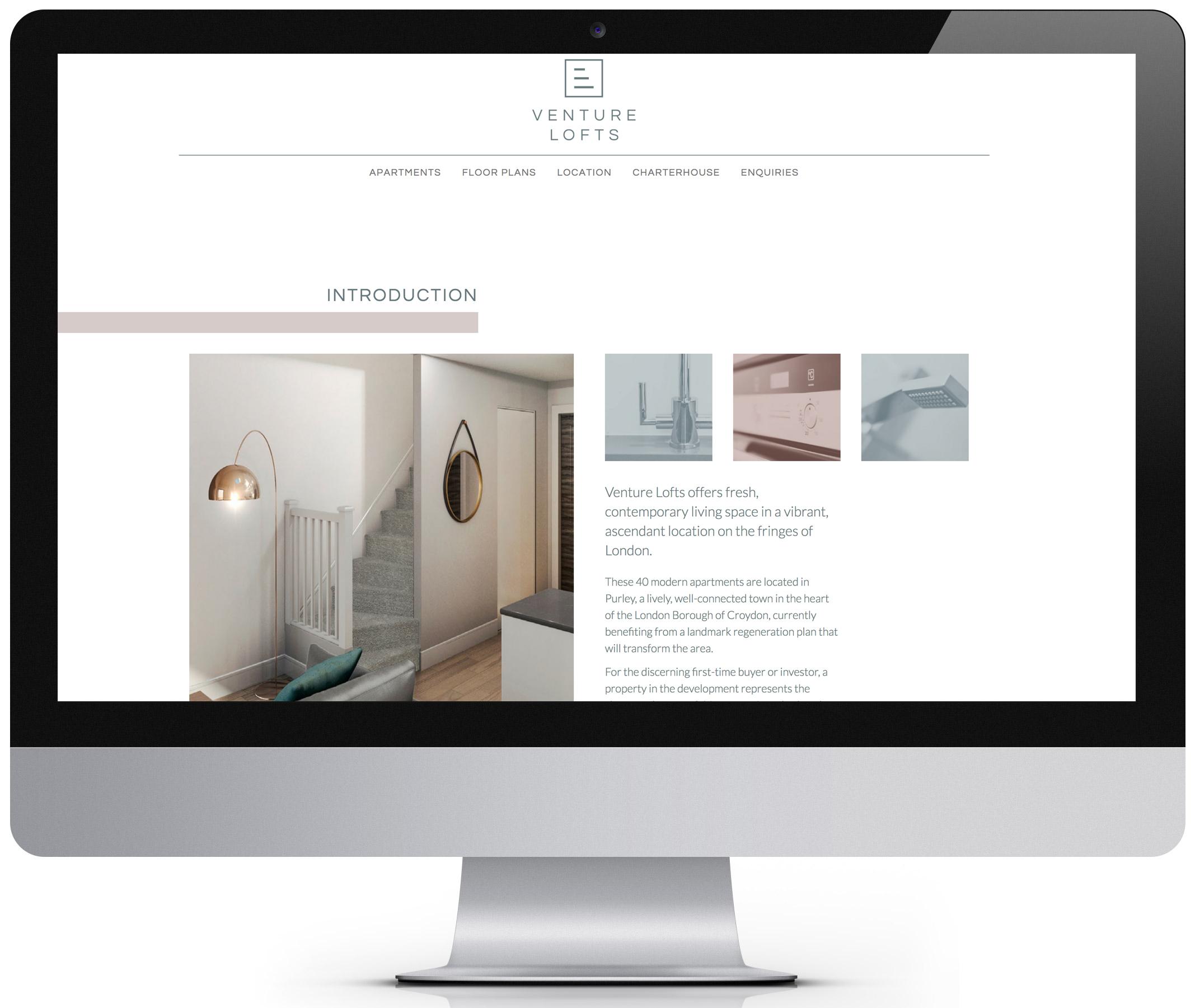
The brochure design and layout for Venture Lofts reflects both the brand mark and the distinctive features that relate to the building. The general look and feel panders to both a young professional target audience as well as appealing to foreign investors.
The intentionally minimalist, abstract cover works on two levels. It evokes a sense of high quality, reinforced with the GF Smith Colourplan stock, whilst the die cut rectangular lozenge shapes pay homage to the unusual rooftop periscope windows that provide vistas over Purley. The lozenge shapes are reinforced throughout the brochure and are combined with a minimal stone, slate grey and brown colour palette that reflect both the interior and exterior of the building.

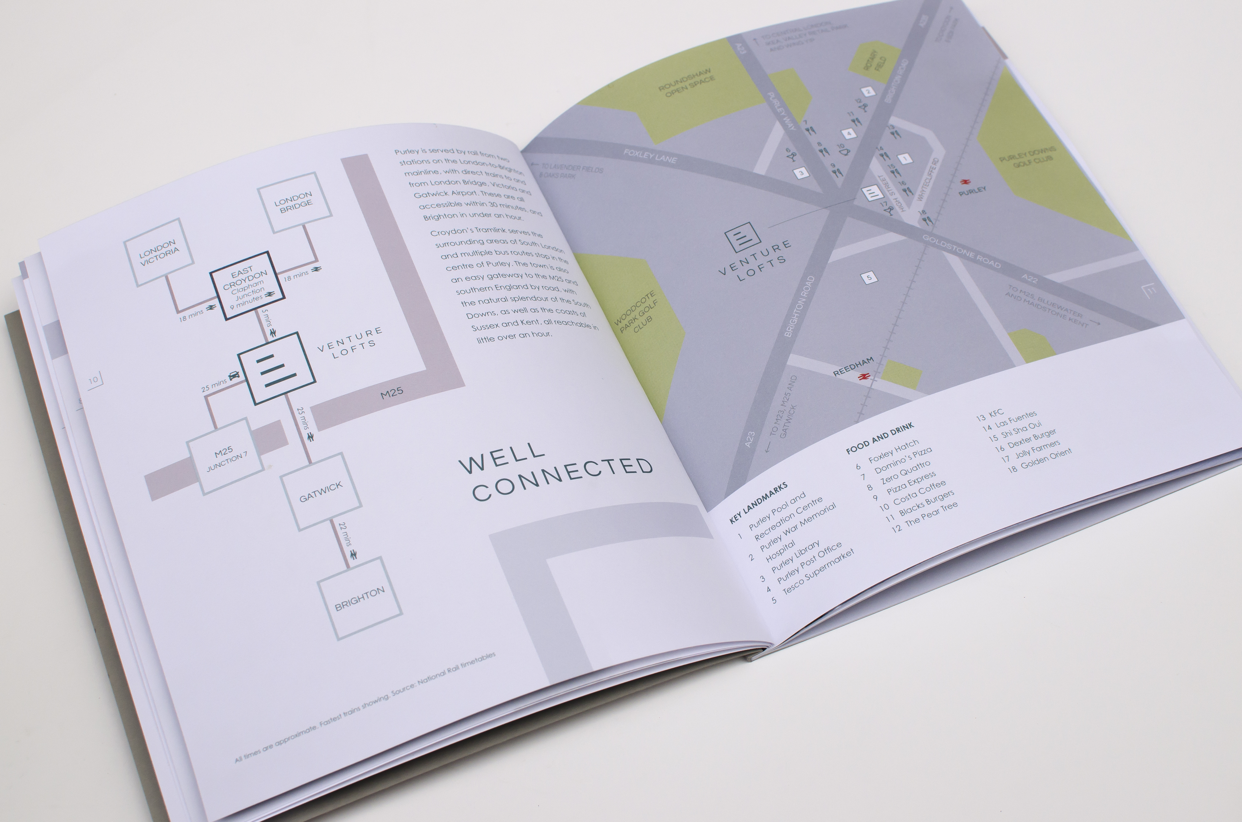
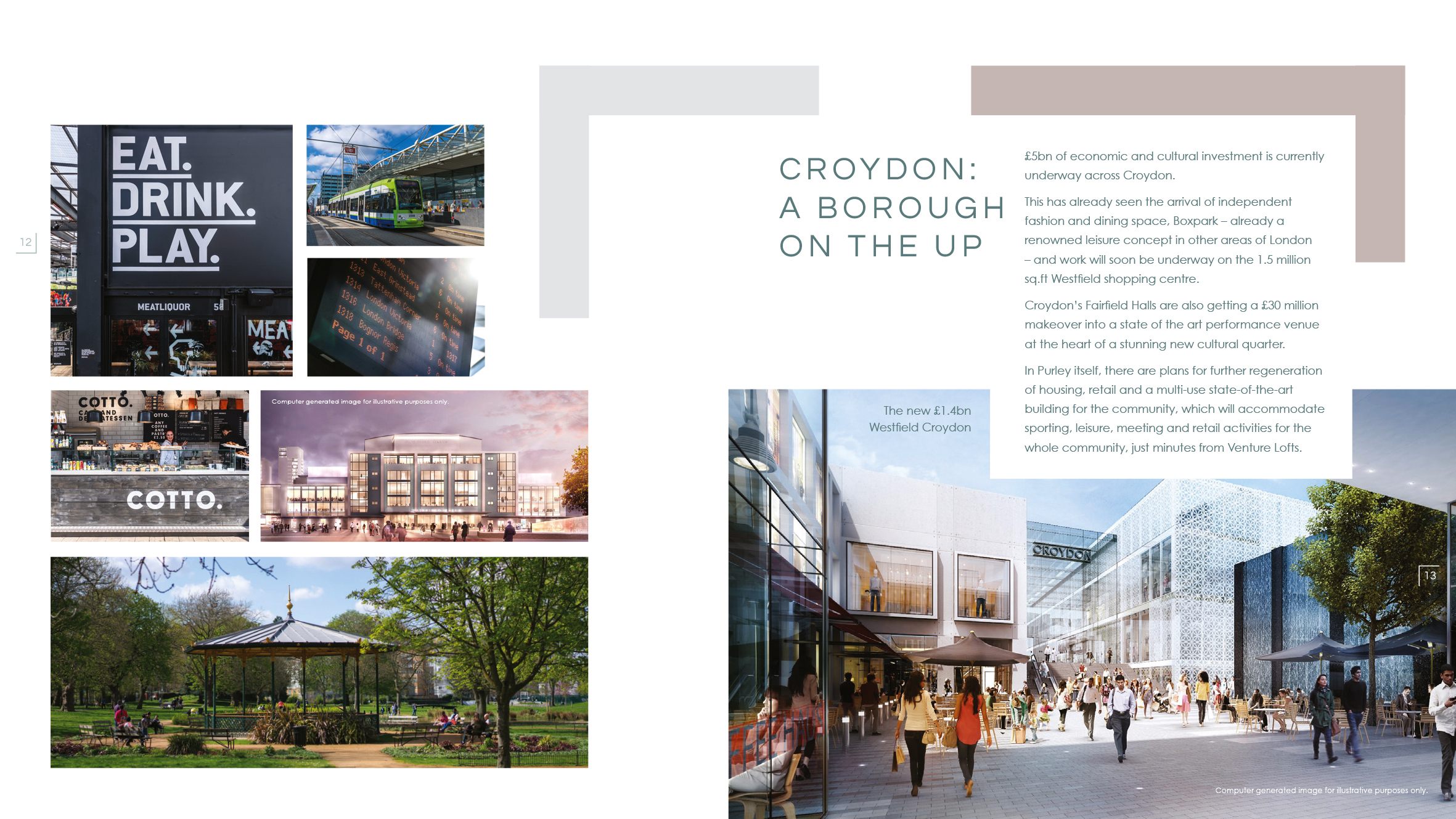
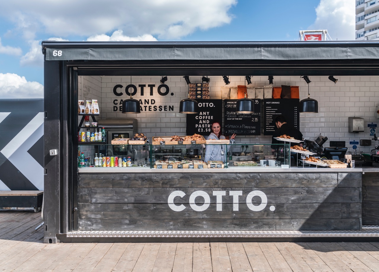
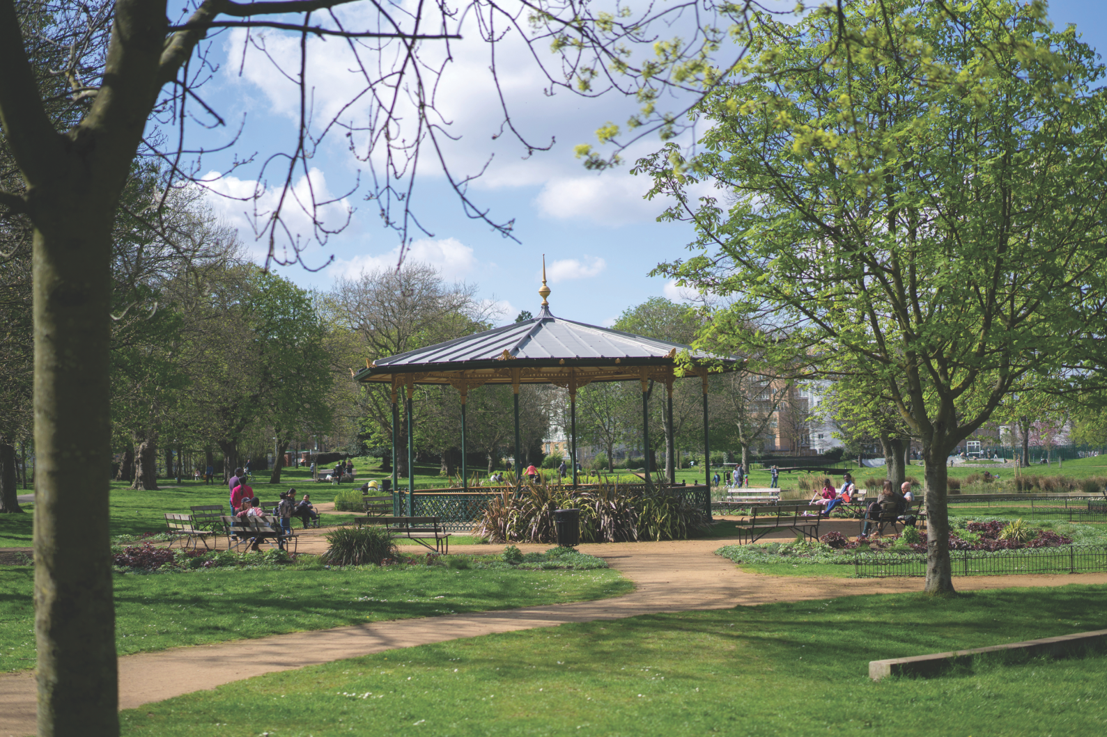
Capturing the surroundings
We also commissioned bespoke photography of the surrounding areas of Croydon and Purley, from the green outdoors to the intimate restaurant and bars, showcasing the local amenities and places of interest that make this a vibrant location.
Taking it online!
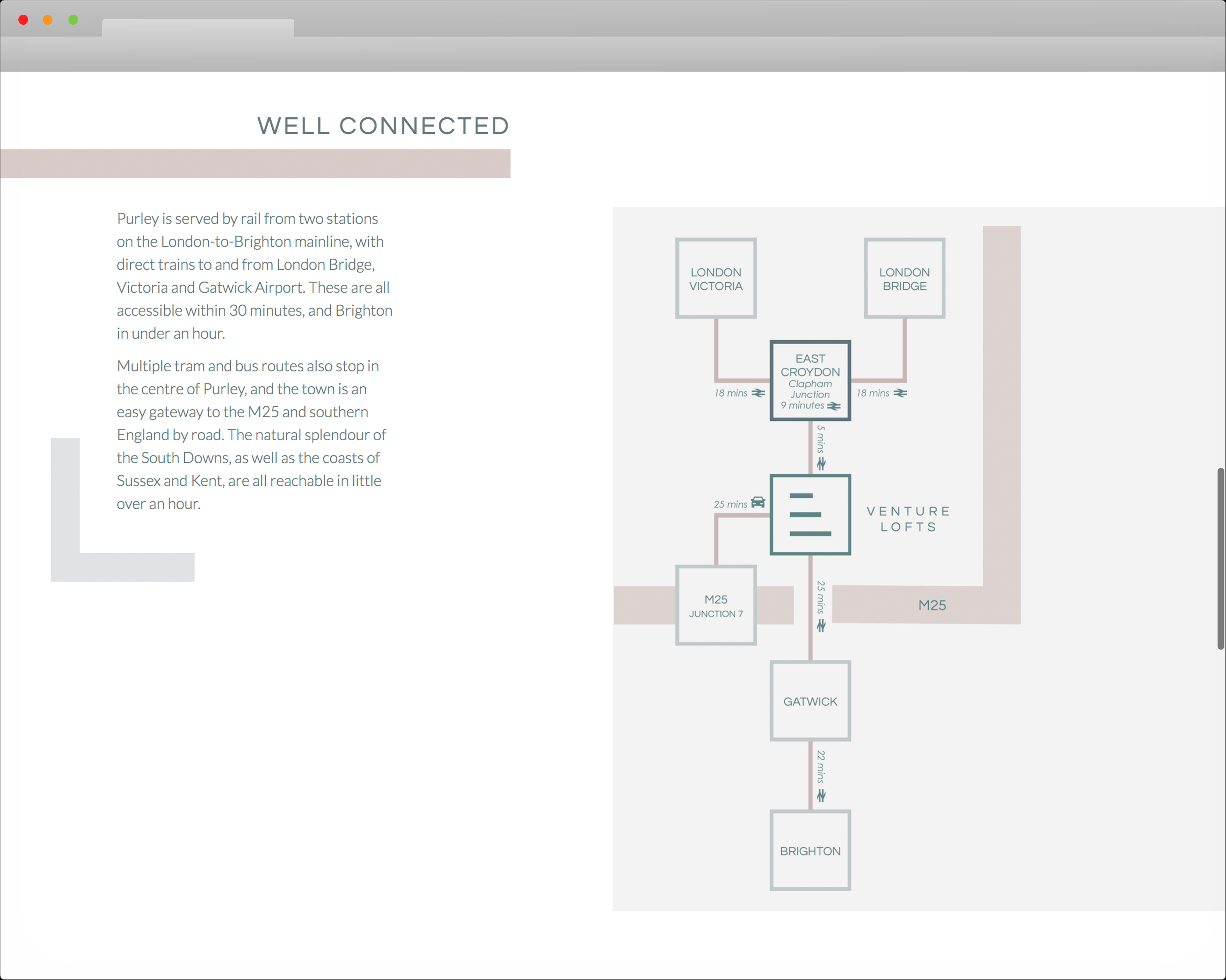
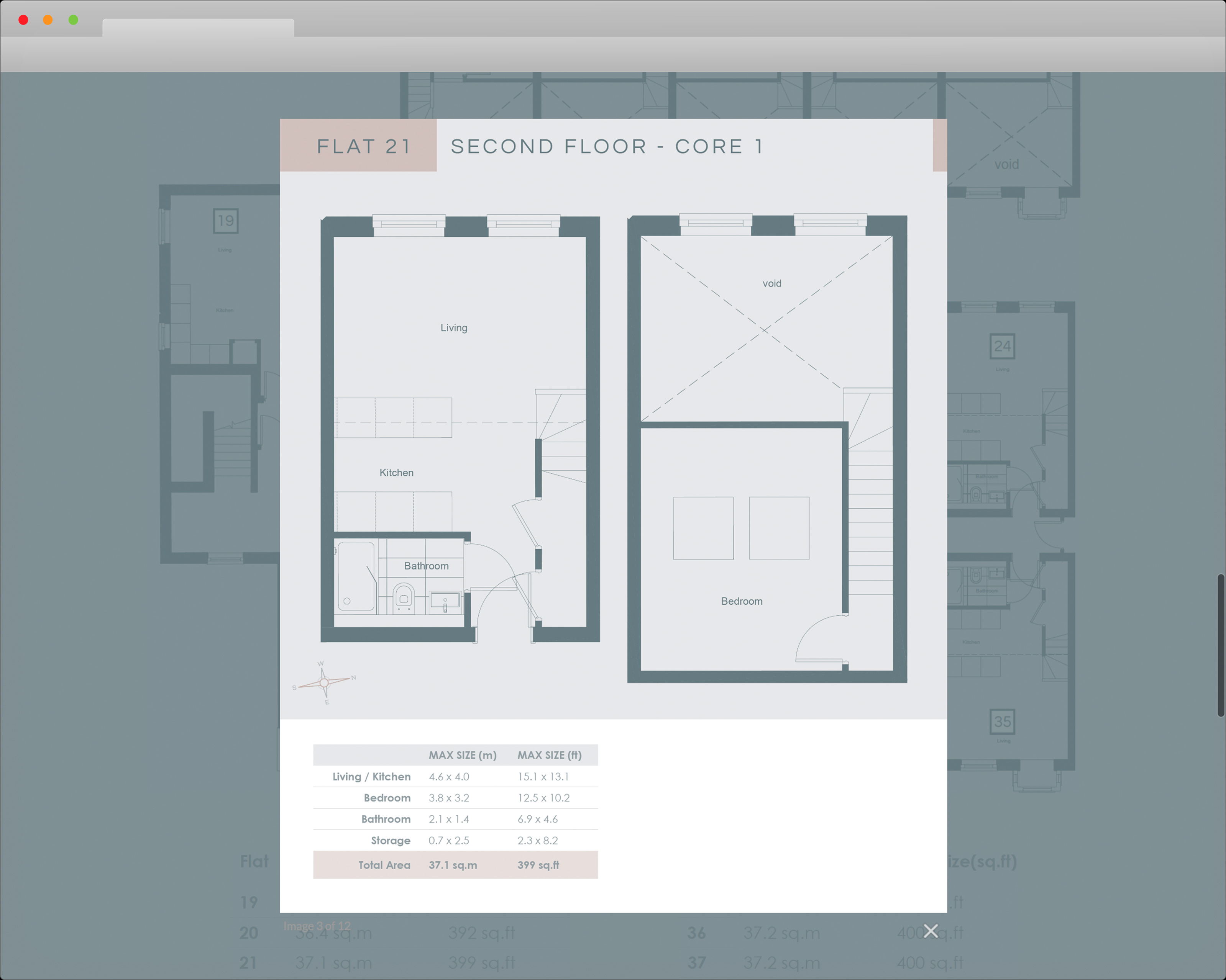
We then carried the visual identity through to the website where we used eye catching asymmetric and “broken” bootstrap layouts, with smooth animated transitions, highlighting key information and content dividers. You can see it all “in action” here.
Ready, set, launch!
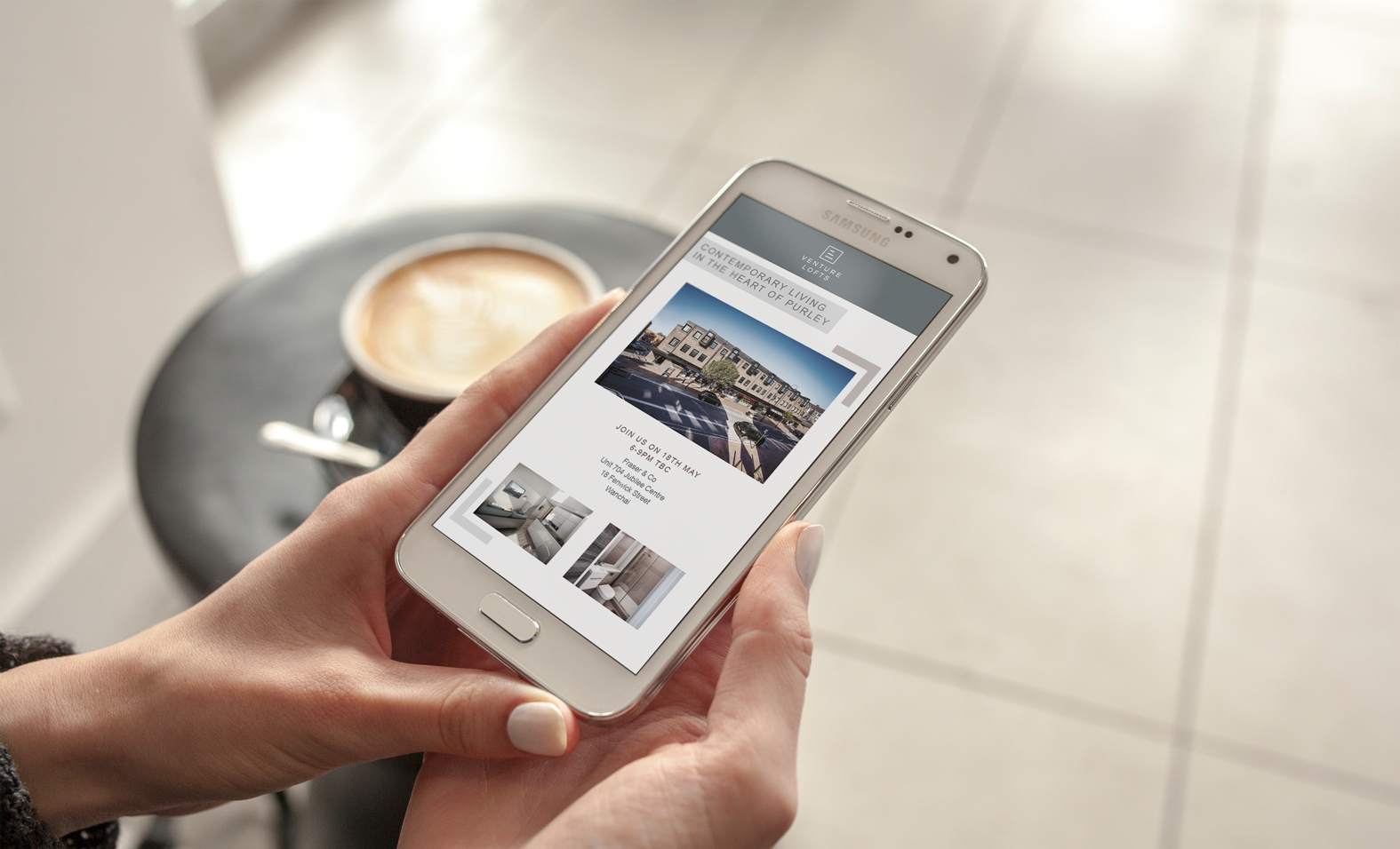
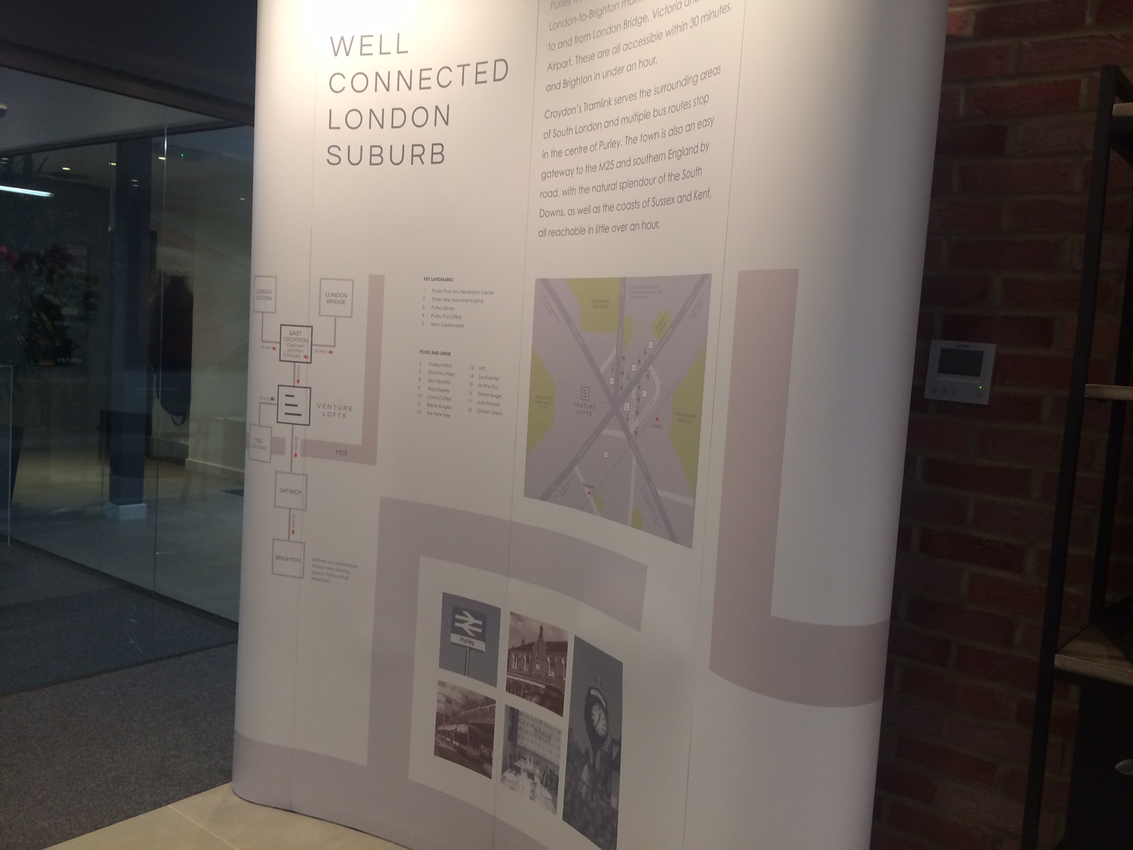
For the local and international launches, we designed and built a bespoke e-newsletter that was sent out to more than 250,000 users to generate awareness about the new development. In addition to that, we also designed the marketing panels for the events that took place in London, Dubai and Hong Kong. We wish Charterhouse success with the sale of these units and look forward to working with them again soon.