NICE PowerPoint
We’ve recently finished our first project for the nice people over at NICE. Not popular with many designers, PowerPoint is often blamed for putting people to sleep or there have been claims of death by PowerPoint. Here at tothepoint we know this is more often caused by the content and design rather than the programme. With good design and short engaging content, PowerPoint really can help people communicate their messages quickly and efficiently. We are believers in our namesake – keep it to the point – keep it simple, clear and concise. And there are enough tools that you really can design clean, considered slides that have impact and can engage. It won’t ever be as good as the Adobe suite and it can’t make a poor communicator a great orator but it can help teams at every level. For us Powerpoint has opened many doors as a starting point to understanding a business and their message and we then help communicate this more clearly across various touchpoints, from print and digital to the workspace environment.

NICE has some great content but needed some consistency and guidance for their teams. They now have the master set and are testing for large screen presentations and for print. We believe for on-screen presentations the slides should be dark with less large white areas that can strain peoples eyes. And for one-to-one and printing we recommend a flip set with white backgrounds. We’ll hopefully be showing more of the work we did for them next month but the above is a taster.
Serving Croydon
The first of our designs for Croydon Bid and Croydon Council to help reinvigorate the night time economy are up on CheckoutCroydon.com. We’ve been working hard with the team at Croydon Bid, and their new marketing and communications manager, Ali Wratten, on this year’s ‘Street Live’ branding and marketing to promote a series of events that will run throughout the summer in the high street.
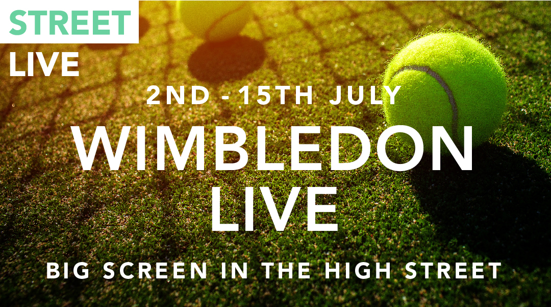
As part of this, Wimbledon will be shown live on the big screen in the high street and this will hopefully draw in the crowds who can then sample some of the great food, drink and entertainment offers that can be found in and around the location. Should be great fun but lots more to come that we will reveal in next month’s enews – checkout the website we designed a few years ago and see what else is happening in Croydon. And with John Lewis now confirmed as the anchor store for Westfield it really is going to be all change Croydon… get down there #ttptryit
INSIDE OUT
Sometimes when we are working on a campaign or brief there are ideas we just love but they don’t get used and stay inside our creative vaults. This is probably because all our ideas are so good it’s difficult for our clients to choose just one. Anyway, this month we just wanted to get one of these ideas out, one that we all loved and are likely to put up in our studio for the summer. For us it really captures the colours of summer, the buzz, the choice, it looks great as a poster and, as always with our work, behind the image is a strong idea. Would be great to hear what you think and if you can work out what it represents… another what do you see

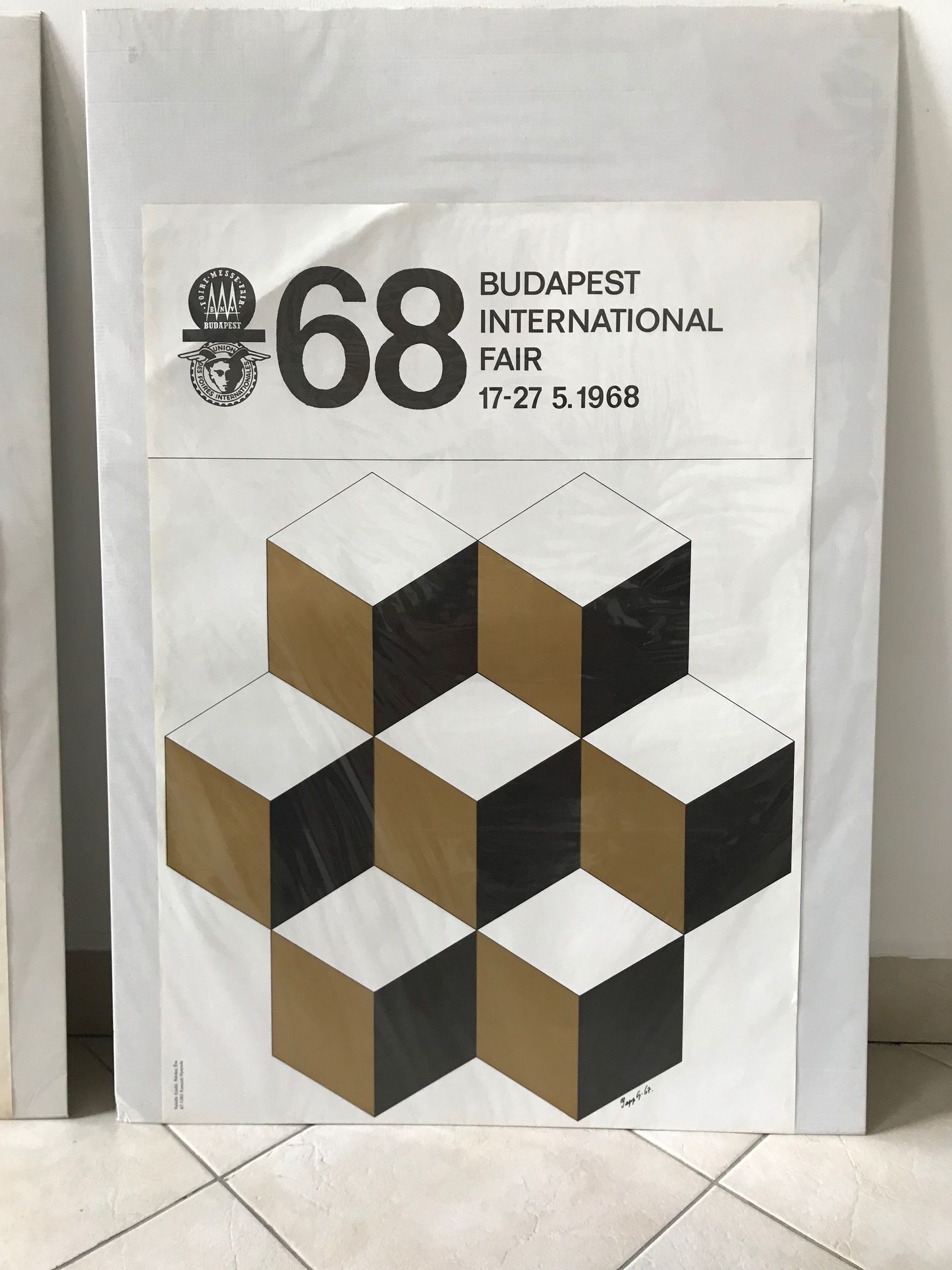
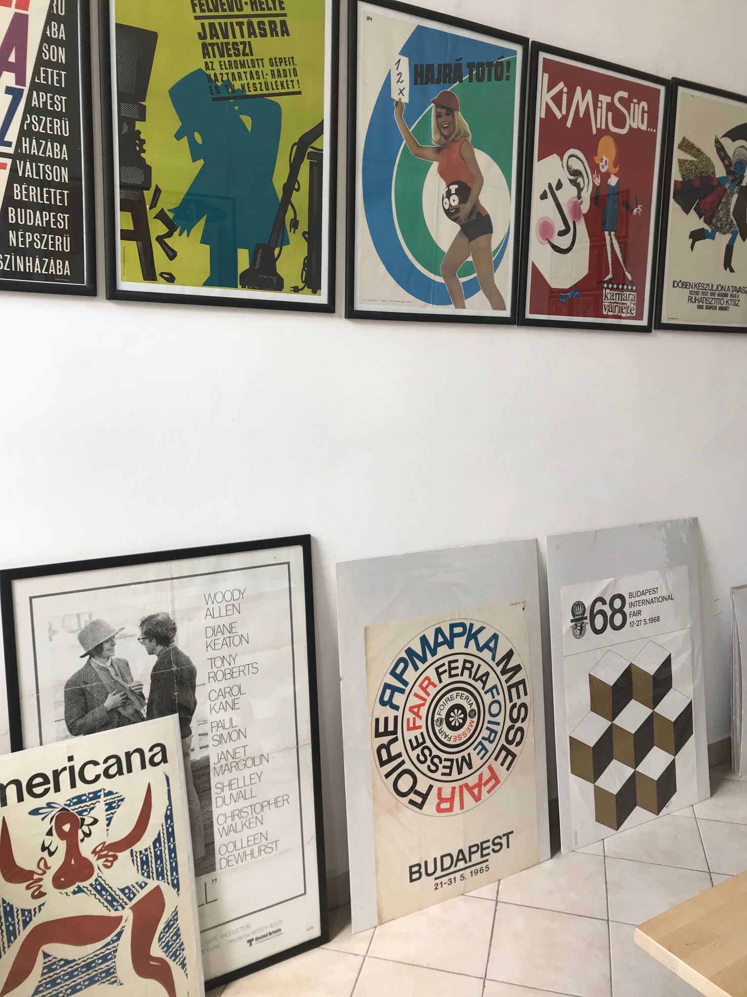
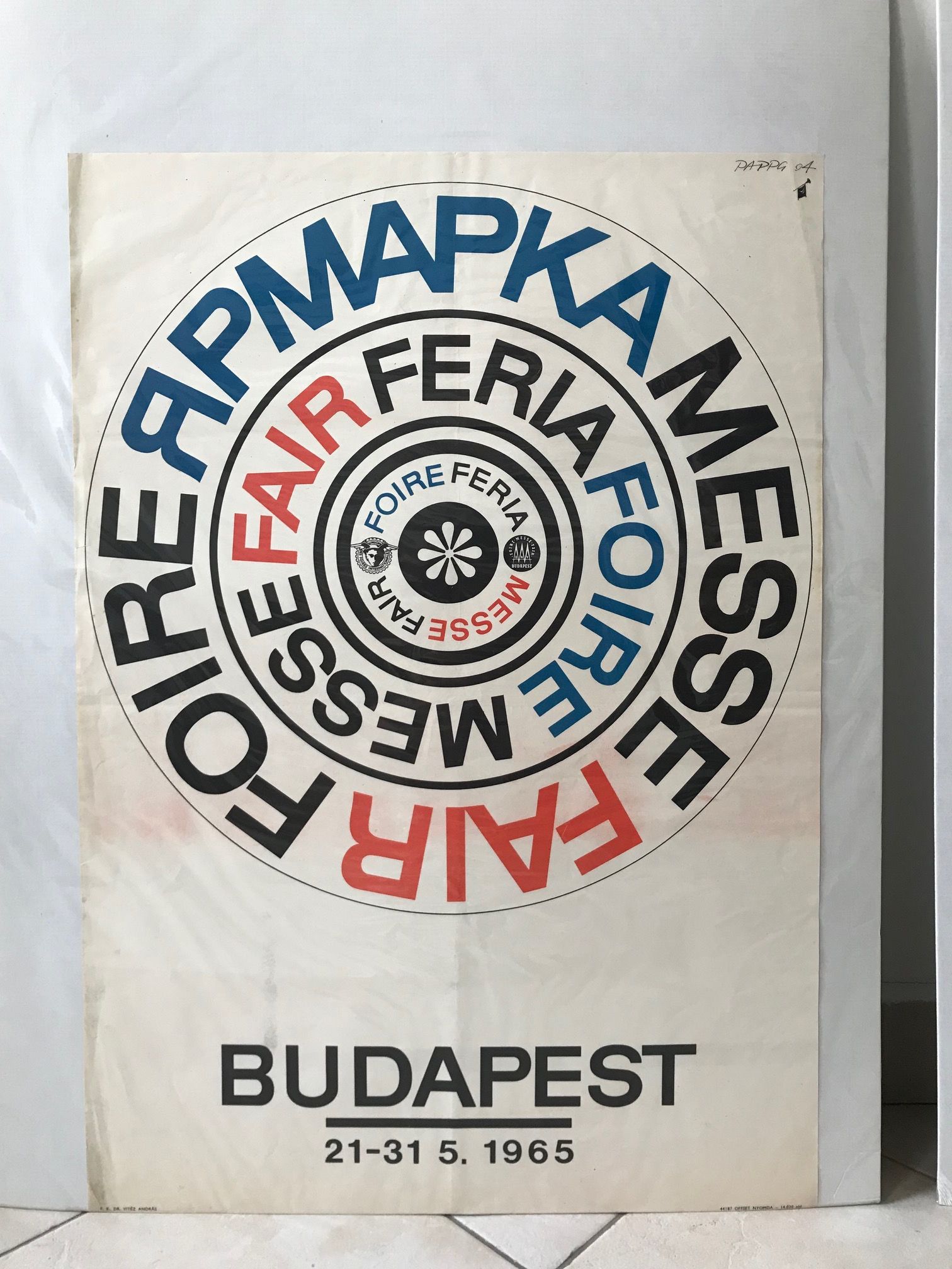
Budapest
Over the long weekend, our designer Lena headed east to Budapest. She found inspiration in the interesting mix of architecture from art nouveau to socialist, lively street art, and a bustling night life.
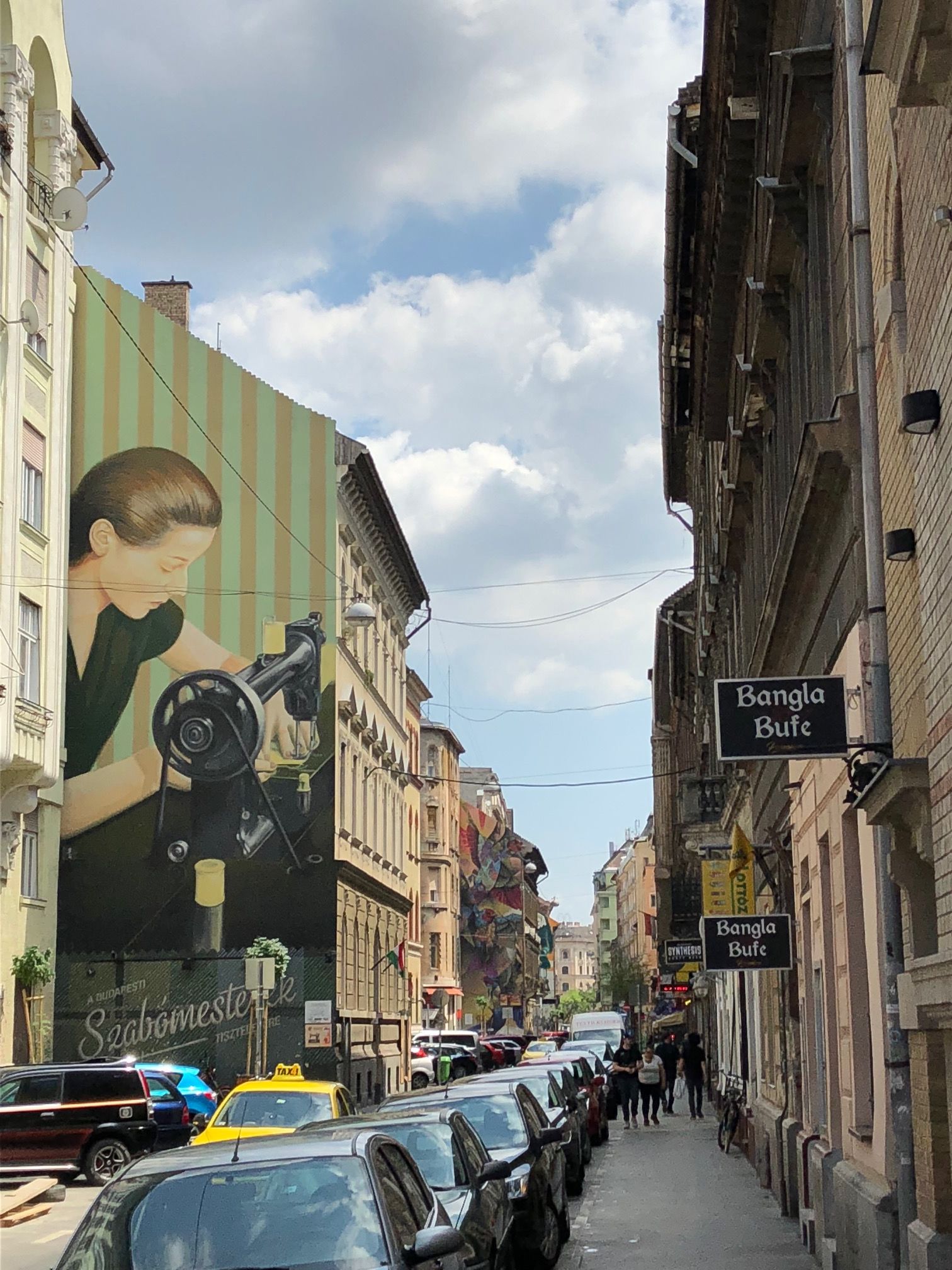
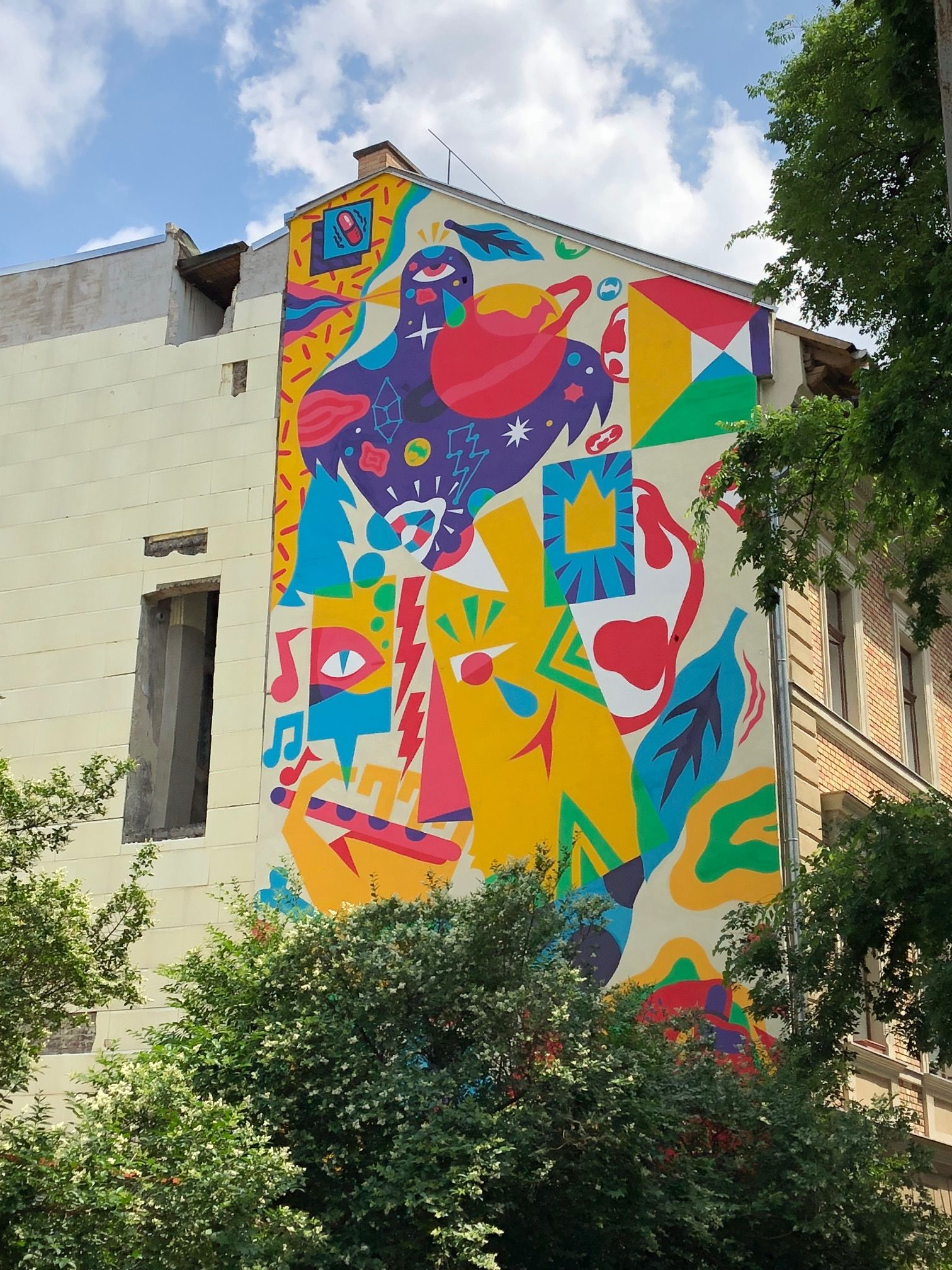
Split by the River Danube, Buda on the left bank is home to lovely Buda Castle, Fisherman’s Bastion, and the Citadella. The view across to the right bank and the stunning Hungarian Parliament building is best enjoyed atop the funicular. Pest is a fascinating blend of old and new, with what used to be the Jewish quarter now a trendy downtown area filled with graffiti murals, restaurants, clubs and Budapest’s famous ruin bars.
Lena stumbled across a Hungarian poster gallery filled with vintage treasures.