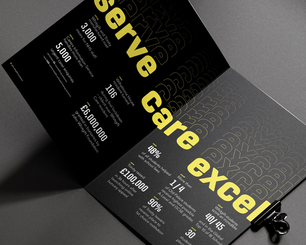
Having rebranded the John Whitgift Foundation in 2019, we were given the opportunity to apply the vibrant, typographic branding we created to their 2020 Annual Review, with the key focus being on how the charity demonstrated their core values of ‘to serve’, ‘to care’, ‘to excel’ more than ever after an unprecedented year replete with challenges due to the pandemic.
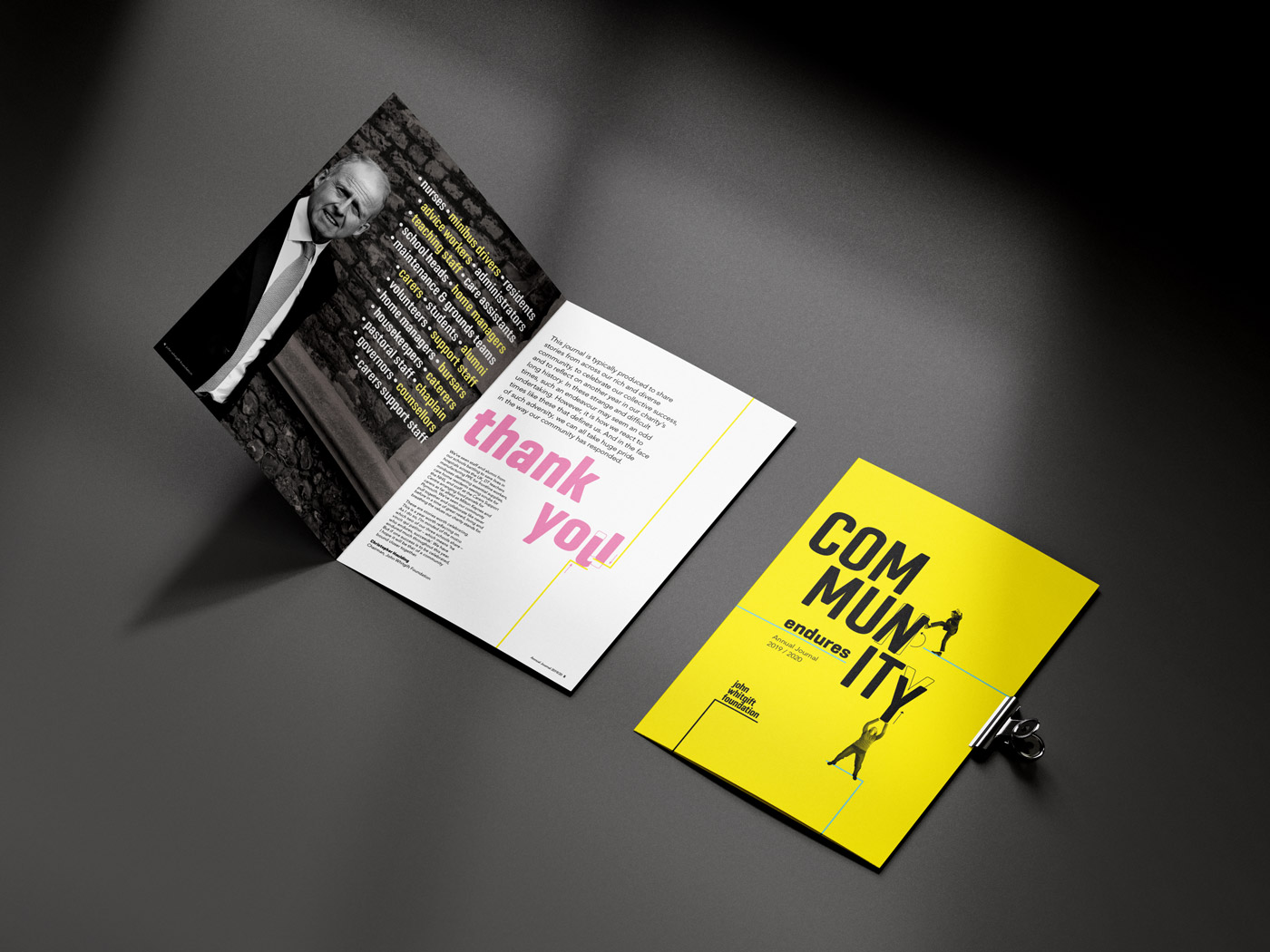
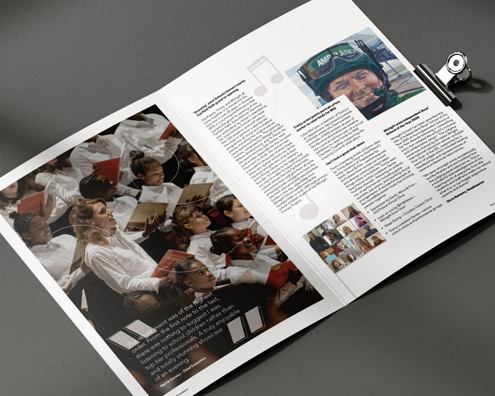
The journal is typically produced to share stories from JWF’s rich and diverse community, to celebrate their collective success and reflect on another year in the charity’s long history. This year, the journal shone a light on the ways in which the charity and community it represents banded together in the face of adversity and helped many of those in need. This solidarity and community spirit are worth celebrating at such times, and something that JWF takes immense pride in.
We felt that a design concept was needed to reflect this sense of endurance, and so we wanted to convey how the charity has helped to mend a community which has suffered so much from the pandemic – despite all the hardship, they have been there to put the pieces back together. This was achieved through the use of typography interacting with people photography, showing how parts of the community that have become broken or damaged due to the impact of COVID are being mended and put back together by the Foundation and its work. The use of photography interacting with typography brings an energy to the Annual Review, and as with most things during the pandemic and the challenges we have all faced, it conveys the idea of how we can all do our own ‘little bit’ for the benefit of the whole community.

Celebrating 425 years
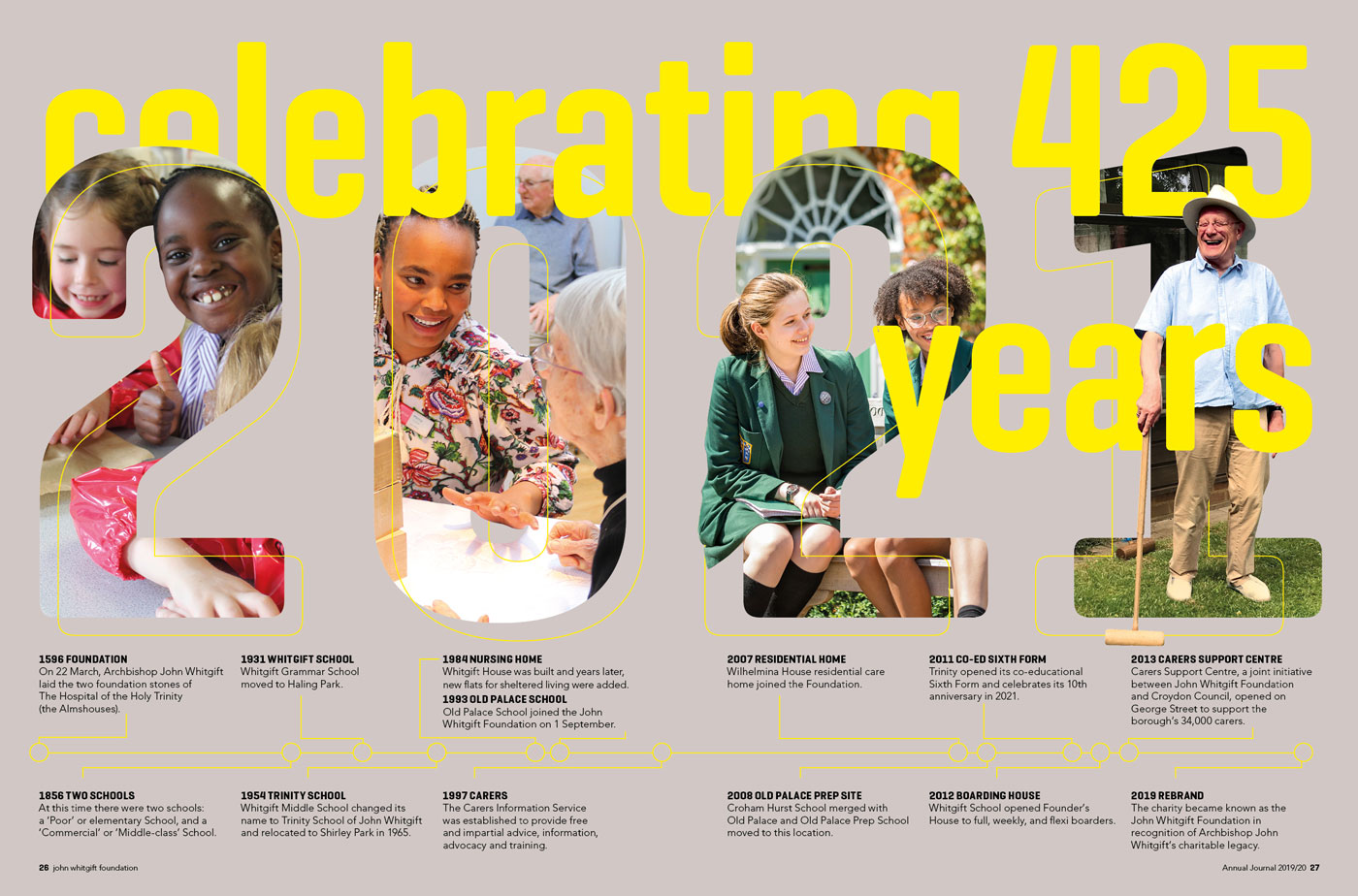
This year also marks the charity’s 425th year. To showcase the charity’s rich history, we included a double page spread timeline which lists the major milestones spanning 425 years, really giving the reader a sense of JWF’s longevity and all that they have done for the community.
JWF is also running various events and campaigns throughout the year to commemorate this momentous birthday, which includes their ‘Grow with John’ campaign which will be the biggest community project in their history! This project aims to support the community by promoting the health benefits of gardening, whilst also creating a lasting legacy for the Foundation.
We worked on bringing this campaign to life through graphics and animation – you can read more about that here.
Catherine Shirley, Head of Marketing and Communications, John Whitgift Foundation, said:
“Another brilliant project delivered by To The Point to showcase how the Foundation and its frontline education and care services have pulled together throughout the pandemic, not just internally but to also support the local community. The striking and bold typography and succinct copy writing that interacts with the images adds great appeal for the reader. Great job!”