Background
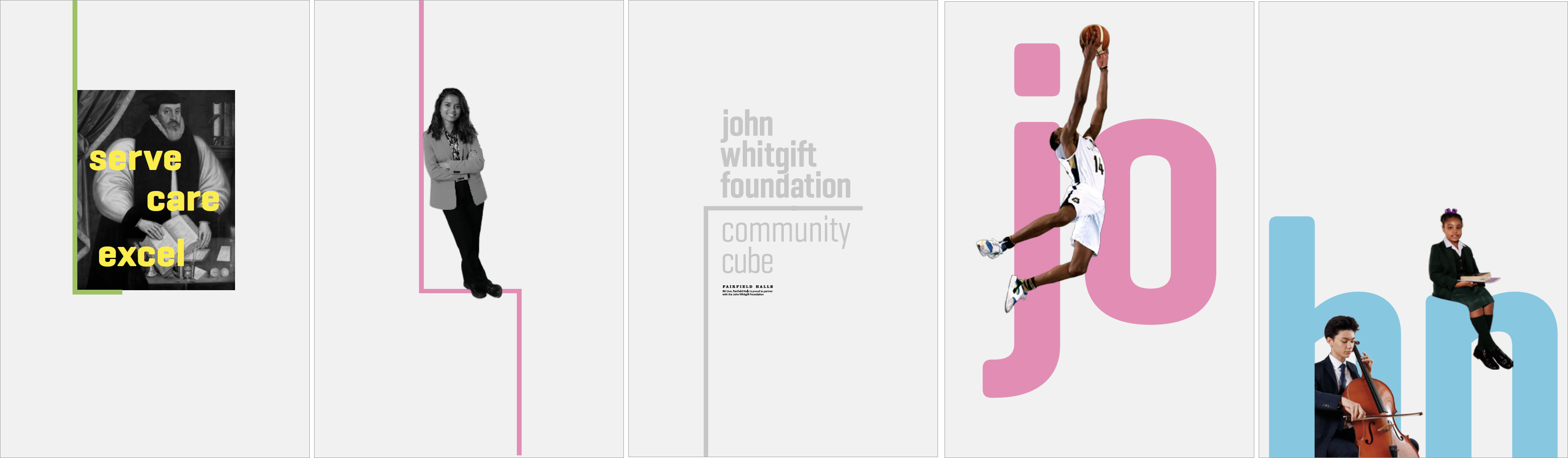
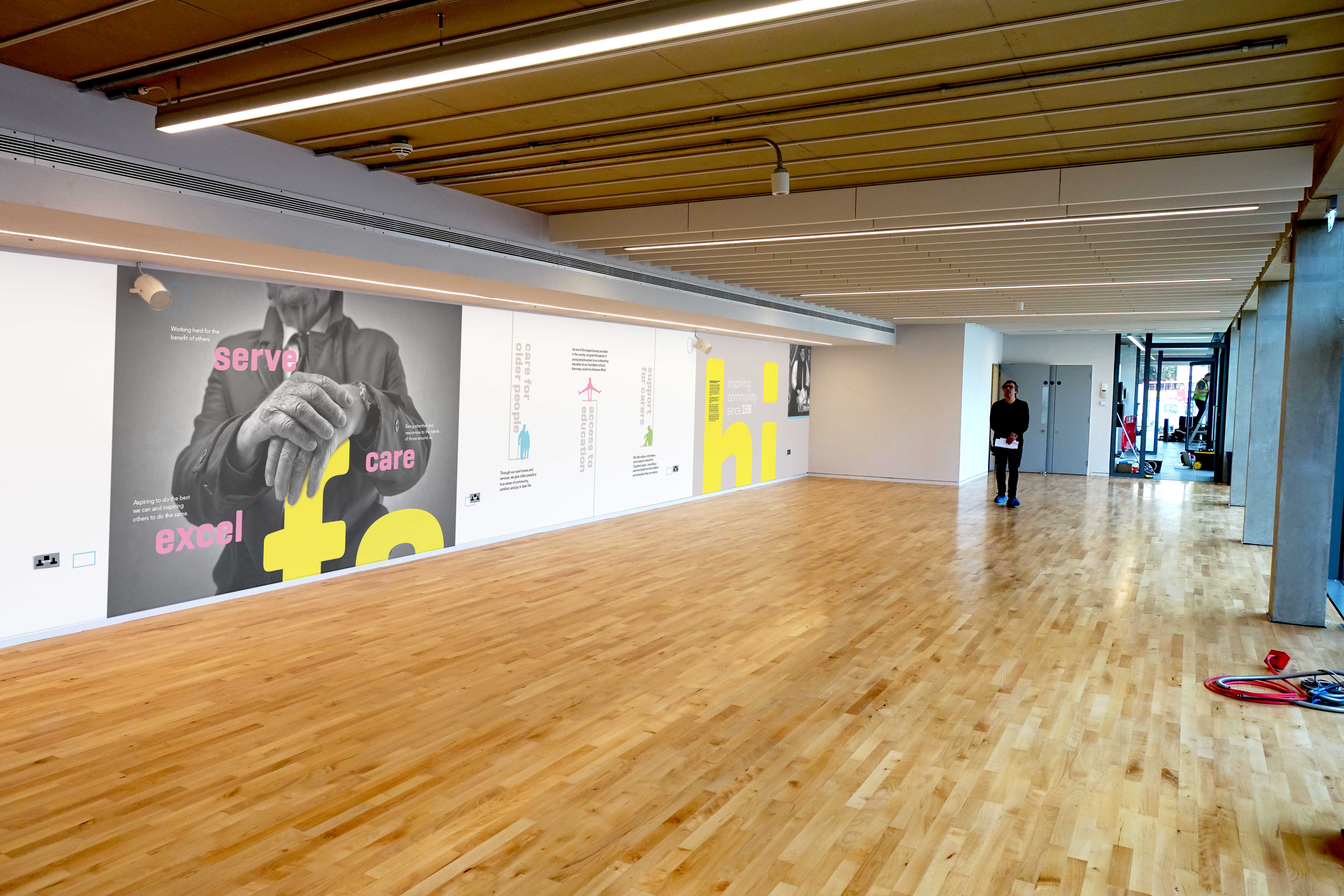
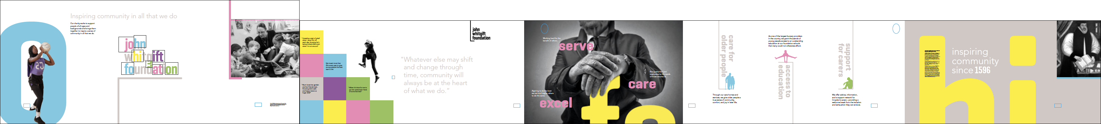
In 1596, John Whitgift embarked on a mission to educate and care for the people of Croydon. Although some of the work carried out by the Foundation would be unfamiliar to him today, the same ethos and values that drove him then are the same ones that drive the charity today. In a world that is increasingly focussed on self interests, with a lack of understanding and compassion for the vulnerable or the needy, the values we have defined for the Foundation, ‘to serve’, ‘ to care’, ‘to excel’ are as relevant today as they ever were, with community at the heart of everything it does.
As one of the largest bursary providers in the country, John Whitgift Foundation grants thousands of young people access to an outstanding education they could not otherwise afford. Through its care homes and services, it gives older people a sense of community, comfort, and joy in later life.
And by funding the Carers Information Service and Carers Support Centre, it provides vital support for the thousands of people across Croydon who care for a partner, child, parent, friend, or neighbour.
This was an amazing project to be involved in. I’ve lived in Croydon for most of my life and went to a John Whitgift Foundation school, so I’ve seen first-hand the ways in which this incredible charity transforms the lives of people from all walks of life. This provided powerful inspiration and led us towards a bold visual concept that could unite all the different ways in which the John Whitgift Foundation serves its community. It’s an adventurous step for the charity, but with all the changes happening in the borough; it’s a timely one too. Simon Hutton, Managing Director of tothepoint, and a John Whitgift Foundation school alumnusThe workshop
After a series of workshops with key stakeholders, involving representatives from the various care and education services, we worked with our copywriter Rupert Bradshaw to formulate a strategy and clear narrative that communicated their relationship with each other and the Foundation’s vision, mission and values in a way that could be easily understood by the public.
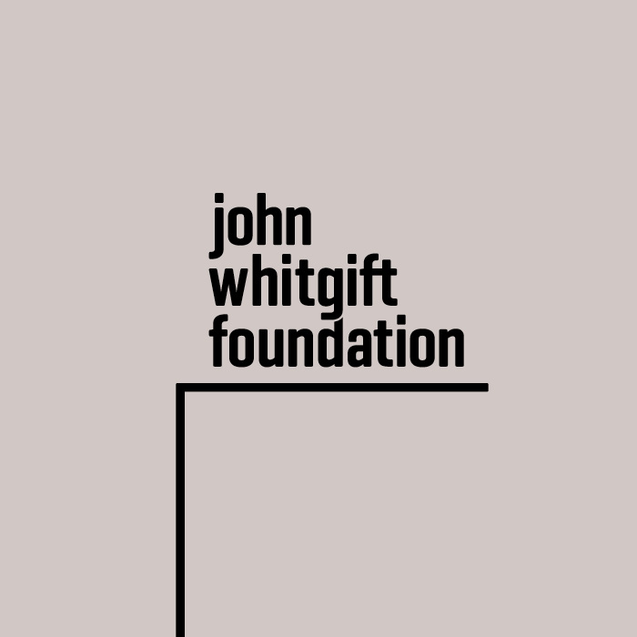
Modernising an historic brand is always an exciting challenge – finding that enduring purpose, that connects old and new. For John Whitgift Foundation, that connection is community. Because while a lot has changed since 1956, the values that drove John Whitgift then are the same that drive this charity today. That’s a powerful story.” We also established that most people were open to a more radical evolution of the brand, including changing the name to “John Whitgift Foundation”. Rupert Bradshaw, CopywriterThis change kept the brand family routed in its heritage and allowed for a more contemporary solution for the branding.
The brand exercise
Once we had established these foundations, we could then explore how best to tell the story, start to create the visual language that would accompany it and explore what the brand personality could be like. The key considerations of this exercise were how to present the organisation as forward thinking, whilst at the same time remembering the importance of its past. We also needed to create a brand that could be dialled up or down to allow the various organisations, with their different personalities, objectives and audiences, to become advocates that were happy to sit and operate within it.
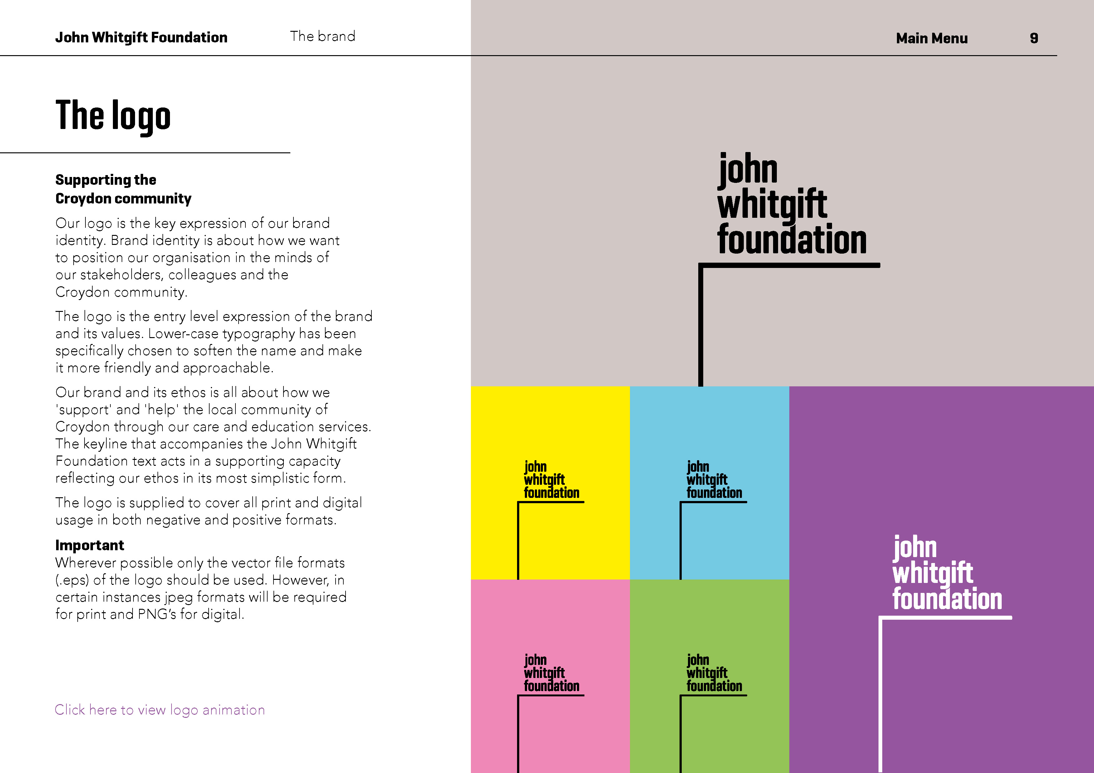
The brand icon – support from various directions:
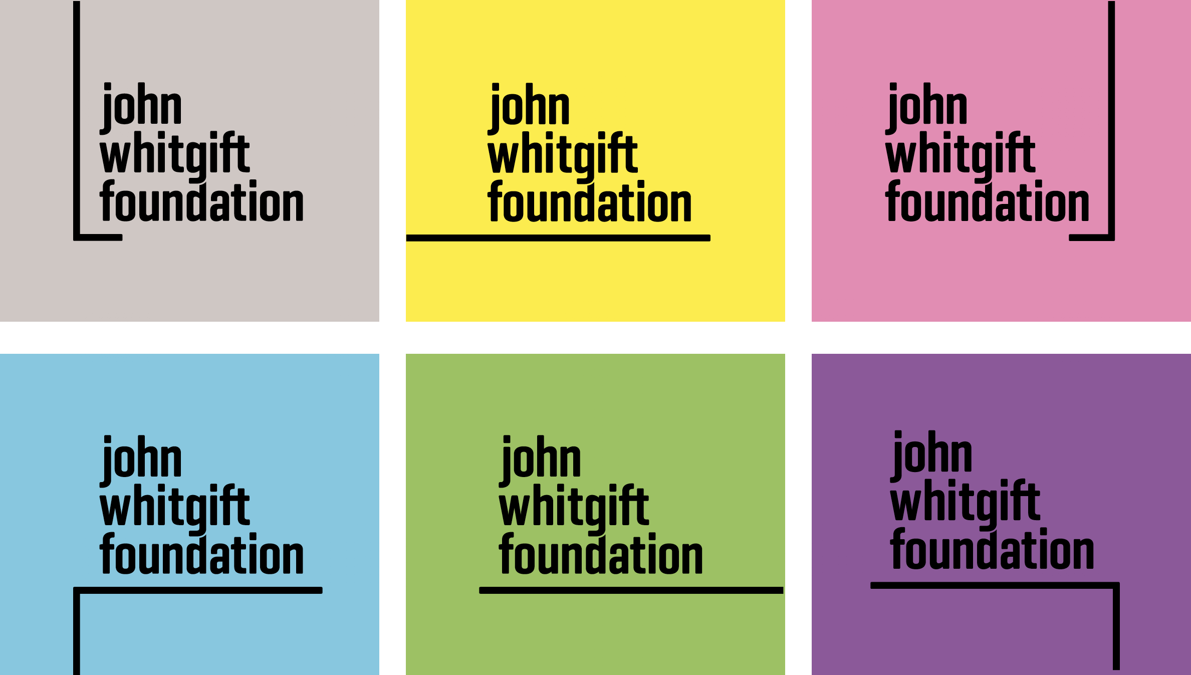
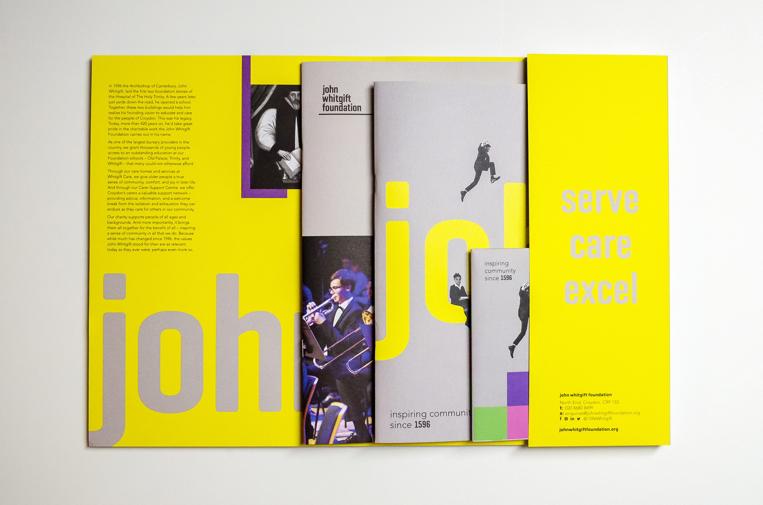
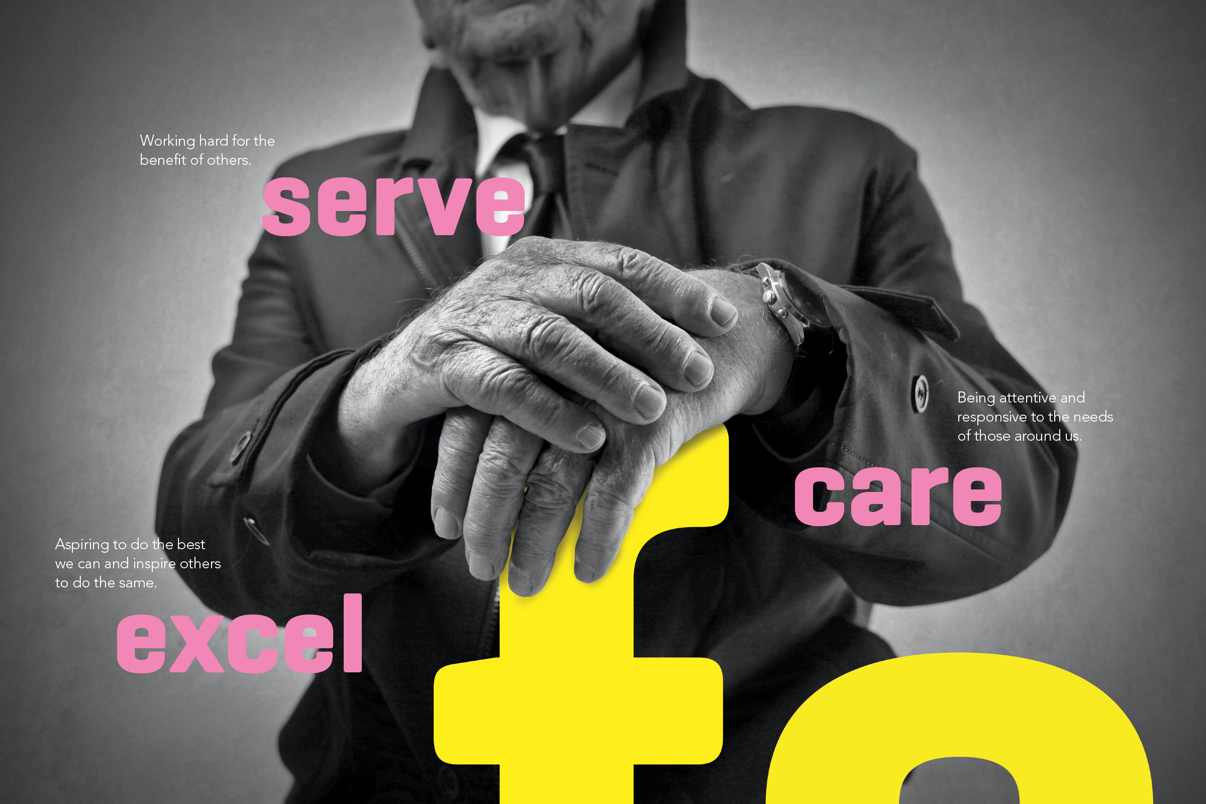
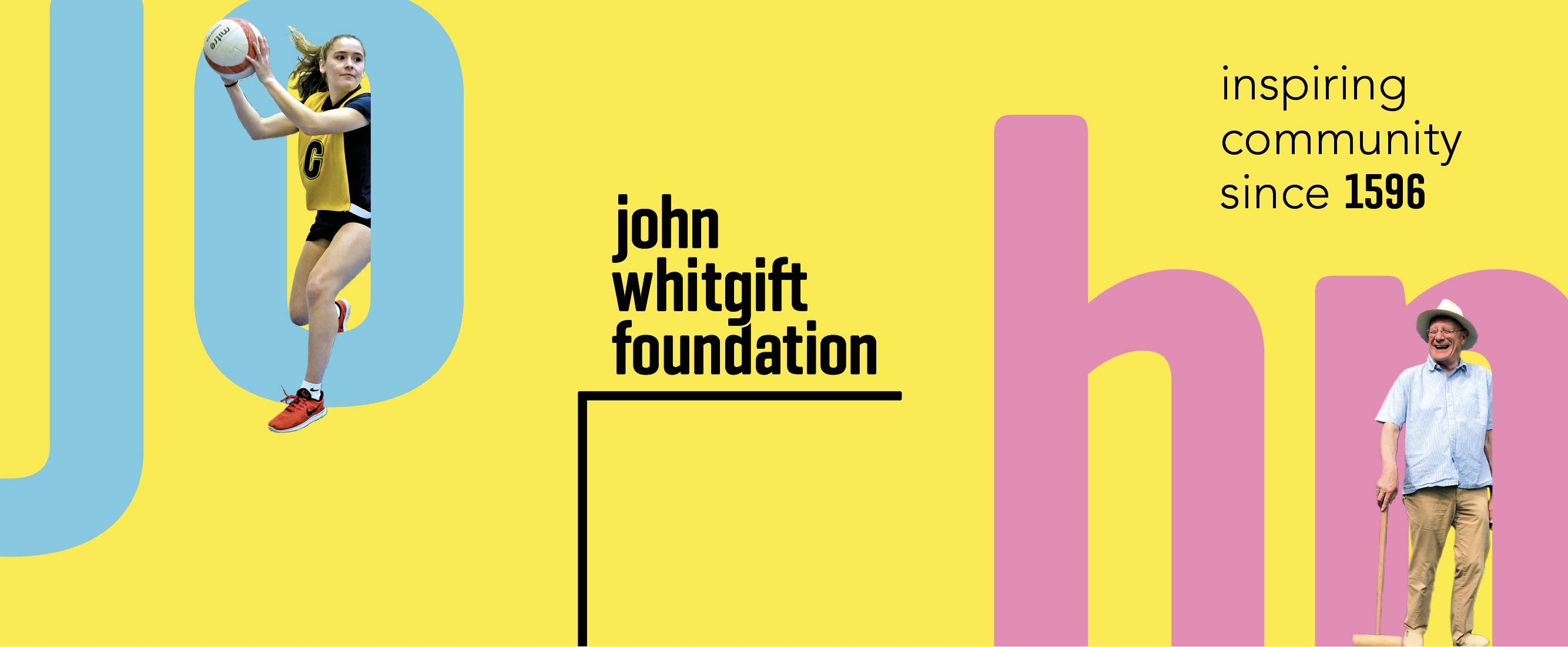
The common denominator was, ‘support for the local Croydon community’, through education, care for older people, and support for carers. Our brand solution in its most simplistic form, ‘the brand icon’ conveyed this ‘support ‘ concept through the use of a simple support keyline. We designed a mark with subtle variations that allowed it to be used in different positions, to provide flexibility. Each variation provided support from a different direction, conveying the basic ethos of the Foundation. This was reinforced with a vibrant colour palette that enabled the brand to be ‘dialled up’ or ‘dialled down’ dependent on its audience and usage.
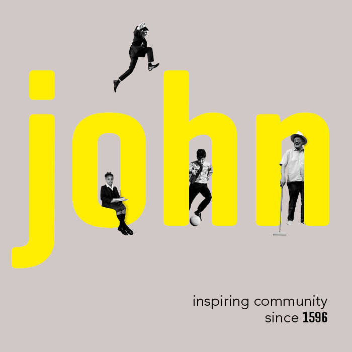
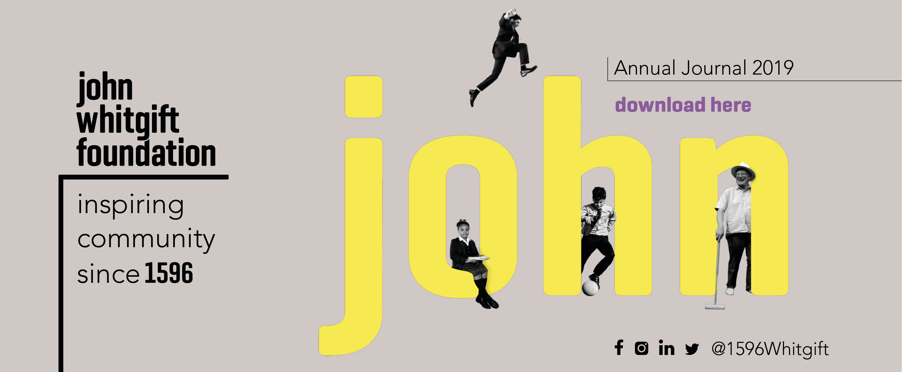
To support the message further, we also introduced the strapline, “inspiring community since 1596”. The hope is that the John Whitgift Foundation becomes a benchmark that other bursary providers, charities and organisations can emulate for their own communities. Kevin Cox, Creative Director of tothepoint, commented: “It’s always rewarding when a client’s vision and ambition are in sync with your own as a design consultancy. The client has been brave with this rebrand, allowing us to take them well outside of their traditional comfort zone. The result is a colourful, playful, and versatile brand that truly reflects the founding principles of the charity, the phenomenal work they do for thousands of people all over Croydon and has the potential to inspire others to do the same”.
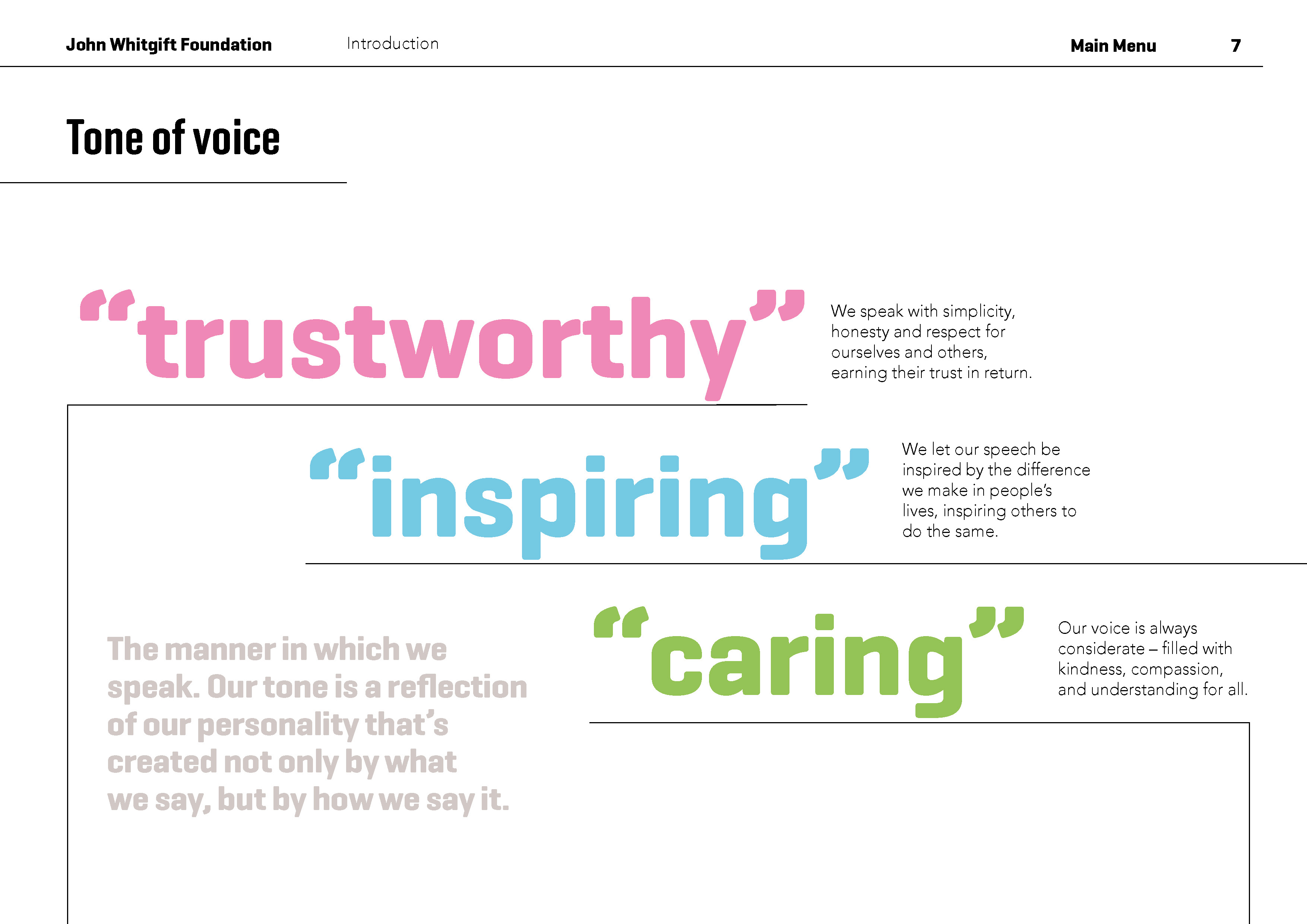
The brand personality – community and people focused
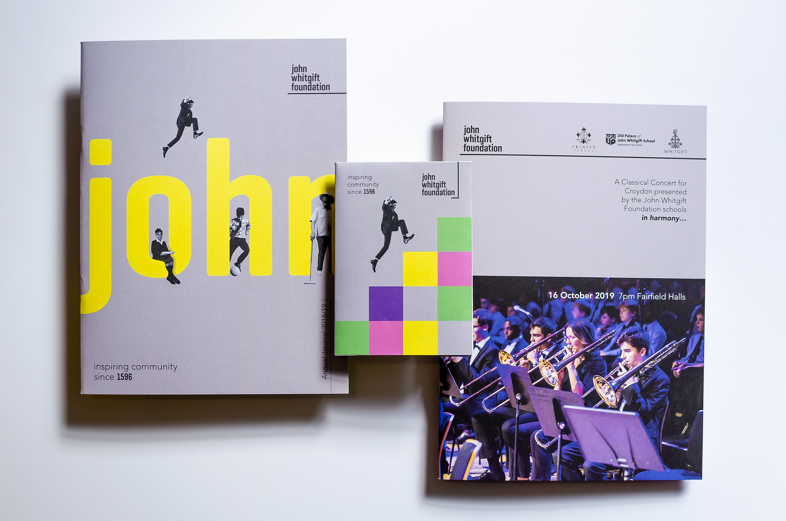
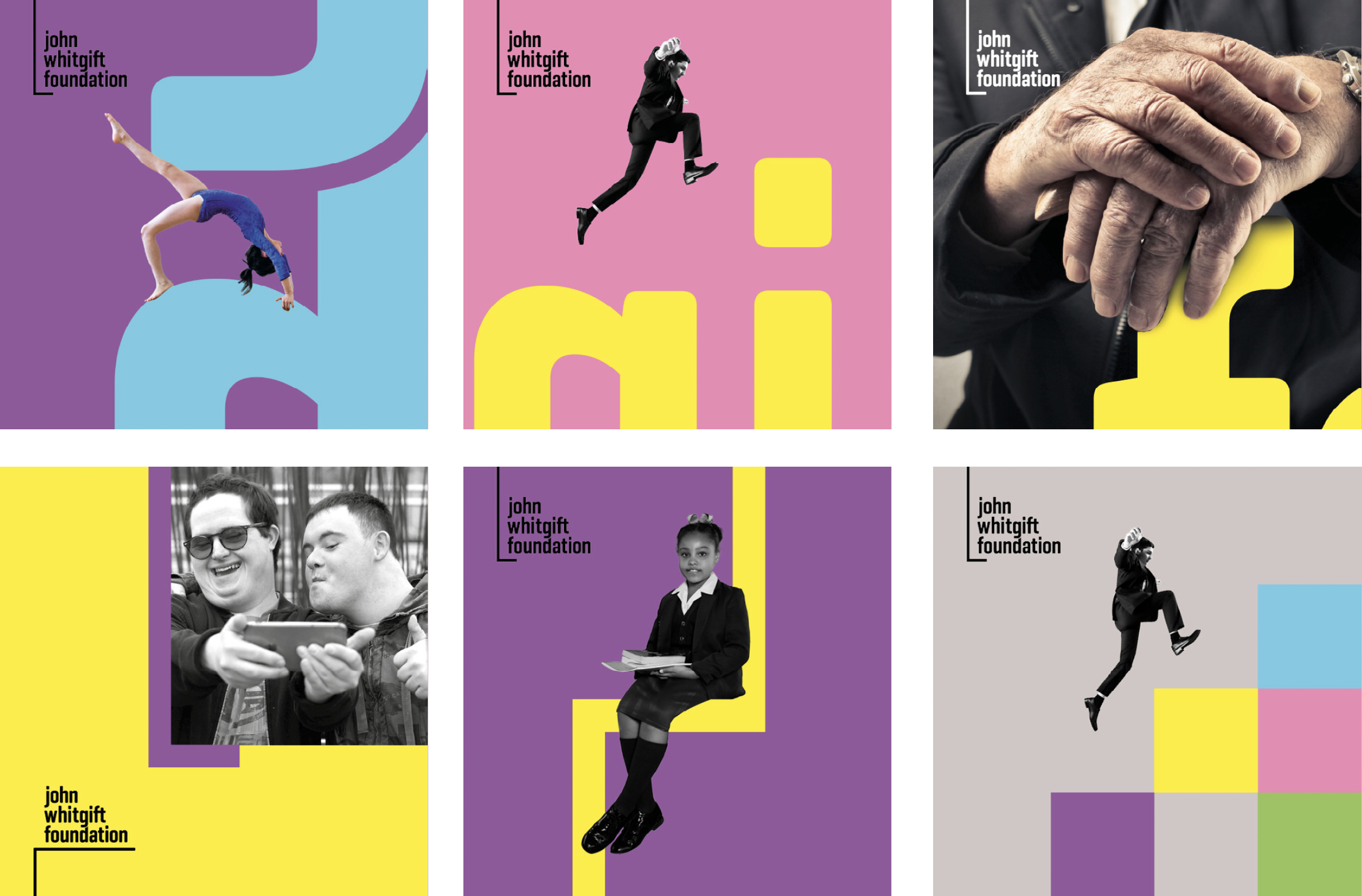
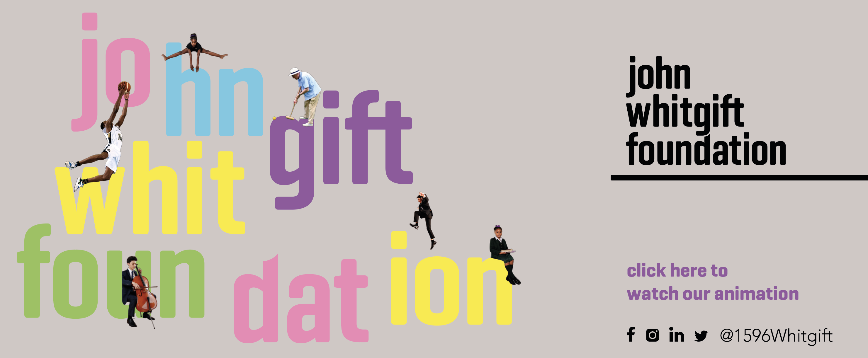
Supporting people and community are at the heart of everything that the Foundation does and it was important that the brand personality reflected this. We created a vibrant, typographic brand that had a sense of energy and dynamism, indicative of the organisation and how it wanted to be perceived by all age groups. Photography would play an important role in establishing the brand personality, not only in conveying the education and care services, but also in how we interlaced the photography with the graphics to reinforce the ‘support’ message.
Photography / keylines / typography concept – people being supported:
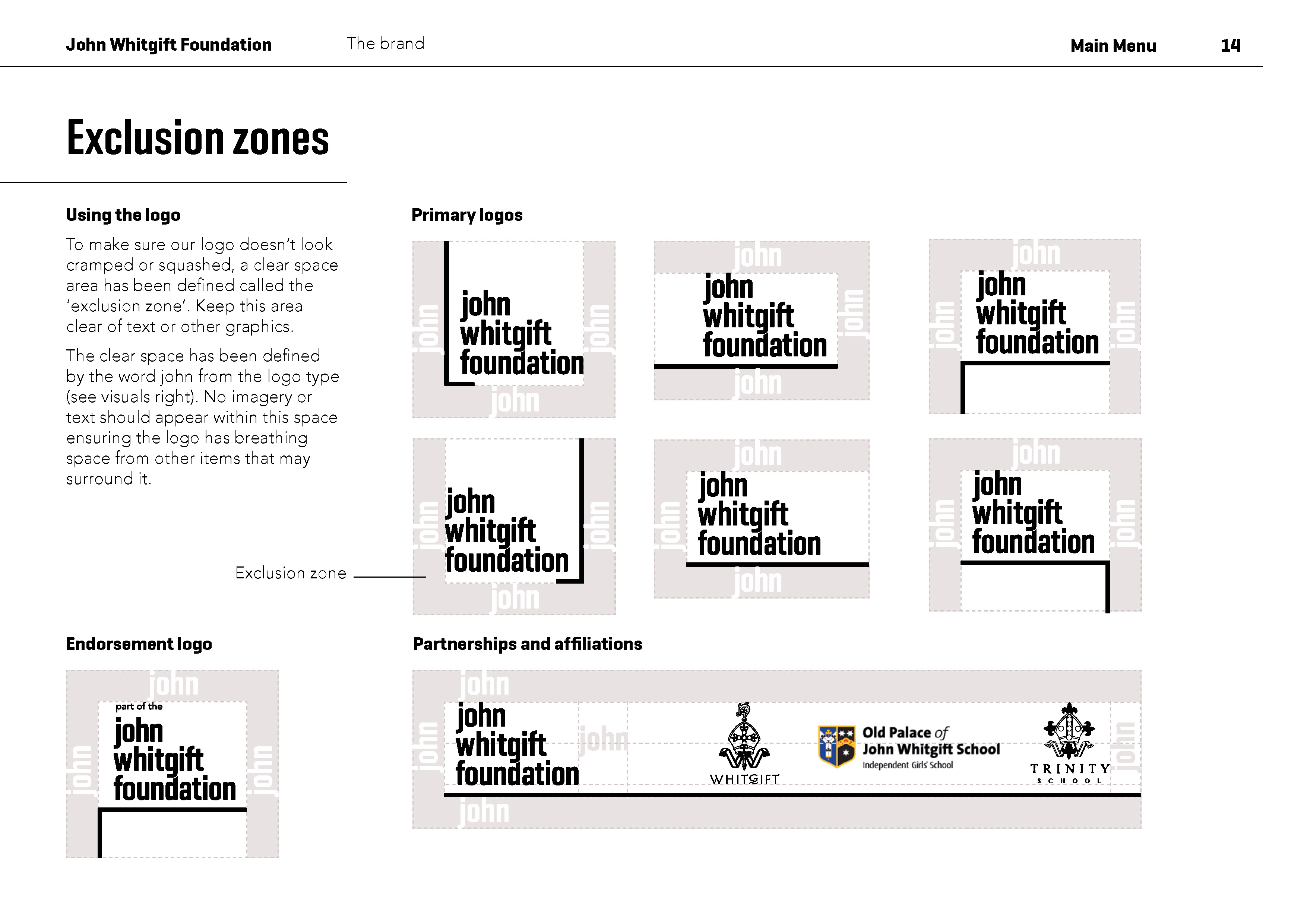
Keylines are also an integral part of the brand toolkit, and are a constant reference to the brand mark itself. The line comes in three weights; thick, medium and light, dependant on its usage and it always provides a supporting role, whether with imagery, people or type.
Storytelling through an animated video
Once we had established a clear narrative for the Foundation and created a strong visual language, we were able to combine both of these in a short one minute animated video that introduced all the core brand elements and tells the John Whitgift Foundation story.
Changing perceptions through merchandising
Historically, the Foundation had always presented itself in quite a traditional, conservative manner and was keen that the rebrand process provided the opportunity to change perceptions, especially with the growing youth demographic of Croydon, making it appear more approachable and engaging with a wider audience. Through the use of relatively cost effective merchandising, we could promote the Foundation externally in a way that draws attention to it and appeals to a younger audience.

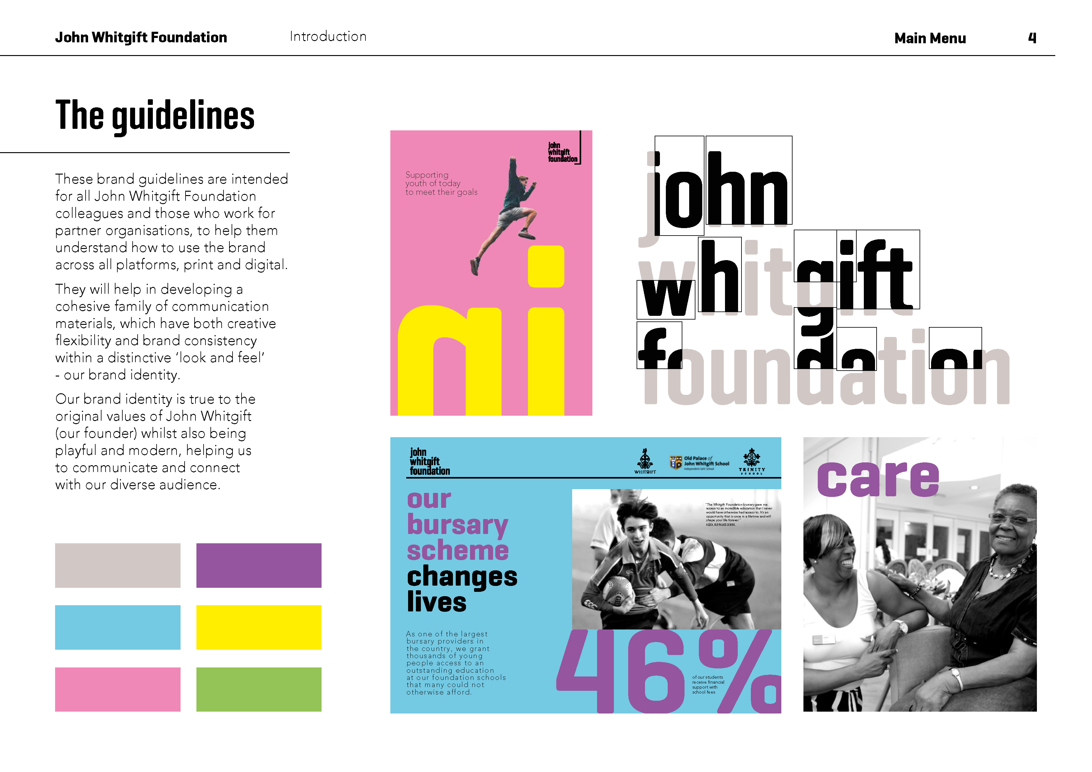
Brand guidelines for consistency and flexibility
As the Foundation has a small but creative marketing team, it was important that we created a set of user friendly brand guidelines that provide tools to create materials that are not only on brand, but give them the flexibility and freedom to expand on them without being too restrictive.
Brand guidelines:
Templates for letterhead, comp slip and business cards:
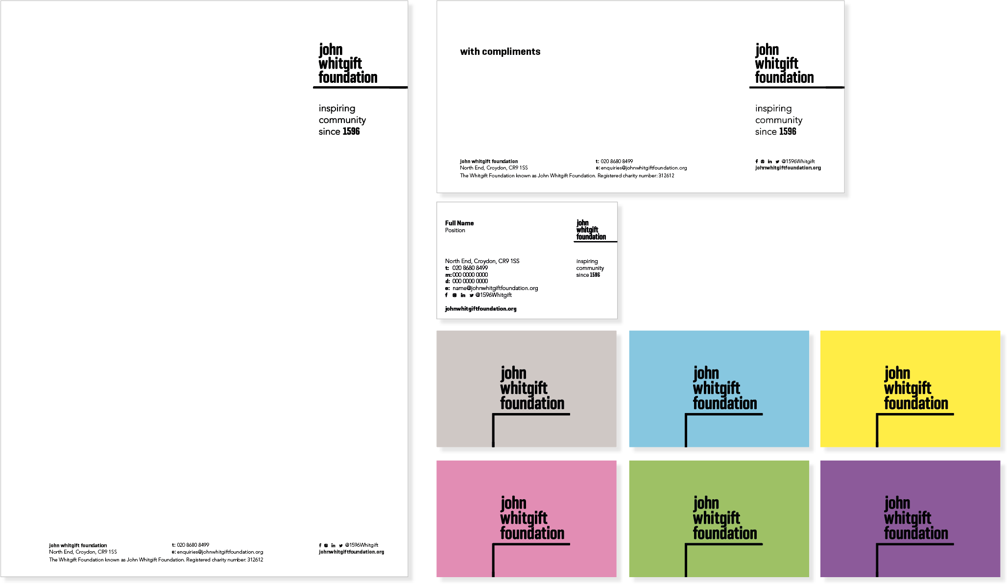
Templates for email signatures and social media:
Exterior and interior graphics at the Fairfield Halls
The John Whitgift Foundation is also sponsoring the new glass extension to the newly redeveloped Fairfield Halls in Croydon, called ‘The John Whitgift Foundation Community Cube’. It will provide the local community with a space to use for a variety of activities catering to all ages. We were asked to translate the brand as interior wall graphics and window graphics in a way that would draw attention to the new and versatile venue. Used primarily as a community centre, it fits nicely with the Foundation’s vision, mission and values. The Cube is expected to be completed during November 2019.
Glass manifestations:
Wall graphics:
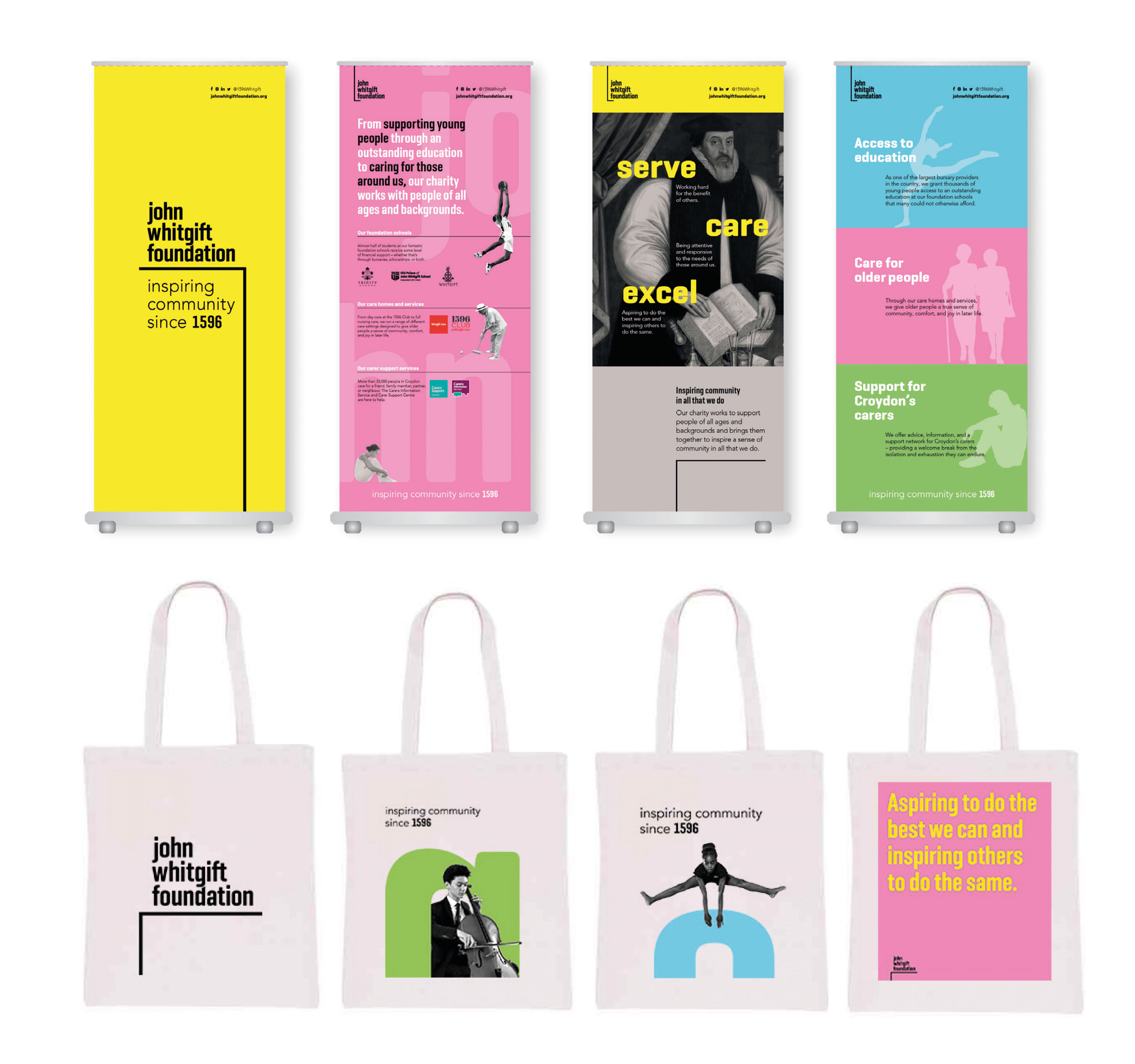
Soft launch
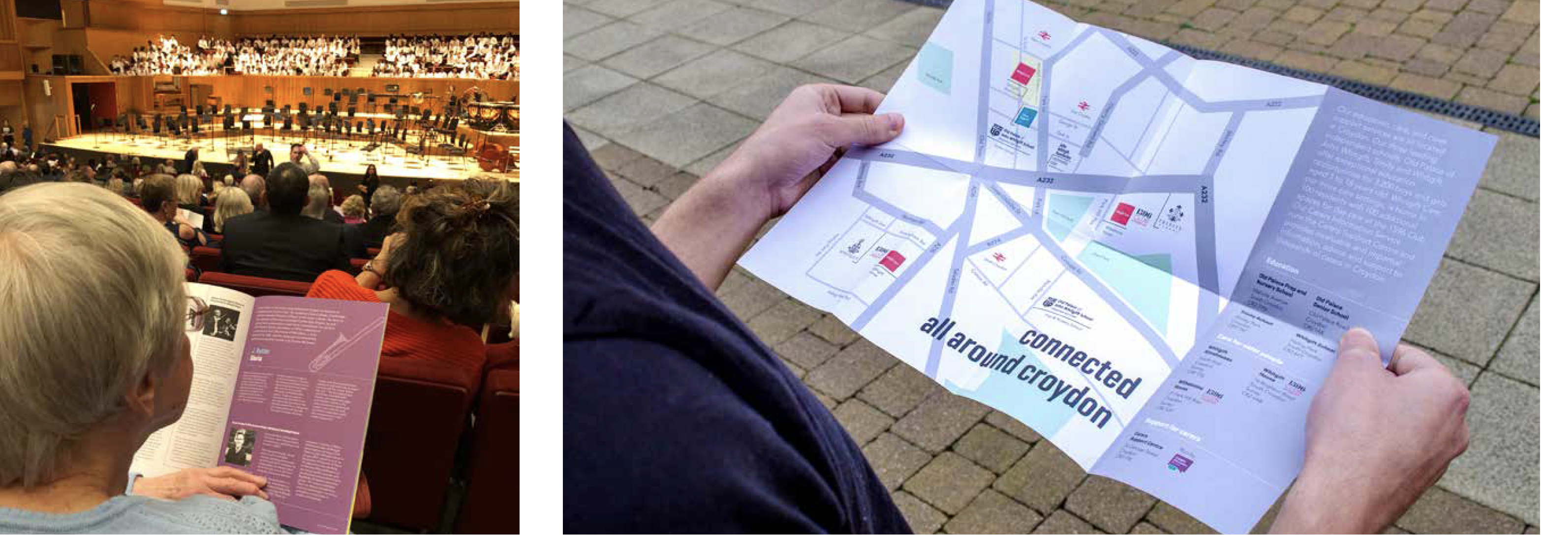
The Foundation used the inaugural ‘Three Schools Concert’, held at Fairfield Halls in Croydon, to soft launch the brand. Pop up banners were designed to welcome the guests and introduce the brand. A series of tote bags were also distributed to all attendees containing the Annual Review, the Three Schools Concert programme and an A6 pocket map give-away, contained within a bespoke folder, all designed and produced by tothepoint.