We had previously crossed paths with Chris during his time as Head of External Communications at UK Research and Innovation (UKRI), where we had been working on a number of campaign and event branding projects for the institution. He valued the work we did and reached out once again.
Background and considerations
The SSF Interdisciplinary Science Summit is an annual event attended by its senior fellows and a broader community of partners and supporters. It features workshops, panel sessions, site visits throughout the day, and a showcase event in the evening.
The goal of the summit is to galvanise the scientific community and showcase leading approaches in interdisciplinary science. Its mission is to change how science is done, working collaboratively with the scientific community to break down barriers, accelerate impact, and address society’s biggest challenges.

Changing how science is done
As the organisation’s flagship event, the branding needed to elevate SSF’s visibility within the research and innovation community and support its mission to “Change how science is done.”
The goal was to develop an identity that felt fresh and distinctive, something with a slightly edgy tone that reflected their innovative spirit, while still being accessible and appealing to a broad audience.
Working collaboratively with the scientific community
Now in its third year, the Summit is held in association with a different leading global university each year. It was essential that the identity acknowledged and clearly communicated this collaboration. For 2025, this took the form of an “In association with” version of the logo, connecting Schmidt Science Fellows with its event partner Caltech institution in Pasadena, California.


Photos credited to Claudine Gossett
The ambition of the campaign brand
Our objective was to create a brand for ‘Interdisciplinary Science’ and the event, that could work across multiple years, adaptable yet consistent. The identity needed to function both as a long-term concept and as a customisable design tailored to each new location.
A logo that embodies interdisciplinary science
The logo is a visual representation of interdisciplinary science. Three coloured bars represent different disciplines, intersecting fluidly to convey integration and directional change. The typography reinforces this idea, flowing into itself, symbolising cross-fertilisation and collaboration.
A flexible, year-on-year brand asset
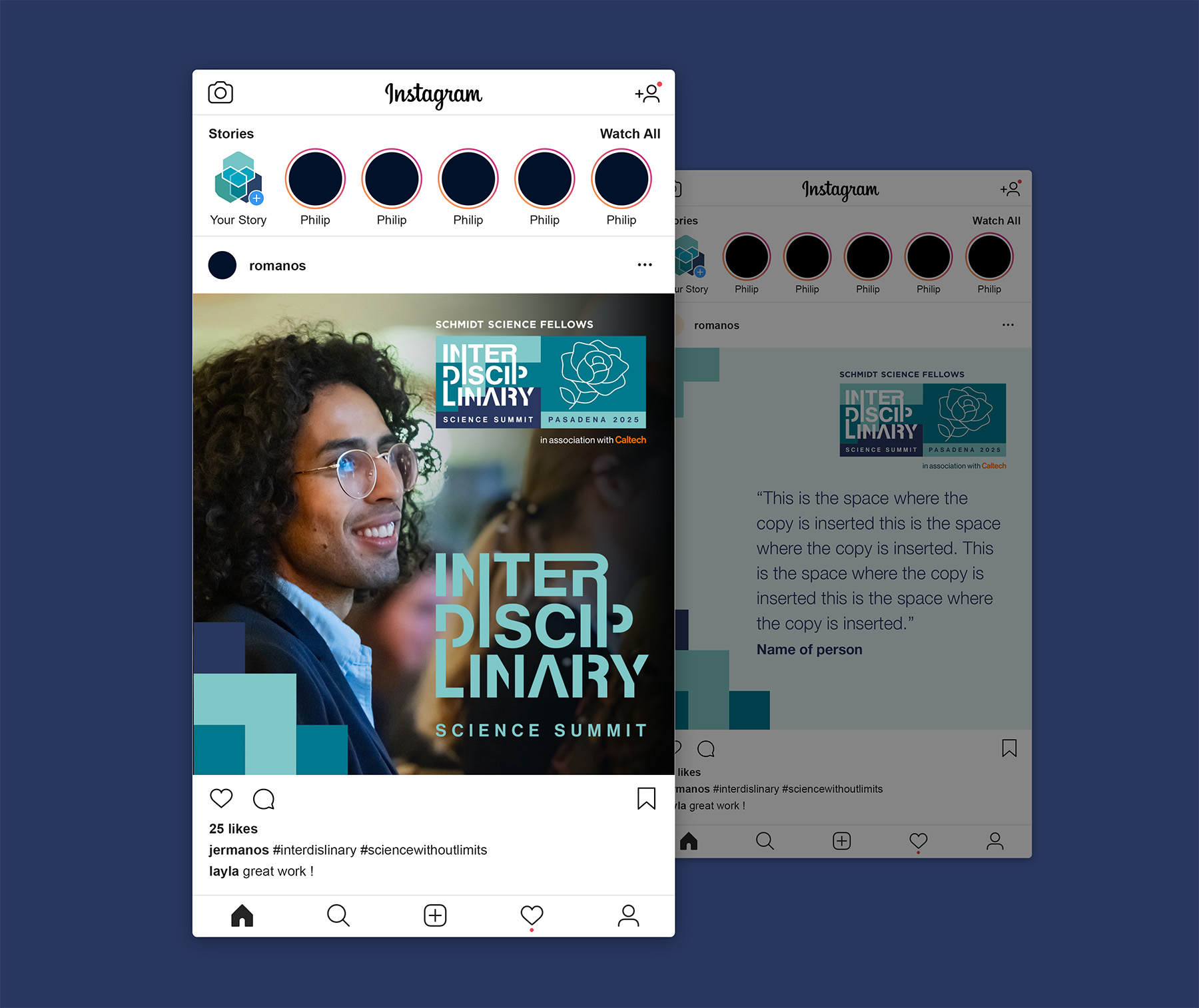
The logo consists of two parts: the left side represents ‘Interdisciplinary Science’, while the right side reflects the event’s new location partner. The left remains consistent each year to build brand recognition, while the right changes to represent each new location. For 2025, the Pasadena icon is a rose, referencing the city’s historic annual Tournament of Roses. The two halves of the design also allow the logo to be stacked so it can be adapted to vertical formats, such as banners or totems, if required.
A grid-based system to facilitate motion and various media
We developed a range of scalable grid formats that offer flexibility across media. Whether landscape (1920×1080) for screens or narrow portrait formats for display pull-ups and digital totems, the grid allows for either linear motion graphics, based on colour blocks, that flow around imagery or pixel-based layouts that incorporate images directly.
Adapting the brand for day and night
The client requested that the brand be adapted to create different moods and atmospheres throughout the day. During the day, the focus is on networking and conference sessions, so the visual identity emphasises professionalism, using photography of attendees from previous summits, integrating with fluid colour blocks to create clean, structured designs.
In the evening, the atmosphere becomes more relaxed and social. The identity shifts to a softer, more fluid interpretation of the campaign brand, making use of abstract graphic elements, looser grid arrangements, and a more artistic tone to reflect the change in mood.
Leveraging Cavalry for dynamic motion
To bring the brand to life across digital formats, we used Cavalry, an advanced animation tool known for its procedural workflow. This approach allowed us to create complex, data-driven motion design elements with speed and flexibility. Cavalry’s node-based structure meant we could quickly adapt assets to different screen sizes and orientations, from wide-format displays to vertical totems. It also enabled us to experiment with motion that felt unique to each context, while staying consistent with the core identity, making it an ideal tool for a brand that needed to feel both dynamic and cohesive across a multi-format event.
Post event video edits
As part of our continued work for the summit, we were supplied with filmed footage of the event’s four headline talks and tasked with editing them. Our role was to weave in the Summit’s visual identity through animated title sequences, branded lower thirds, and on-screen graphics. This ensured each video felt polished, cohesive, and visually connected to the event’s broader brand.
Event videos are more than just documentation; they’re an opportunity to extend the brand experience. By integrating consistent visual elements, the talks became part of the Summit’s story, reinforcing its professional image and leaving a lasting impression, rather than feeling like an afterthought.
Jacqueline Campbell – 2020 Fellow, Asterisk Labs
Jacqueline highlights how creative breakthroughs emerge when distinct scientific perspectives unite to solve shared problems.
Mikhail Shapiro – Caltech Professor and PI hosting Schmidt Fellows
Mikhail shares his journey from early inspiration to cutting-edge work on non-invasive ways to interface with the brain and body.
Deepak Krishnamurthy – 2020 Fellow, UC Berkeley
Exploring how crossing disciplinary boundaries can spark innovative solutions, Deepak shares lessons from his research journey bridging engineering, biology, and technology.
Sara Walker – Polymath, Arizona State University
Sara challenges conventional ideas about life, systems, and complexity, inviting the audience to imagine the future of science through an interdisciplinary lens.