This is a conversation we had recently with our client Union Maritime, a shipping company managing large vessels in Nigeria, when we started to work with them on a brand refresh and web redesign.
Establishing a strong brand isn’t something that happens overnight (if only life was that easy!), so the hard work is still going on. However a major project for building the brand was the website, as this was to be a major tool for them.
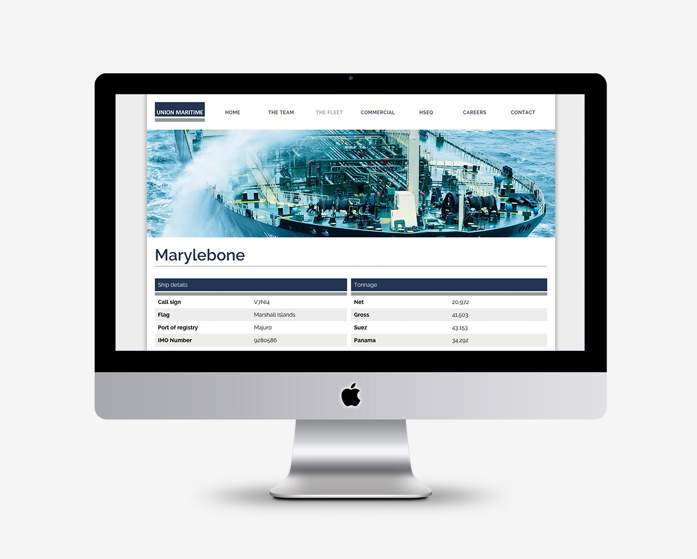
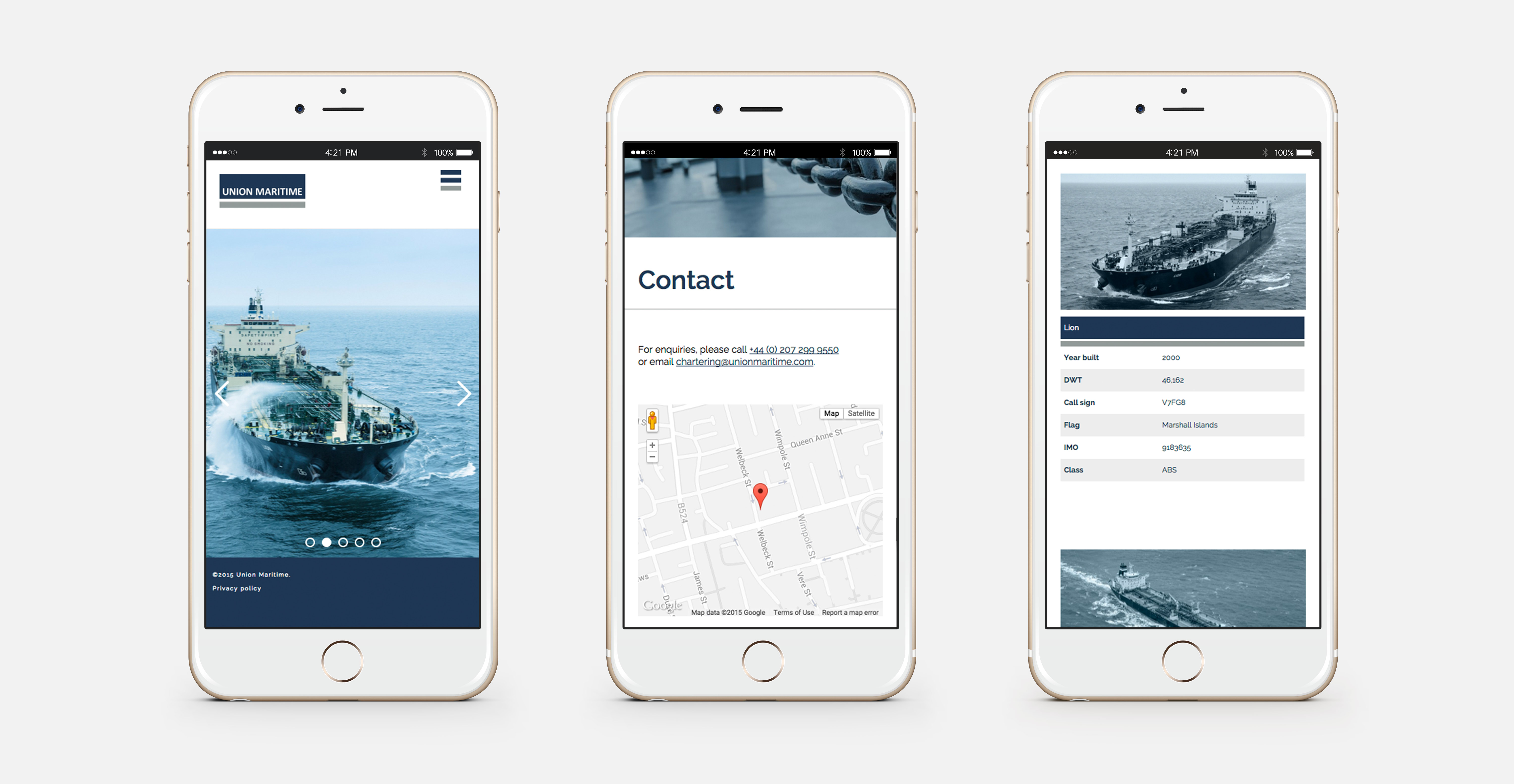
The team at Union Maritime wanted an easy to update, and relatively low-maintenance site, so we opted for WordPress. The design of the site reinforces their branding through the strong use of their corporate colour palette, and using the blue and grey blocks from their logo to create different elements such as the tables on the fleet pages. Click here to see the website in all its glory.
During our journey with them we’ve also looked at their PowerPoint presentation and are currently working on their email signatures. So from here it should be plain sailing, the key is to maintain consistency.