Within a short space of time we managed to agree the naming as well as design, artwork, produce and install a new brand and interior graphics for their ‘News Logistics’ division.
Following initial talks and naming, we ran a full day workshop to help their team explore some of the key aims and aspirations for News Logistics prior to embarking on the branding. The workshop was a melting pot of ideas, exploring and defining a vision for the business, a mission statement, a set of values and how they wanted to be perceived both internally and to clients.
 As a result of the day we were able to define some key themes that needed to shine through in the branding and a link back to Newsprinters was key. The best way to do this was to maintain the globe icon from Newsprinters and the impactful colour. Their knowledge and existing infrastructure is also key to their offering, with a focus on building strong, long term partnerships.
 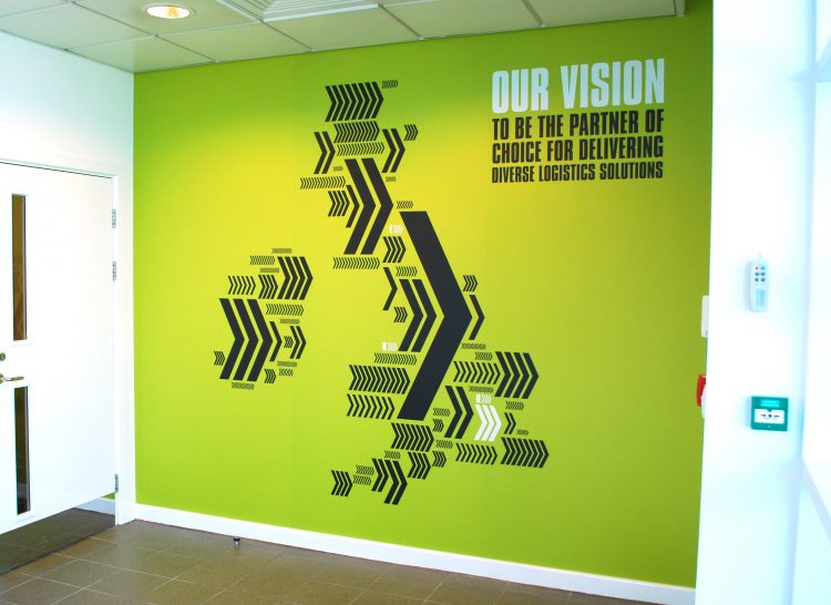 The brand uses various graphic devices, the most obvious being the use of A-B (suggesting what they do in the most simplest form), and A-Z (denoting the breadth of their offering).
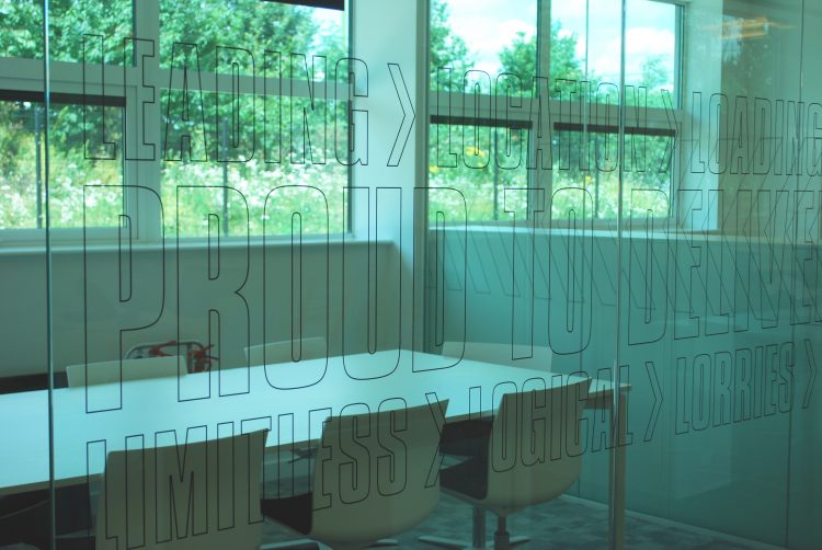
More subtle is the use of the chevron, of course a symbol related with road travel. However scratch a little deeper and it suggests movement and forward motion, a company that isn’t standing still but looking to the future.
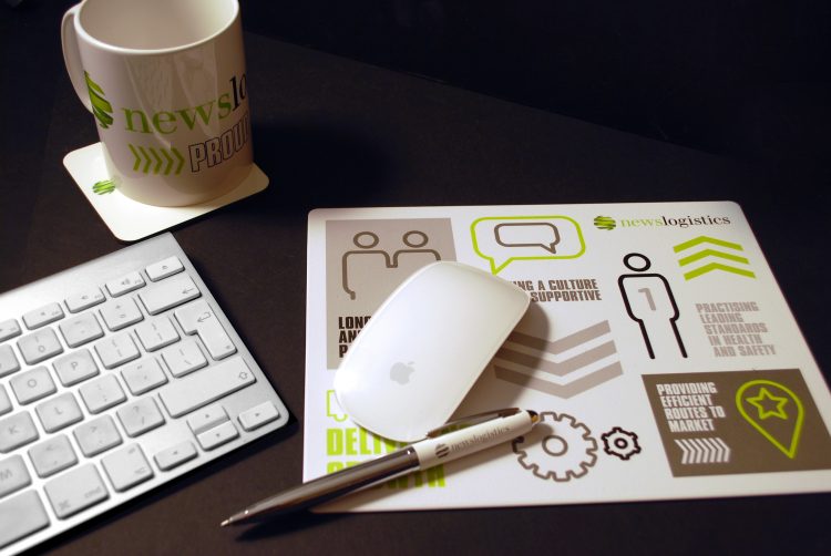
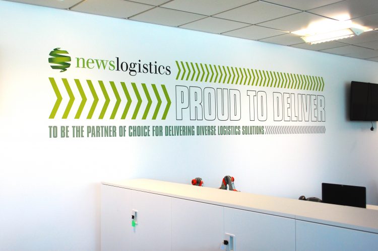
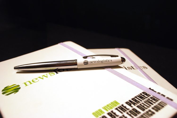 The idea of partnerships is shown through the wall graphics and also in the playful names of the meeting rooms (great and successful partnerships: Laurel and Hardy, Tom and Jerry to name a few) and the strapline that came out of the workshop; ‘Proud To Deliver’, features across various materials produced for the launch including some staff giveaways.