Studio FFE is the manufacturing arm of the company and part of the brief was to communicate the close ties with Apteriors and where possible, reflect the manufacturing element of the organisation.
Initial concepts
We explored several design approaches that ranged from subtle and stylish, similar to the Apteriors logo, to bold, daring concepts that focused on the manufacturing element. The examples shown here are indicative of some of the approaches we took.
The approved concept
The chosen route reflected more of the close association and collaboration with Apteriors and its brand, with the same colour palette and a ‘forward slash’ graphic device that nicely countered the Apteriors ‘back slash’ device.
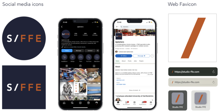
Social media applications and Favicons

As with most clients, social media is playing an ever increasing role in generating news articles and new business interest. This needed to be factored into the brand identity and the full range of logos, icons and favicons that were required for both digital and print format usage.
Guidelines
A simple set of guidelines were created that showed basic usage across digital and print applications. These followed the same design templates as the Apteriors guidelines we created, to ensure they sit together as a brand family.
Sarah Hough at Studio FFE had this to say:
The Point really understood the brief and the connection between Apteriors and StudioFFE. They brought a number of relevant designs to the table and helped us ultimately feel comfortable and happy with our new brand guidance. Sarah Hough, Director, Studio FFE