
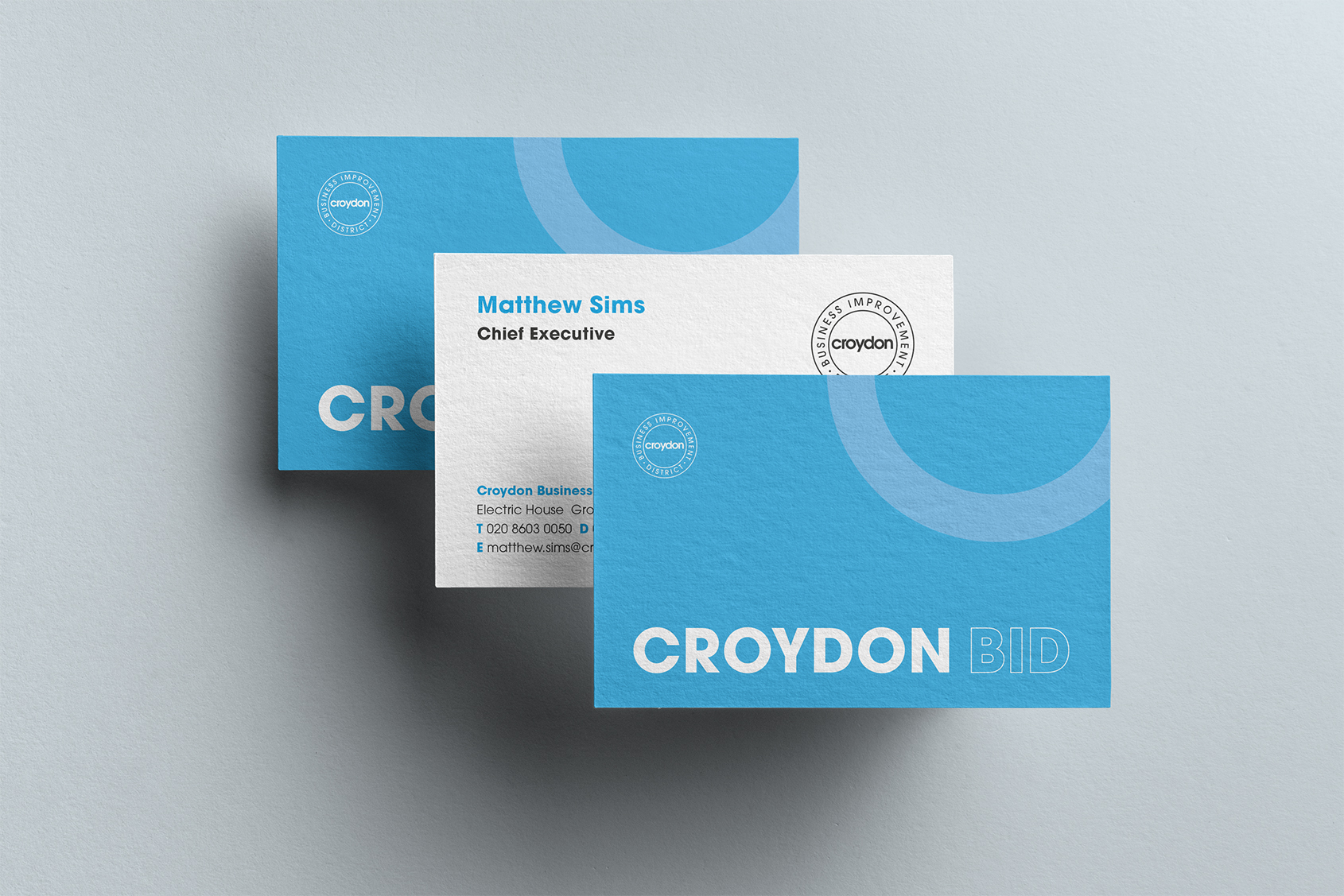
Because they have many face-to-face meetings with their levy payers and local businesses, this involved bringing all their printed stationery items and folders in line with the current brand look and feel.
For the new website, we had evolved the logo to a simple keyline application and incorporated a new typographic keyline styling so they both worked in tandem with each other to create a new brand aesthetic.

The backs of the stationery items incorporate this new styling with different bold statements such as ‘CROYDON BID’ or ‘WELCOME TO CROYDON’, depending on who the recipient is.
In conjunction with this, one of their five core pledges to levy payers and the general public is the ‘greening’ of Croydon, and they were keen for us to bring their ‘greening’ signage in line with this new brand look and feel. The signs sit amongst various greening projects and foliage, and make the public aware that the BID are responsible for this work. They were also receptive to being more playful and public-facing with some of the language used on the signs, with phrases such as: Blooming Lovely, Wild about Croydon, and Watch Croydon grow.
Kayleigh Paget, Marketing & Communications Manager at Croydon BID had this to say about the project.
Working with tothepoint to refresh our printed marketing materials and ‘Out of Home’ greening signage was a natural progression in evolving the Croydon BID brand. The updated stationery brings a modern, professional feel to our meetings with local businesses, while the new ‘Out of Home’ signage injects a playful, welcoming tone into our greening initiatives across Croydon town centre. Working with tothepoint is always a smooth and enjoyable experience. They understood my vision and ensured that the Croydon BID brand remained consistent and cohesive across both briefs. Kayleigh Paget, Marketing & Communications Manager, Croydon BID