We have been working with The Francis Crick Institute for a few years, from their development hoardings in 2012 up to the recent ‘About Francis Crick’ leaflet we delivered last month. This month we completed the creation of new window graphics that will help communicate what takes place in the amazing spaces inside this huge structure.
As with the Francis Crick hoardings, it was important to attract public attention to the building in a way that was approachable and friendly, encouraging them to enter the building to find out more and hopefully get involved with the many activities that take place in the visitor centre.
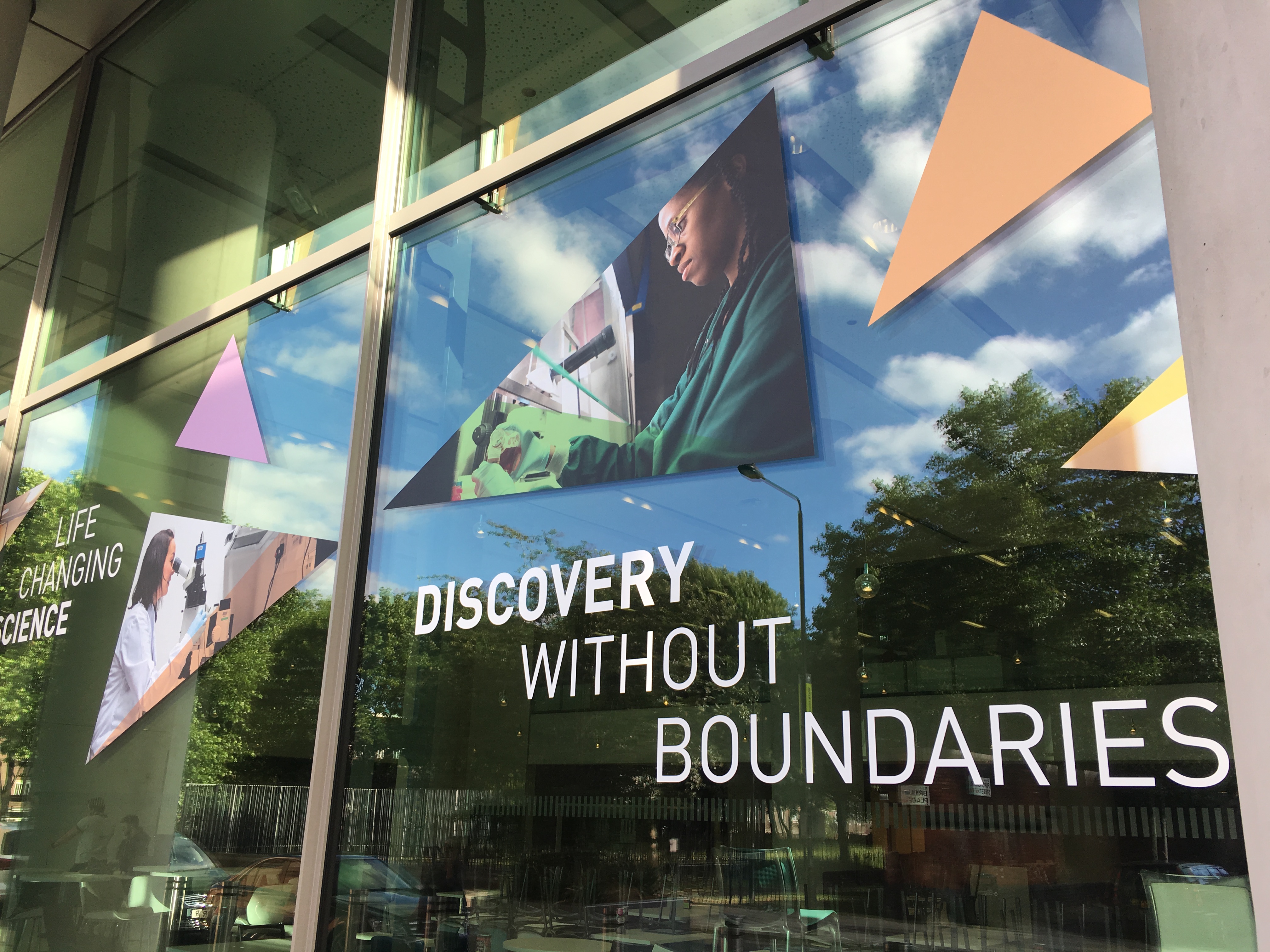
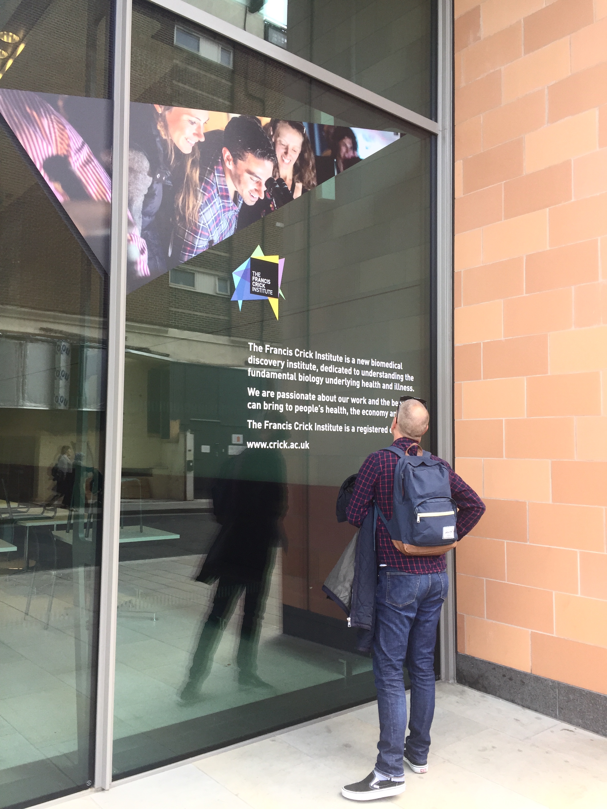
Our creative solution involved taking key elements from the brand, in particular, the shards of the logo and using these in a playful nature across the whole 24-metre expanse of the exterior glass fascia. The shards were used to hold imagery and were supported by copy that introduced a simple narrative about what the Crick is all about: the home of discovery; life-changing science; brilliant minds and discovery without boundaries.
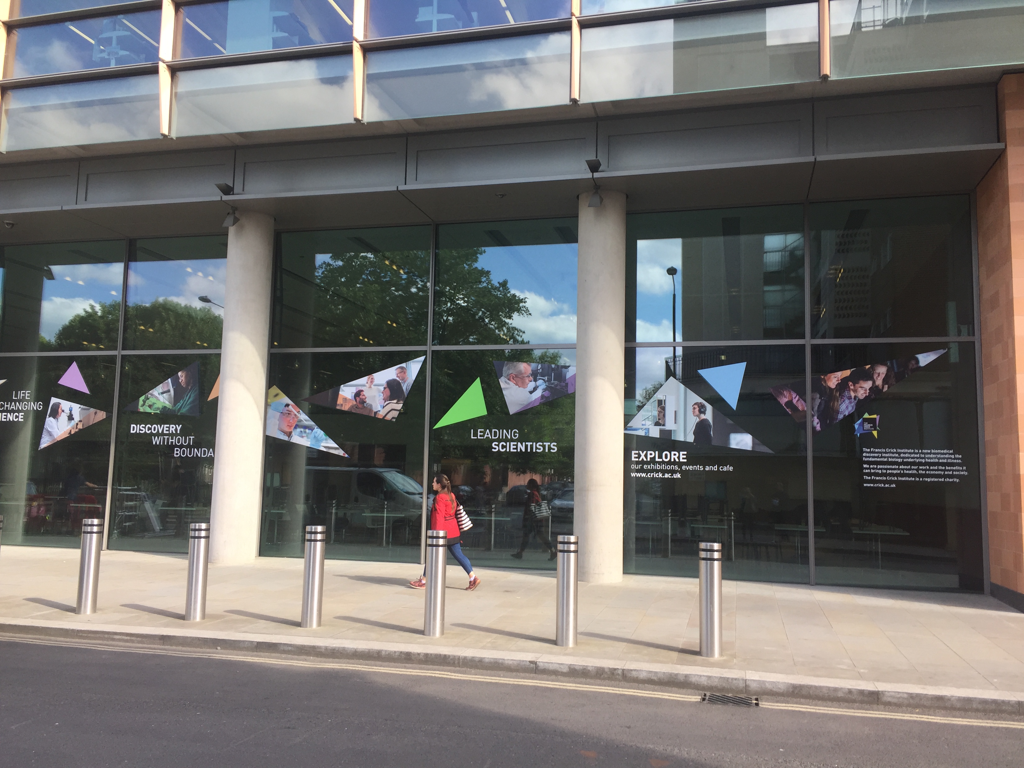

Logistically the key issue we faced was how to apply such large graphics to the super thick glass in a way that had the maximum impact but didn’t block out too much light or restrict views from the interiors. The density and tinted nature of the glass meant they could not be applied to the inside as visibility would have been poor from outside. This meant that the graphics had to be applied to the outside and as a consequence needed to be weatherproof and extremely durable.
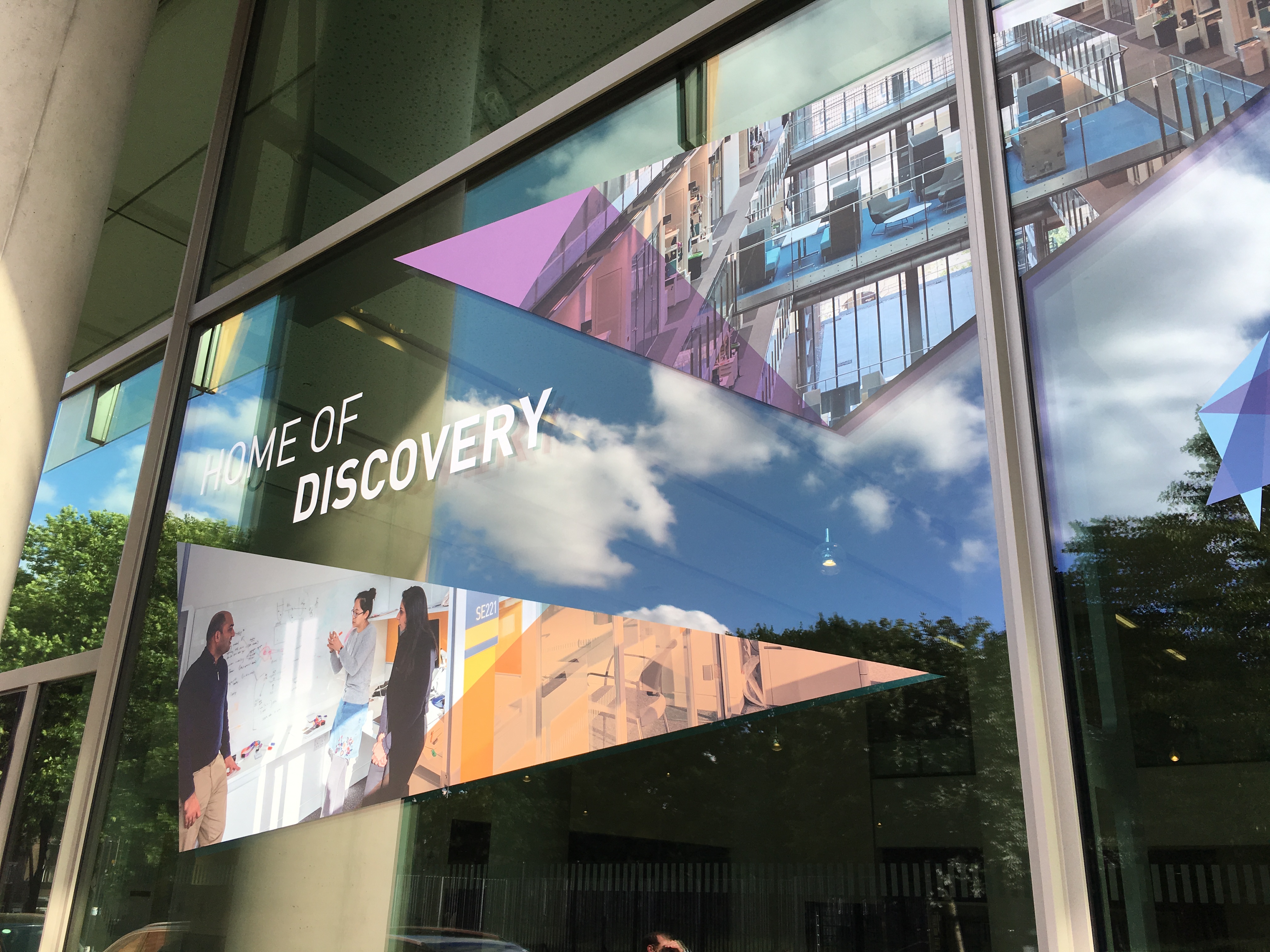
After several rounds of proofing and site visit tests, the end result had the desired effect of adding drama to the external fascia and this large expanse of glass, adding intrigue and drawing the public’s attention to the activities taking place inside.