tothepoint

John Whitgift Foundation Brand Overview

A distinctive, innovative brand identity that realises the full potential of the Foundation and the great work it does for the local Croydon community.
gi from jwf logo
jwf-logo

The brief

The Whitgift Foundation approached us to rebrand the organisation, with the intention of moving the charity forward and conveying its relevance in today’s society. 

The brand needed to communicate their commitment and service to the community of Croydon, whilst not forgetting the heritage of their founder, John Whitgift, whose ethos and values still live on through the charity today. 

We needed to ensure the organisation was presented as forward-thinking, whilst remembering the importance of its past.

The creative idea

Our strategy was to place ‘support for the local Croydon community’ at the heart of everything it does, whether through education, care for older people, or support for carers. We formulated a clear, simple narrative that communicates their relationship with each other, together with their vision, mission, and values, in a way that could be easily understood and underpinned by the phrase; ‘to serve, to care, to excel’.

Disciplines

Brand Identity
Editorial
Animation
Merchandising
Interior Design
Web consultancy

At entry level, our brand solution utilises a ‘brand icon’ to convey the ‘support’ concept through the use of a simple supporting keyline. We designed multiple variations of the mark which allows it to be used in different positions. Each variation provides support from different directions – a metaphor for the ethos of the Foundation.

JWF brand style 1
JWF brand style 2
JWF-Brand-3

We created a vibrant, typographic brand with a sense of energy and dynamism, indicative of the organisation and how it wants to be perceived by all age groups. We also used photography interlaced with graphics to further reinforce the ‘support’ concept. 

A vibrant colour palette enables the brand to be ‘dialled up’ or ‘dialled down’ dependent on its audience and usage.

The Foundation was keen that the rebrand provided the opportunity to change perceptions, especially with the growing young demographic of Croydon, making it appear more approachable and engage with a wider audience.

JWF Annual Spread 1
JWF Annual Spread 4
JWF Annual Spread 2
JWF Annual Spread 5
JWF Annual Spread 3
JWF Annual Spread 6

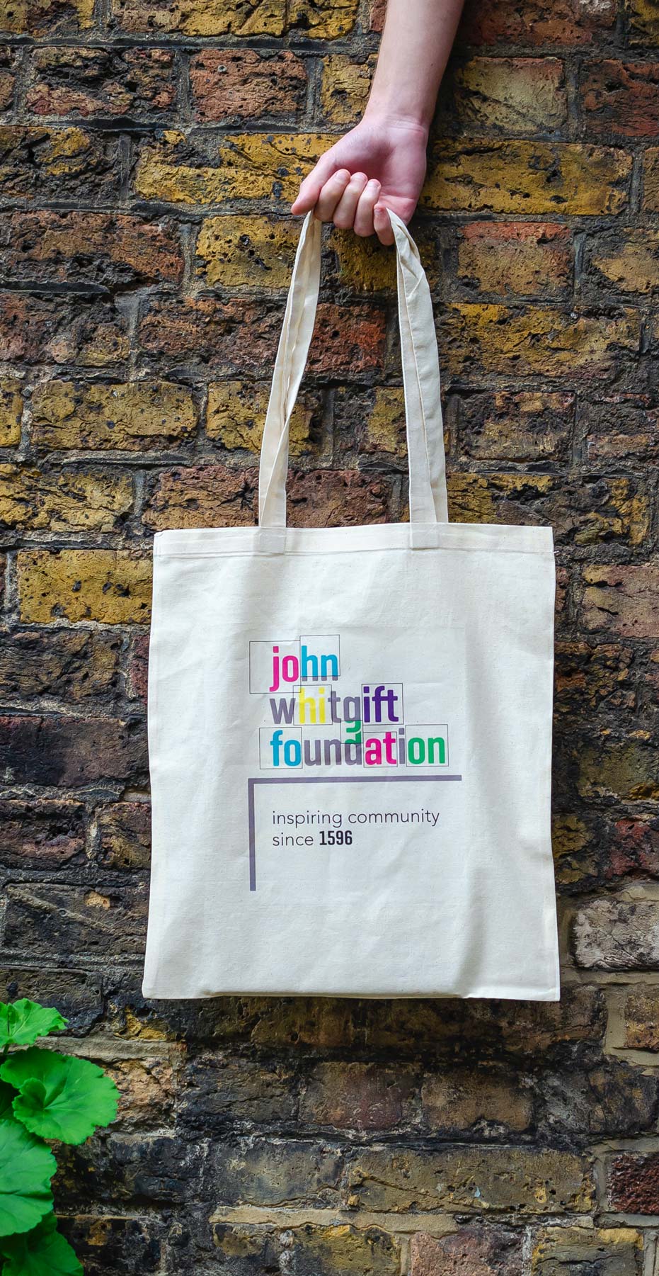
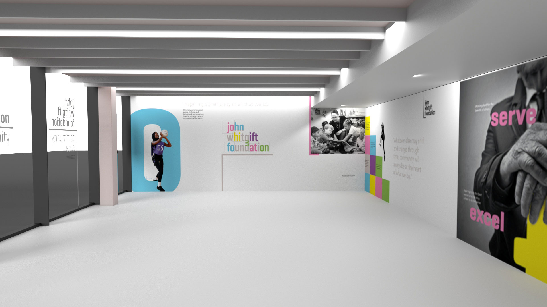
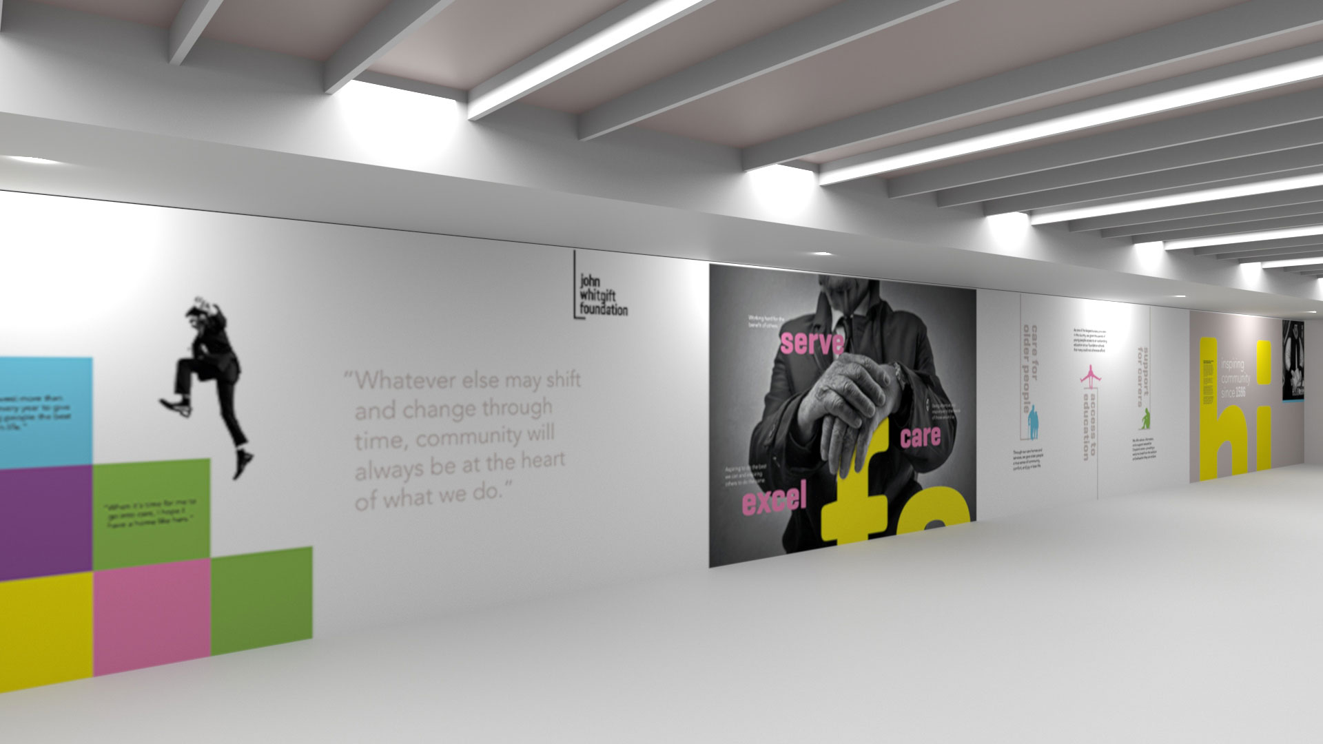
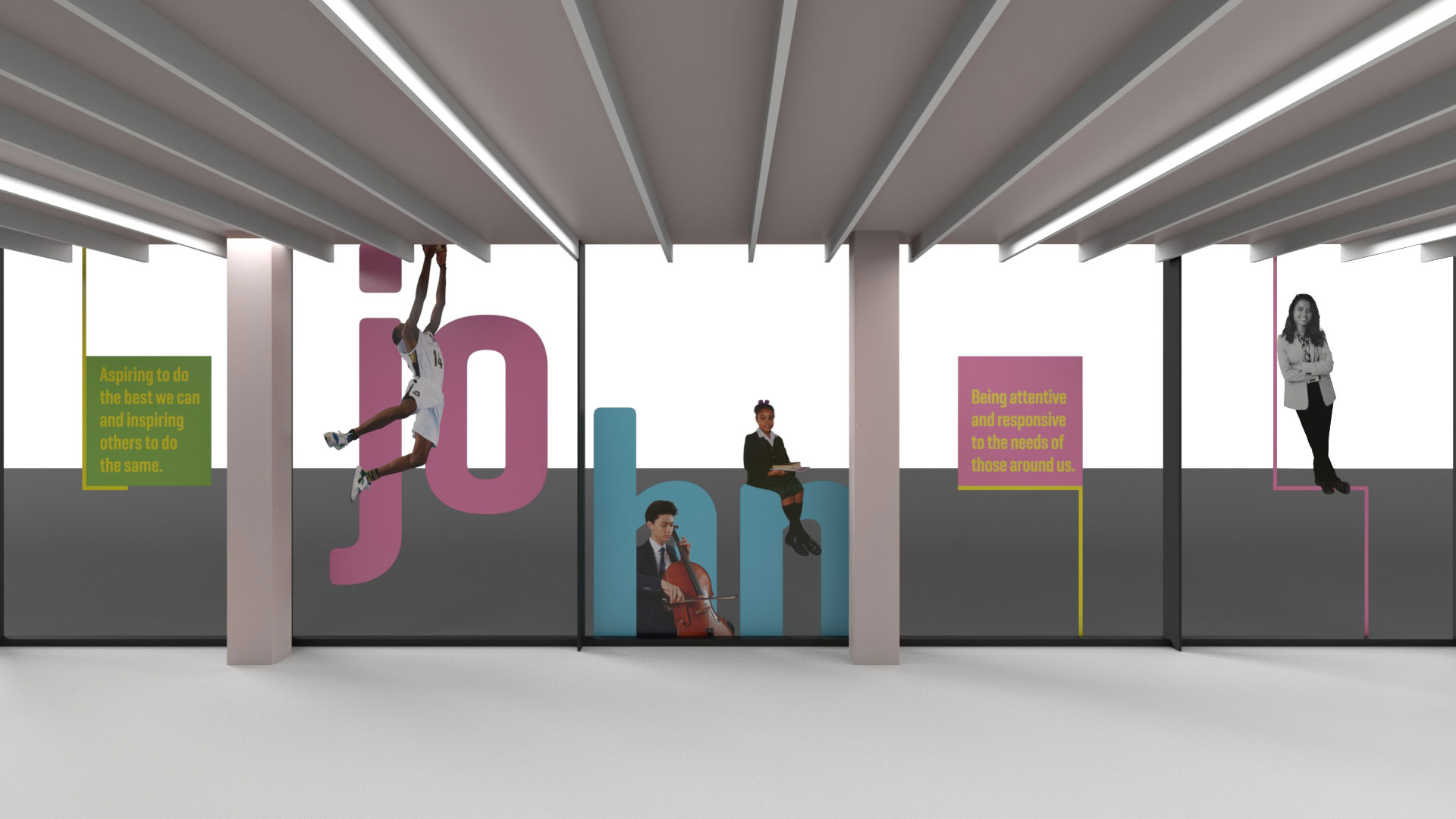
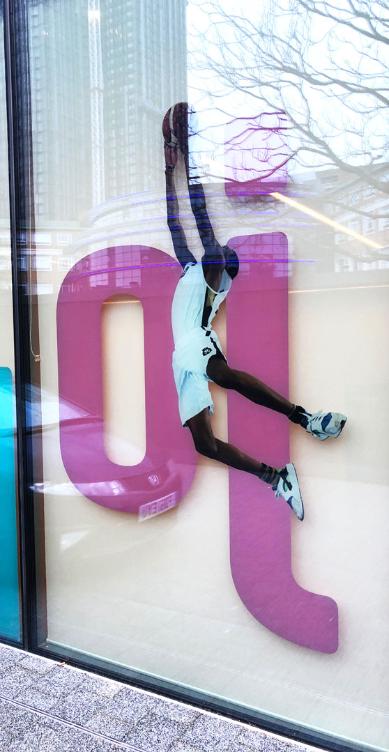
“The clean, modern style complements both the Foundation’s ethos and its values. It mirrors the developments happening in Croydon, with the regeneration of the town centre, recent opening of the Fairfield Halls, and the town’s thriving tech community.

The creative has great potential to push the Foundation to a more modern, relevant position within the heart of Croydon’s community.”

Marketing Manager, Trinity School

JWF Bag
JWF-Badges

This year marks the John Whitgift Foundation’s 425th anniversary, and to commemorate this momentous milestone, the charity is running their biggest community project ever called ‘Grow with John’. This project aims to support the community by promoting the health benefits of gardening, whilst also creating a lasting legacy for the Foundation.

Grow with John Poster

The foundation sponsors the ‘John Whitgift Foundation Community Cube’, adjoining Fairfield Halls, which provides the local community with a space to use for a variety of activities catering to all ages.

Community Cube Image Window
Community Cube Stairs
Community Cube Wall

“We love the design of this project, powerful and modern, we wish more NGO’s understand the power and value of creativity to communicate and engage, well done to all involved. Impressive.”

Chrissy Levett MA (RCA) Founder / CEO Creative Conscience

“I like the idea of the ‘support’ line, it’s clever. I also think the logo influence/brand exploration is exciting and will allow for a strong visual interpretation. The logo is modern, fresh and with longevity – it takes the Foundation a long way from its current, rather traditional logo.” 

Marketing Manager, Old Palace of John Whitgift School