A safer, healthier, happier, world
For the last few months we have been working closely with the Lloyd’s Register Foundation, a UK charity that was established in 2012. We are developing a new campaign, with a distinct look and feel, to help them communicate and promote the Foundation’s new 2019 strategy.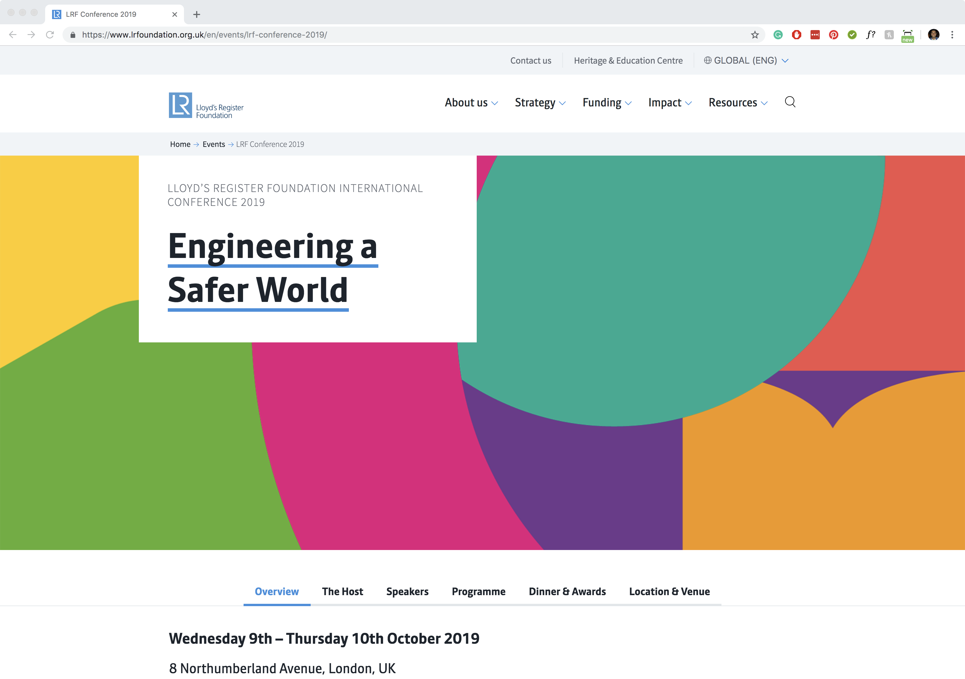
We have created an exciting new visual language for the campaign that incorporates a series of simple colourful icons that can also be used to create abstract graphics. These icons have been developed to represent their focus on the biggest safety challenges facing the world. We are applying them and the new look to various materials, across print and digital, including their 2019 strategy brochure, a postcard launch park, animations and social media templates. The first teaser for the new look has just appeared on a web banner for their International Conference that starts on the 9th October 2019. Watch this space next month when we will reveal more of the campaign for this exciting project.
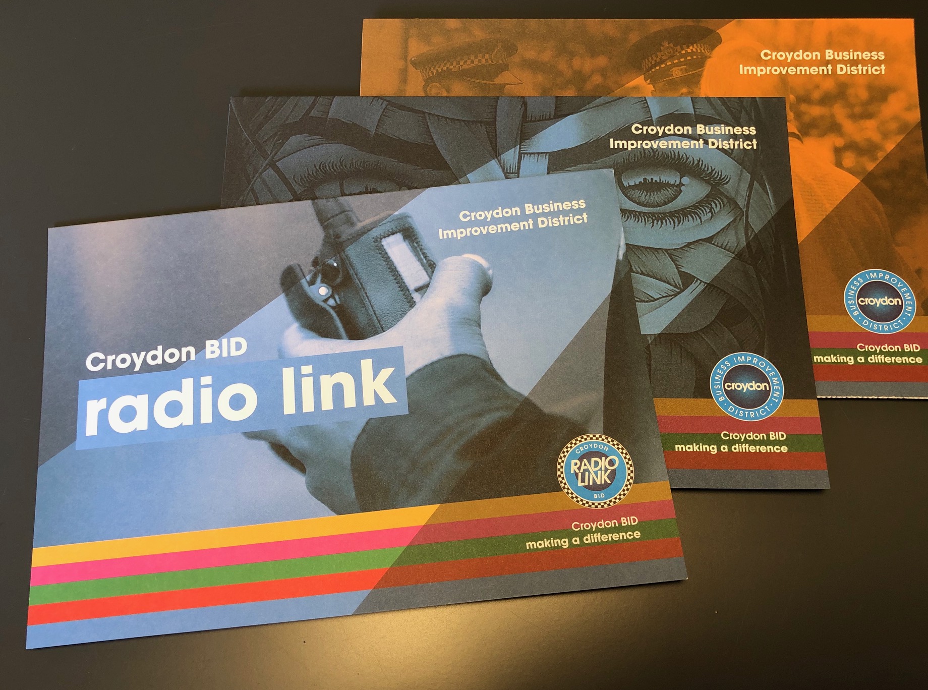
Radio link for Croydon
We were recently tasked with creating a new logo and marketing assets for the Croydon BID Radio Link, an initiative in partnership with Chatterbox, which aims to help improve the feeling of safety and security for those that work, live and visit Croydon town centre.
The brief was clear; to incorporate a design consistent with the Croydon BID and BCRP logos and for it to seamlessly sit alongside the other suite of materials that we have been creating for the BID recently. On the same brief of consistency, we also designed an application form and an A5 fold-out brochure outlining the service, what it is, how to use it, value proposition, how to join and how to contact the BID and those involved with the initiative.
We are still busy working with the BID on the brand refresh for CheckOut Croydon so watch this space as materials roll out over the coming weeks…
Uniformed Typeface
Adam, one of our talented designers, has designed a new typeface, which consists of uniform characteristics, hence its name ‘Uniformed’. This distinctive sans serif headline font is formed of simple uniform shapes and allows users to customise the shape with ease.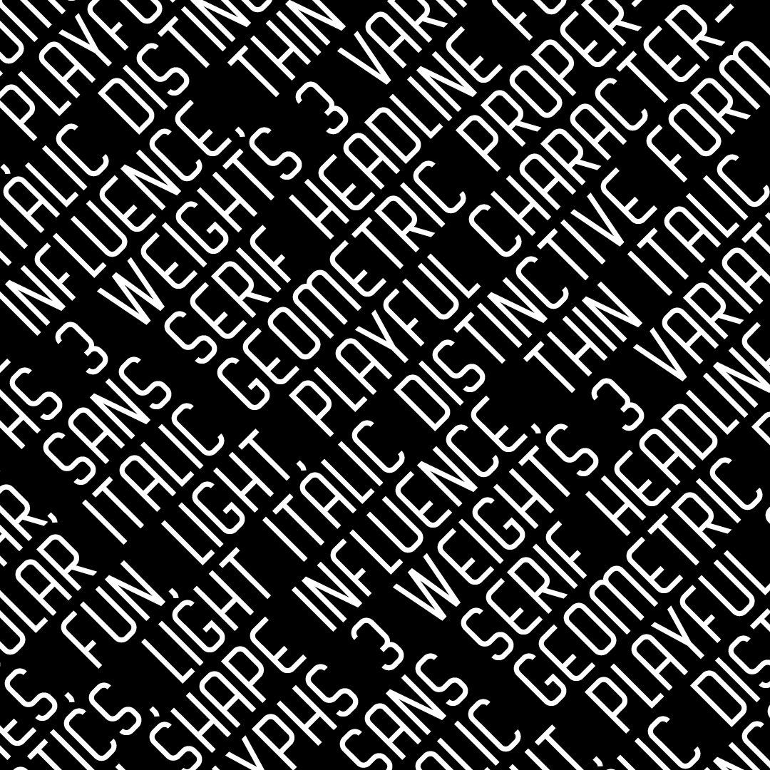
Its base structure is designed with strict rules, formed only of 4 shapes within its proportions. Uniformed has a long and condensed appearance, which makes it ideally suited for use in headlines. Due to specifically placed anchors, you can modify the height of all the characters, the width and the weight to suit any design needs without having to reconfigure curves within the character properties. The typeface is available in 3 font weights including 3 italic variations.

Celebrating Community
Once again the Brighton Fringe Festival has come and gone www.brightonfringe.org. As a Brighton resident, our Creative Director has been experiencing the full gamut of offers that have existed over the month of May when the festival is in full swing.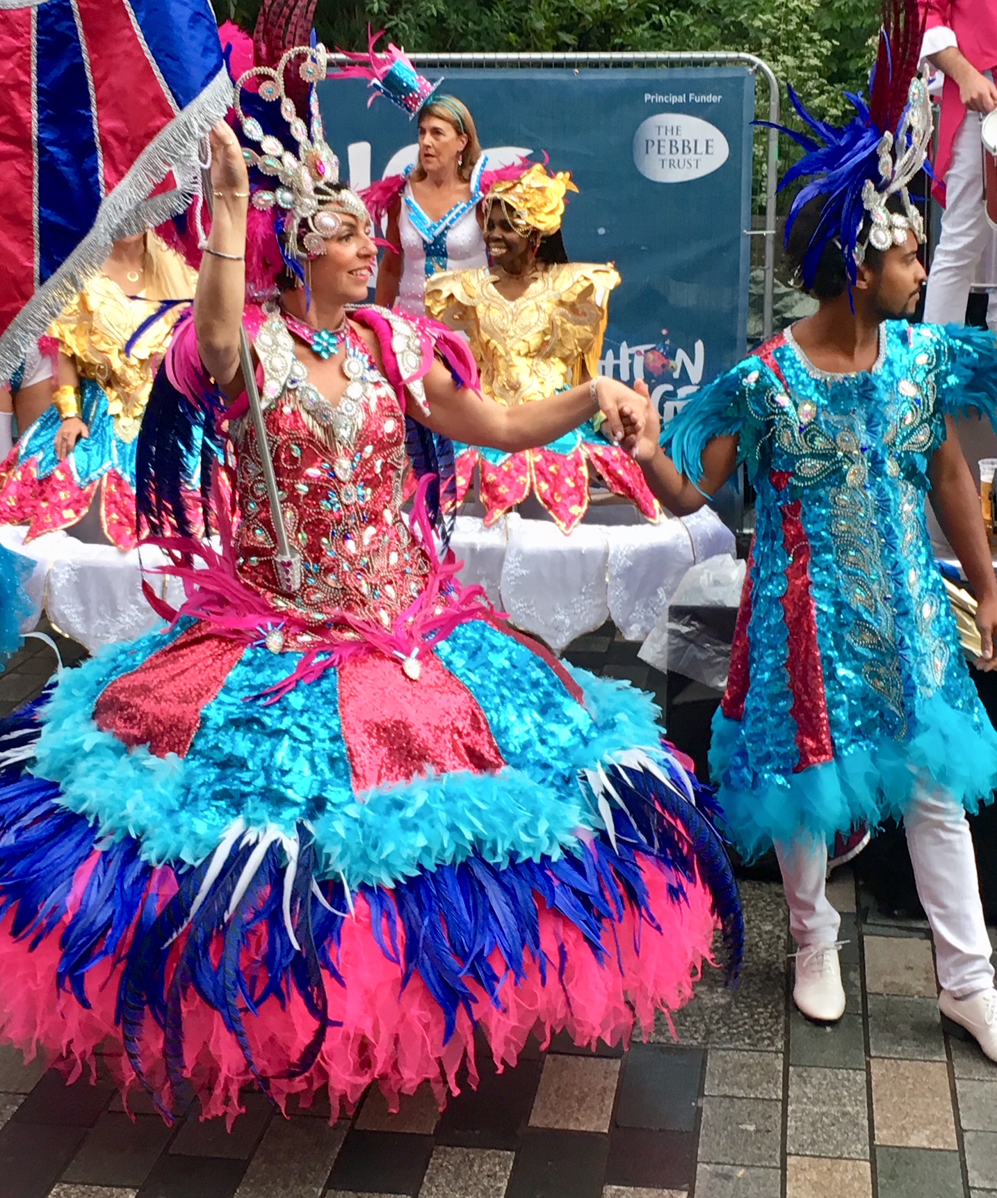
Its breadth and depth, that covers the children’s parade, Cabaret & Circus, Comedy, Dance, Theatre, Performance artists, Visual artists, free entertainment and workshops are truly staggering and testimony to the local Council and its commitment to the arts and free entertainment for its citizens.
As a business we are doing more and more work for charities whose focus is on the local community, engaging with them whilst promoting local enterprises and activities. This has involved creating campaigns that extol the virtues of the local community www.tothepoint.co.uk/work/bankside-concept-campaign hoardings that inform people of activities www.tothepoint.co.uk/work/ulc-hoardings or brands that promote local businesses checkoutcroydon.com