
As an organisation, PMCPA has close ties with ABPI. In fact, PMCPA was established by ABPI as the self-regulatory body for the UK Pharmaceutical Industry. The project coincided with both organisations moving into the same new premises in Hays Galleria, London Bridge to encourage collaboration, but with a layout that enabled the two organisations to retain their independence.

The PMCPA brand and its ties with ABPI
There was a real desire on the part of PMCPA and ABPI to build a synergy between the two brands while making clear the independence of the two organisations. At entry level, we used the same ‘Gilroy’ font used as part of the new ABPI brand as a linking device, but instead of lowercase, we used caps, as this better reflected the authoritative nature of PMCPA.
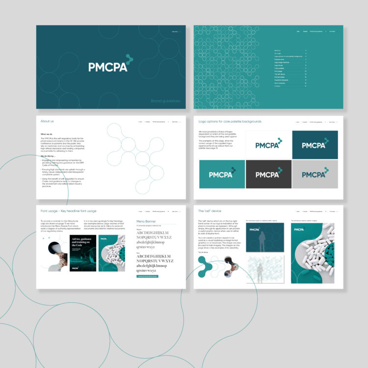
The ‘cell’ device

Where ABPI utilises the ‘shard’ device as an instrumental brand asset that runs through many of its communications, we created a ‘cell’ device which works in a similar way and adds the same flexibility and impact. It visually creates a simple, fluid structure which is indicative of the work of Pharma industries (representing a cell or organism under the microscope).


It can be applied in multiple formats including a device to hold imagery, as a pattern repeat, for highlighting key information, and as a scalable vector file that can be used on its own as a singular device or as a more complex interactive structure or animation.
Brand implementation at their new London Bridge headquarters

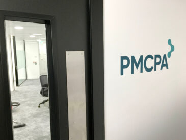

The initial requirements after the branding concepts had been approved, were to implement the new PMCPA logo, colour palette and brand assets in its brand-new London Bridge interiors in a similar way to how we had approached the brand application for ABPI’s space. Each brand application focussed on its respective colour palettes, and we applied these to wall surfaces as sophisticated large-format graphics. To help with keeping synergy throughout the new offices, the core PMCPA colour palette was derived from the ABPI secondary palette. The interiors for both organisations showed how the individual brand assets and icons could be brought to life and used to differentiate the two businesses in the interior spaces, not in a rigid, business, corporate manner but as a free-flowing, interior design aesthetic.
The brand and colour palette were also applied as glass manifestations and pattern repeats in a modern, sophisticated manner. Once again it showed the flexibility of the ‘cell’ device, it could be used singularly when used in signage applications or collectively when used as part of wall graphics and glass manifestations. These interior applications provided PMCPA with their own individual space and identity, reflecting their independence from the ABPI.
Digital guidelines, social media, PowerPoint and Word applications
As PMCPA are a serious, authoritative body, it was important that the online and print materials reflected these qualities and had a degree of gravitas. As with ABPI, we created interactive digital guidelines that enabled the user to access the required information at the click of a button. Social media templates were created that facilitated their perceived usage including text only, image and text, and quote only.
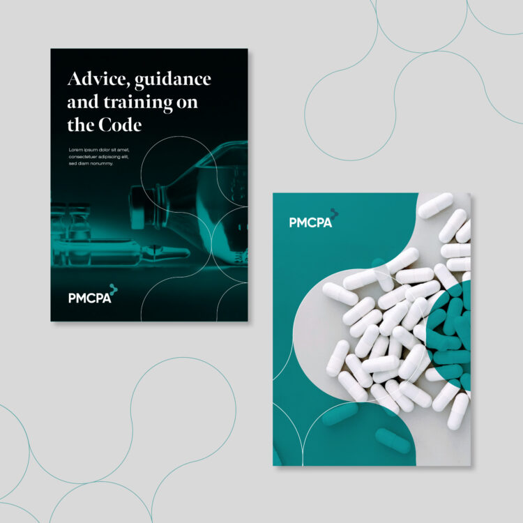
Once again, the flexibility of the ‘cell’ icon came into play enabling us to use it as flat colour vector graphics or more complex image-rich files. For day-to-day usage, we created PowerPoint and Word templates that followed the same basic layout and structure as ABPI, with the PMCPA palette and iconography emphasising its independence.
Below is the simple ‘before’ logo that we were briefed to change, and to the right the new logo enhancement. This shows the modernised typography and inclusion of the new flexible ‘cell’ icon as a building block for the visual language of the brand.
![]()
The result of all these measures is a brand and application that has the authority the PMCPA requires while still having the impact and dynamism it desires. Alex Fell had this to say about the project
“Our new branding and materials have given the PMCPA a modern, fresh appearance and created a strong sense of identity in our new office space. We worked to tight timescales and appreciate all the creativity and attention to detail from Kevin and his team at tothepoint.” Alex Fell, Director at Prescription Medicines Code of Practice Authority (PMCPA)