The Research Triangle

North Carolina’s Research Triangle is one of the world’s leading centres for research, innovation and economic growth. Anchored by the cities of Raleigh, Durham and Chapel Hill, it takes its name from Research Triangle Park (RTP), the largest research park in the United States, and three world-renowned Tier 1 universities: Duke University, UNC-Chapel Hill and NC State.
This unique location became the foundation for the creative concept. Our challenge was to develop a visual identity that referenced both the geography and significance of the Research Triangle, reinforcing its role as a centre of scientific excellence across every touchpoint of the event.
A brand system for Interdisciplinary Science
To build long-term recognition for the Summit, we previously developed a flexible identity system rather than creating an entirely new brand each year. See last year’s news story here. This adaptable framework allows each Summit to have its own distinct character while maintaining continuity with previous events.
The approach reflects Schmidt Sciences’ commitment to interdisciplinary research and its belief that bringing together diverse scientific disciplines creates opportunities to solve complex global challenges in ways that traditional research pathways cannot.


Pic credit: Claudine Gossett
A logo inspired by the Research Triangle
The logo evolved from the triangular relationship between the three universities and the cities that define the Research Triangle. We explored a range of ways to express this form, ultimately creating a simple, dynamic symbol that worked equally well across print, environmental graphics, motion design and film.
Pic credit: Claudine Gossett
Science at the edge
This year’s creative direction sought to capture the mindset of the exceptional scientists who thrive within this environment – individuals willing to challenge convention, embrace risk and push the boundaries of discovery.
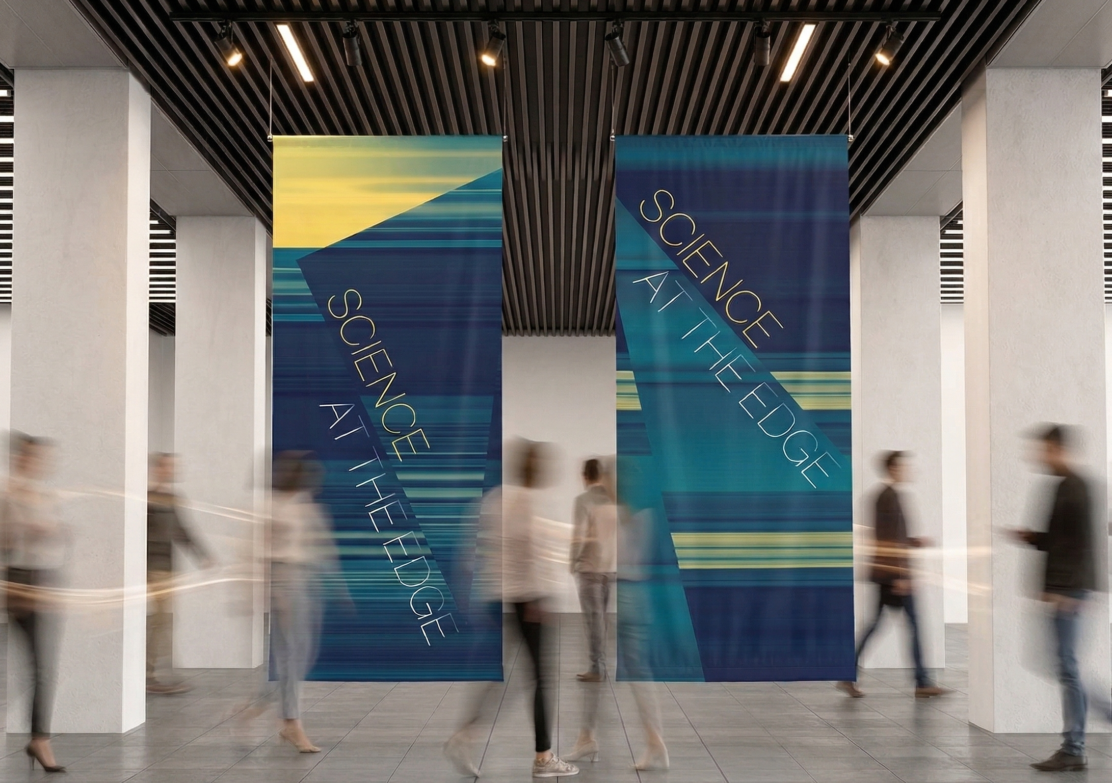
This idea was distilled into the campaign theme Science at the Edge, supported by messaging such as Innovation at the Edge and Discovery at the Edge. Together, these phrases reinforced the pioneering spirit that defines both the Summit and its participants.
Colour palette
The partnership between Schmidt Sciences and Duke University was reflected in a carefully balanced colour palette. Schmidt’s signature blues and teals were combined with Duke’s distinctive mustard yellow to create a visual language that represented both organisations.
This palette was applied consistently across all printed materials, environmental graphics, motion graphics and film content, ensuring a cohesive visual identity throughout the event.
Daytime and nighttime experiences
As with previous Summits, the identity needed to distinguish between the different moods of the daytime conference programme and the evening social events.
During the day, the focus was on research, collaboration and the exchange of ideas. In the evening, the atmosphere shifted towards networking, celebration and informal conversation.
Daytime
The daytime graphics featured monochromatic photography from previous Summits, framed within angular shards derived from the logo. In motion, these same graphic elements were brought to life through scale, rotation and movement, creating an energetic visual system that reflected the dynamic nature of interdisciplinary collaboration.
Nighttime
The evening identity leaned more heavily into the Science at the Edge narrative. Motion graphics combined cinematic footage with bold typography, allowing key messages to emerge from translucent triangular forms inspired by the logo. The layered use of colour, light and movement created a more immersive and atmospheric visual experience, reflecting the shift from conference programme to social gathering while maintaining a strong connection to the overarching brand.