tothepoint

Skyler London Retail Brand Identity

London’s first hair colour only salon, Skyler London, when launched on the high street needed a brand and salon interiors that conveyed the innovation and creativity behind this unique concept.

The brief

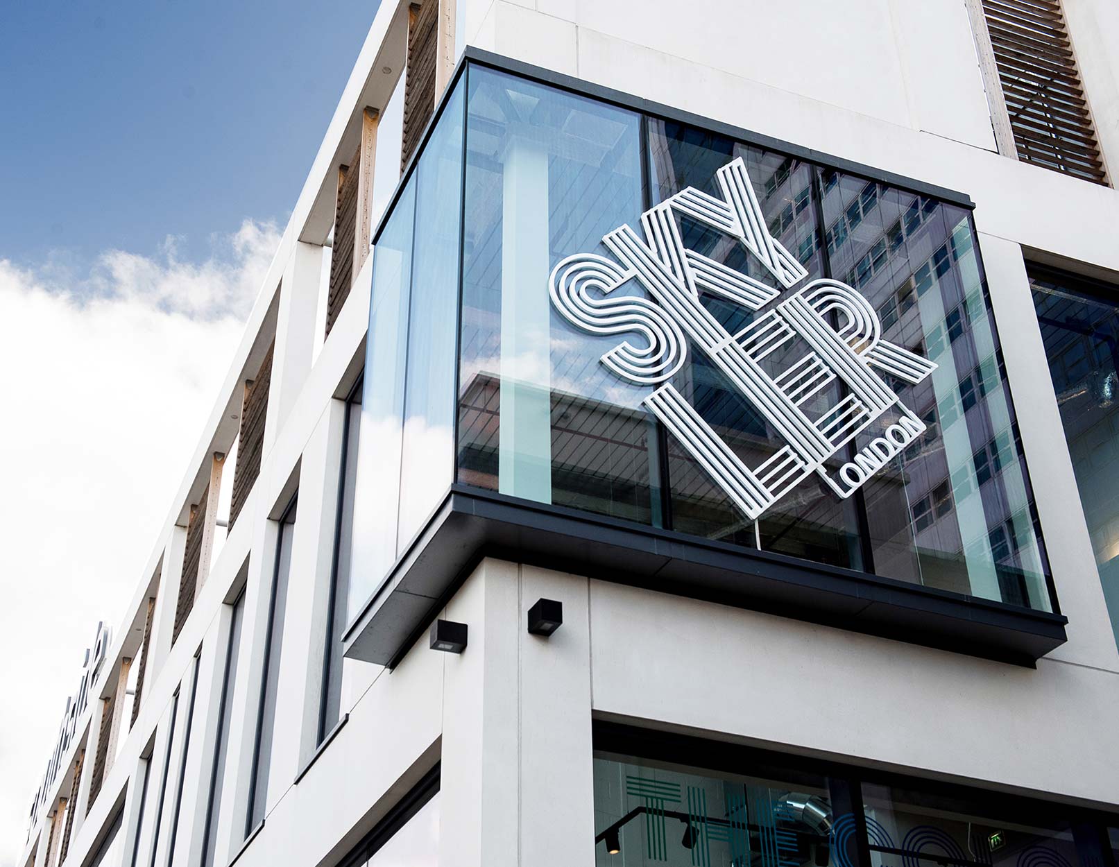
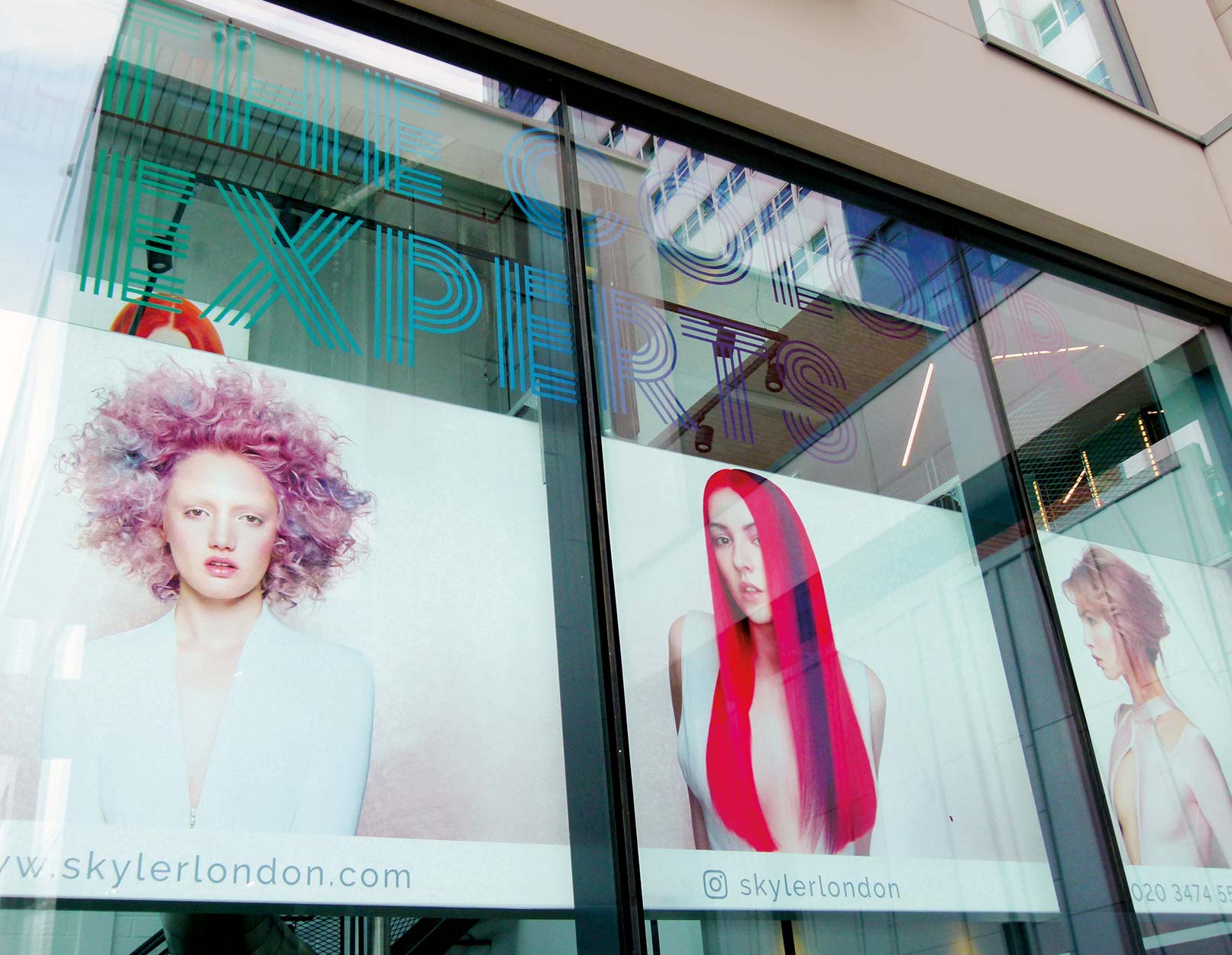
In 2007, ‘Skyler London’ was launched, the joint venture of existing client Sean Hanna and Skyler McDonald who introduced their new ‘hair colouring experts’ concept to the market. 

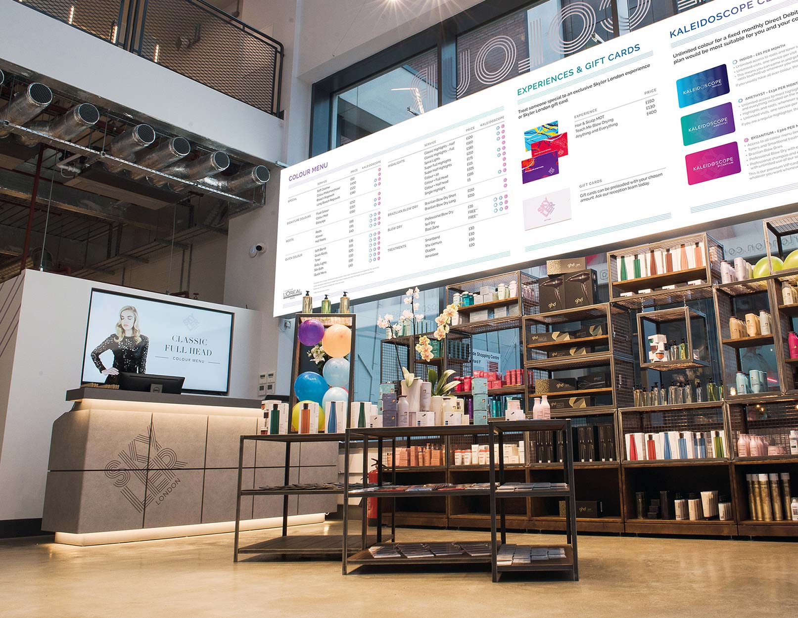
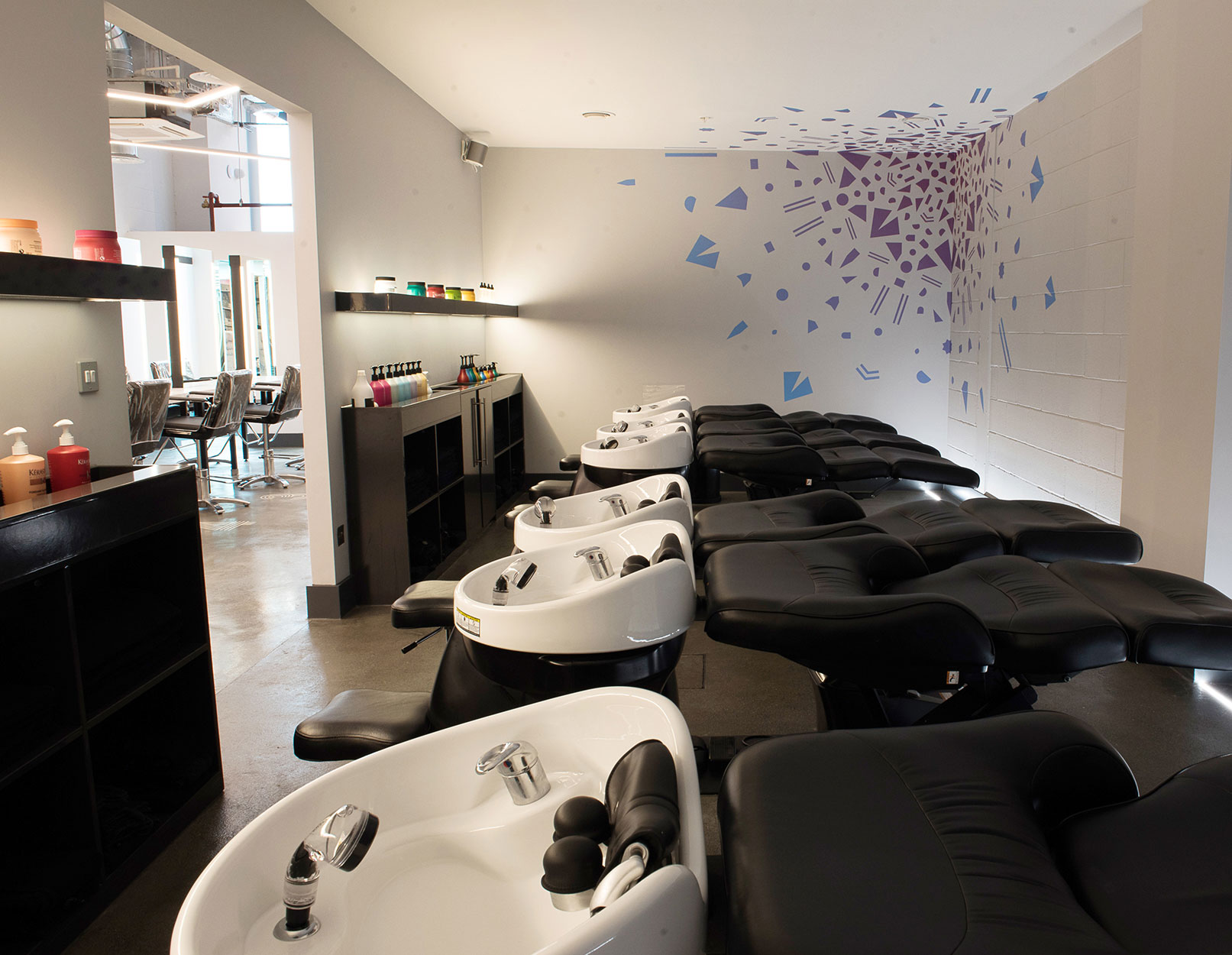
Whilst other hair specialists offered colouring as part of their professional hair services, no one offered it as a stand alone item, where customers could chose unique, bespoke colours, watch it being mixed in the technical area before being applied in a colour only environment. 

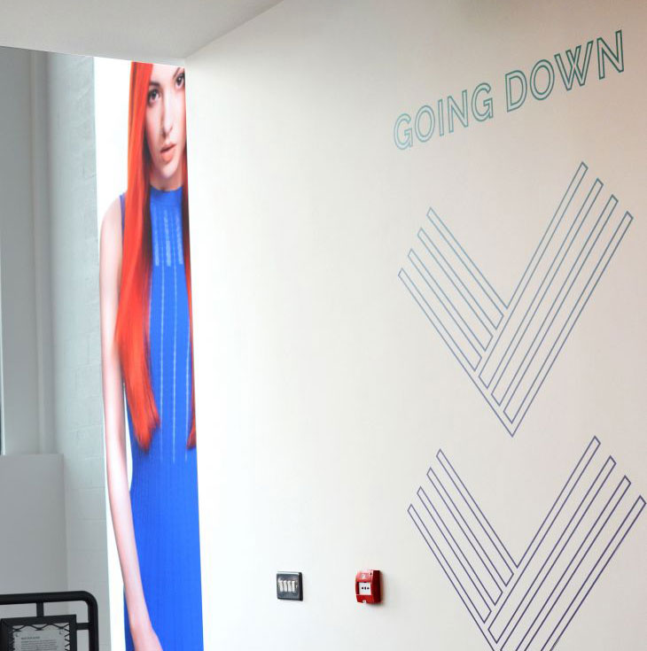
Our brief was to make the focal point of the whole brand the application of colour to hair in all its various guises.

The creative idea

We created a stacked linear typographic brand icon that represented ‘strands of hair’ whose appearance and mood changed, based on the choice of colours that were applied to it (a simplistic interpretation of the concept they were bringing to the high street). 

This linear treatment was used in conjunction with a ‘kaleidoscope’ effect which represented all the colours of the rainbow used on interior wall graphics. It was also the name chosen for the branding of their three membership card offers (Indigo, Amethyst and Byzantium) where the customer could enjoy unlimited colour visits for a fixed monthly fee

Disciplines

Brand Identity
Web design
Large format Graphics
Interior design

The concept is carried through to the salon’s interiors, with linear-based iconography used as an integral part of the wayfinding system and interior graphics.

The exterior large neon style LED signs, vinyls and hair model imagery all helped to maximise the visibility and make the space stand out on the street and against the other retailers in the area.

floor graphic numbers
going down graphic

Industrial style, distressed floor numbers are used to guide guests to their seats. This graphic treatment is also followed through with interior signage where individual icons were created to highlight specific tasks taking place in individual rooms such as the laboratory, rest room, staff only, cloakroom, etc.

To create a spectacle and provide a talking point on social media, the 418m² space also features large LED lightbox displays, wall vinyls, artistic interpretations of hair colour, and, for fun, a giant, metal slide that customers were encouraged to use to get from the first to the ground floor.

The website we created reinforced all of the brand values, clearly highlighting their full colouring service offers as well as the Kaleidoscope Club membership card ranges (Indigo, Amethyst and Byzantium).

“working with tothepoint was great – they really put effort into understanding our brand and how we could communicate our values in both our physical space and our website. They pushed us and challenged us when they felt it was appropriate and they genuinely brought a lot to the table.”

Skyler McDonald