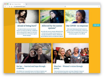
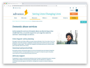
How did we help Advance Charity support vulnerbale women and children, and enable them to take a break from domestic abuse, especially during the COVID-19 lockdown?
By creating a website that prompted their ‘I am with her’ campaign and Annual Reviews that highlighted their strategies to prevent domestic violence and abuse taking place
The brief
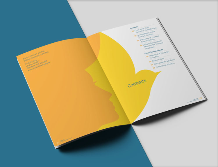
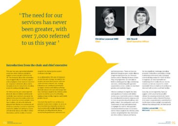
We were approached by Christine Losecaat MBE (Chair) of Advance to redesign their Annual Report so that the charity’s impact resonates more with its various audiences and stakeholders. There was a real desire to make the design more contemporary whilst not losing its human focus, highlighting their impact and importance through statistics / facts and telling the women’s stories. Their goal is to support women and children to be safe from abuse and take control of their lives and divert women away from being involved in offending at the earliest opportunity, preventing family breakdown.
The creative idea
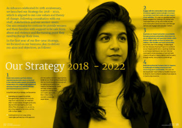
We refreshed the charity’s visual identity by incorporating elements from the brand mark, creating a distinctive look. The logo, featuring a woman’s face with a bird symbolising freedom, forms dynamic shapes that can be used for impactful messaging. Communication focused on the charity’s five strategies aligned with core values, presented in a dedicated spread for clarity.
Photography, representative of the subject matter, avoids showing survivors for privacy. The images convey seriousness with a touch of hope, ensuring a respectful portrayal of women associated with the charity.
Disciplines
Guidelines
Large format graphics
Social media
Editorial
Microsoft template design
Animation
Video work
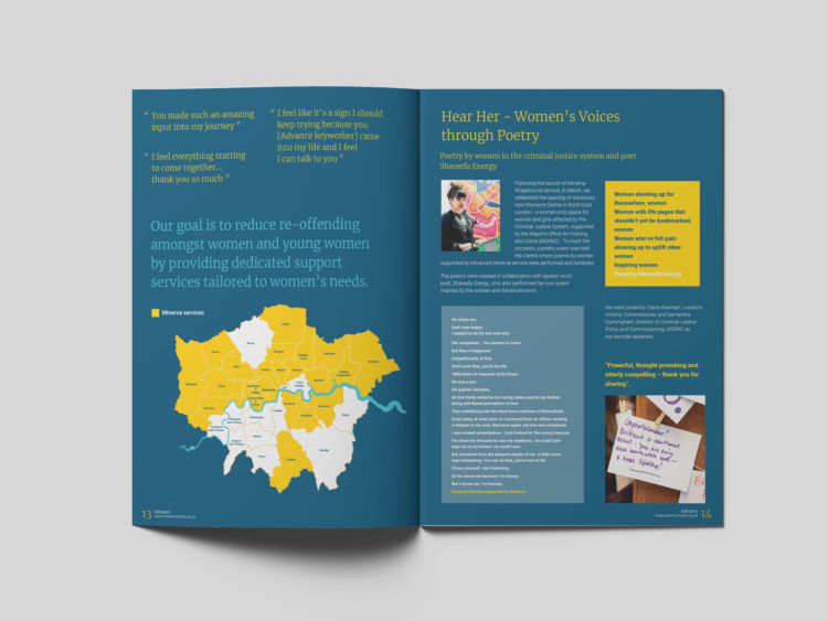
Another consideration was to highlight their expanded Minerva service activities and specifically the opening of their new Women’s Centre in North East London. The centre is a women-only space for women and girls affected by Domestic Abuse and those involved in the Criminal Justice System. To mark the occasion of the opening, a poetry event was held at the centre, where poems by women supported by Advance’s Minerva service were performed and exhibited, which the charity was keen to promote in the publication.
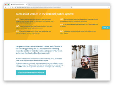
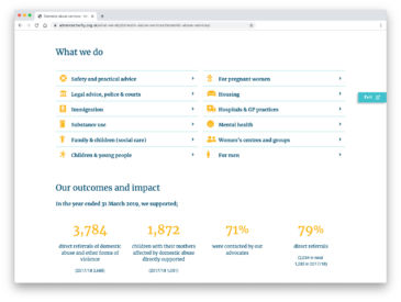
The launch of the website coincides with Advance’s ‘I am with her‘ campaign; an urgent appeal with a fundraising target of £100,000 to help run free telephone helplines for victims of abuse as well as advocacy services, and providing essentials such as housing, food and care packages. The campaign centres around 5 women’s stories; video case studies portraying real life survivors of abuse and how Advance has helped them.
We created the website for Advance in WordPress using a simple ‘starter’ theme and collection of tried and trusted plugins. This solid foundation, combined with a small amount of bespoke functionality added from our own code-base, enabled us to create a flexible and easy to use solution to meet our client’s brief.
