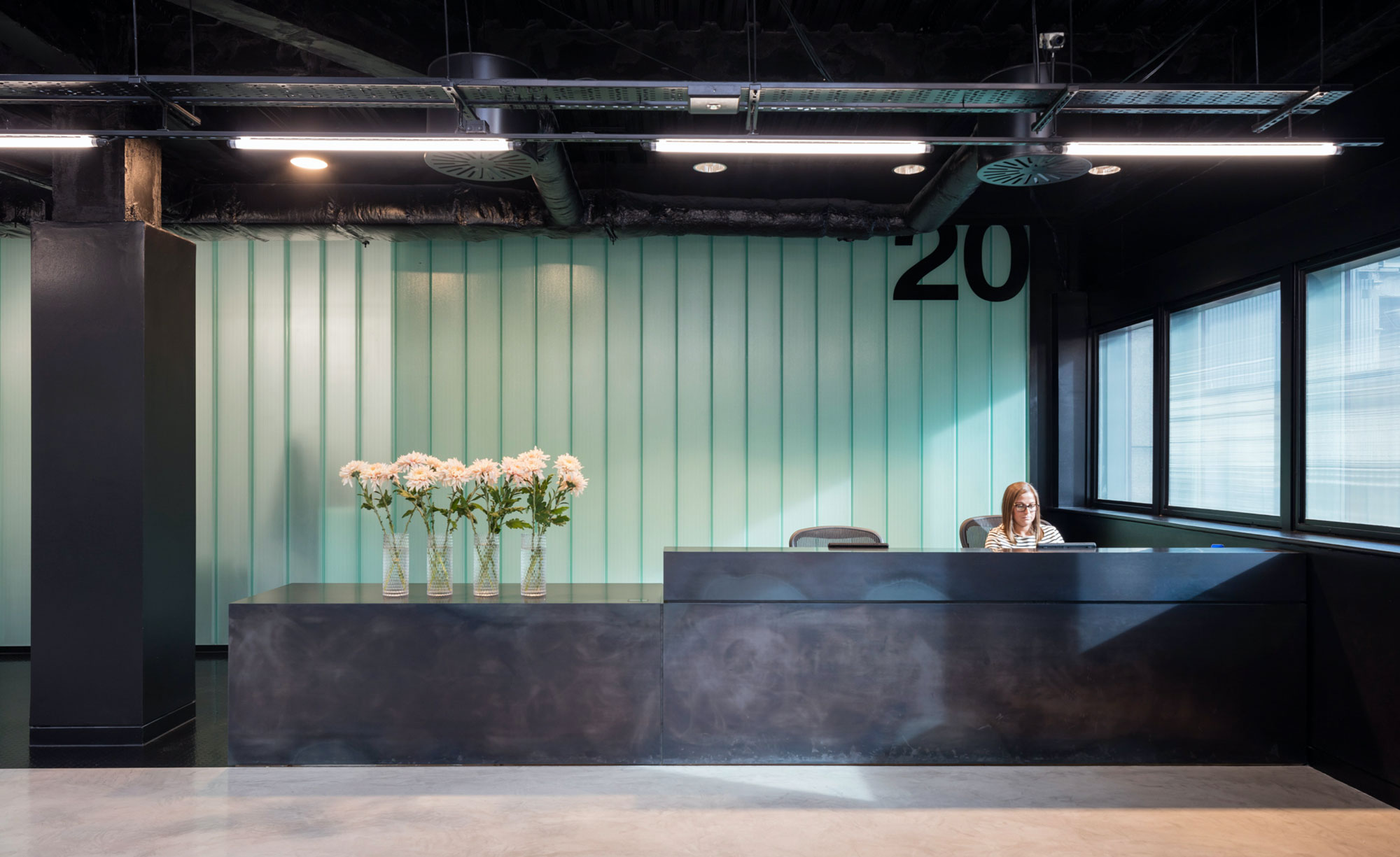
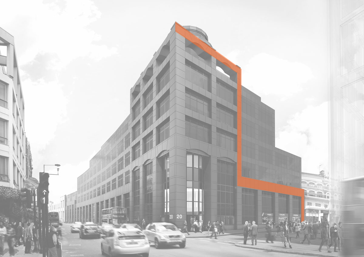
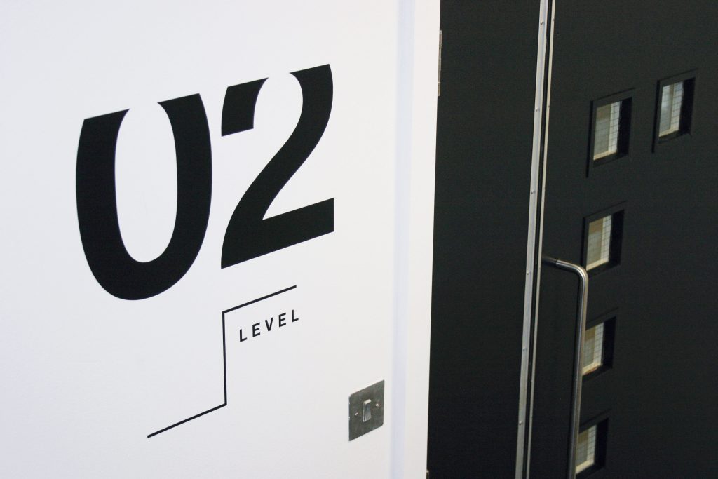
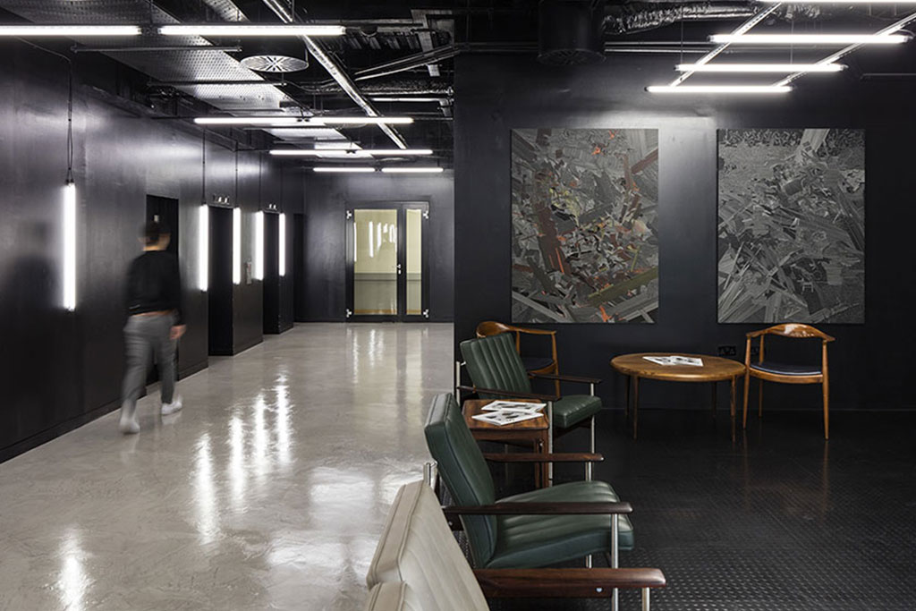
tothepoint

Derwent London Brand Overview

Creating unique property brands and materials that reflect Derwent’s design led philosophy and their focus on niche, regenerative office spaces in central London.

The brief

Derwent London is one of London’s most innovative office specialist property regenerators and investors and is well known for its design-led philosophy and creative management approach to development.

Their contemporary approach to design attracts a range of tenants, in particular those from creative industries. This philosophy is reflected in the choice of graphic design studios on their roster and the work these agencies produce to promote their developments.

It’s important that their ‘Derwent’ ethos and aesthetic is reflected in the end product which is all about simple, clean, contemporary design.

The creative idea

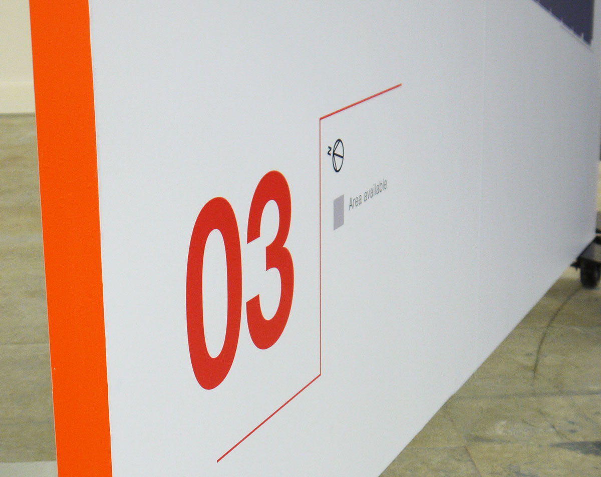
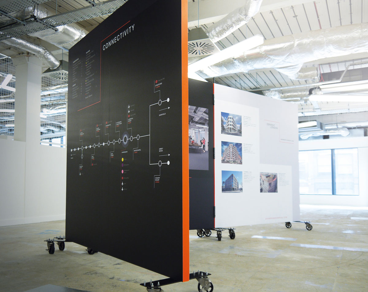
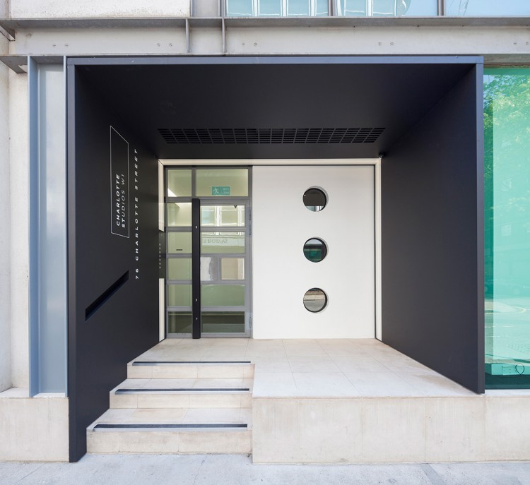
Our approach with all Derwent projects is to treat each space independently, pulling out the unique features of individual buildings, their characteristics and locations. In doing so, we create a distinct brand personality for each property, whilst at the same time retaining and reinforcing the cool simplicity of the Derwent brand.

In some instances the catalyst can be as simple as a detail from the building, the way that it’s structured internally, or the materials used in its construction. We then demonstrate the flexibility of the concept so that it feels different when applied across print, digital and workplace environments, keeping the brand fresh and exciting.

Disciplines

Brand Identity
Large format graphics
Signage 
Web design
Wayfinding

20 Farringdon logo

Typography, combined with positive and negative space play an essential role in the brand personality of 20 Farringdon Road. The minimal colour palette of black and white reinforce this concept.

The ‘zig zag’ or ziggurat detail as we described it was inspired from how the stonework was used on the outside of the building and this detail fed through to all of the materials in some shape or form.

zig zag graphic
02 level image
Waiting-room

The building had two separate entrances at 20 and 30 Farringdon road which created a lot of confusion in terms of navigating the building. We did an extensive signage and wayfinding exercise in streamlining which path and entrance to take depending on where you wanted to go.

Following the design of the technical pack, we set to work on the website. A staggered responsive grid system, punctuated with parallax photography and galleries, the single page website was a simple cost effective solution.

Interactive, move-able sales displays and invites, in the ‘zig zag’ format were generated to promote specific areas of the building that proved difficult to let.


WITH ALL DERWENT LONDON PROJECTS WE TREAT EACH SPACE INDEPENDENTLY, PULLING OUT THE UNIQUE FEATURES OF INDIVIDUAL BUILDINGS, THEIR CHARACTERISTICS AND LOCATIONS.

Charlotte Street Studios’ key characteristic was the amount of light that the structure let in, we reflected this through the predominant use of thin and light typefaces and white space throughout the design concepts

“tothepoint interpreted the brief well, it complimented the property and also Derwent London’s brand. The final identity and marketing materials for Charlotte St Studios really show that they understood what we were looking for, they work well with our other materials but still give the building a unique look and feel.”

Lesley Bufton, Property Marketing Manager at Derwent London

Holden House was unusual due to its non-standard floorplates and we decided to reflect this characteristic in the design with paper engineering, where unusual shapes and sizes interact with each other.


We were asked to create all the marketing materials for Holden House, a Grade II listed building whose office entrance is nestled on Rathbone Place, after its return to the market following a comprehensive refit.