tothepoint

Following a successful collaboration on this key SDG report and our ongoing work with RELX, Elsevier asked us to also develop visuals and infographics for template overviews of their core research findings in various reports. Leveraging our knowledge of the brand, expertise in the science and healthcare sector, and our skill in bringing data to life through infographics, we were well-suited to meet all their needs.

The brief 

Having completed the report shown here, we were given two briefs for infographics covering different aspects of research and analytics in the SDG space. We helped craft the briefs and approach we would take with Elsevier. The purpose of the infographics was to be a valuable guide for universities and academics about the global growth stats of countries that excelled in efforts to perform in the SDG’s research sector. Who was performing well in pushing forward? Who was not? What did this tell us about priorities and the overall engagement health of the UN’s SDG’s?

The creative idea

Our approach was to break the content down into 4 sections of the different areas of research being covered and use a single word to capture the essence of each quarter. The four words – Inspiration, Relevance, Quality and Collaboration – were used around an overarching pie that showed the global growth of SDG research. This set the main structure for future templates that would be used for other sector and subject-specific research.

Disciplines

Brochure Design
Brand Identity
Guidelines
Editorial Design
Infographics


The report : The Power of Data to Advance the SDG’s

The United Nations SDGs themselves have a very strong and distinguishable brand identity, making great use of simple iconography and vibrant colours to represent each SDG, something that we wanted to leverage by featuring these and the colours throughout the report. This also helped the Elsevier and RELX elements of the report sit together. Working closely with the Elsevier marketing team to ensure the report we developed was on brand, we created a master template to help with future publications that mix Elservier and RELX content.

previous arrow
next arrow
Slider
previous arrow
next arrow
Slider

“Just wanted to share the proud moment and give you a huge thanks from us for the excellent job you did on the SDG report! The report has been very well received”.

Ylann Schemm, Director of the Elsevier Foundation

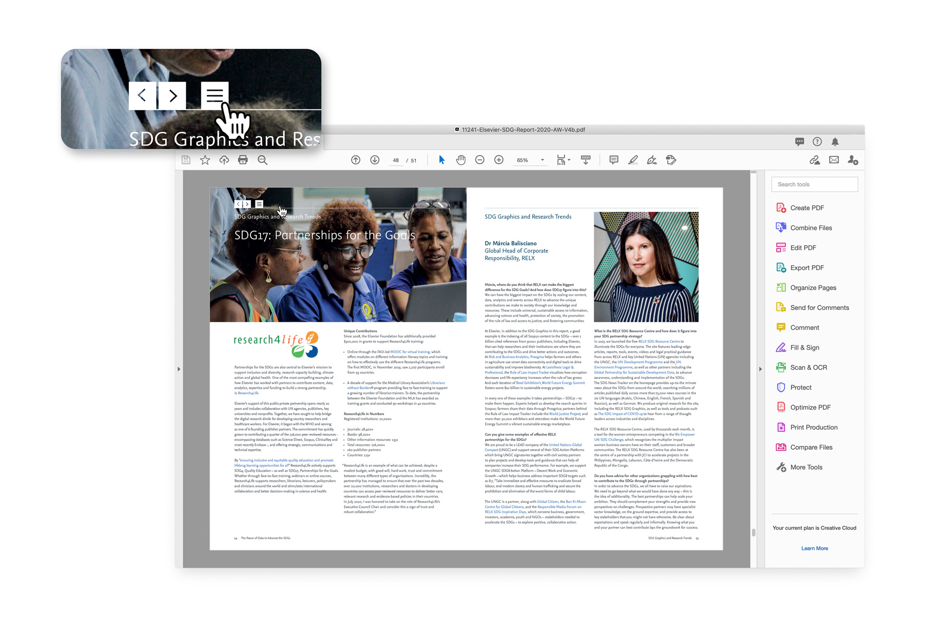
The SDG and Biodiversity infographics, telling a story

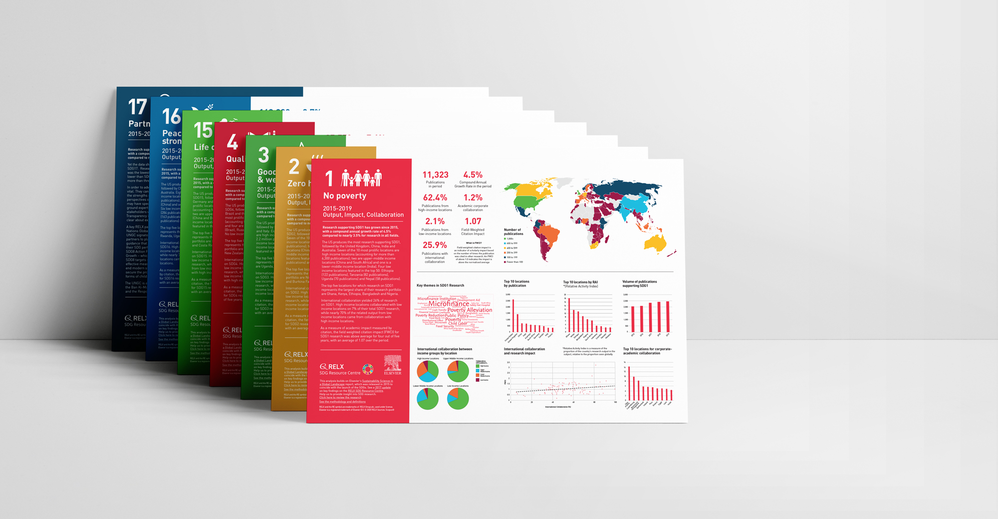
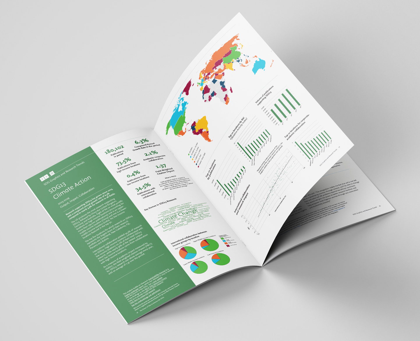
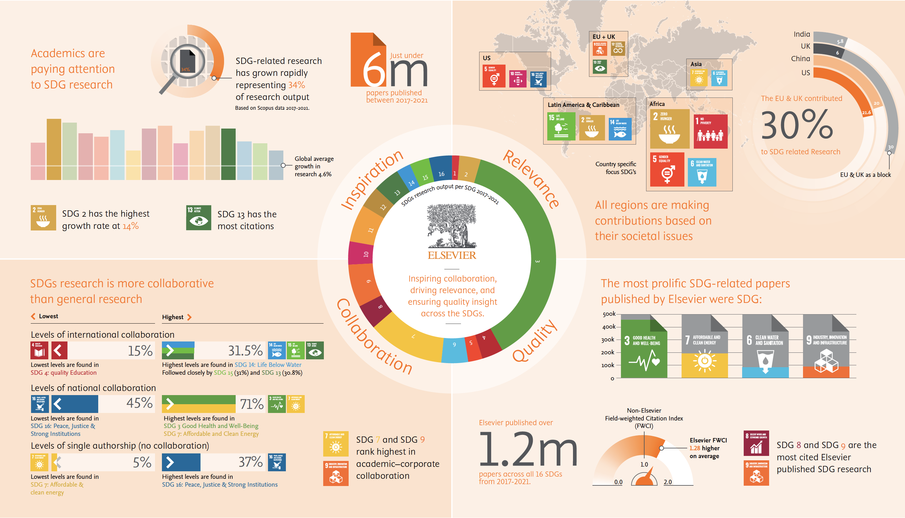
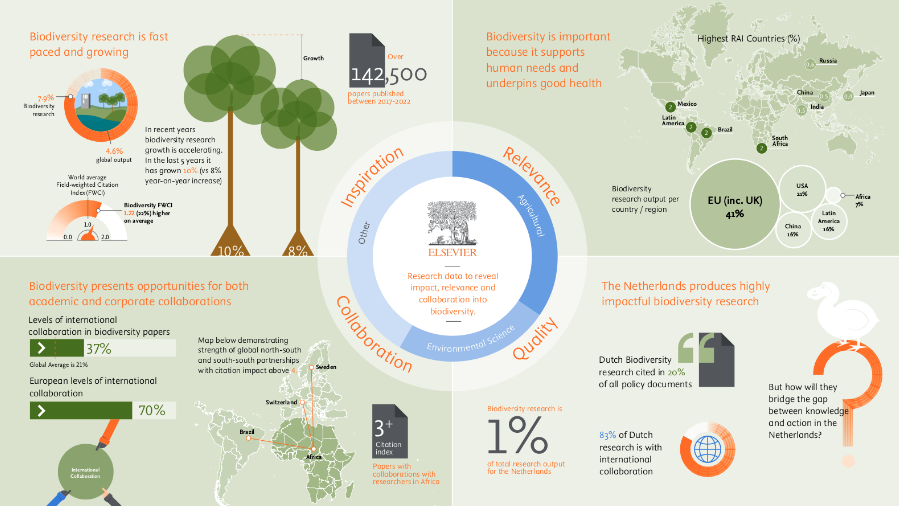
Following the brief and understanding the data was essential to help tell the stories of the information in an engaging and consistent way, that could be used later for new reports. It was interesting to see in the final SDG Global Research outputs that some countries with the lowest number of publications had among the highest collaborations and those with the highest volume of publications often weren’t great at collaboration.

Beyond this was whether the quality of research and collaborations had an impact on action, not always the case as can be seen from the Netherlands.

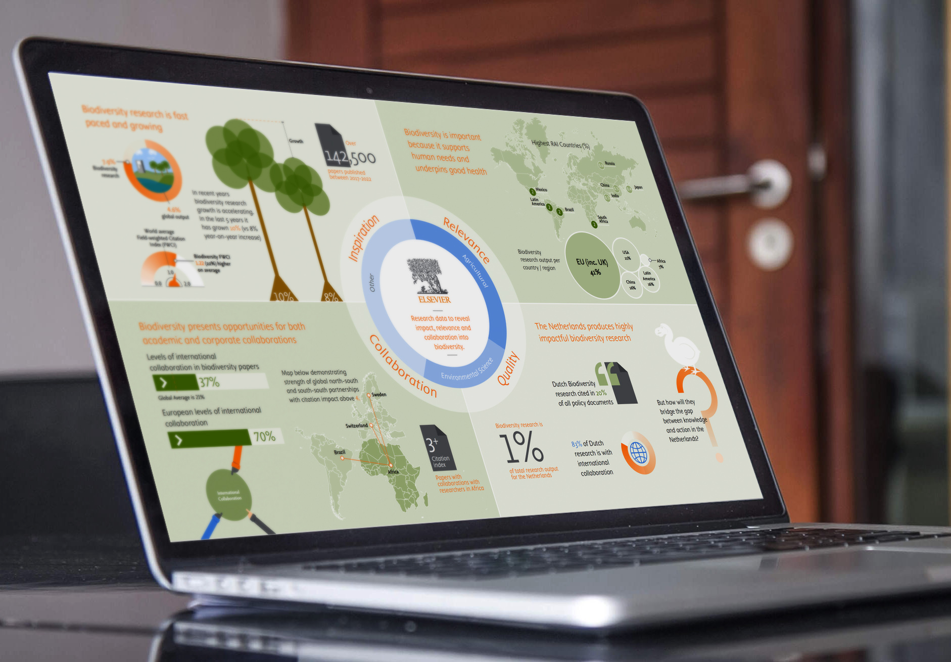
To help differentiate the Biodiversity infographics, before delving into the ‘data detail’, we used a colour theme based on a softer, more friendly look, depicting scenes of nature, animals, around the main stats to engage the audience. The graphics are again relevant to the stories and insight from the data, from maps to depict country-by-country data, trees to depict the wider biodiversity themes, to elements of humour to address the need for greater actions.

The SDG frameworks infographic 

For the final infographic, we discussed with the client team what the multiple sets of complex data meant and what the key takeaways should be, distilling it down to its most basic form and through this, we were able to present the two sets of data with clarity and consistency. Often we will sketch quick ideas to show the approaches we could take before spending too much time on colour, typography and graphics on the computer, which may be going in the wrong direction. Some clients like this, others need more highly polished visuals – the latter obviously taking longer but we are happy to work both ways.

For the final solution, we settled on using simple doughnut pie charts to link the two sets of data and separated them visually by using the UN SDGs colour scheme on the left side, and a colour palette based on naturally associated colours with their topics for the other sustainability data on the right. The end result is a detailed dual-infographic that easily allows you to quickly compare complex data and see where the big differences are across the six areas covered by the research and the report.