tothepoint

Creating a concept for Informa’s Colchester offices that celebrated the company’s values and ethos and the town’s past and present.

The brief

We were approached by Informa’s Director of Global Branding and Corporate Communications, Graham Jerome-Ball, to put together a proposal document that outlined how we might be able to help create an interior brand concept for their offices around the world. The testing ground for this was to be Informa’s Colchester office which although newly refurbished, was felt to be too sterile and would benefit from bringing some interior graphic stimuli to the modern, clean, and bare whitewashed walls.

The creative idea

Informa has a very distinctive brand logo icon based on a roundel constructed from a series of dots and linear marks. We explored how the roundel, dots, and linear marks could be deconstructed and expanded upon to create a series of flexible new assets that could be applied to the Colchester interior across imagery, signage, and messaging. The result was something that evolved and expanded on the existing brand whilst also celebrating Colchester’s past and present.

Disciplines

Interior Design

The flexibility of the dot concept

The dot concept enabled us to explore different ways in which it could be applied to:

  • Imagery
  • Iconography that reflects elements of the Informa logo
  • Key messages around the workspace
  • Unique typography for signage and wayfinding.

Celebrating Colchester

As part of the brief, we also looked at how we could represent and celebrate Colchester from a cultural, historical, and artistic perspective. From our site visits and research, we identified what made Colchester unique and the legacy that its people and history had left on the town, from historical landmarks like Colchester Castle to famous modern-day cultural icons like Blur.

The dot halftone imagery

The imagery worked on two levels. When viewed up close the large format dot imagery appeared abstract with a pop art aesthetic and look and feel. At the same time, the images were created from hundreds of different-sized dots, the same dot that appears as part of the Informa logo.

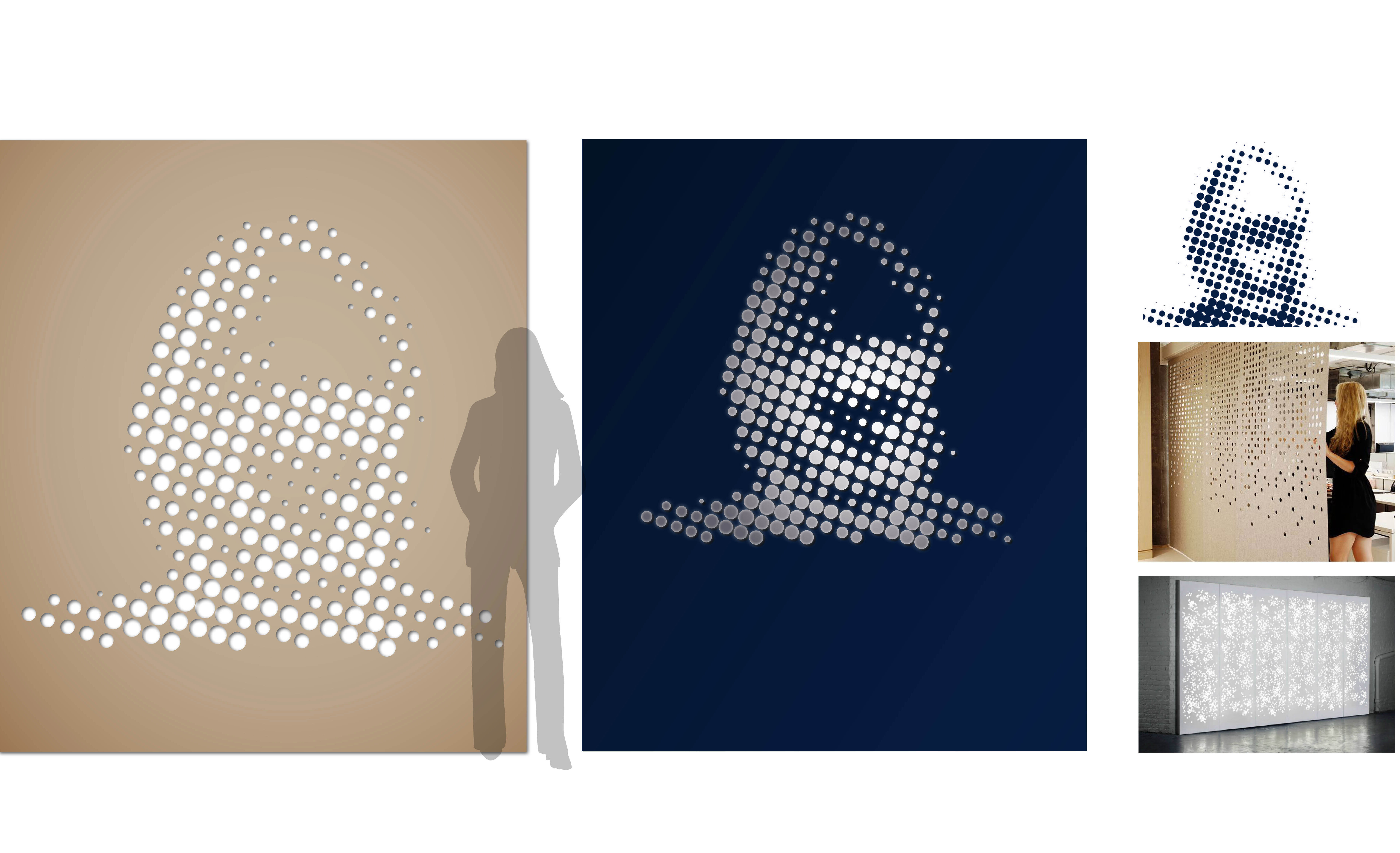
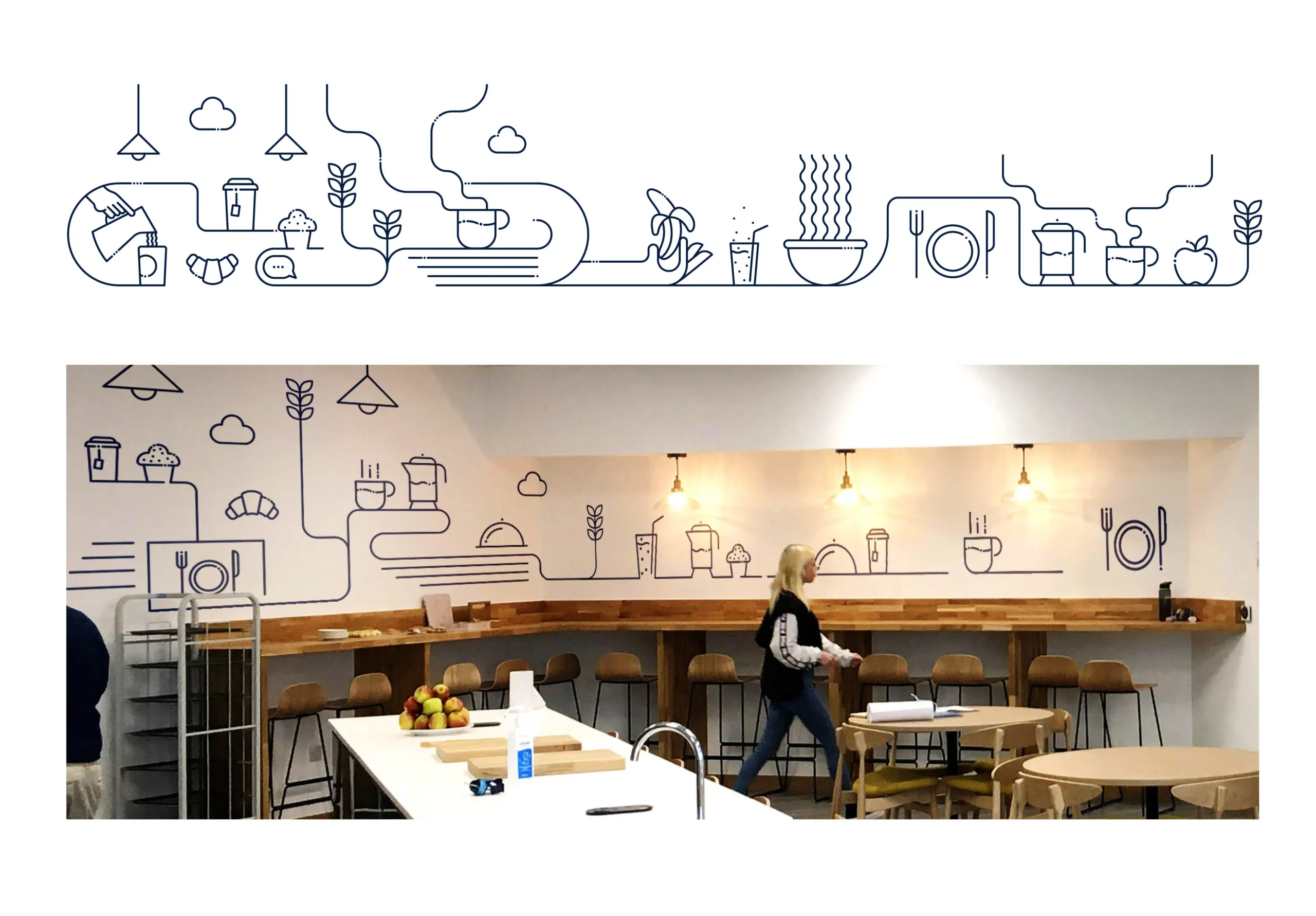
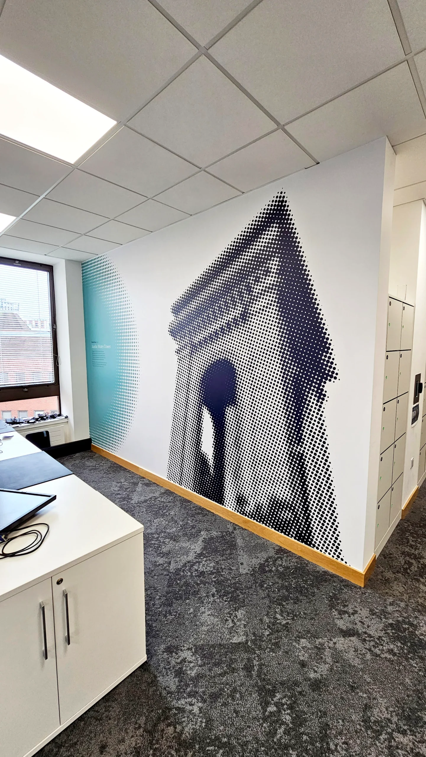
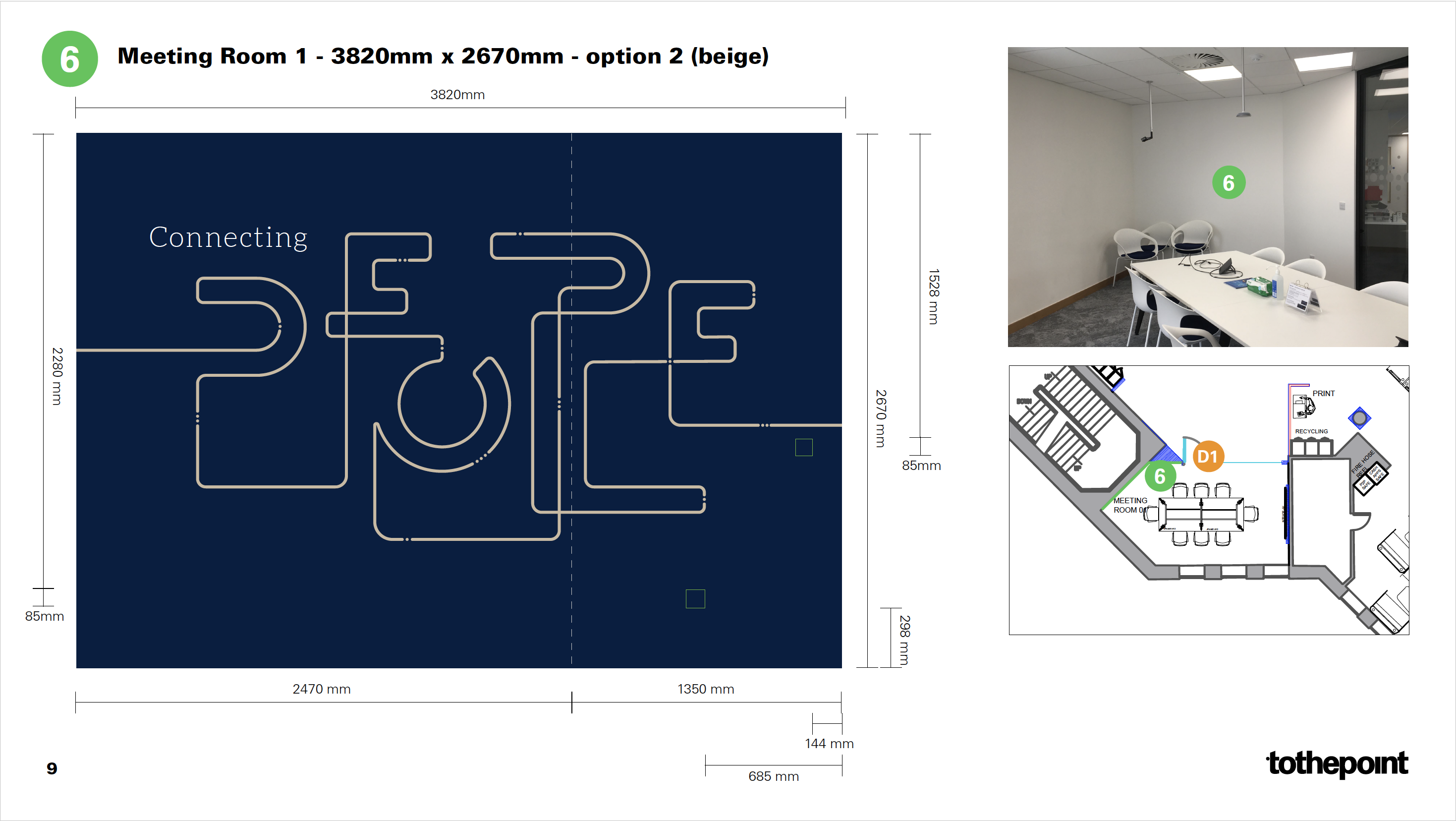
Highlighting key Informa messages

The ‘hero’ graphics represent some of Informa’s key values and messaging including ‘connecting knowledge’, ‘connecting ideas’, ‘connecting people’, and ‘connecting places’. They are expressed as continuous linear graphics interspersed with dot ‘pauses’, which we rationalised as the ‘deconstructed Informa logo’.

Space planning and production packs

An important part of any project of this scale and nature is the planning and plotting of the graphics in terms of where they appear, accompanied by site visits to measure up to determine their size, production and application methods, and likely cost including installation. The final production pack contains all this information in one document.

 “It’s vital that our interiors provide a sense of belonging and somewhere people feel comfortable, engaged and supported. We spend a huge amount of effort on getting the tech, furniture and fittings correct and I wanted to make sure we also had a complementary graphics pack that built on this. ToThePoint understood and developed the brief to give us a pack that has stayed close to the Informa identity but has also injected some fun and interest into our office space.”

Graham Jerome-Ball, Informa’s Director of Global Branding and Corporate Communications