tothepoint

Following our successful brand refresh work for The Association of the British Pharmaceutical Industry (ABPI), including a new brand look, digital assets, video assets, interiors, and brand guidelines, we were approached by Alex Fell​, Director at Prescription Medicines Code of Practice Authority (PMCPA) to overhaul their brand.

The brief

As an organisation, PMCPA has close ties with ABPI. In fact, PMCPA was established by ABPI as the self-regulatory body for the UK Pharmaceutical Industry. There was a real desire on the part of both parties to build a synergy between the two brands while making clear the independence of the two organisations.  The project coincided with both organisations moving into the same new premises in Hays Galleria, London Bridge to encourage collaboration.

The creative idea

To make a clear connection between the two we decided to take the same branding approach to both, pandering to their European and worldwide audiences. Clean, European sans serif typography was accompanied by an icon which represented each of their activities in an abstract form. We also applied the same ‘Gilroy’ font used as part of the new ABPI brand as a linking device, but instead of lowercase, we used caps, as this better reflected the authoritative nature of PMCPA.

Disciplines

Brand Identity
Social Media Templates
Powerpoint Template
Word template

PMCPA-Logo-Before-01 PMCPA-Logo-After-01

As PMCPA are a serious, authoritative body, it was important that the online and print materials reflected these qualities and had a degree of gravitas. As with ABPI, we created interactive digital guidelines that enabled the user to access the required information at the click of a button.

Where ABPI utilises the ‘shard’ device as an instrumental brand asset that runs through many of its communications, we created a ‘cell’ device which works in a similar way and adds the same flexibility and impact. It visually creates a simple, fluid structure which is indicative of the work of Pharma industries (representing a cell or organism under the microscope).

PMCPA_brand17

Social media templates were created that facilitated their perceived usage including text only, image and text, and quote only.

ABPI-Interior-1

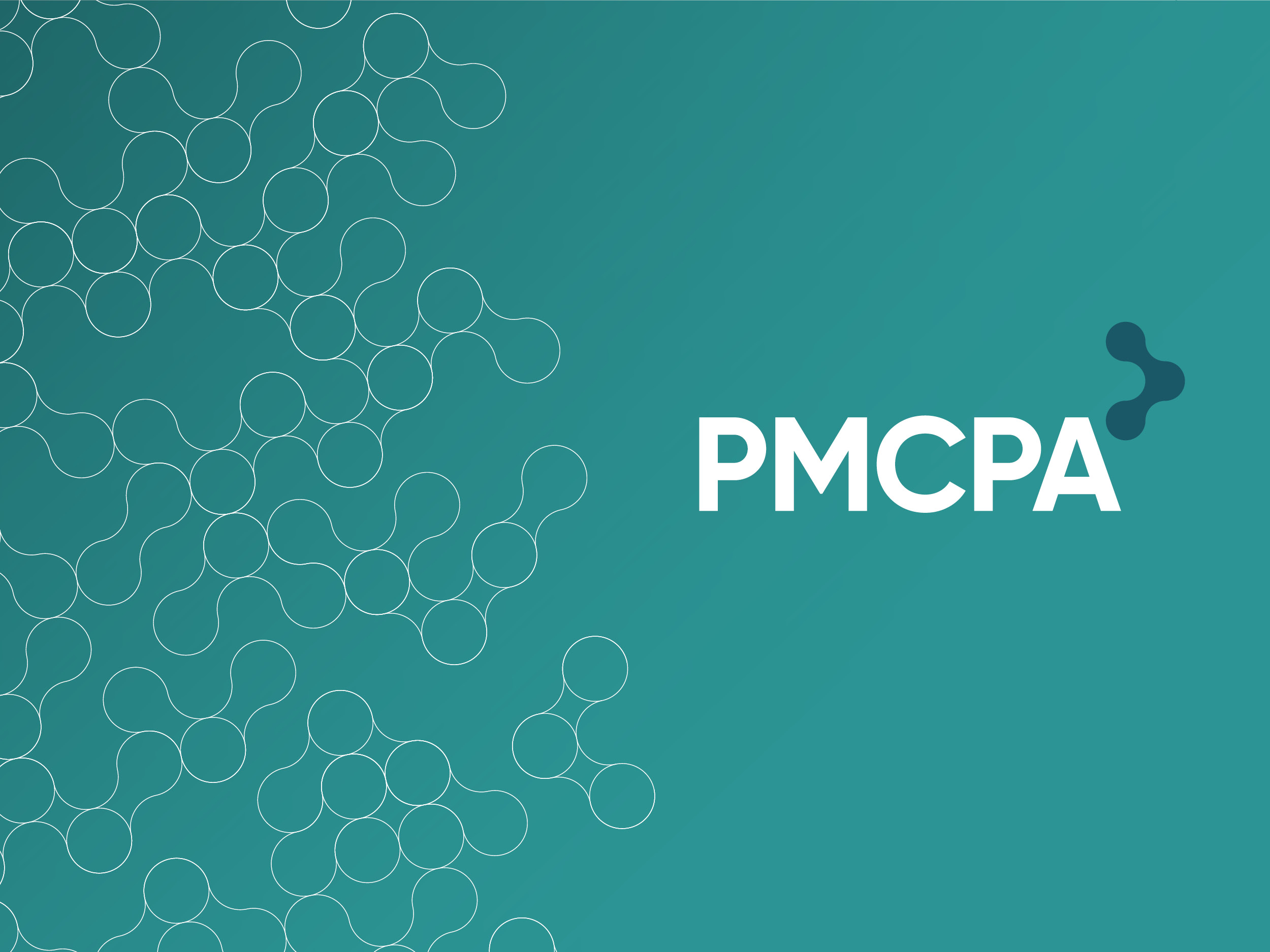
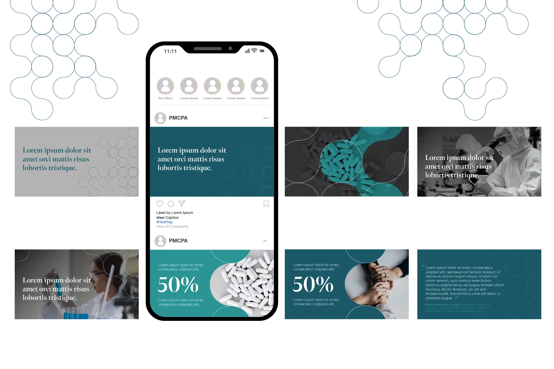
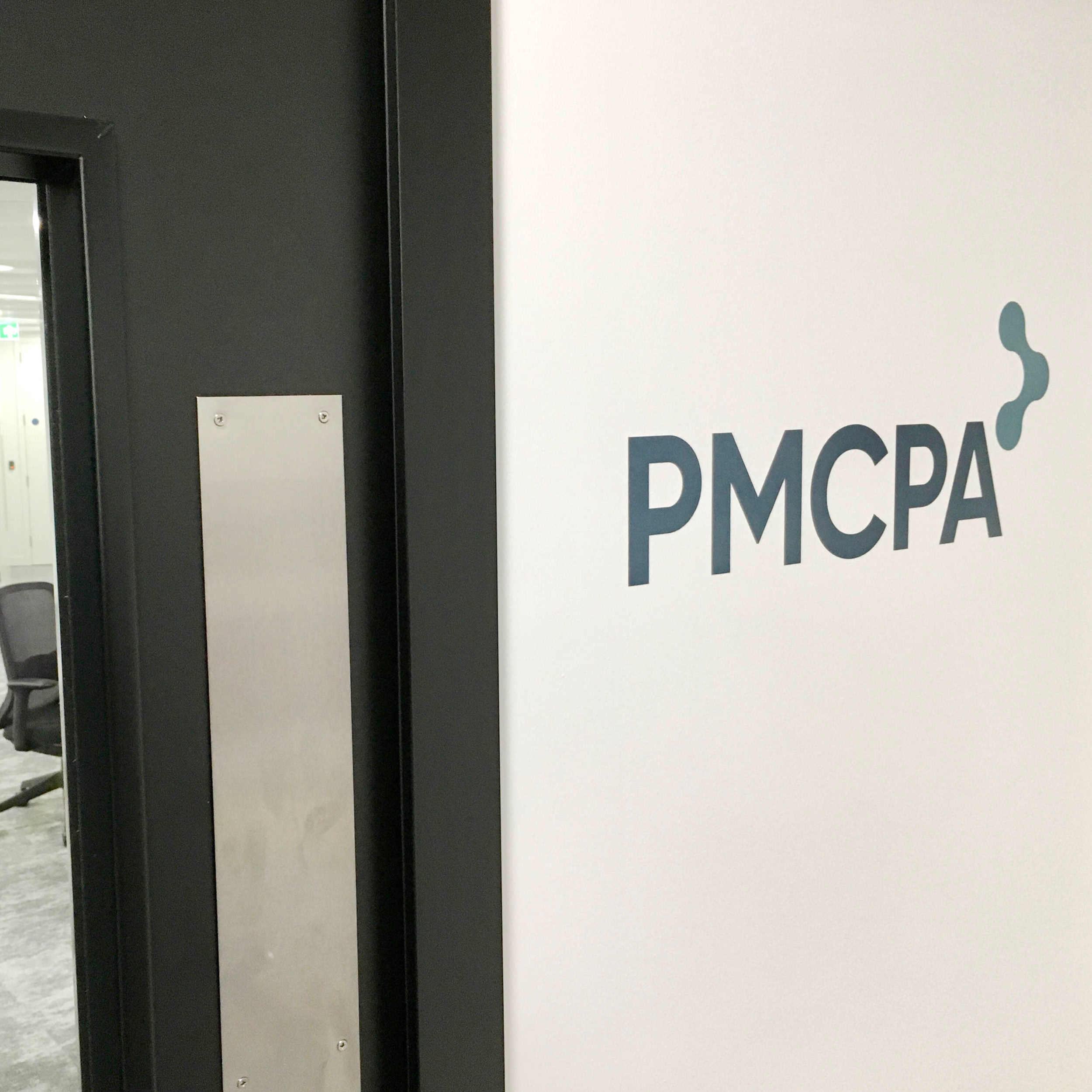
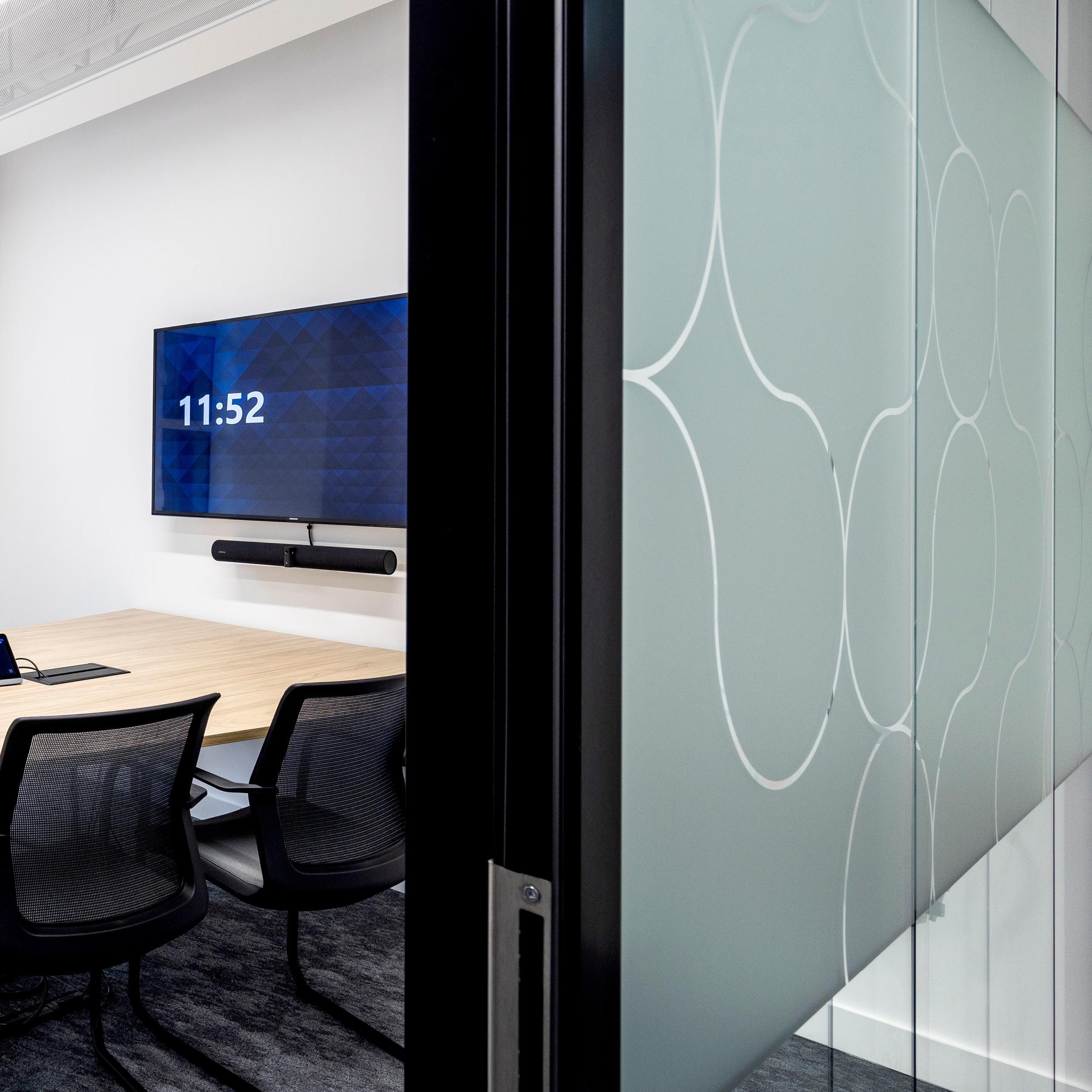
After the branding concepts had been approved and its personality established we were asked to implement it within the workplace environment. The brand and colour palette was applied as glass manifestations and pattern repeats in a modern, sophisticated manner.

Once again it showed the flexibility of the ‘cell’ device, it could be used singularly when used in signage applications or collectively when used as part of wall graphics and glass manifestations. 

“Our new branding and materials have given the PMCPA a modern, fresh appearance and created a strong sense of identity in our new office space.  We worked to tight timescales and appreciate all the creativity and attention to detail from Kevin and his team at tothepoint.”

Alex Fell​, Director at Prescription Medicines Code of Practice Authority (PMCPA)