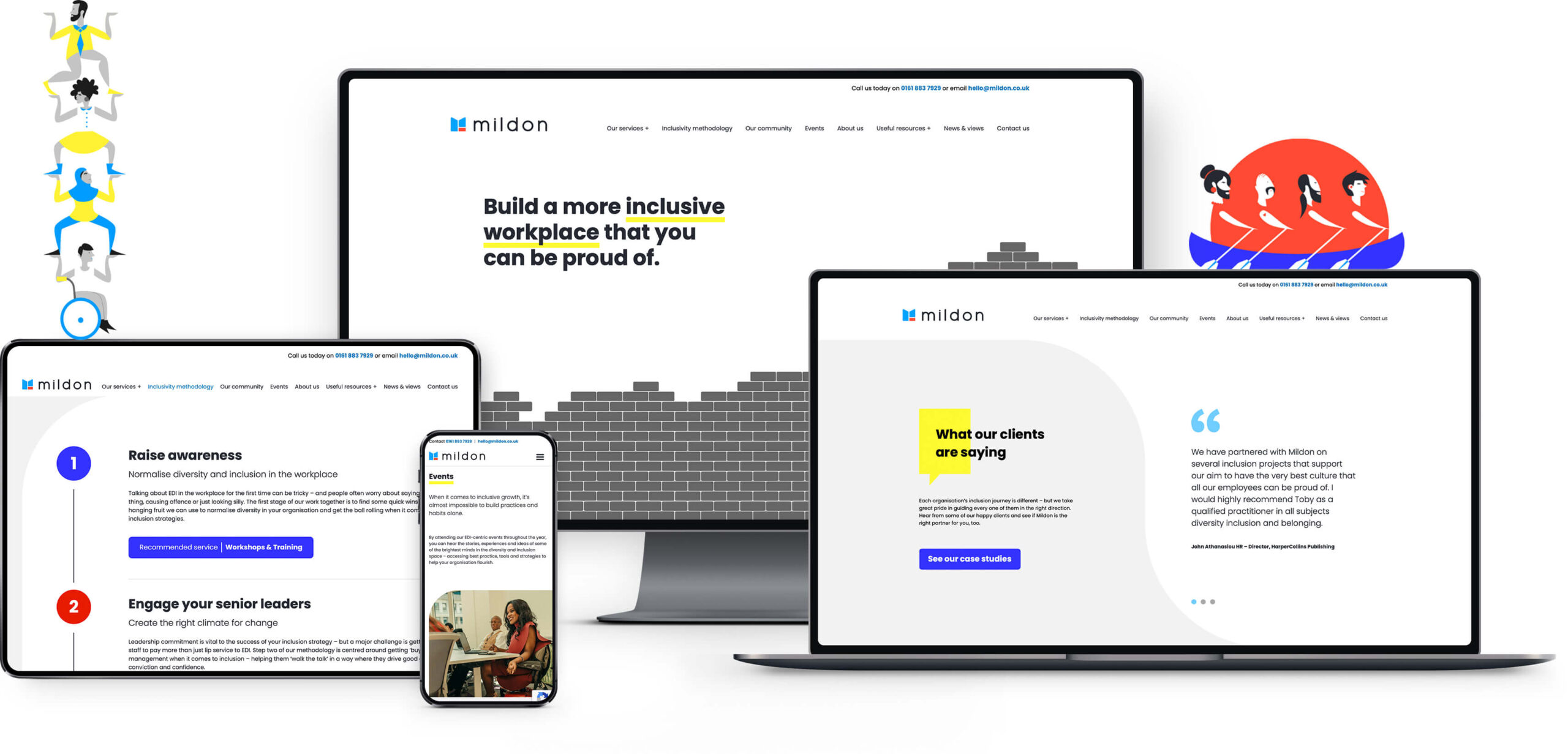
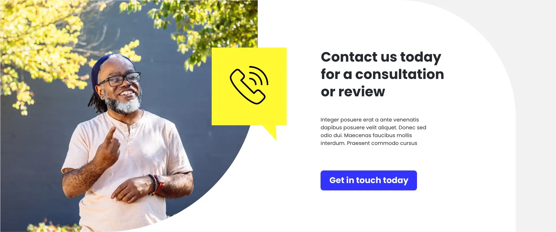
Beginning with an already playful brand style, we worked with Toby and the team to enhance the messaging by bringing together a bold mix of illustration, diverse photography, a strong colour palette and clear typography. The resulting look is friendly, impactful and engaging, perfectly pitching Mildon’s core goal of achieving inclusion and diversity in the workplace.
Starting with a review of Mildon’s existing content, we worked closely with Toby to understand how the organisation had developed and grown. Understanding our client’s audience and core services is vital to enable us to establish their brand position and piece together a content strategy. Underlying all of this was the need to make the website as accessible as possible, communicating Mildon’s key services and values in a clear and concise manner.
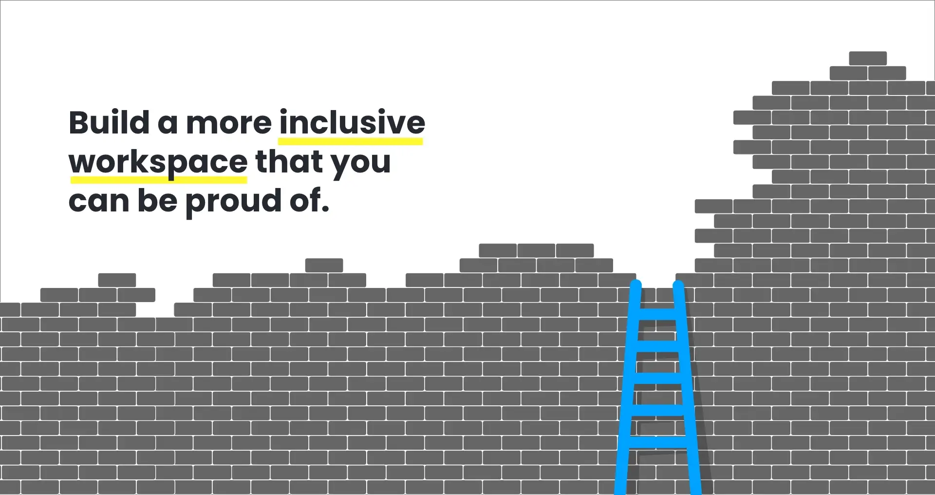
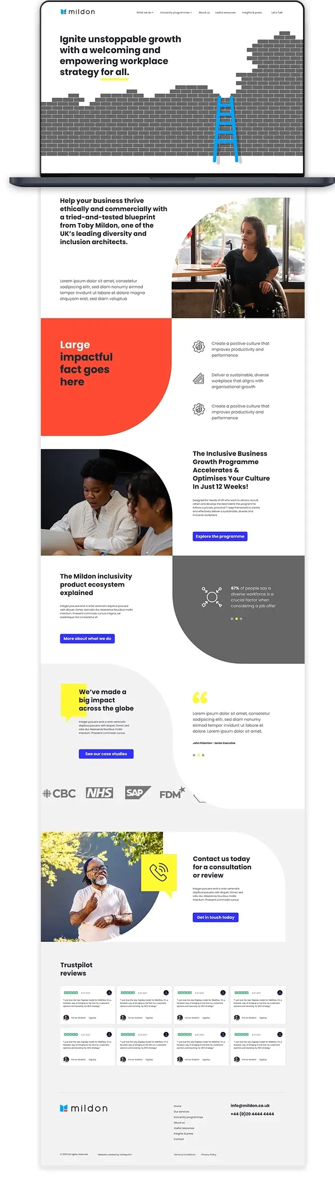
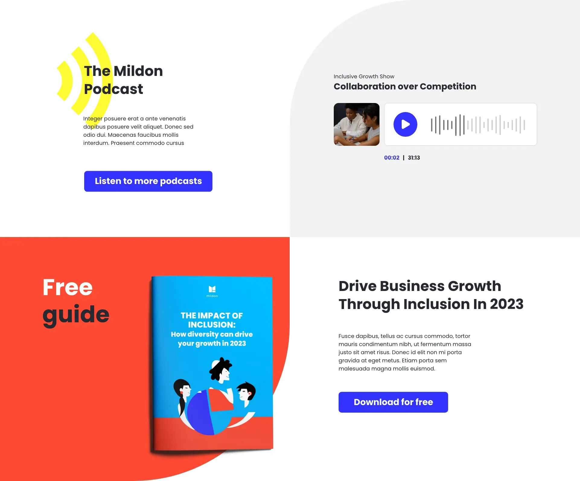
A great example is the homepage, clearly summarising Mildon’s services and signposting the reader to key areas of the website. The homepage outlines the core message of Mildon as an industry leader in Equity, Diversity and Inclusion (EDI).
Equity is needed to address the unique barriers and challenges faced by different individuals, leveling the playing field so everyone can have equal access to opportunities. Equality is necessary to ensure that once that level playing field is established, everyone is treated with the same respect and given the same opportunities. Both are essential in creating an inclusive, diverse, and productive workplace where everyone feels they belong and can succeedThe website continues to expand on Mildon’s corporate training in EDI, periodic reports, thought pieces, articles and frequent topical podcasts.
The illustrations across the website were created by the very talented Luana Conti. Luana’s illustrations were designed to be representative of diversity with depictions of playful diverse characters depicting various scenarios to reflect the content. The only adjustment required for use online was to introduce some grey tones to calm a very bright and vibrant colour palette.


Another important consideration for the website design and build was accessibility. Beyond obvious design and typographic considerations required to maintain a high level of legibility across the pages, we drew on our deeper understanding of accessible website design and build, fostered from past experience of working with Toby on previous website projects.
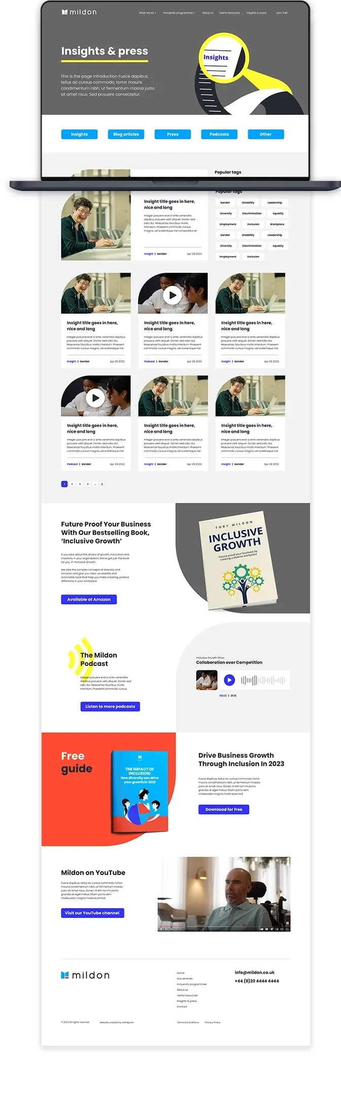
Content structure is key, as with all websites, it is important to arrange key messaging correctly on the page in a clear sequence of blocks and topical headings. Clear navigational structure is of primary importance, allowing the reader to toggle through the website, not just the main menu but the page content beneath. Correct tags and labels are essential to enable someone using a text reader to access all areas of a website. Many of these techniques also cross over with best practices for Search Engine Optimisation.
Now Mildon’s new website has launched, we look forward to keeping an eye out on all the exciting developments as they expand the site in the future.