Having developed a new identity and branding for EDIS, we have now applied our skills to designing and building them a new website. The previous EDIS website was based on WordPress, mostly functioning as an online resource library. Our challenge was to expand on this with a completely new build, communicating EDIS’ mission statement and goals, alongside topical news, events, and useful information.
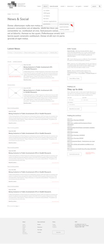
Before:
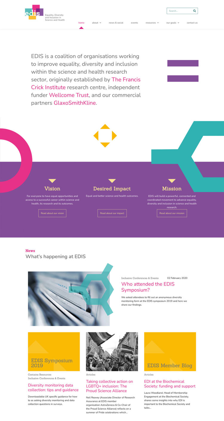
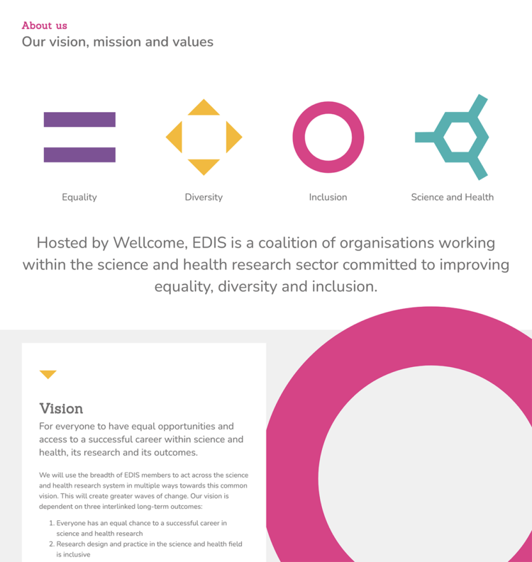
The new identity was created to communicate the acronym EDIS (Equality, Diversity, Inclusion, Science) using 4 key icons as graphic devices underpinning all their marketing and design material.
Having produced various printed material for EDIS as well as wall graphics for their symposium, it was a logical step to apply this visual language to the website. We created a minimal and elegant design based on clean typography, clear messaging and the playful use of the 4 EDIS icons.
Our approach to building the EDIS website began with producing wireframes based on our discussions on content and functionality, before moving on to designs. We based the website build on our simple, paired down WordPress theme, customised with bespoke styling and functionality, giving us the flexibility to deliver a tailored solution within the timeframe required.
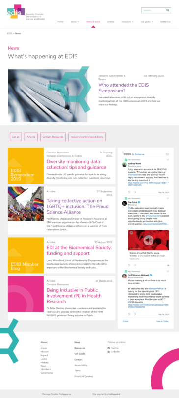
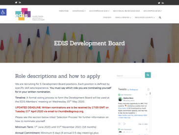
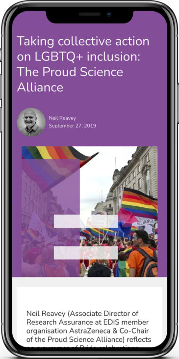
An easy to use categorised news and events area enables our client to keep the website up to date with current goings on, whilst keeping an archive. Events can be submitted by anyone via a form on the website for our client to approve, streamlining the publishing process.
The previous resource library has been redesigned to clearly direct the visitor through a collection of published articles, guidance documentation and reports. EDIS’ goals are clearly mapped out and direct people to find out more by taking part in conferences and events, as well as reading about key research.
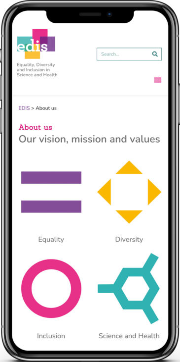
Accessibility was a key requirement, so displaying content and navigation as clearly as possible was vital. Using the EDIS colour palette could not compromise the legibility of the site. The symbols were purely used as decoration, to complement the content and support the brand aesthetic without getting in the way. We will soon be entering a ‘phase 2′ of the website build to tailor our approach to accessibility further to make sure that we reach a high standard and as many people can gain access to EDIS’ content as possible.
Once again, working with tothepoint and James on this project was a great experience. Considering accessibility to be the priority in this design was critical for EDIS, so to see such a usable, calming and creative site produced was fantastic. We hope this will also inspire other organisations to consider accessibility as a ‘must have’ rather than a ‘nice to have’ for their own websites, and tothepoint have proven this is more than possible. Lillian Hunt, EDIS Programme LeadWe’re very pleased with the end result, having created a website that projects EDIS’ approachable personality and its inclusive principles, without losing the gravitas that such an important organisation deserves.