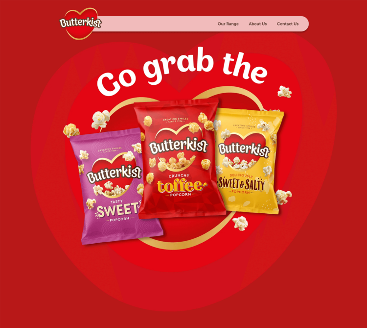
The site is crafted to reflect the brand’s playful personality while showcasing its range of well known popcorn products. Each product, from Sweet & Salty to Crunchy Toffee, is presented through visually striking and easy-to-navigate custom build page templates.
Using motion and interactive elements, we’ve ensured the site feels dynamic and engaging without overwhelming the user. Subtle animations encourage visitors to explore Butterkist’s offerings, whether they’re viewing on desktop or mobile devices. Built on WordPress, the flexibility of the Elementor page builder allowed us to create custom layouts that ensure smooth navigation and an enjoyable user experience.


The product range is front and centre, visitors can easily find their favourite flavours, explore new ones, and learn more about Butterkist’s long-standing legacy as the UK’s favourite popcorn. The clean design allows for quick, straightforward interaction, helping Butterkist fans discover more about the products they love.
Looking ahead, the website is built with growth in mind. Following a similar approach to websites we have created for McCoys, KP Nuts and Popchips, Butterkist now has a flexible web platform that can evolve and expand with new products and promotions.
