January – News for News UK
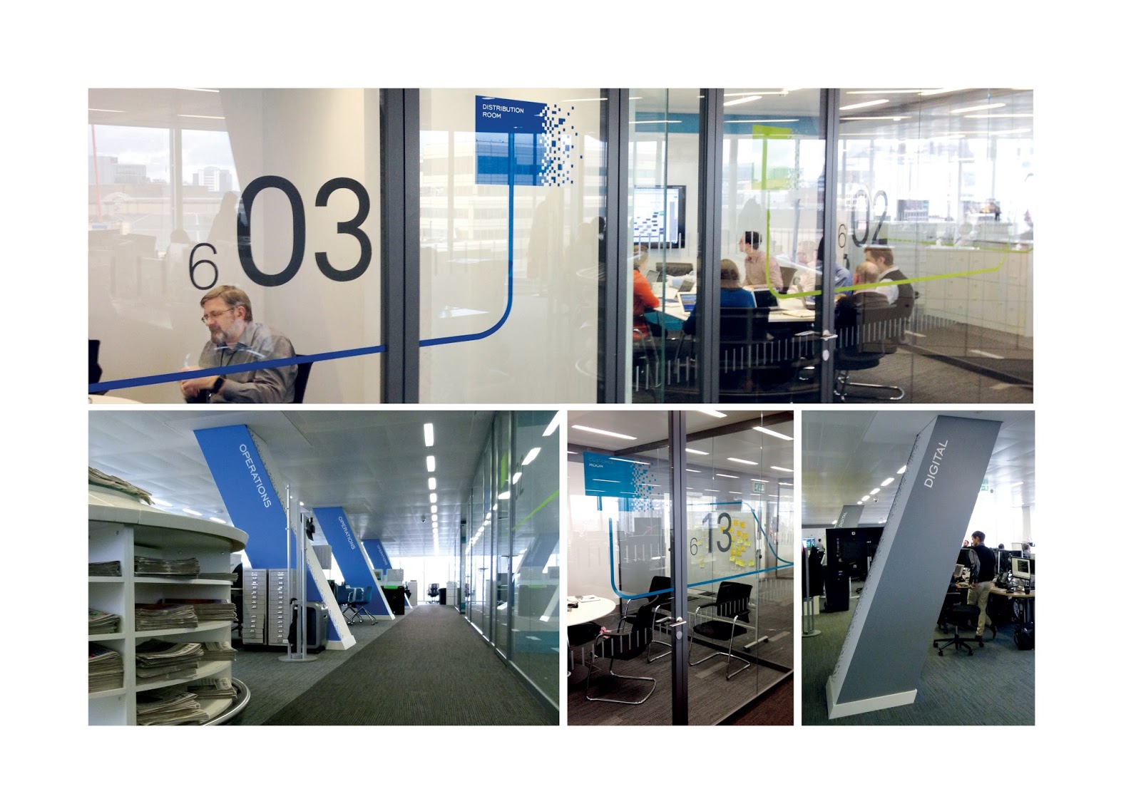
News UK’s Technology and Operations division were looking to create a wayfinding solution for the merger of 10 departments whilst injecting some personality into their new space on the 6th floor of 1 London Bridge, which sits directly opposite the Shard. Our interior branding skills were put to the test but everyone was very happy with the results as the new look brings them all together! Click here for the full story.
February – A new look for 3DReid
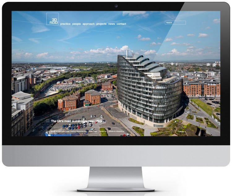
February saw the launch of our new website for award-winning architects, 3DReid. Having designed their brand, they wanted us to design a responsive wordpress site that mirrored the quality of their work whilst retaining the simple and clean style we had created across their other touch points. The site is uncluttered and gets straight tothepoint (see what we did there!) with an impactful homepage showcasing a full screen carousel of their leading projects. Click here for the full story.
March – Celebrating with a bang
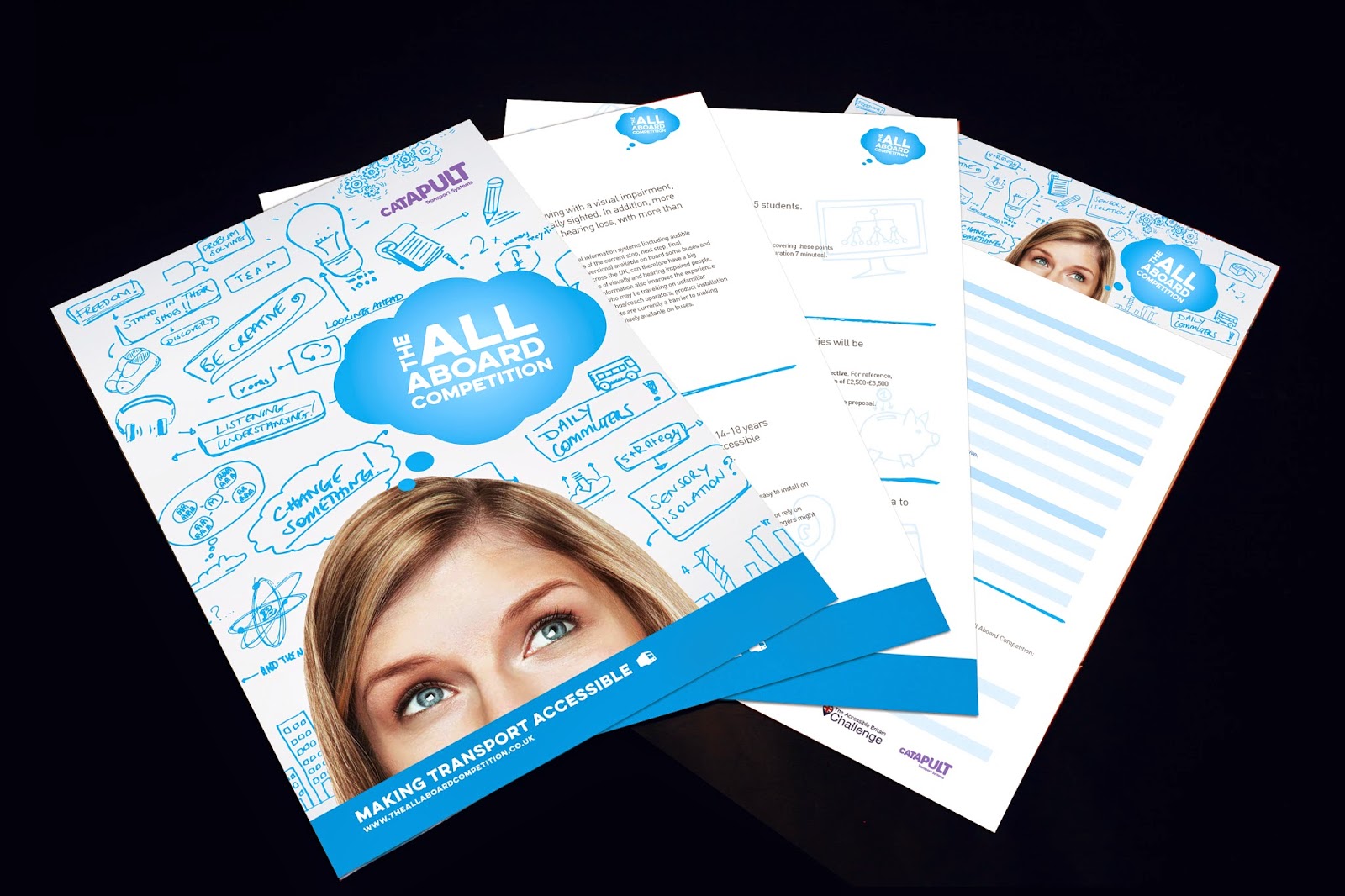
Not too long ago we helped Transport Systems Catapult launch the All Aboard Competition, a national school competition challenging children and young adults to make it easier for those with a visual or hearing impairment to travel by bus. We branded the competition with a quirky and vibrant take on the existing TSC IM campaign we’d also created, using hand-drawn icons and the trademark TSC blue to create something a little more “down with the kids” as they say. The competition featured on national TV, with Baroness Kramer; Minister of State for Transport, helping to drive the competition forward. Click here for the full story.
April – Speak for yourself!
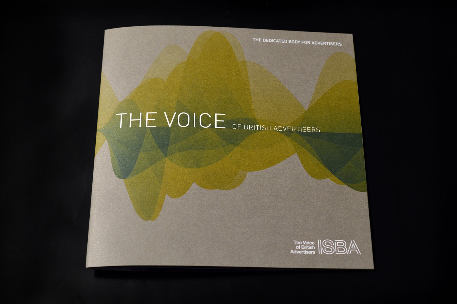
In April ISBA felt it was time to refresh their marketing materials. Our work started with their Annual Conference, however from the very beginning the plan was to create a contemporary suite of marketing materials for 2015 that reflected ISBA as the voice of a modern industry. We’re now working with them on evolving their look ready for launching in 2016, with a few new twists and turns, starting with the look and feel for their 2016 Annual Conference. Click here for the full story.
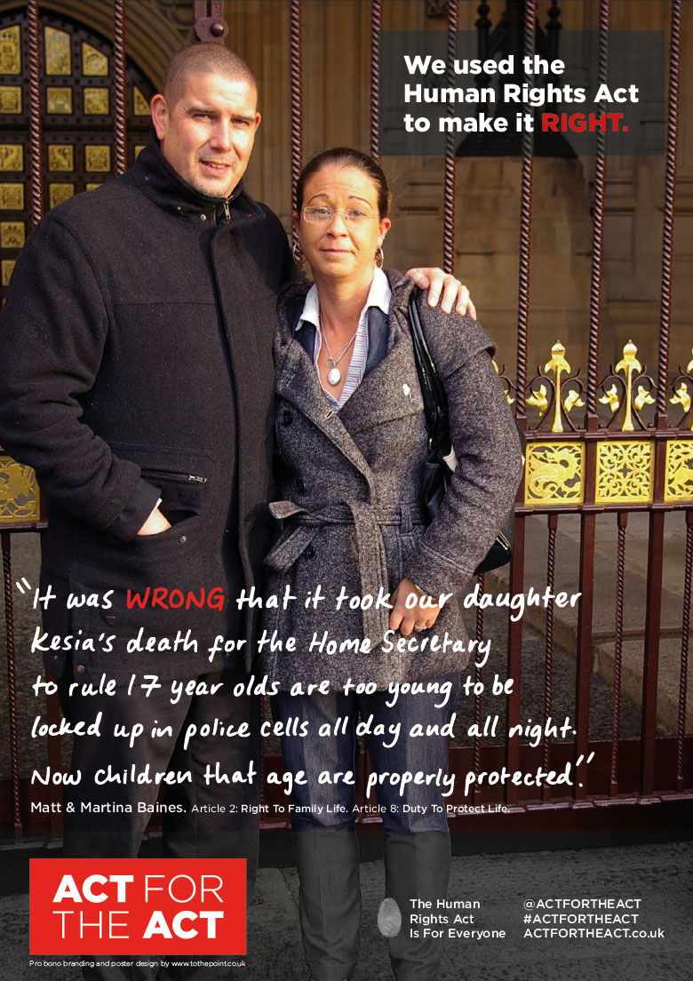
May – Act for the Act
In super quick time, one week from brief, we helped create the brand and the theme for the poster campaign and within three weeks the crowdfunding had exceeded its target! The Act for the Act Campaign went out all over London later in the year and can still be seen at some sites and even on some cupcakes. You can find out more on their website, and still sign the letter to Michael Gove, here.
Click here for the full story.
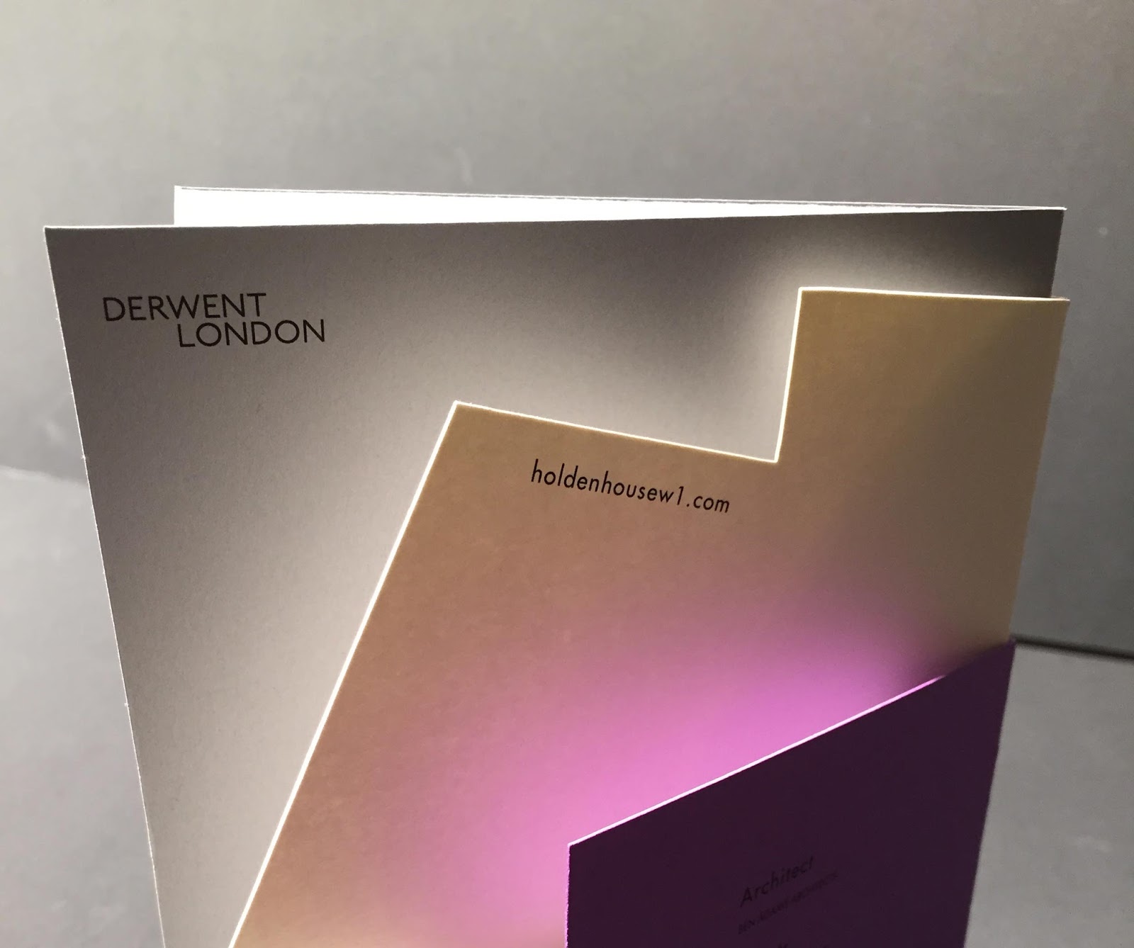
June – The home of design
July – An Ace up our sleeve
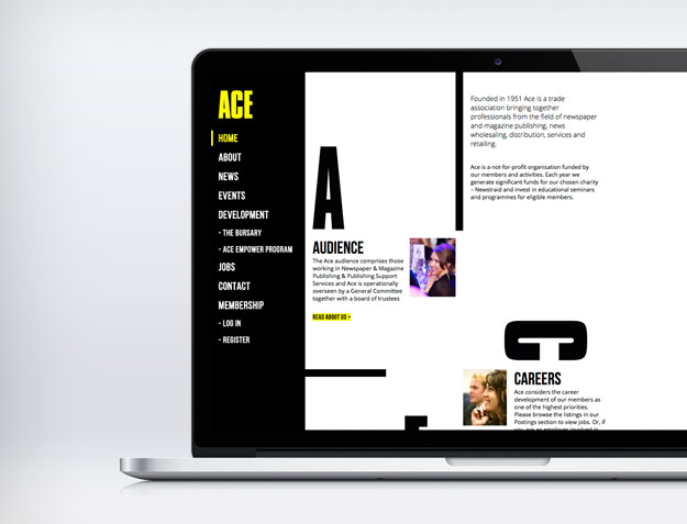
In the summer our friends at News UK asked us to help the team at ACE Circulation to create a refreshed identity and website that was able to keep up with their growing needs. Their new site needed to be able to manage online event bookings, invoicing and payment and included a jobs database and login space for members. All this along with a fully responsive layout, analytics and a CMS that was easy to update…not much then! They were delighted with the results and we even got an invite to their fab Christmas party at the Grosvenor House Hotel. Click here for the full story.
August – Ship shape branding
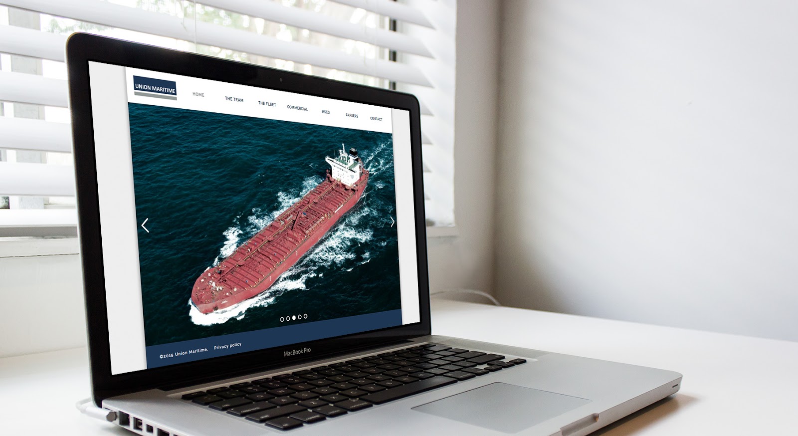
We’ve been working with the folks at Union Maritime for some time, but in 2015 we refreshed their logo as well as designing and producing their slick, new minimal and responsive website. These designs are now influencing other divisions within the group who are looking to align their brands with the new simplified look and feel. Establishing a strong brand isn’t something that happens overnight (if only life was that easy!), so the hard work has only just begun.
Click here for the full story.
September – Nuts for KP
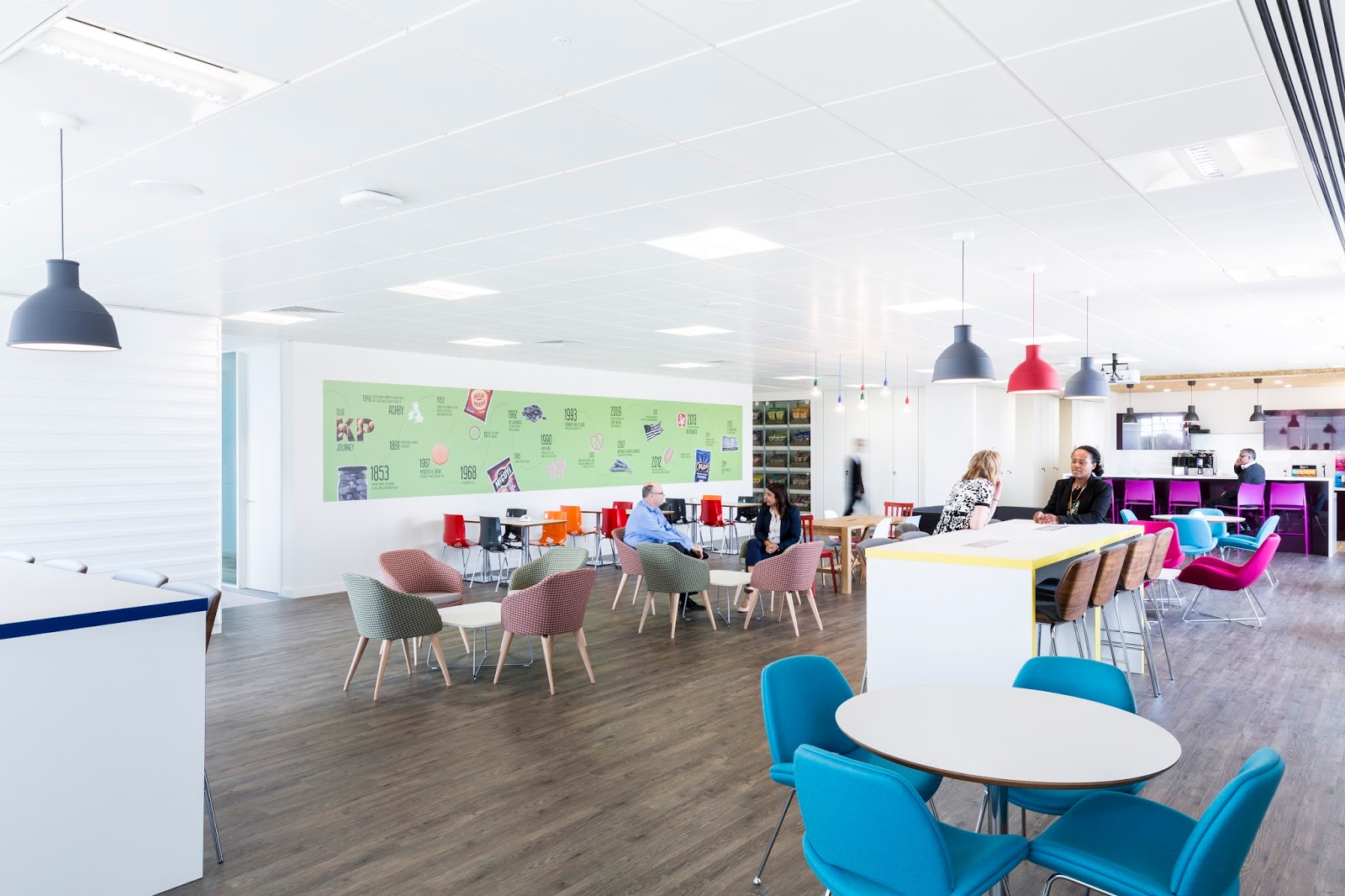
As Autumn arrived we began working with the Intersnack group. The project was the branding of KP Snacks’ new head office in Slough. The interior branding needed to balance their 22 strong portfolio of well known brands, parent company branding and their new look staff materials. With an overarching theme that ran through the office we tied together corporate messaging with humour, graphics, pack illustrations, product icons, taglines and photography, even producing an alphabet from their core logos that helped bring the KP brands to life. The result, a creative, playful, energetic working environment. Click here for the full story.
October – New signage for Thames Clippers
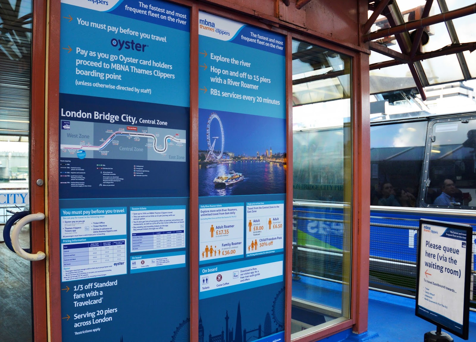
The ship shape crew at Thames Clippers had been working with TfL to introduce touch-in, touch-out Oyster payments across their services. Time for us to be called in to help update their pier signage and alert commuters and visitors to these changes. It started with a few enjoyable trips on the service for an audit of their current wayfinding and messaging. The main challenge was to align the two brands to ensure consistent messaging, to help bring synergy to the information and provide greater clarity for the traveller. It’s now all in place and no-one has been reported lost so far! Click here for the full story.
November – Have you heard: In London For London

Following on from the success of our ‘have you heard’ campaign to launch their Reading office, we’ve been working with the guys over at Turley to build on their presence in London, launching the ‘In London For London’ campaign. The campaign needed to highlight their expertise as a cross service and cross sector company within the capital. We created a ‘co-ordinate’ sub brand mark that will allow Turley to visually pinpoint their projects to the exact latitude and longitude. The ‘In London, For London’ logo has been used across various materials for key client events, and will be expanded upon in 2016. Click here for the full story.
December – Onwards and upwards!
December is always busy sorting out our calendars and catching up with clients to celebrate the successes of 2015 but we are also looking forward to working with some great new clients on exciting projects in 2016. As we run up to our break (24.12.15 – 03.12.16), we are putting the final touches to a new brand and website for the Patient Hub, preparing for the next stage of our work with ‘Return2Play‘, starting work on a multisite for KP Snacks and also making a start on our ‘give back’ work for 2016, working with the charity ‘Circles Network’ to help develop their brand hierarchy and look and feel. We look forward to developing this initial work further in 2016.
We hope you’ll continue to watch this space for our latest news but for now have a great Christmas and all the best for 2016 – our 25th year!